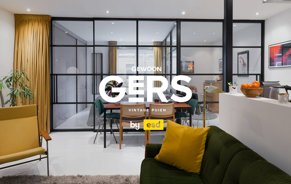
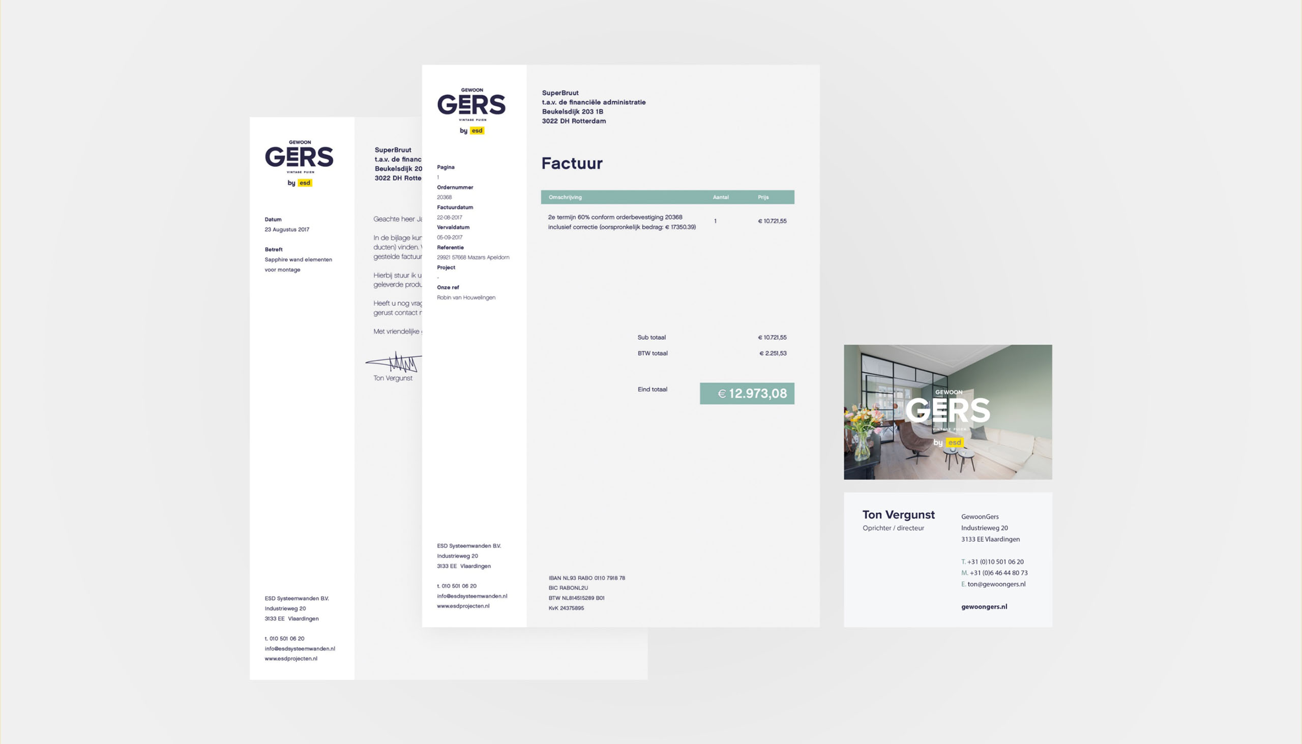
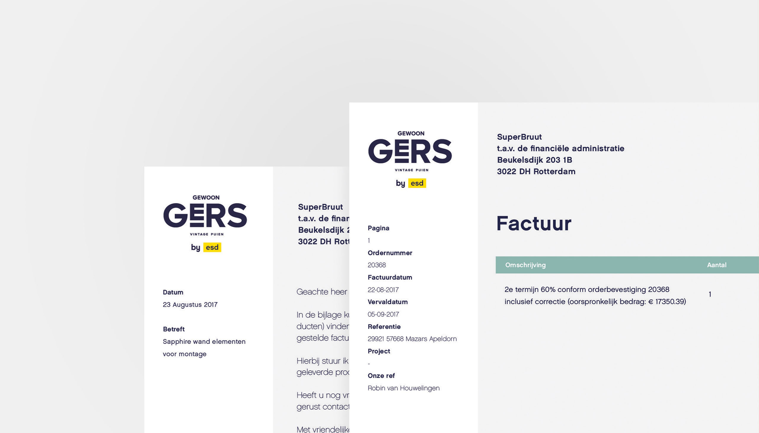
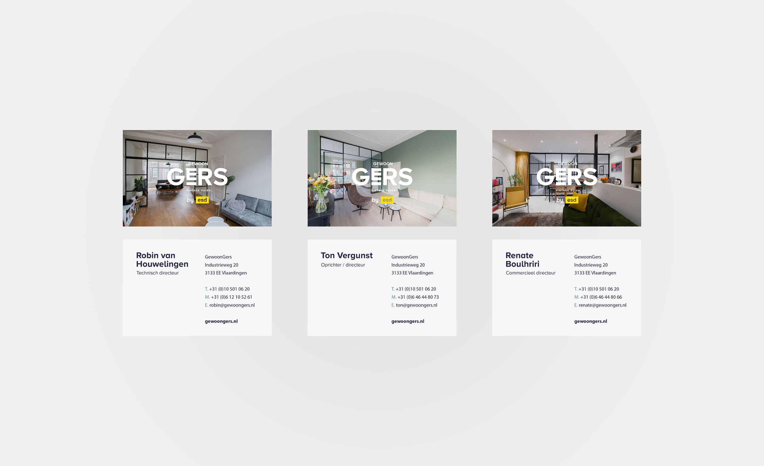
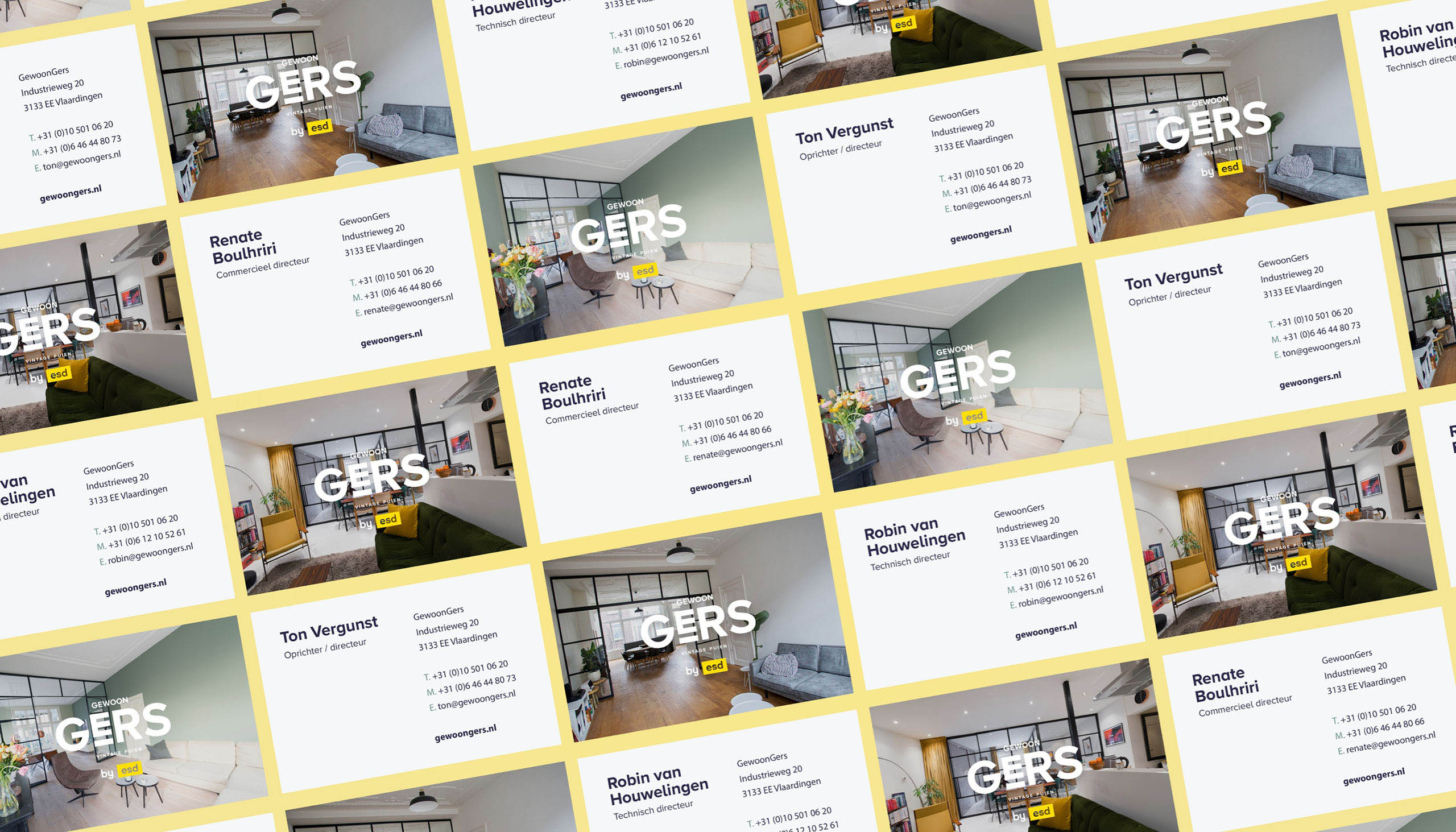
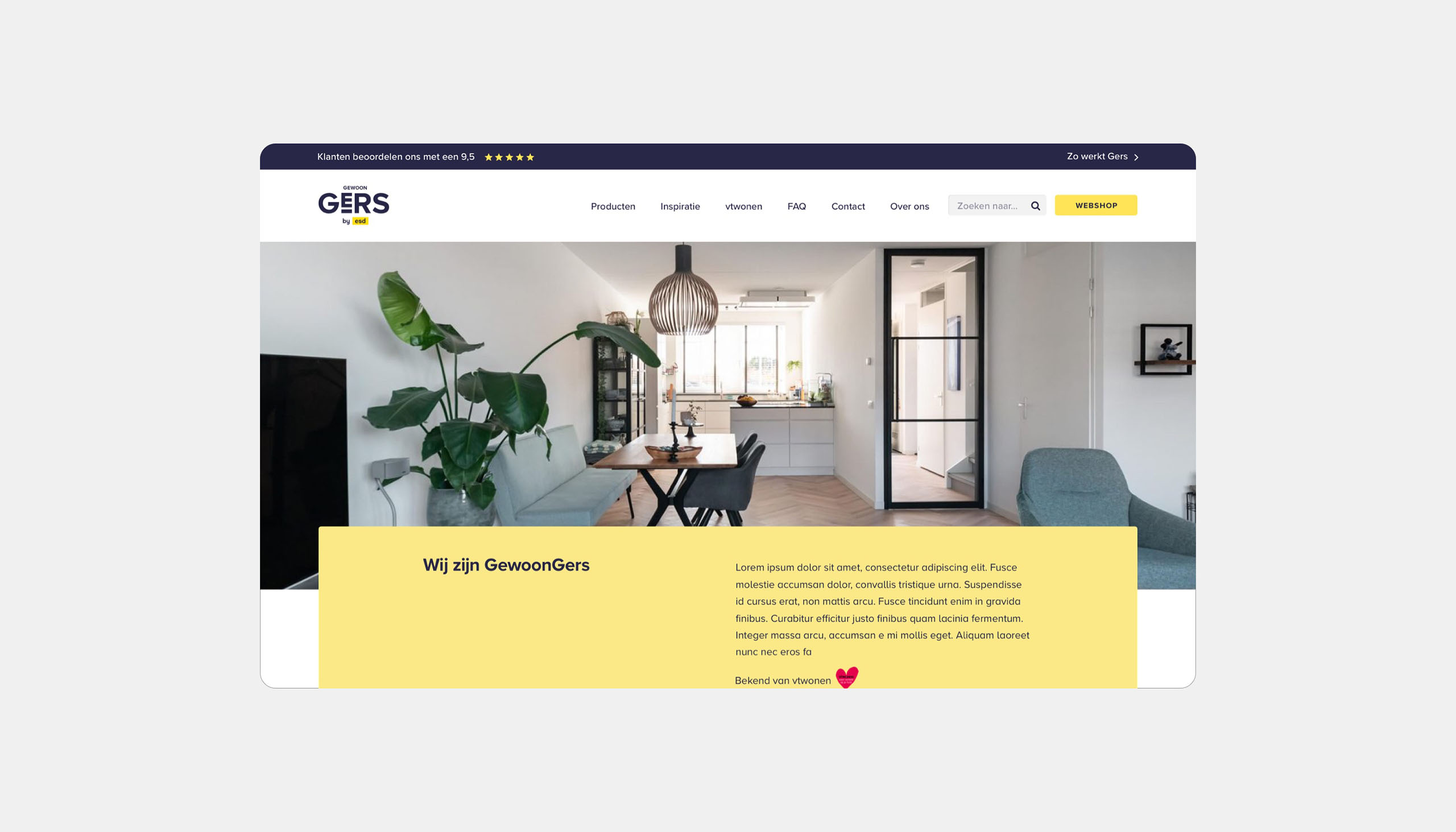
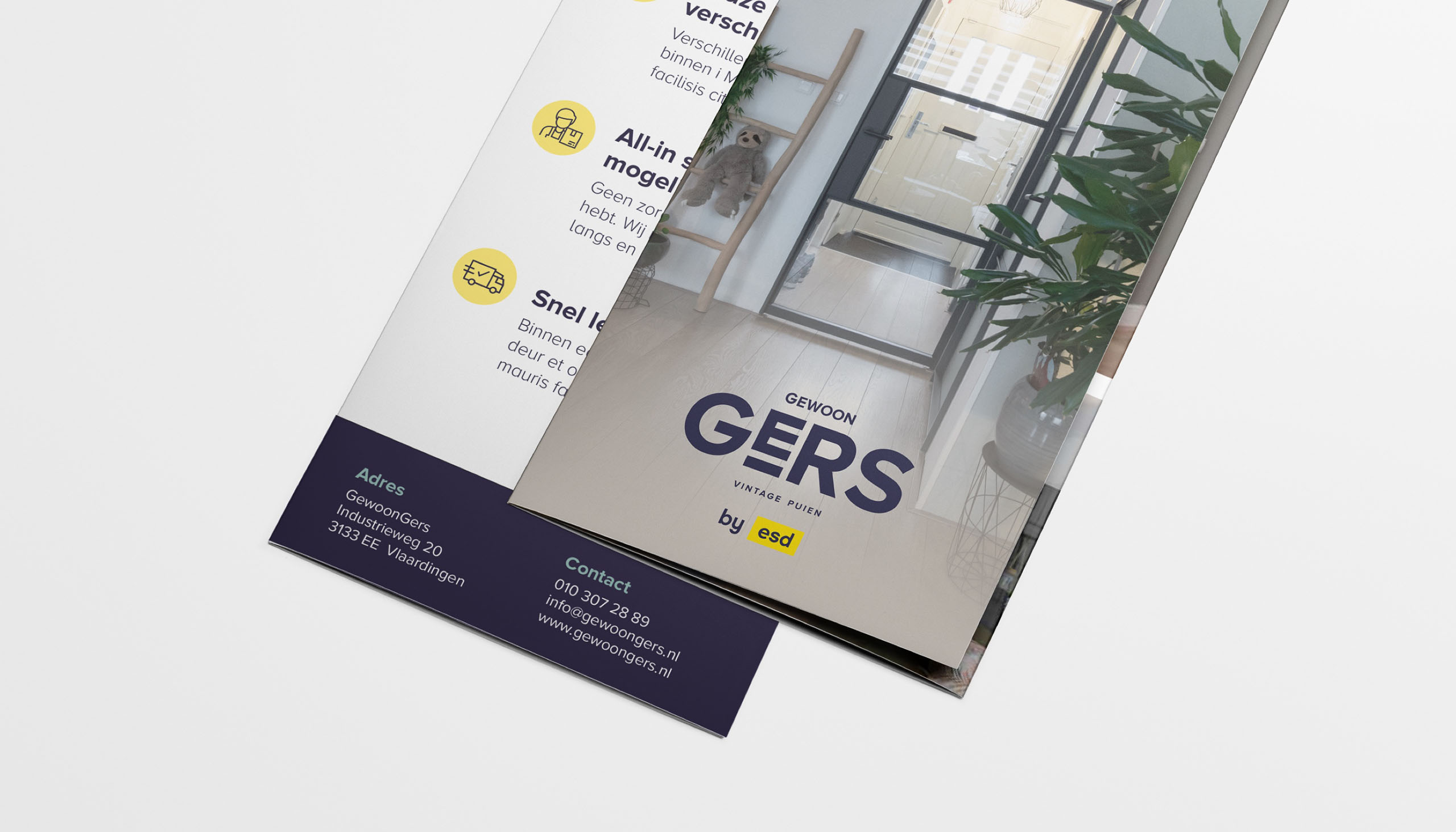
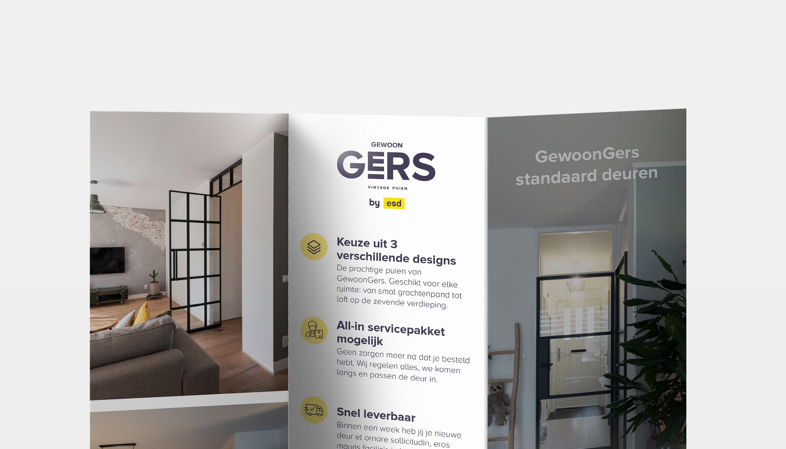
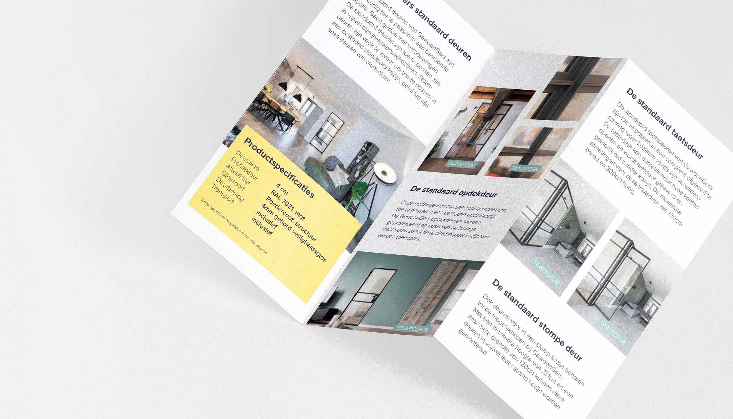
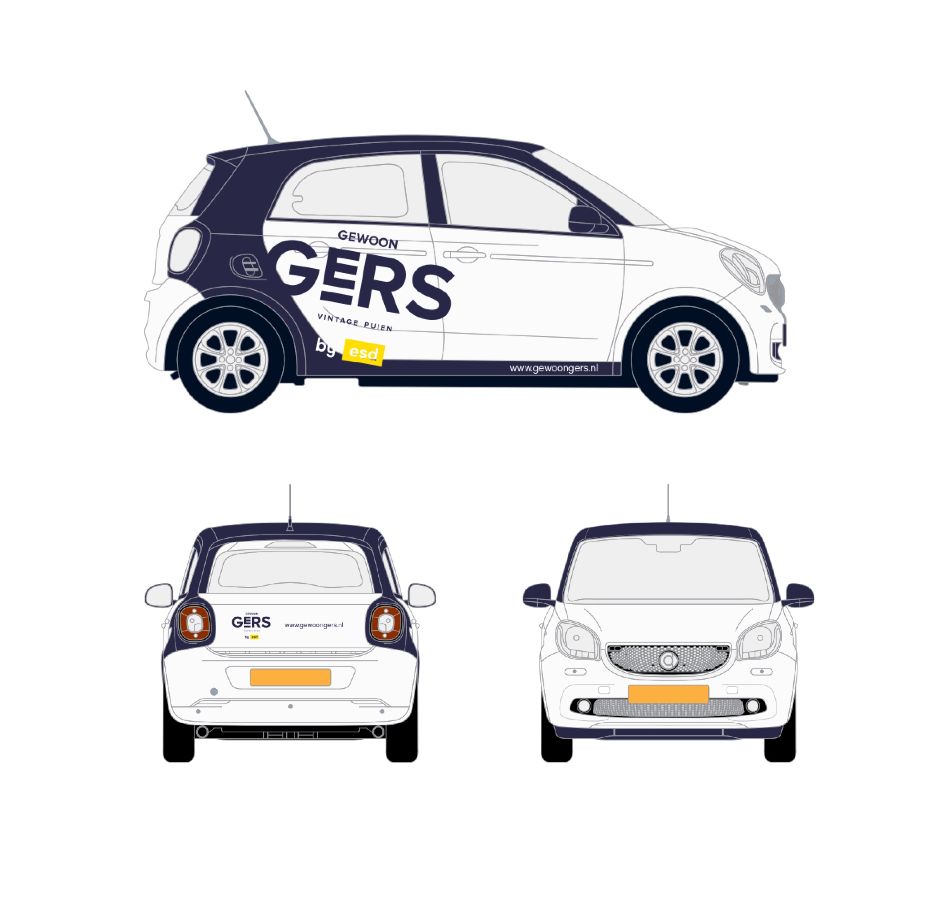
GewoonGers branding
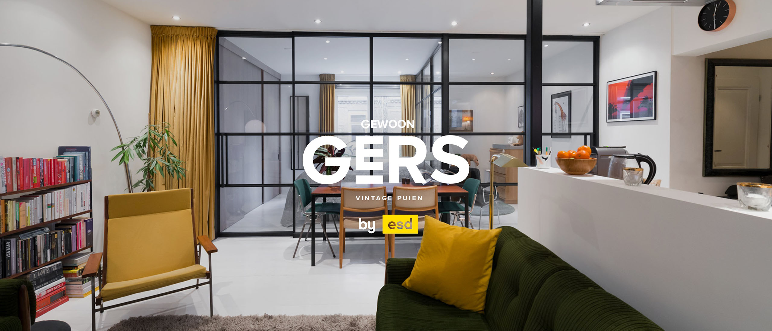
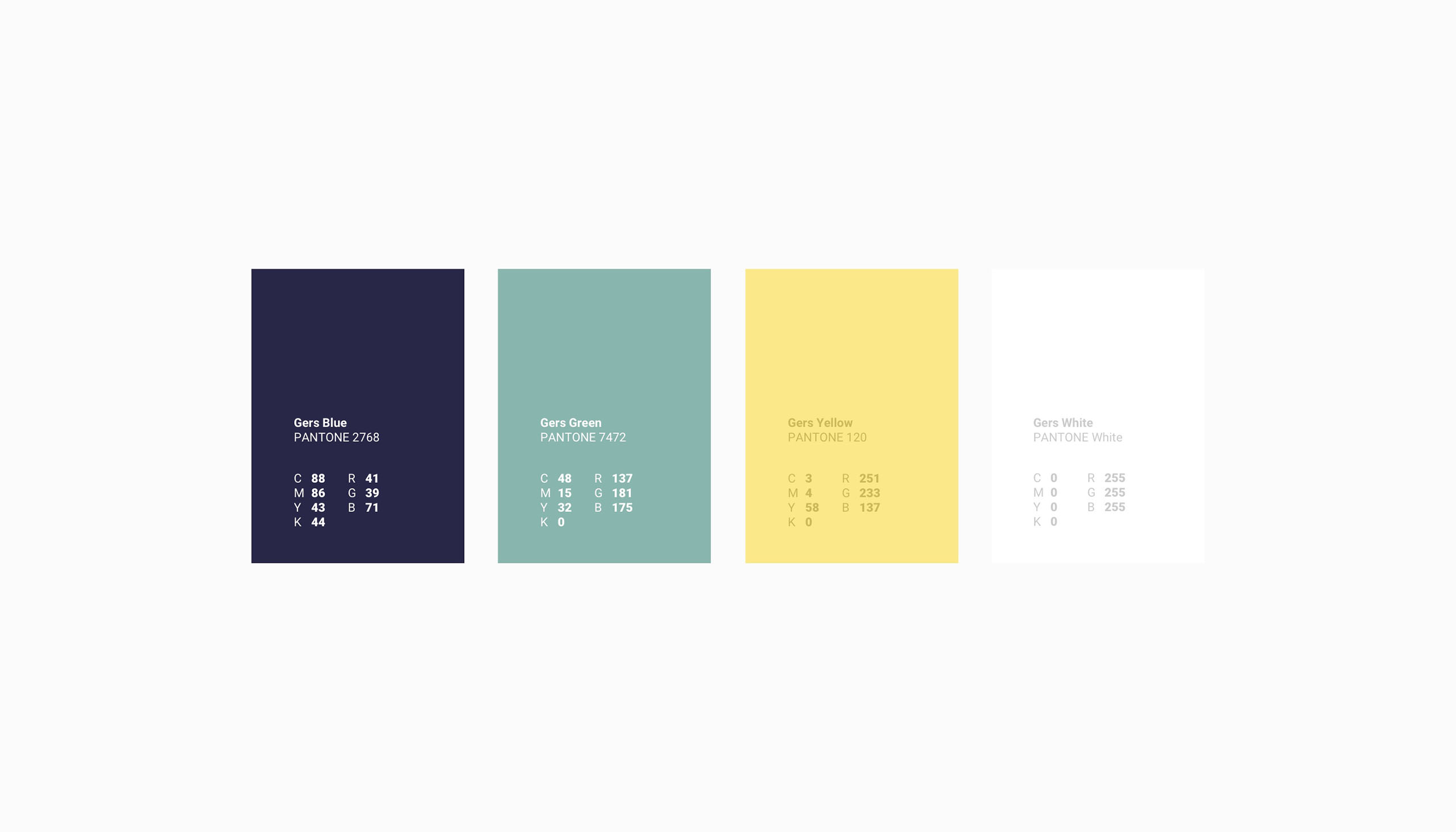
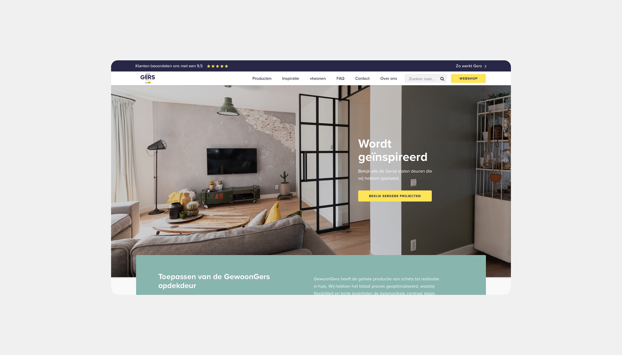
GewoonGers combines the charm of the steel doors of the past with the technology and service of today.
We started with a benchmark on the competitors of GewoonGers, which gave us good insights on the landscape. After concluding that they all were presenting themselves the same way. We could start concepting & sketching.
We ended up landing on a modern style with a reference to the art deco style from the 1920's. Which was referring to the vintage look at feel of the products.
Year
2018
Project sort
Freelance
Client
GewoonGers
Website realisation: Tabs & Spaces
What did I do
Concepting
Branding
Logo design
UX design
Visual design
High fidelity prototyping
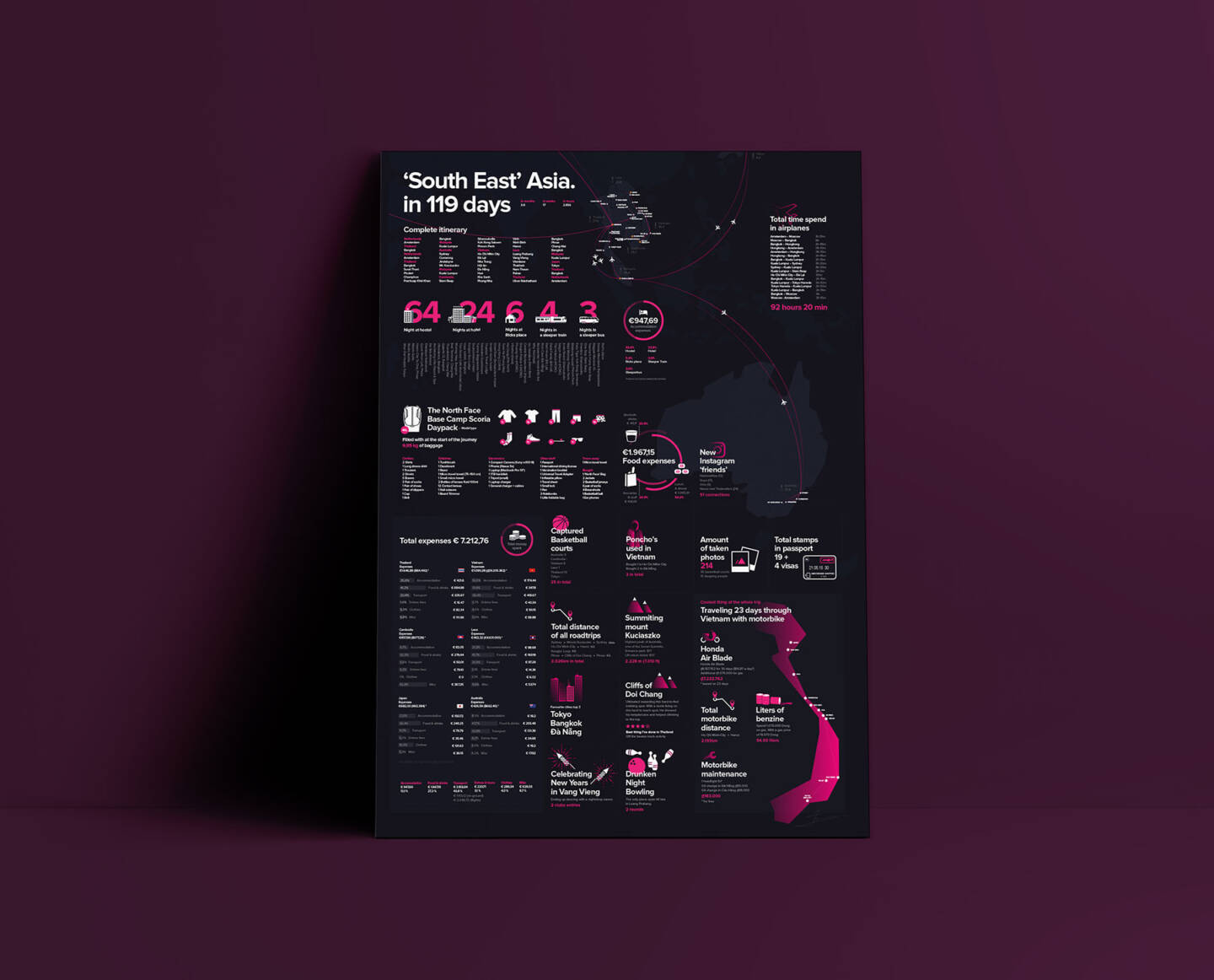
Travelgraphics
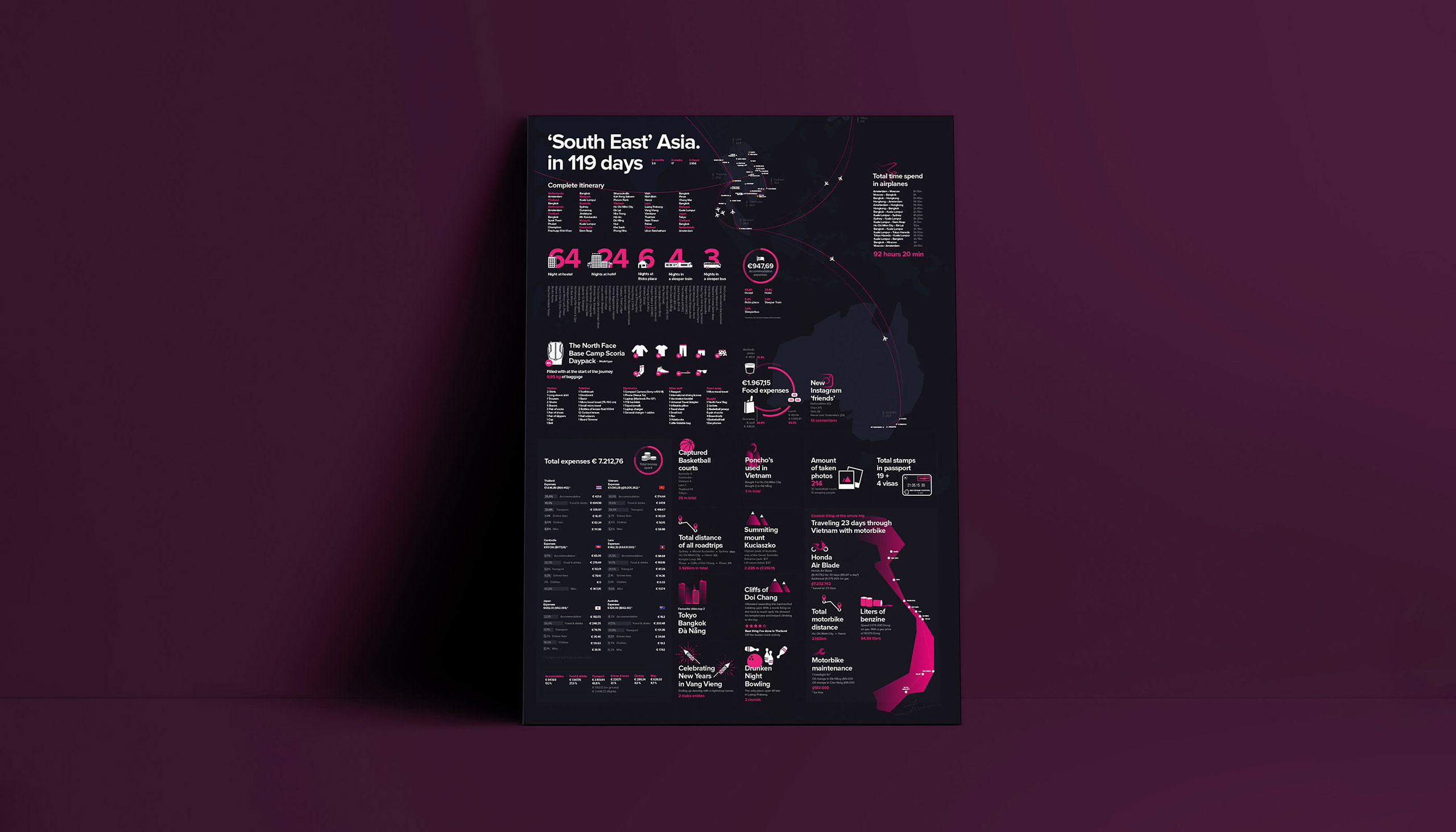
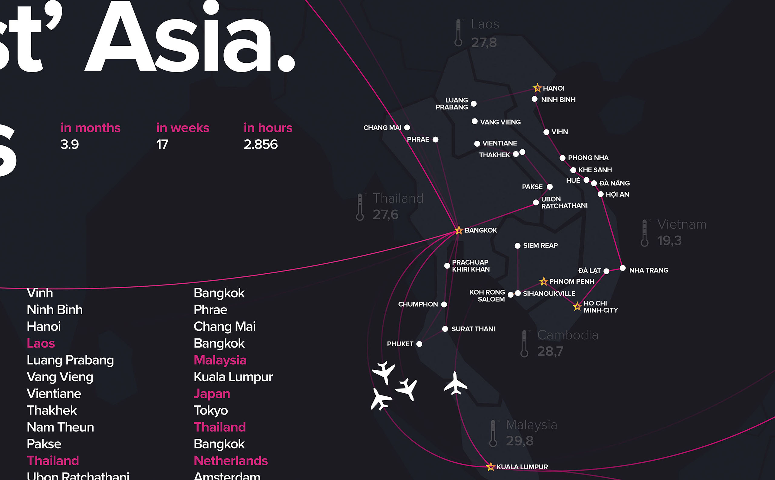
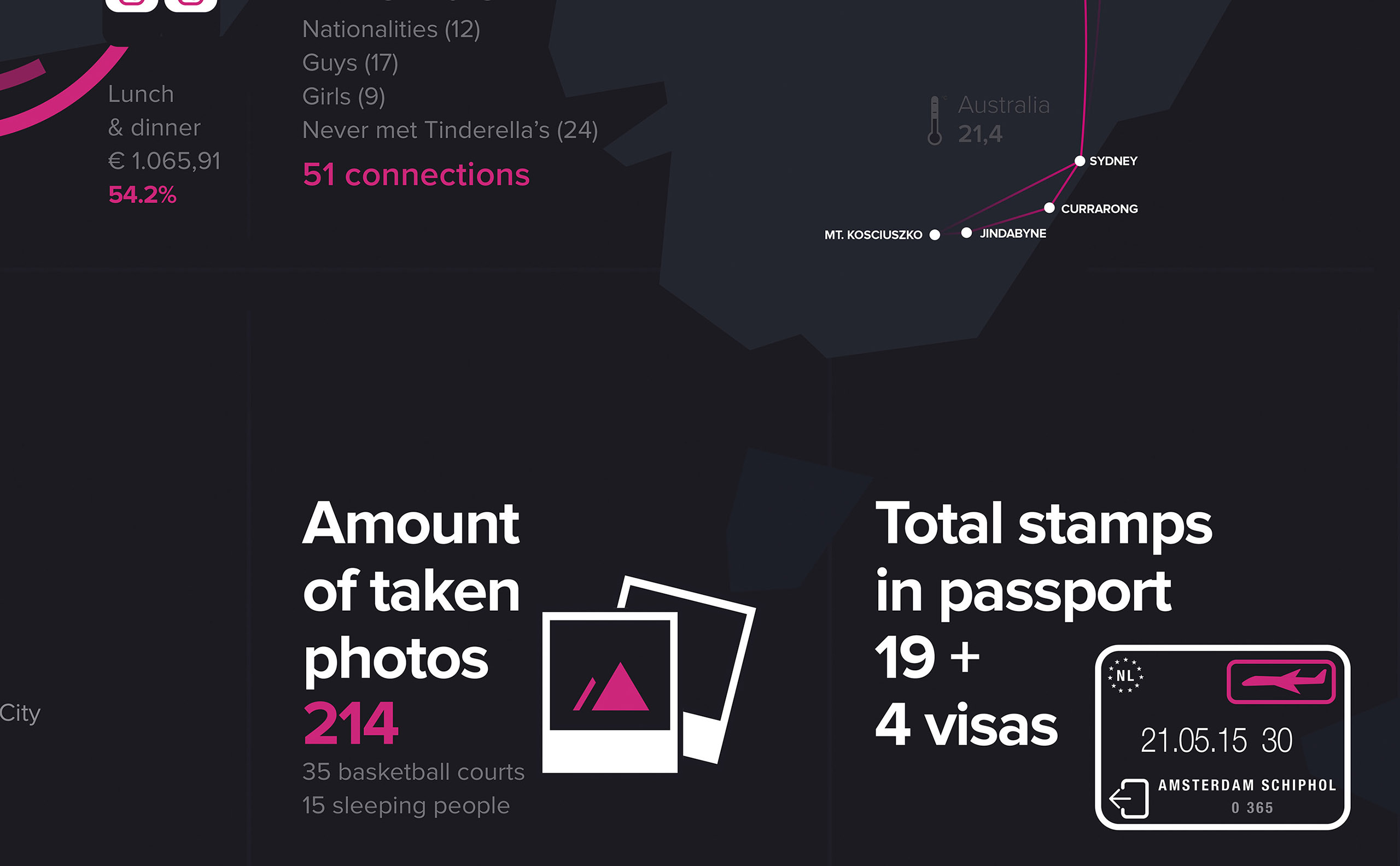
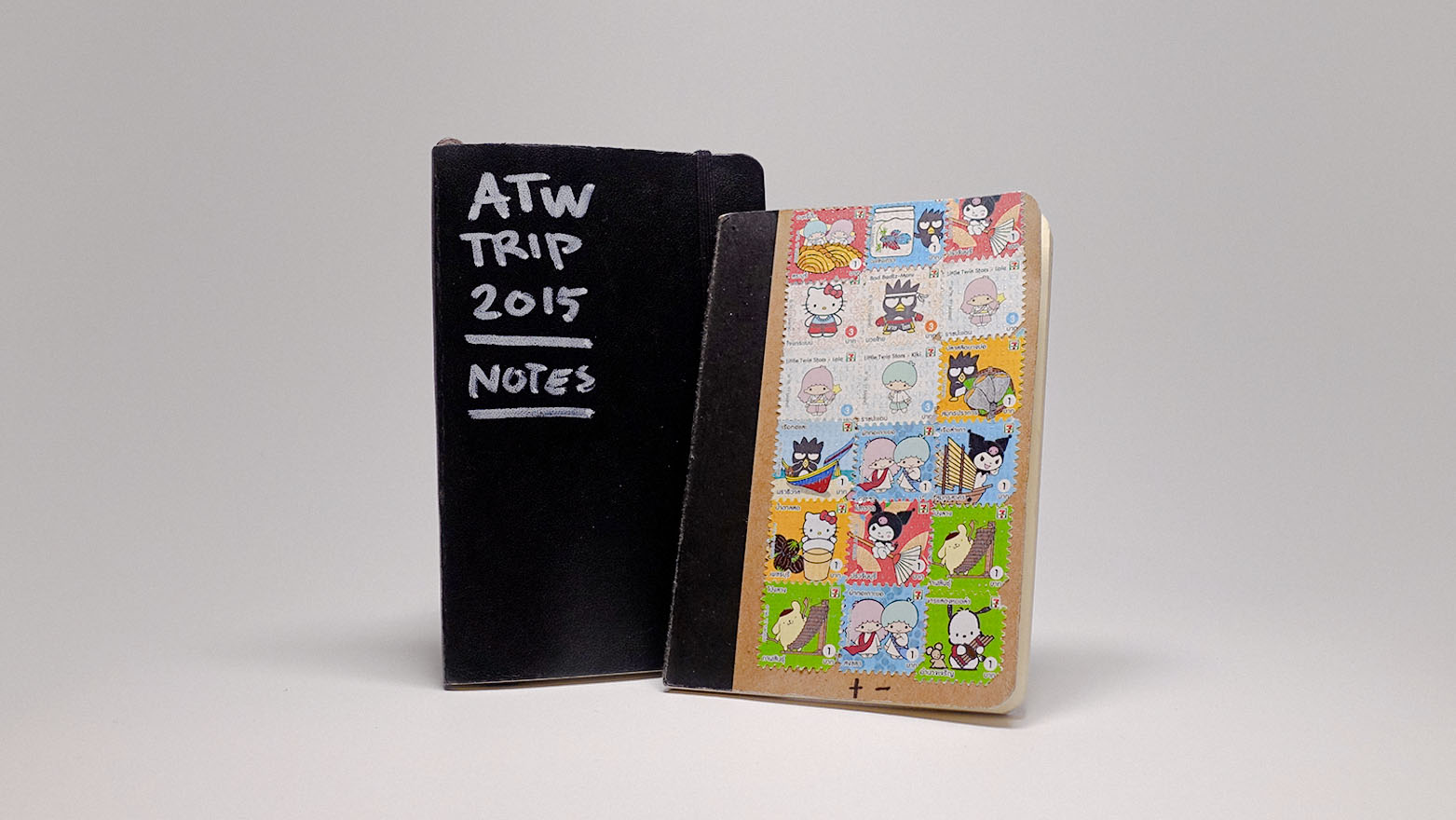
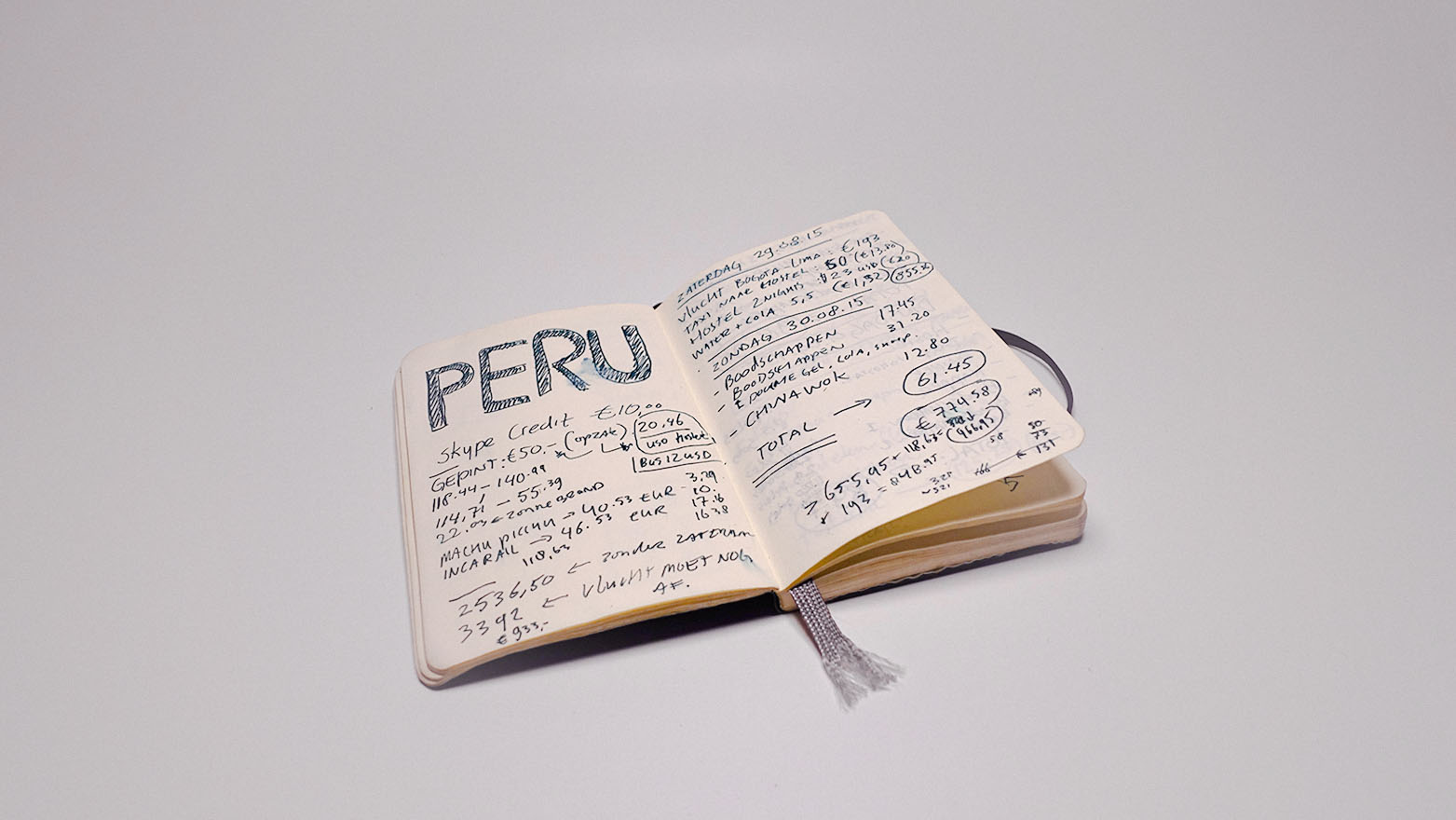
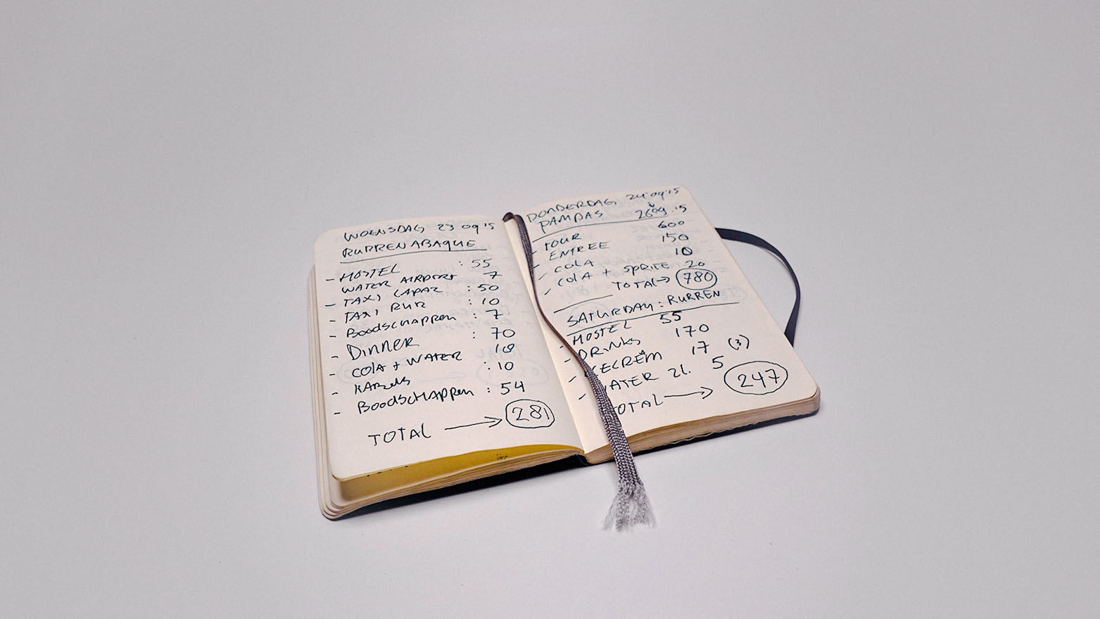
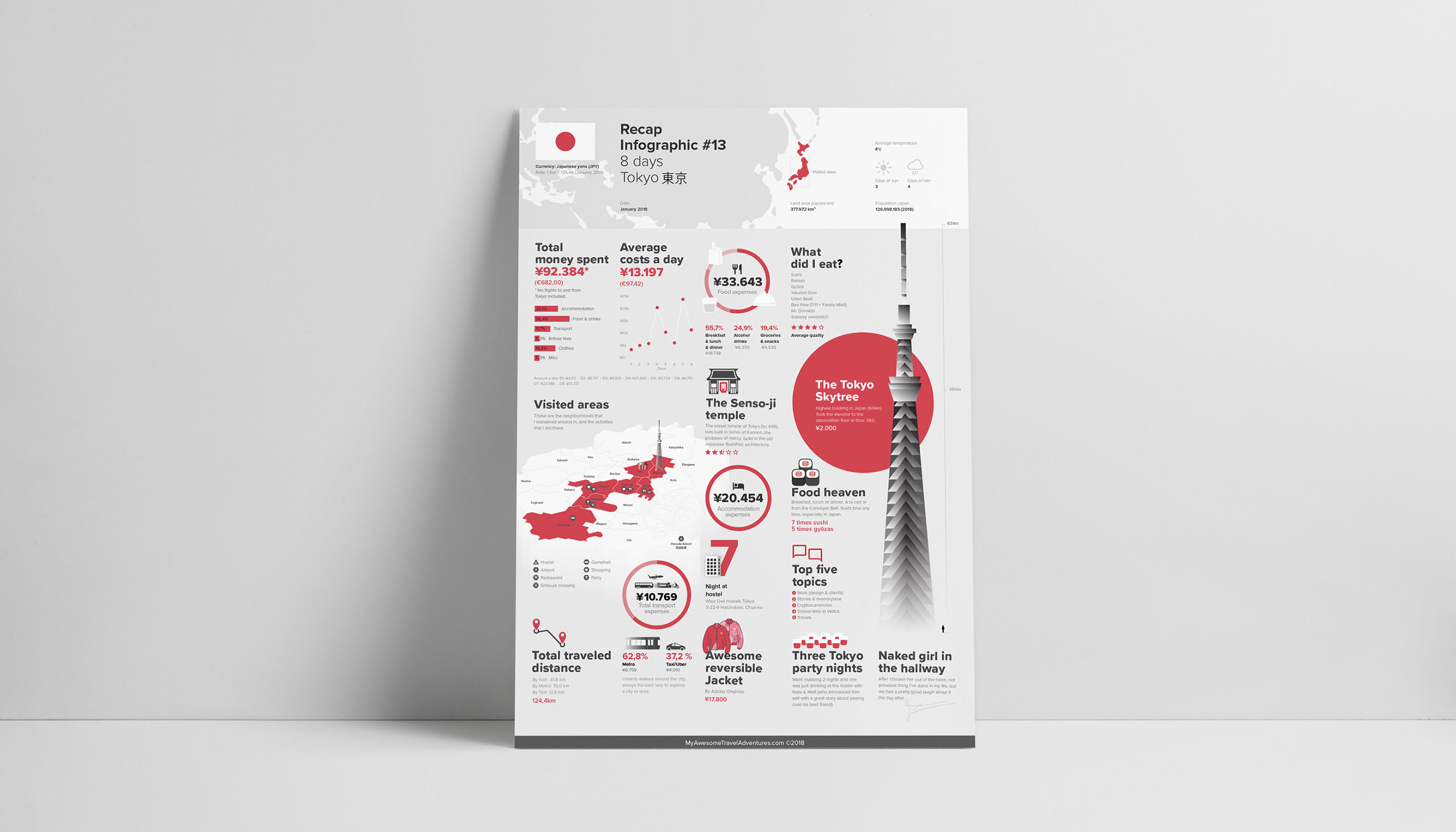
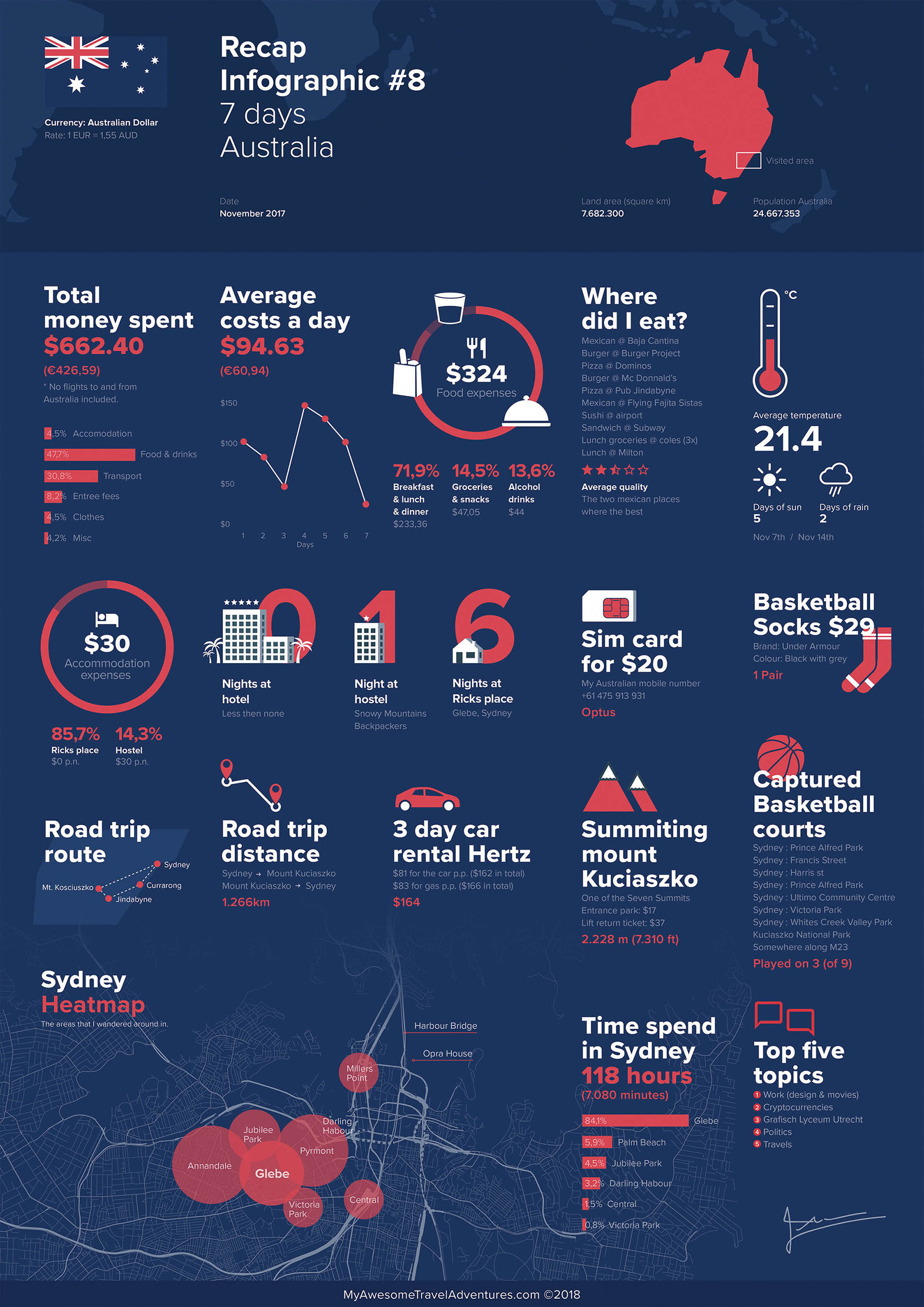
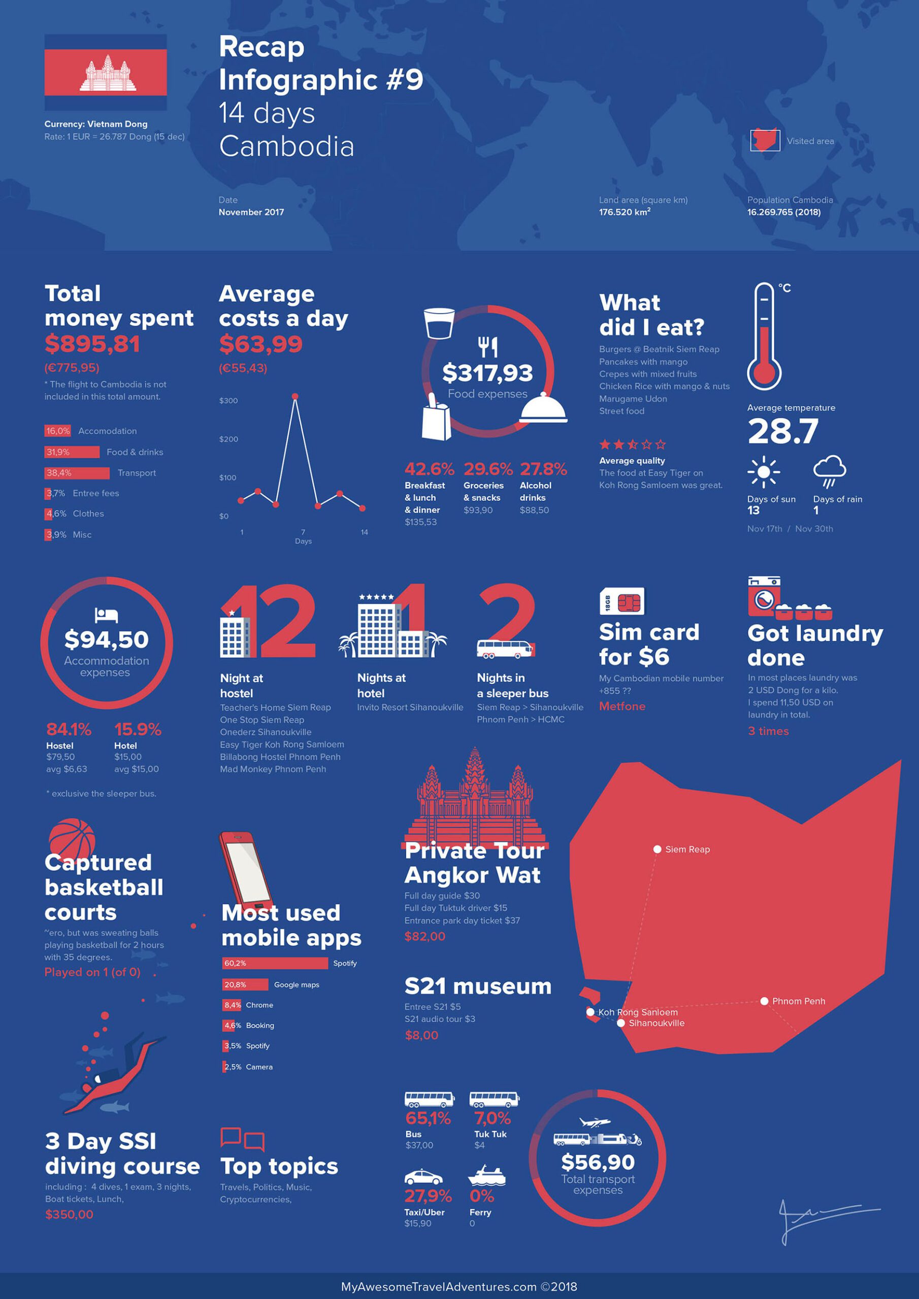
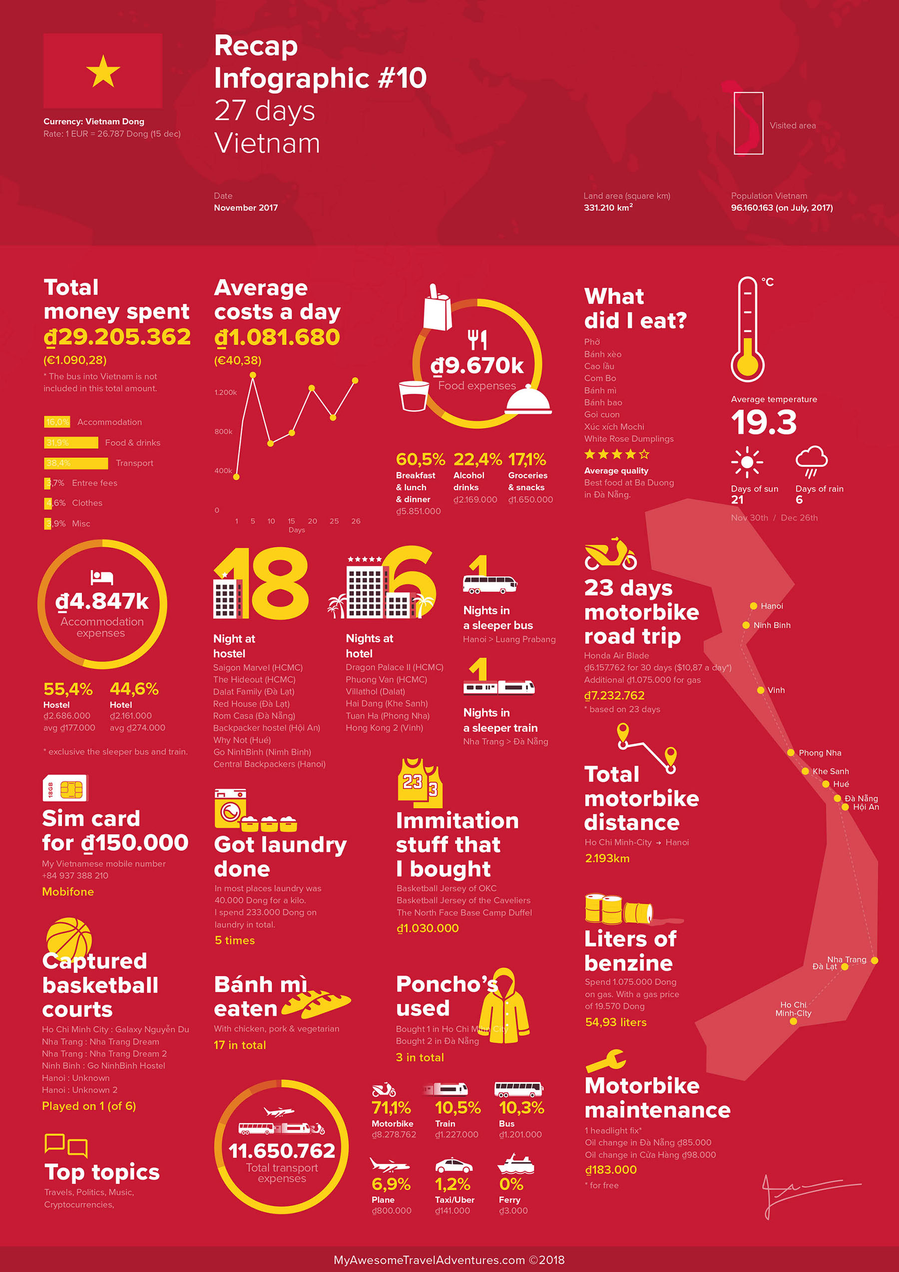
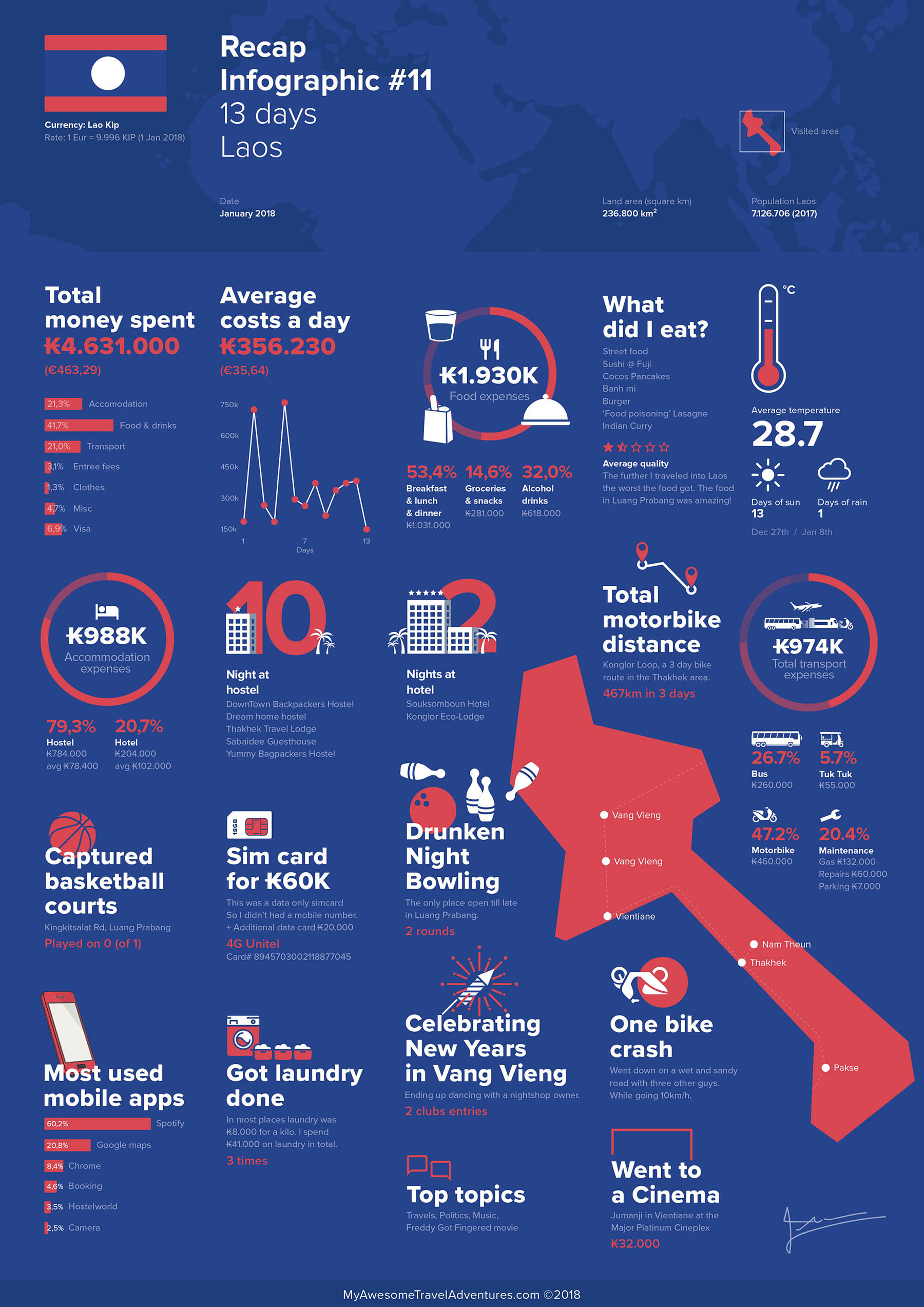
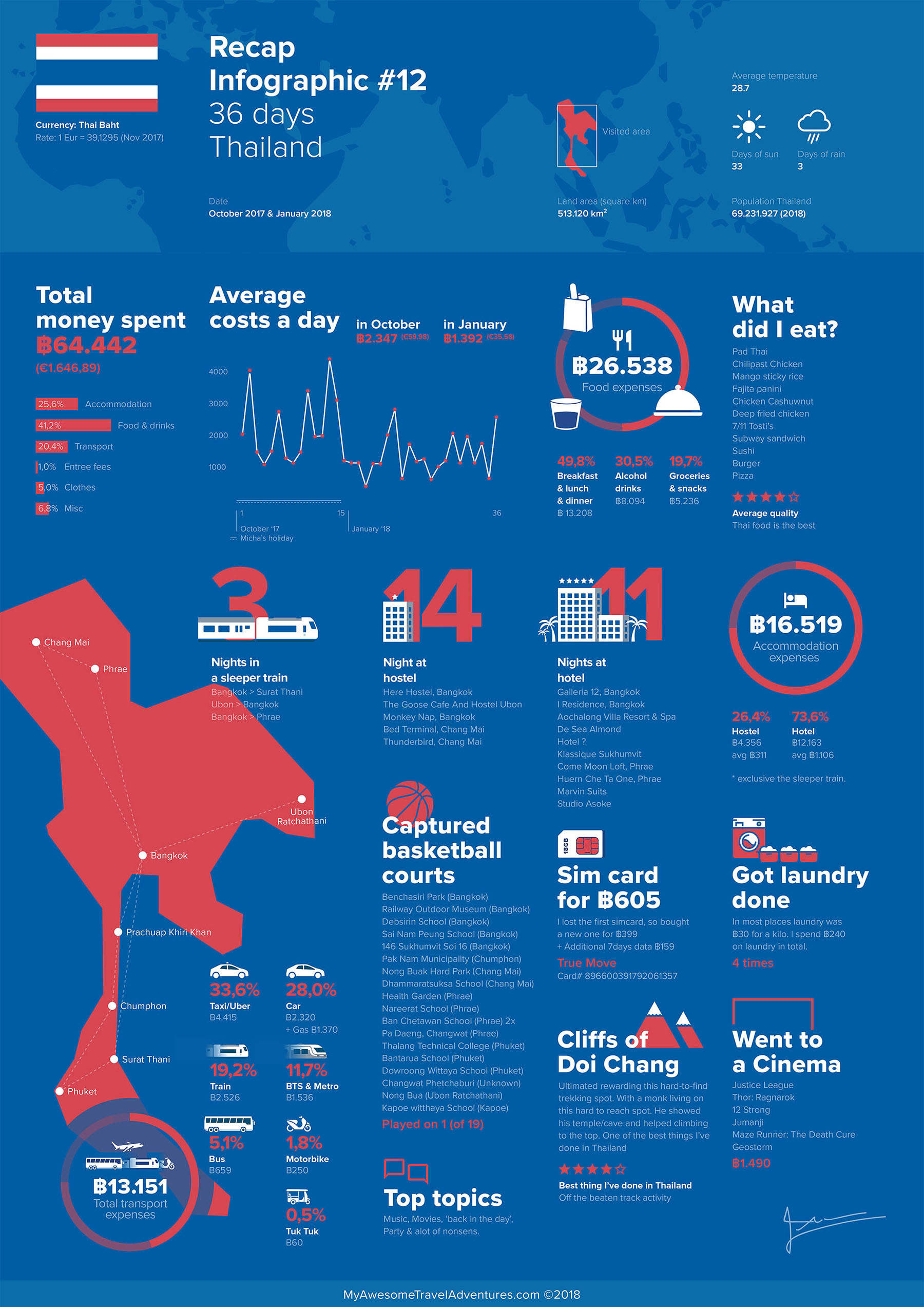
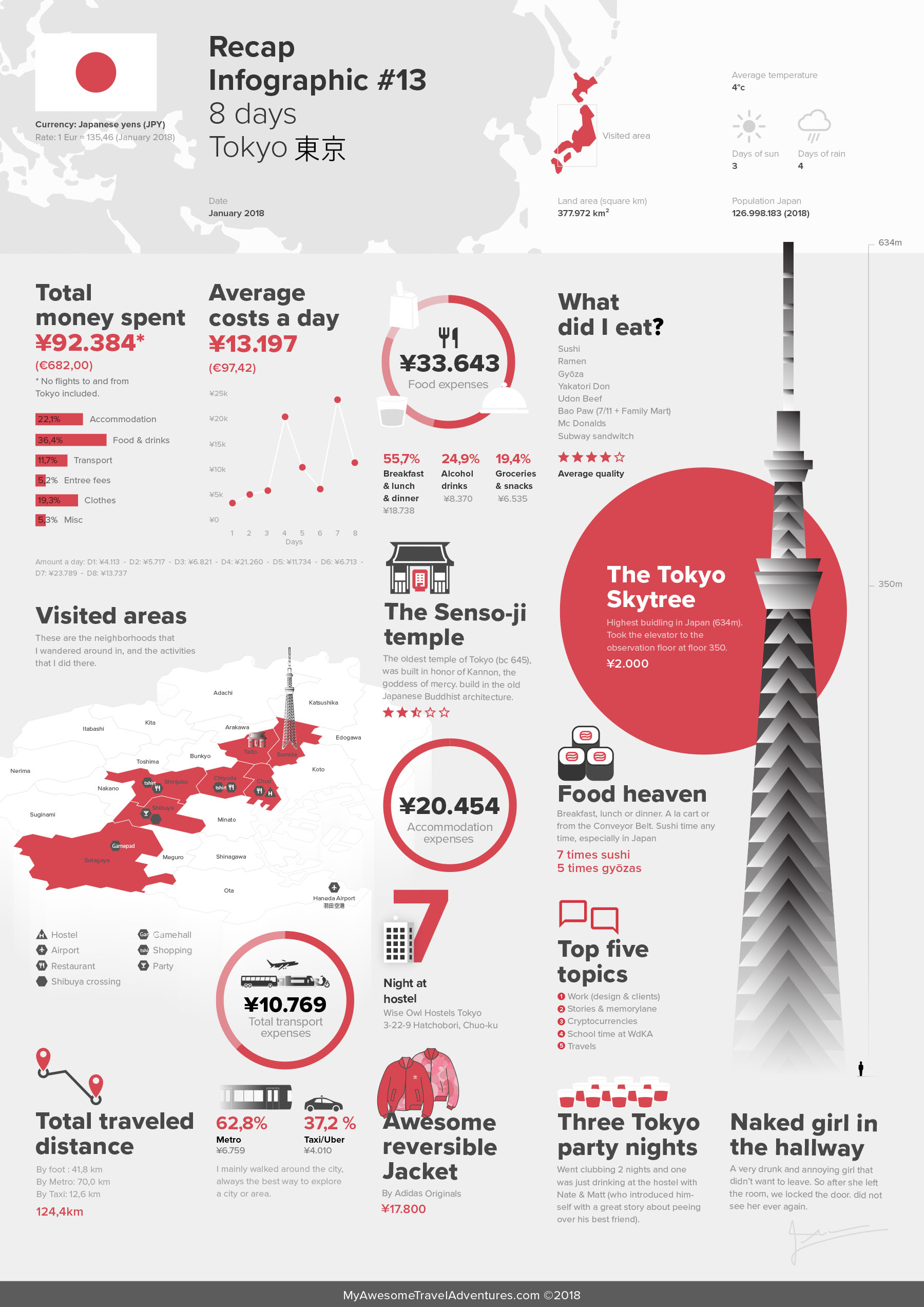
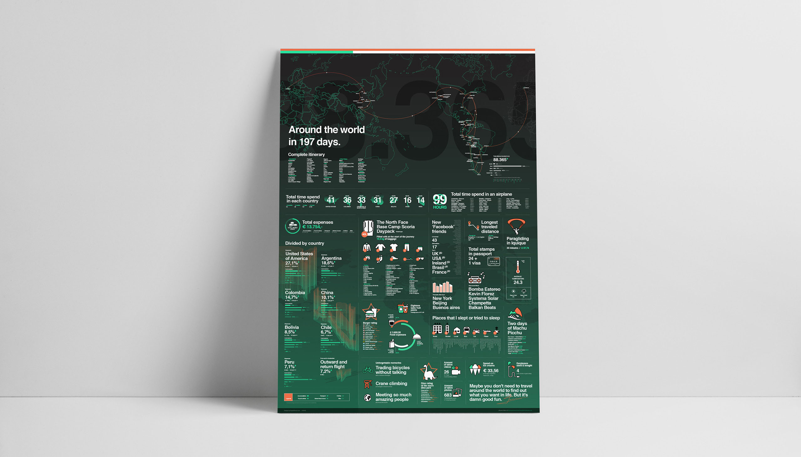
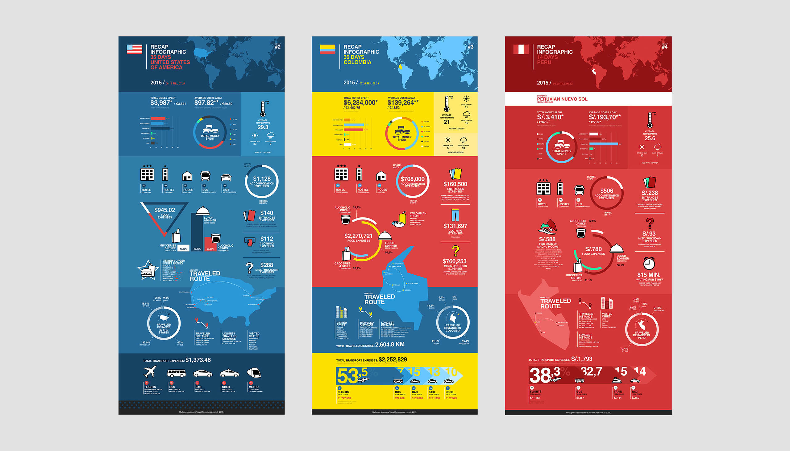
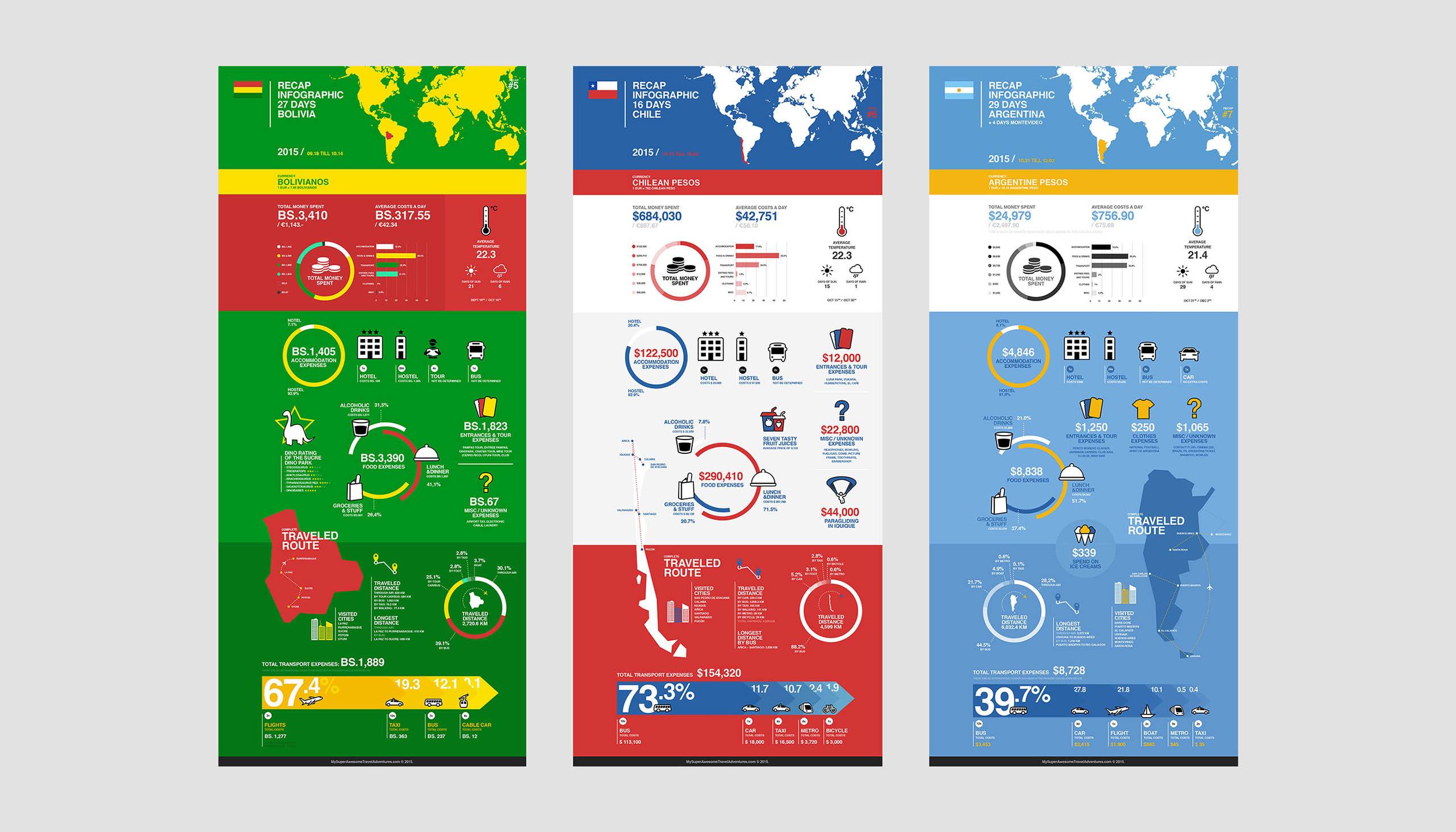
I did two long solo trips, one from China to Argentina (2015) and second one was South East Asia in (2017/2018). In these trips I used little notebooks (later apps) to keep track on all the things I ate, visited, bought, how I traveled etc etc. I then translated this data while traveling into infographics per country and overall trips.
Year
2015-2018
Project sort
Self initiated
What did I do
Art Direction
Concepting
Graphic Design
Icon Design
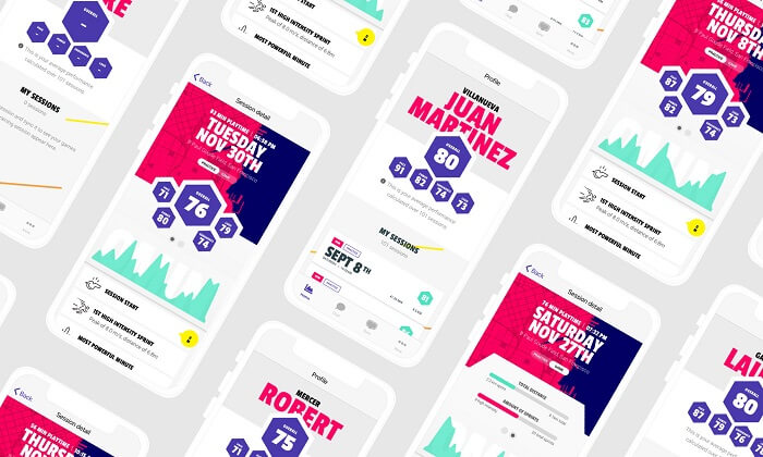
DashTag
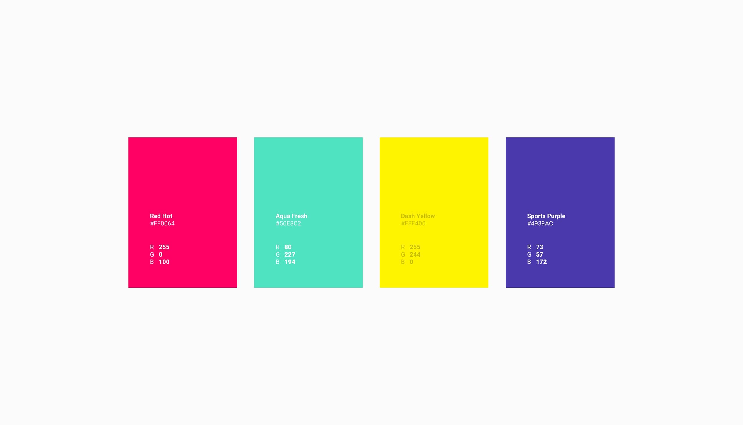
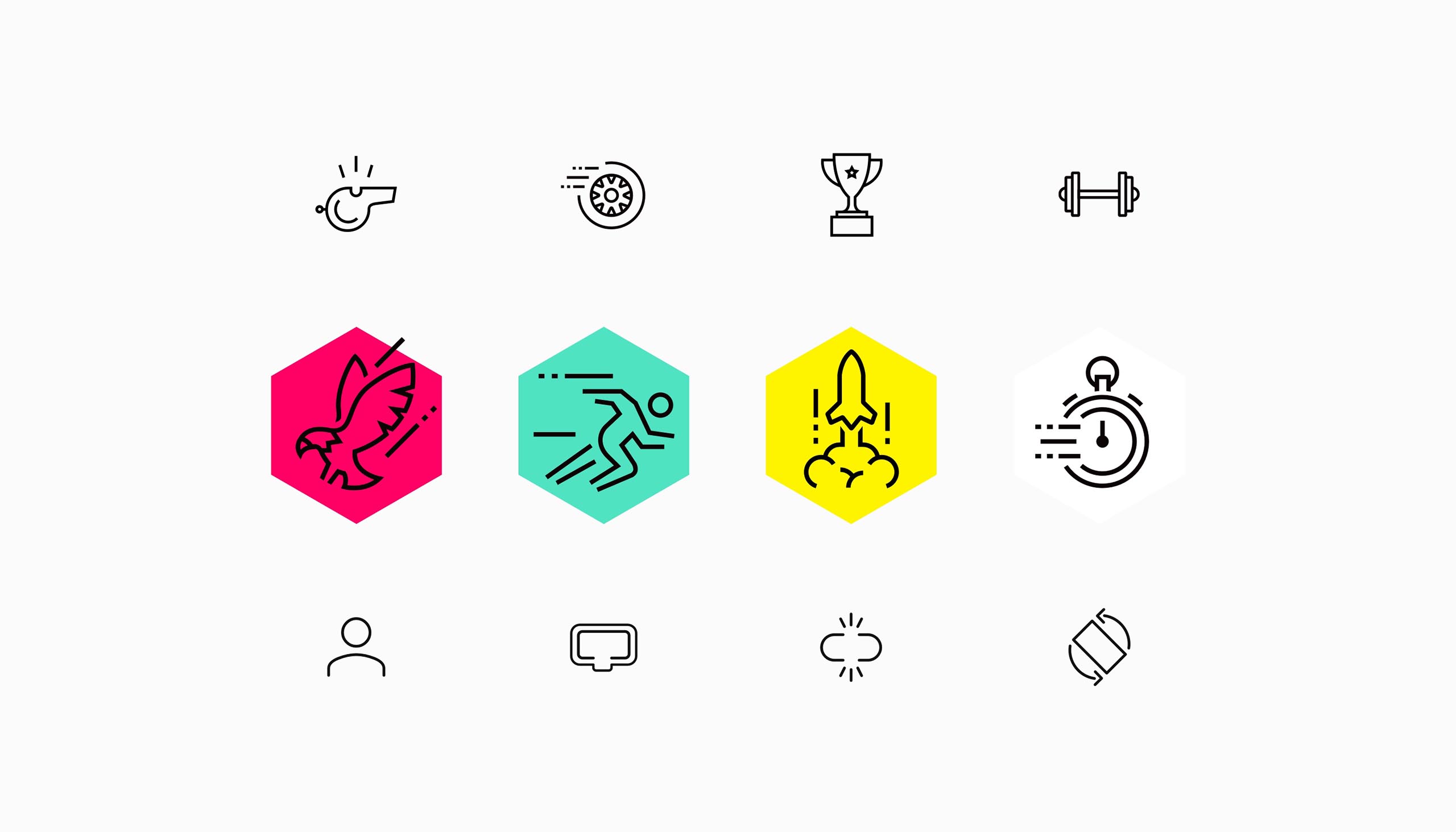
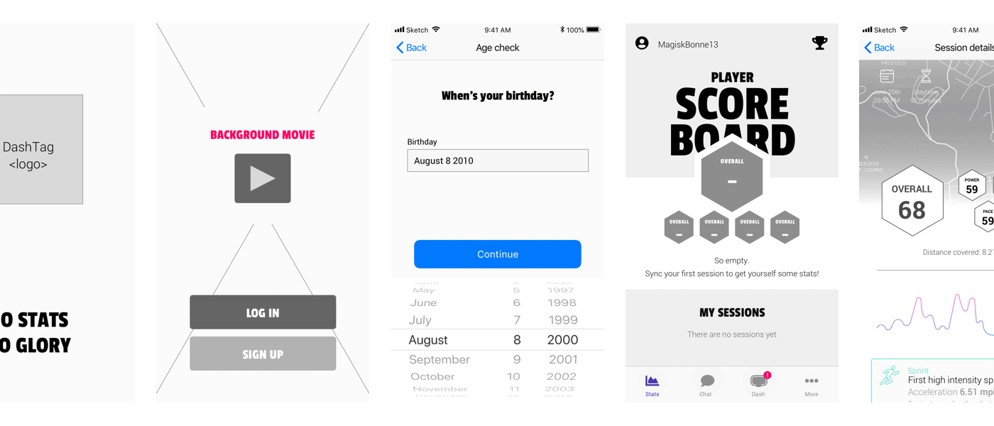
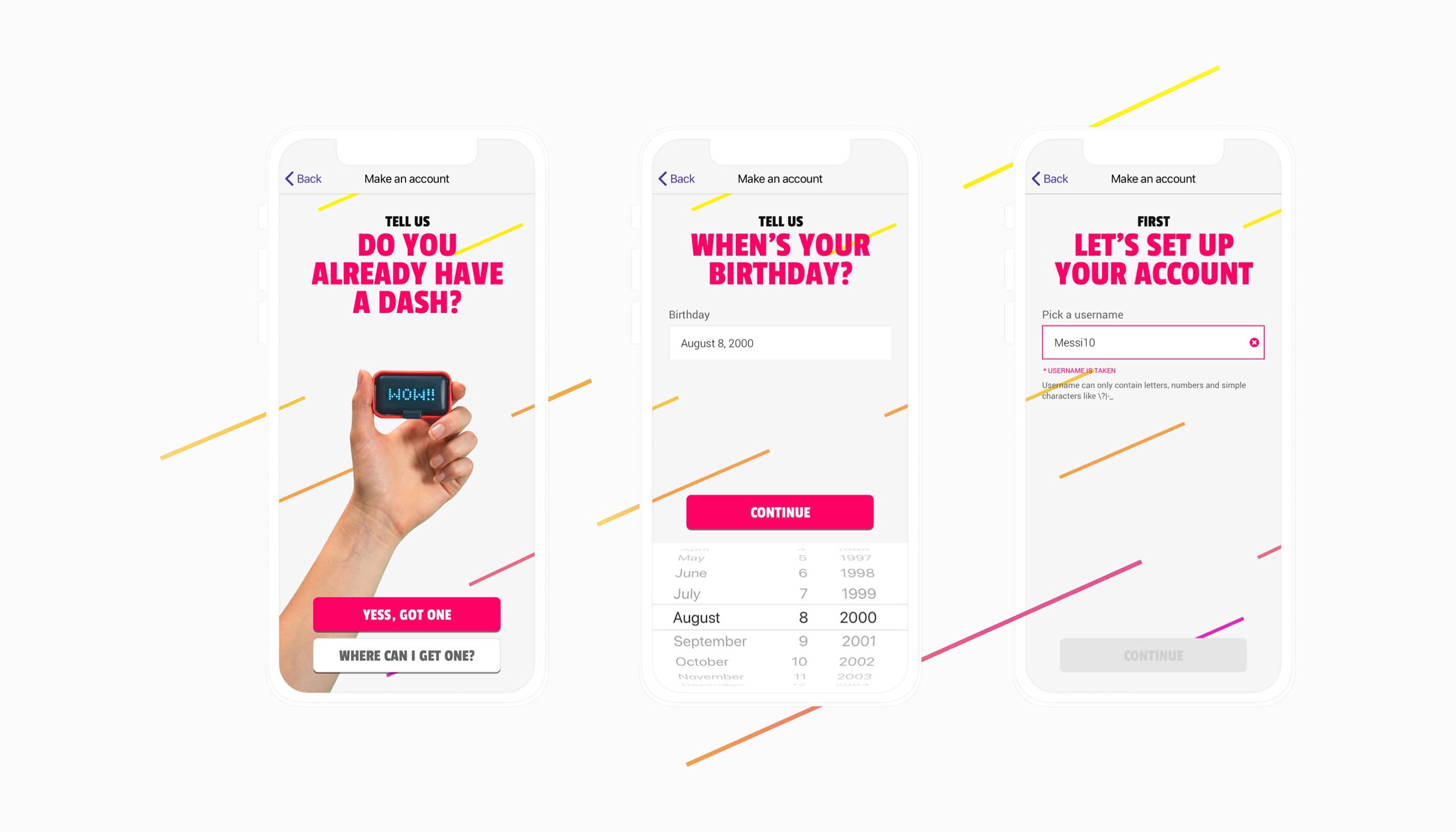
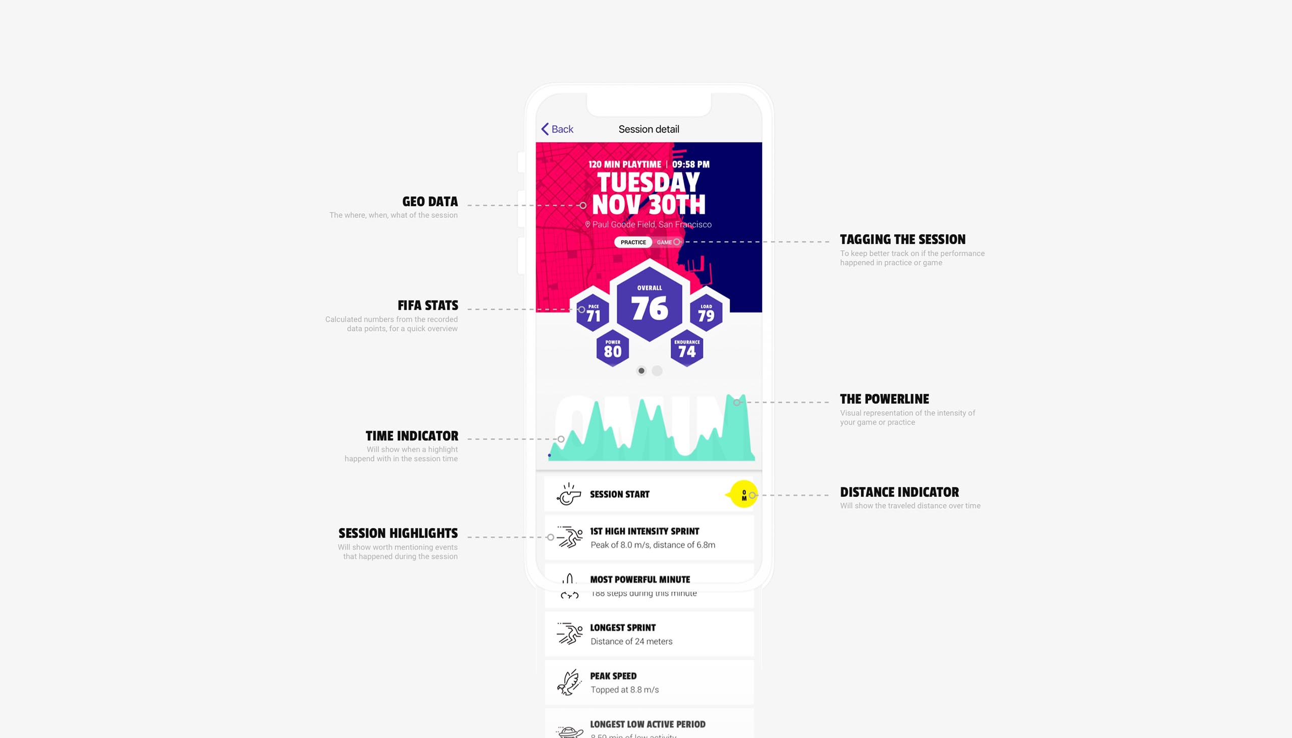
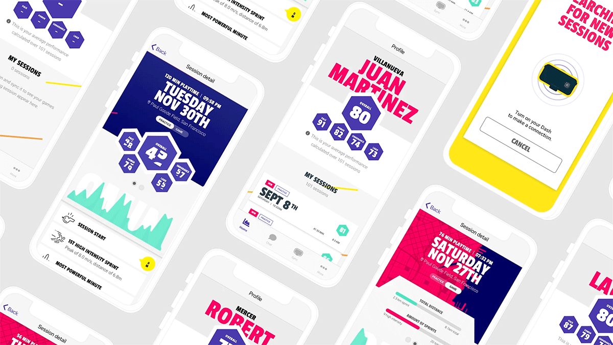
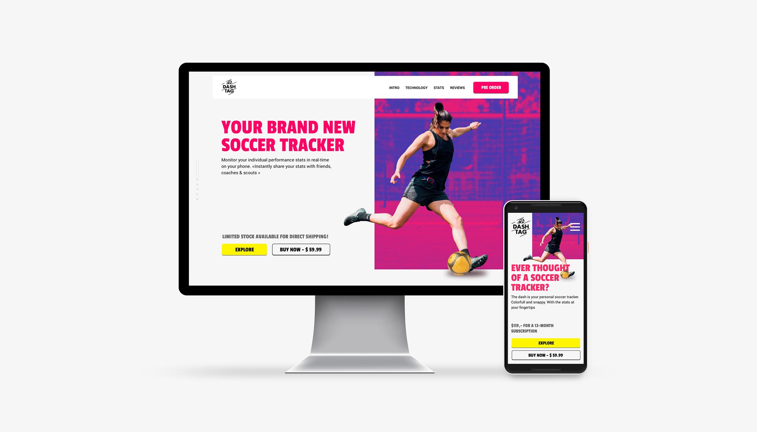
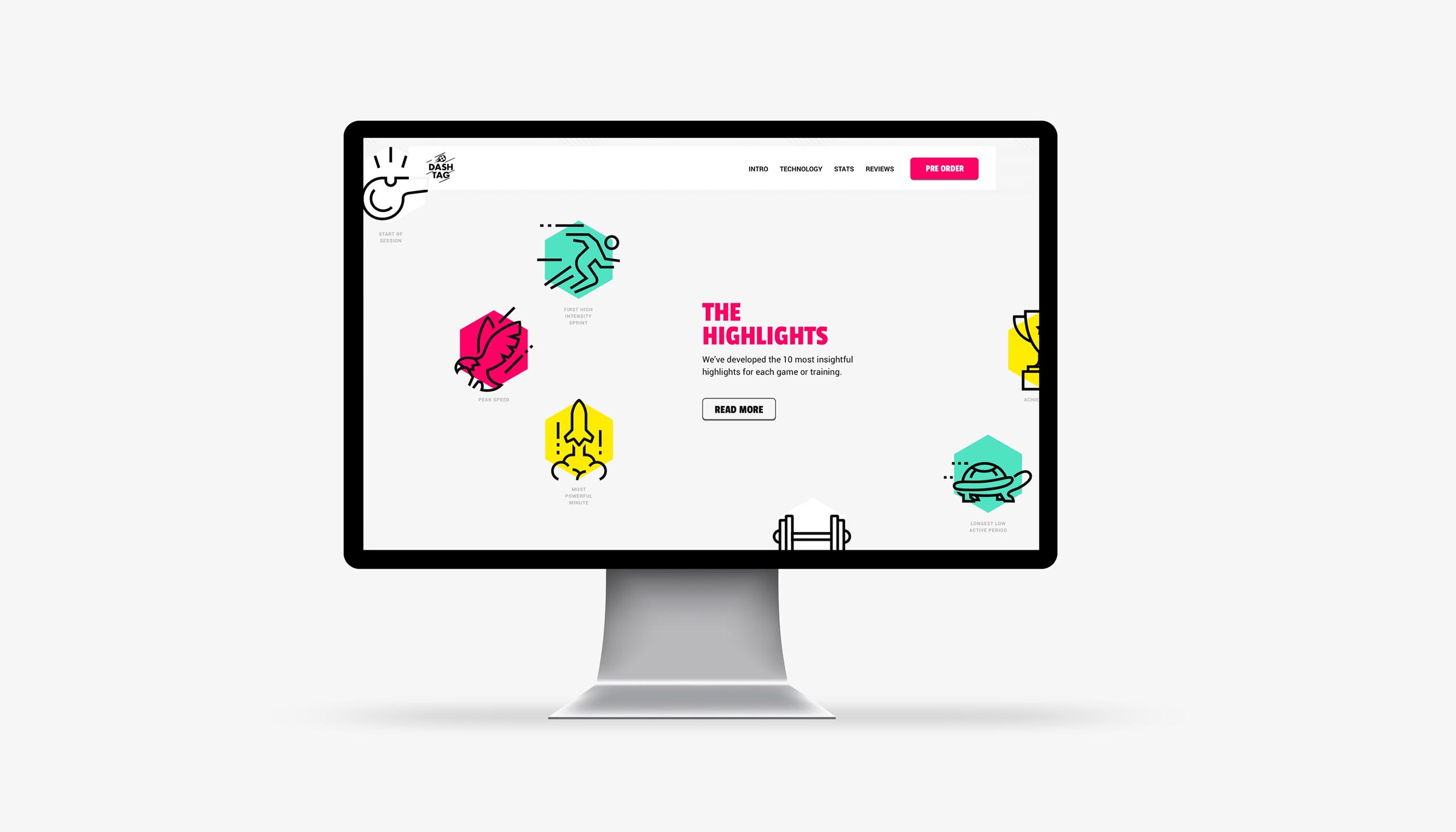
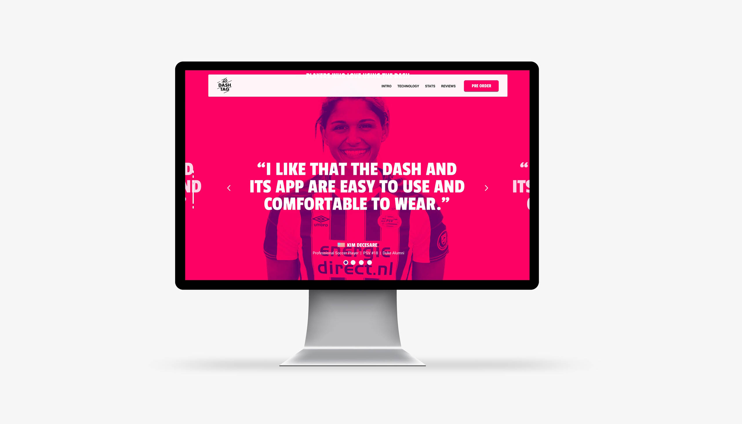
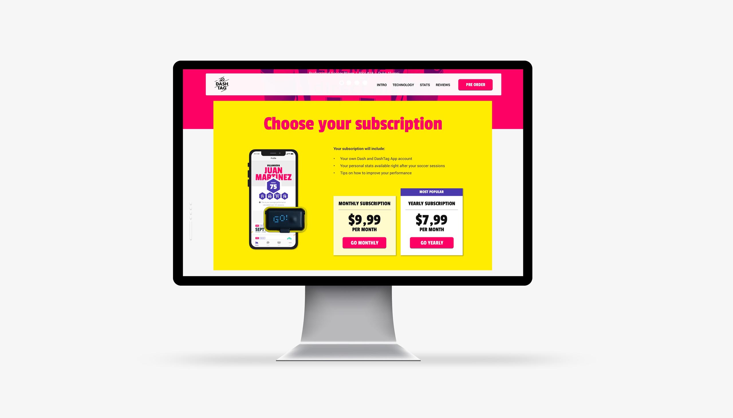
The problem that Dashtag encountered was a lack of visual clarity. So they asked me to grow and expand the brand identity with specific digital guidelines.
The target group of users were young football players that wanted to improve on their game. With that I mind I started with simplifying the brand identity by reducing the colours and gradients to a minimum (they had quite some). After that we created some overall rules on how to use the colours.
These rules translated into the design of the website and interface of the app. A light and clean base were there was room for elements to pop. Quite a bold look and feel that still connected with the earlier designed packaging.
Year
2018
Project sort
Freelance
Client
DashTag
Product videos & photography: form + function
UX design: Maarten van Sprang
Packaging & logo: March
Website realisation: Bedrock
What did I do
Branding
Visual design
High fidelity prototyping
Prospery Wealth Manager
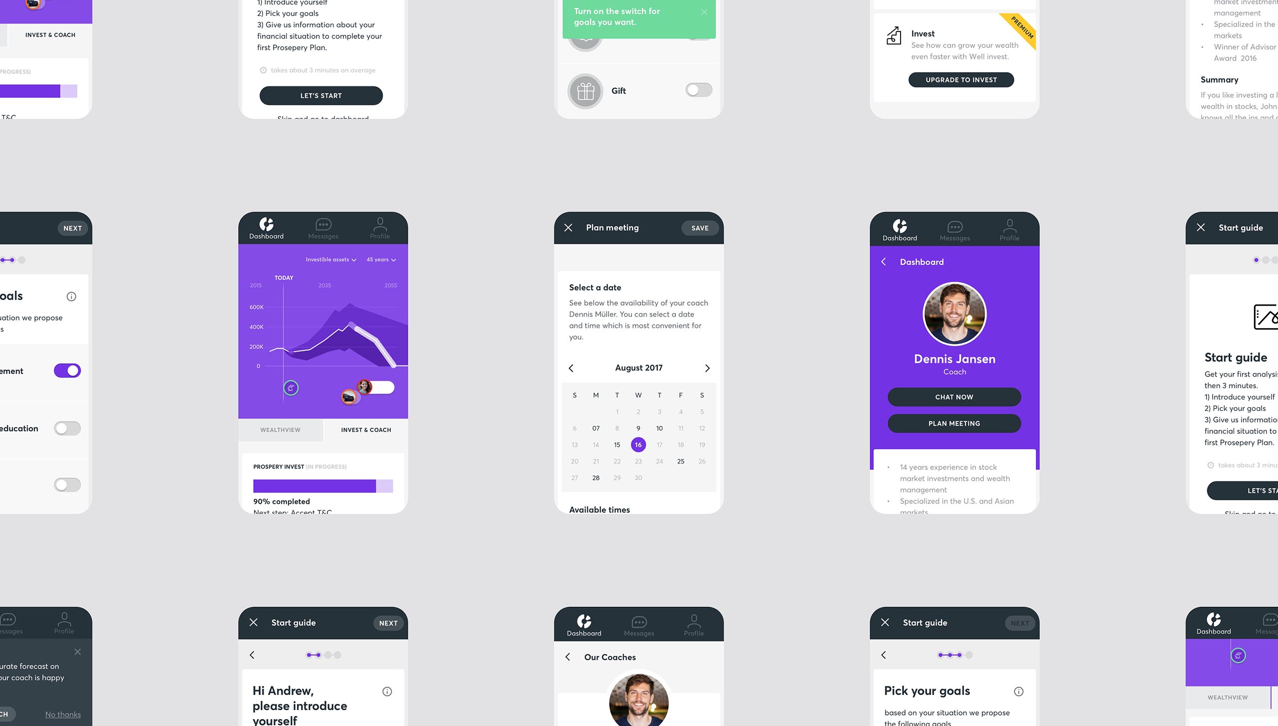
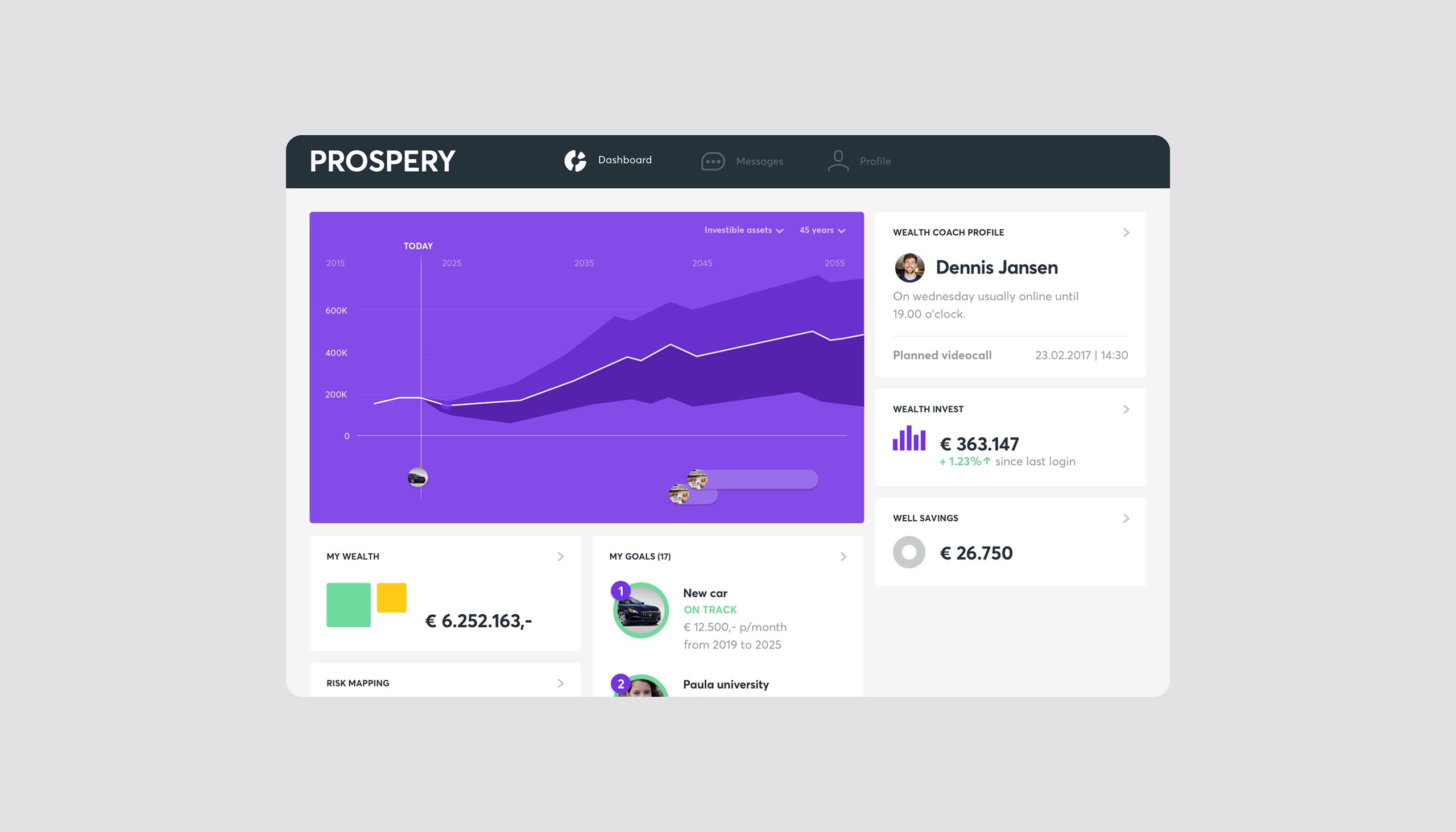
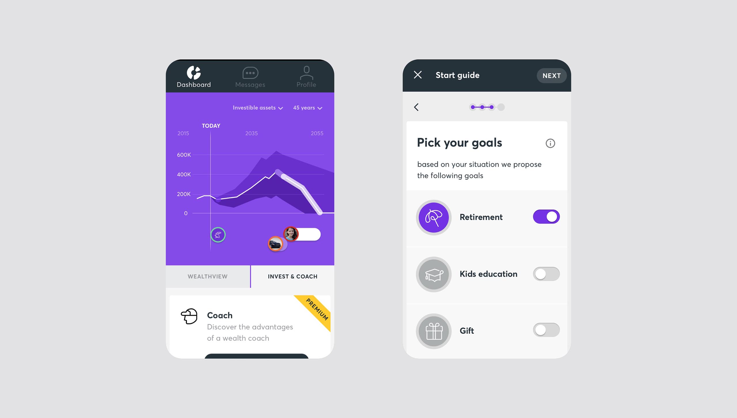
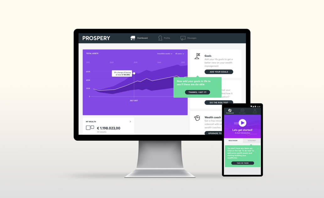
When it comes to wealth management and investing, there are a lot of solutions, but they usually result in expensive coffee talks in fancy office buildings with marble flooring.
ABN AMRO was looking to launch a platform for people with considerable wealth who need help investing, but don't trust traditional wealth managers to do that for them. Exclusively digital, but with access to professional wealth coaches only one click away. This would become Prospery.
I joined the design team of Fabrique on this project. We had two teams: generic (interface, structure and flow) and investing. Which brought the challenge to keep the design cohesive over time & over different teams. We had set up an atomic design system for the platform, which loosely based on Google’s material design, to make working a cross teams easier.

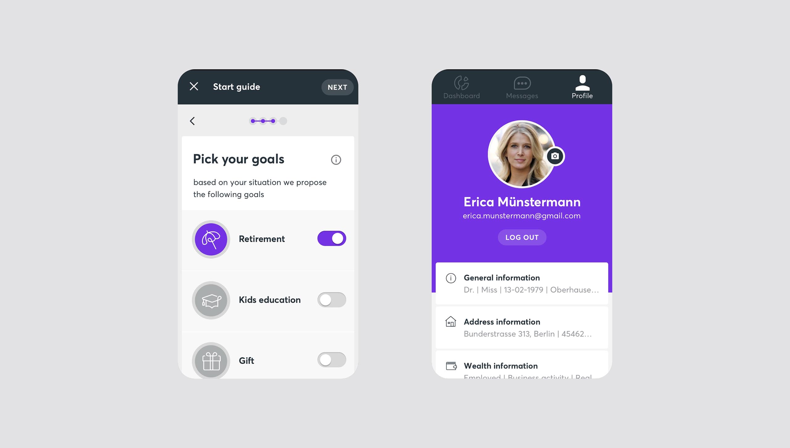

Awarded with two 2018 Silver DIA’s for Service and for Digital Transformation
Year
2017
Project sort
Freelance
Client
Fabrique
Collaboration with:
Virtual Affairs, Deloitte, ABN Amro, UX Delta, Thomasvansante
What did I do
Visual design
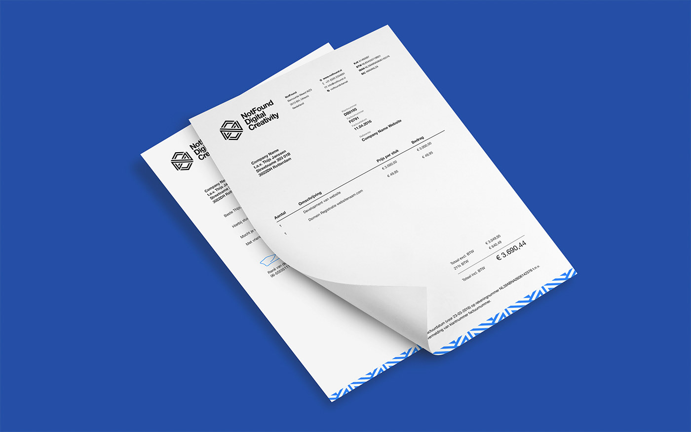
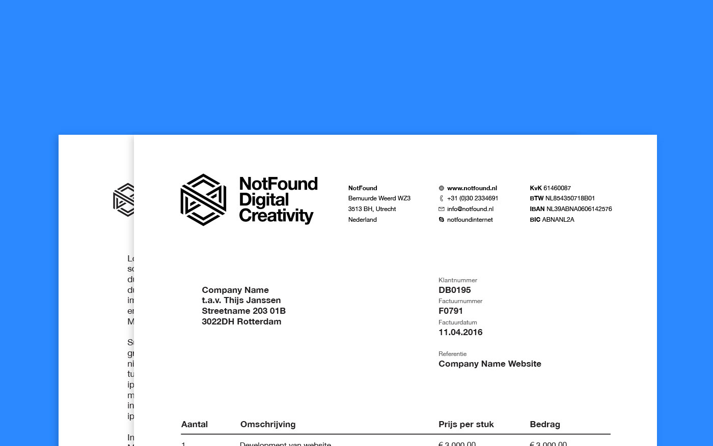
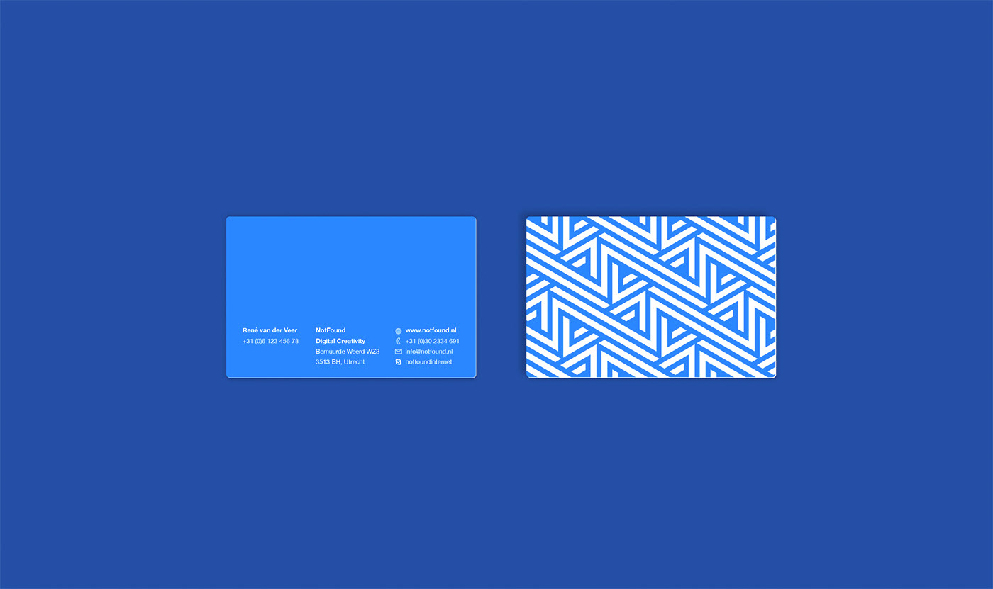
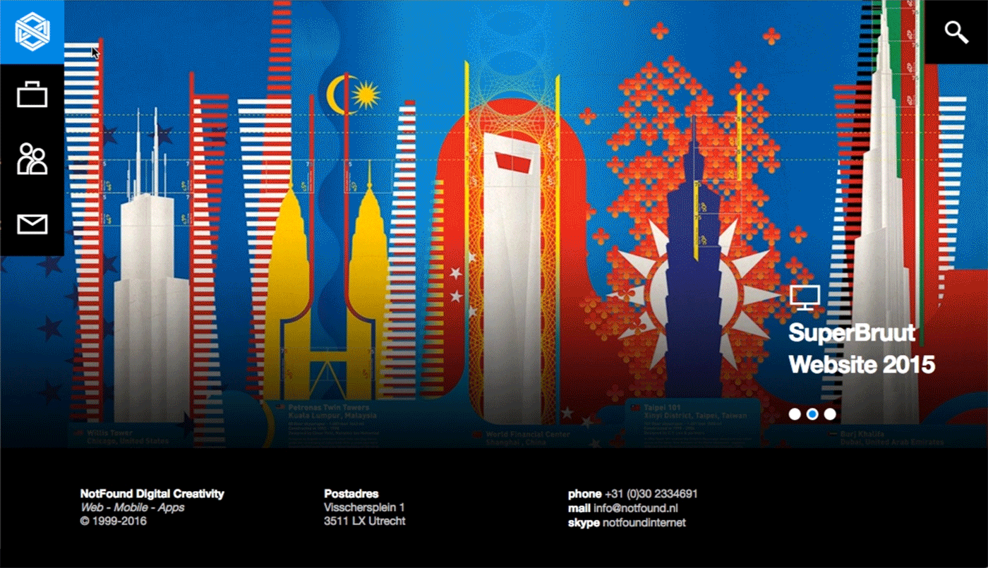
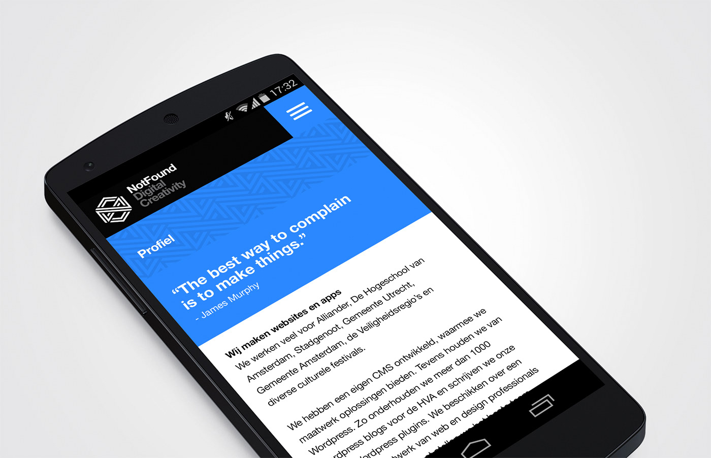
NotFound Branding
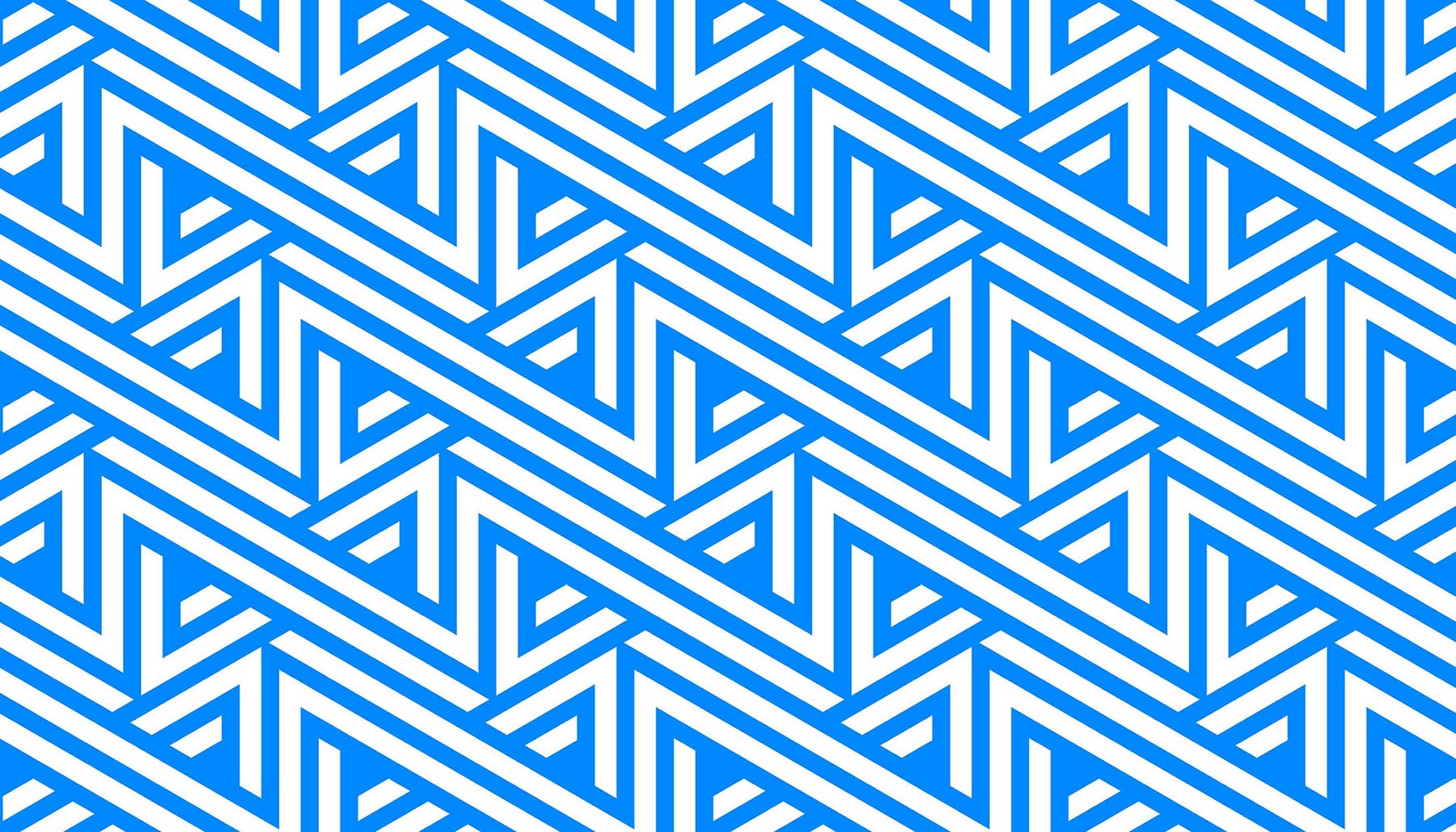
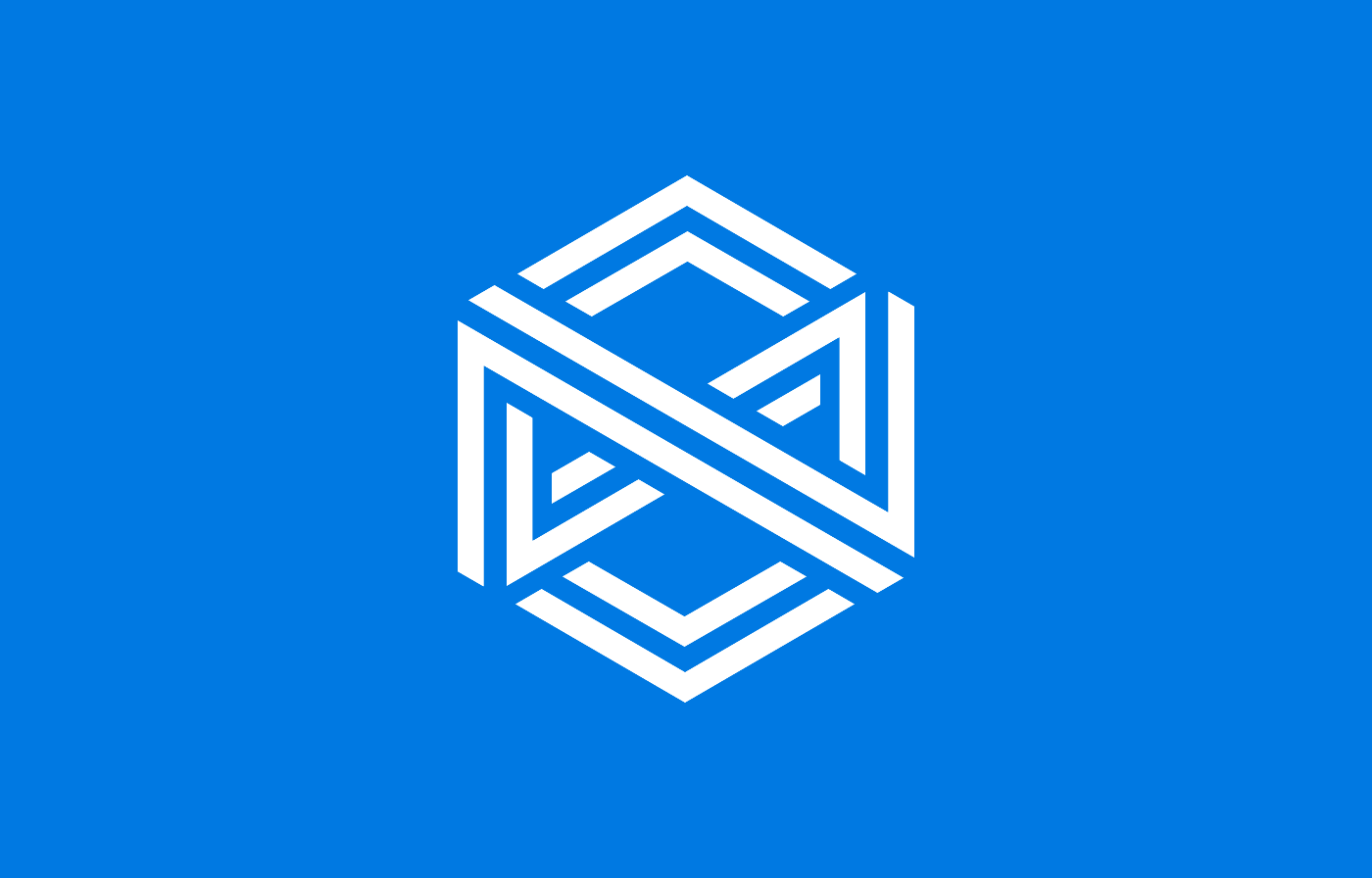
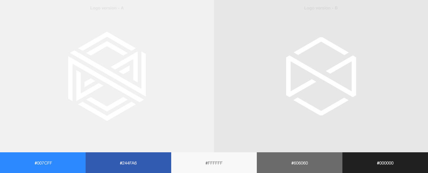
NotFound is a creative digital agency based in Utrecht, the Netherlands. Their core business is developing websites and apps. And the name refers of course to the 404 NotFound page on internet websites. Which is kind of funny, because if you present them a problem they will aways find a creative way to make it happen.
For the brand identity I took this contradicting between the name and ability to think outside the box as the core concept of the identity. With a logo design that has endless & continuation at it center. Because they will never stop until they find the solution.
Year
2015
Project sort
Freelance
Client
NotFound Digital Agency
What did I do
Art Direction
Concepting
Branding
Logo design
Visual design
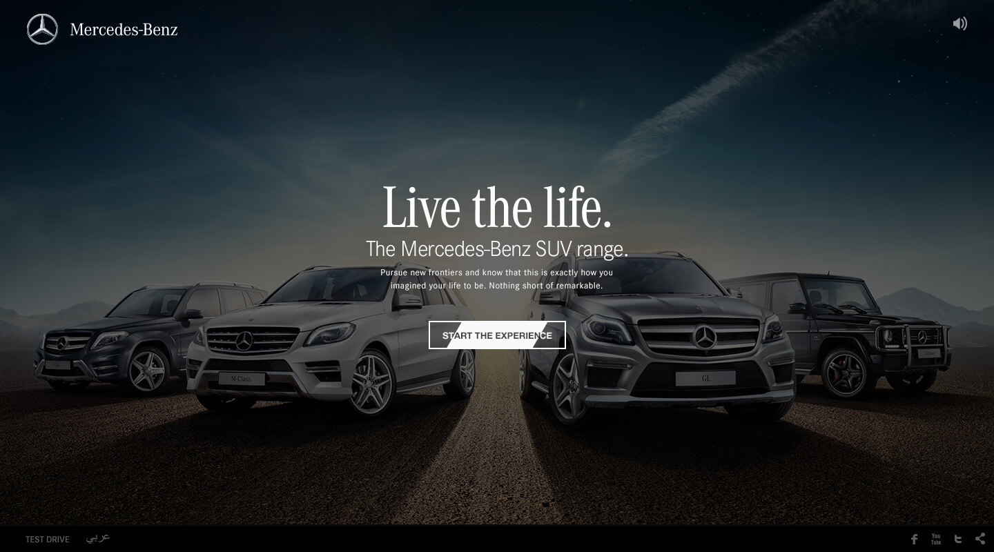
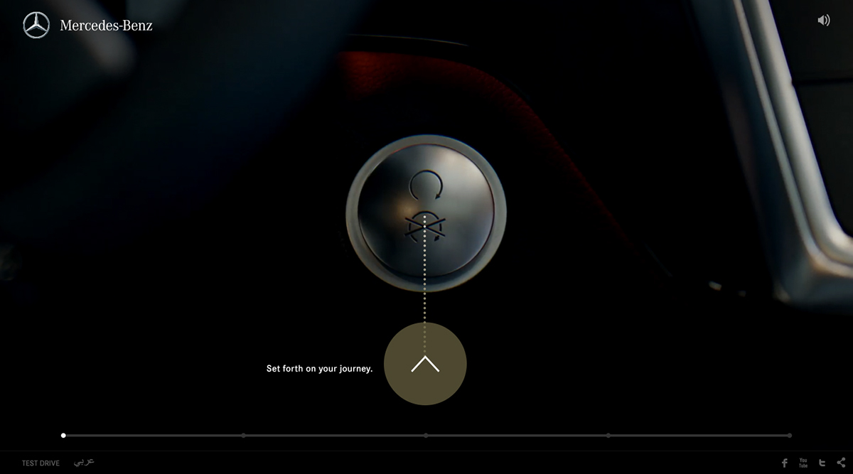
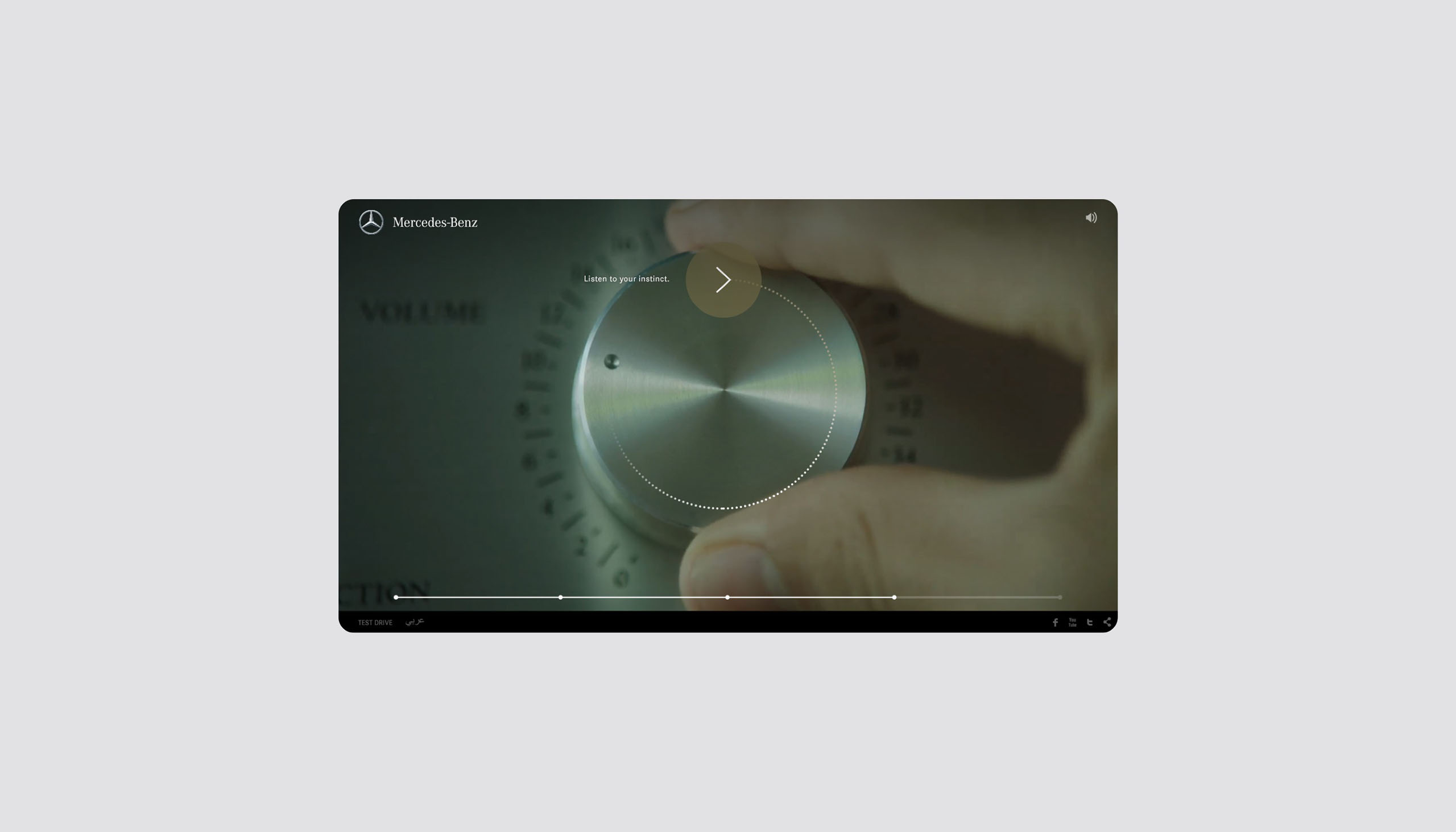
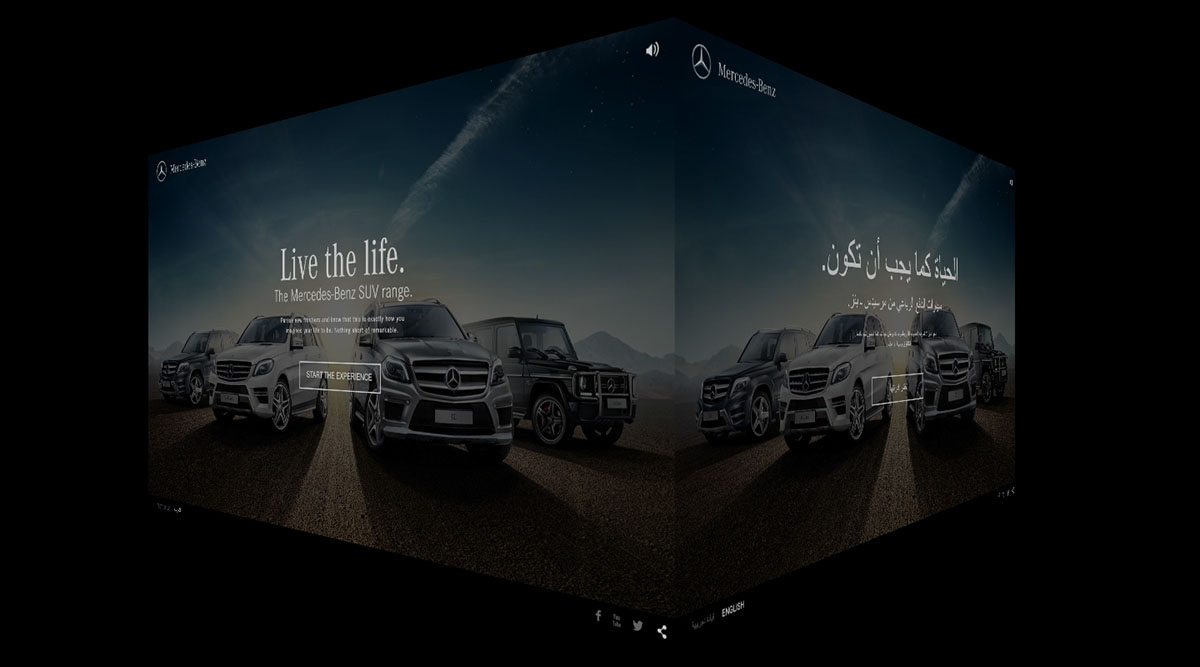
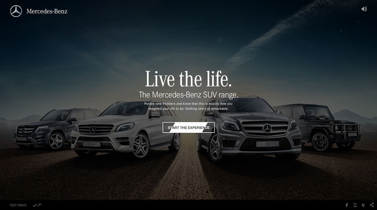
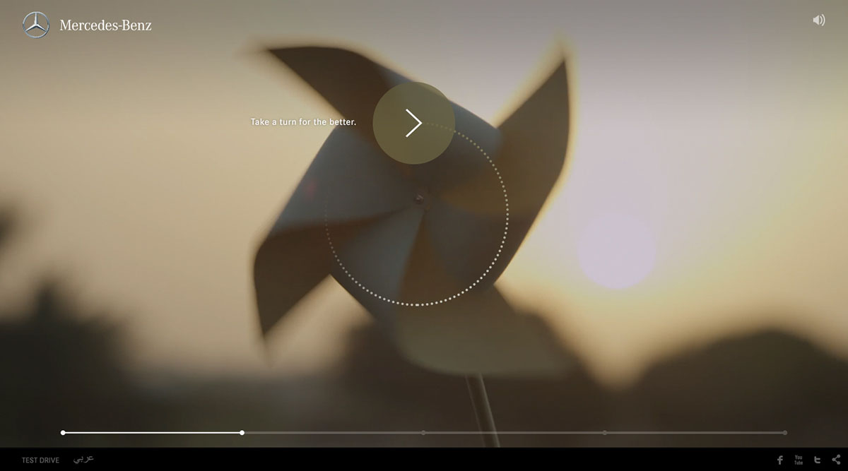
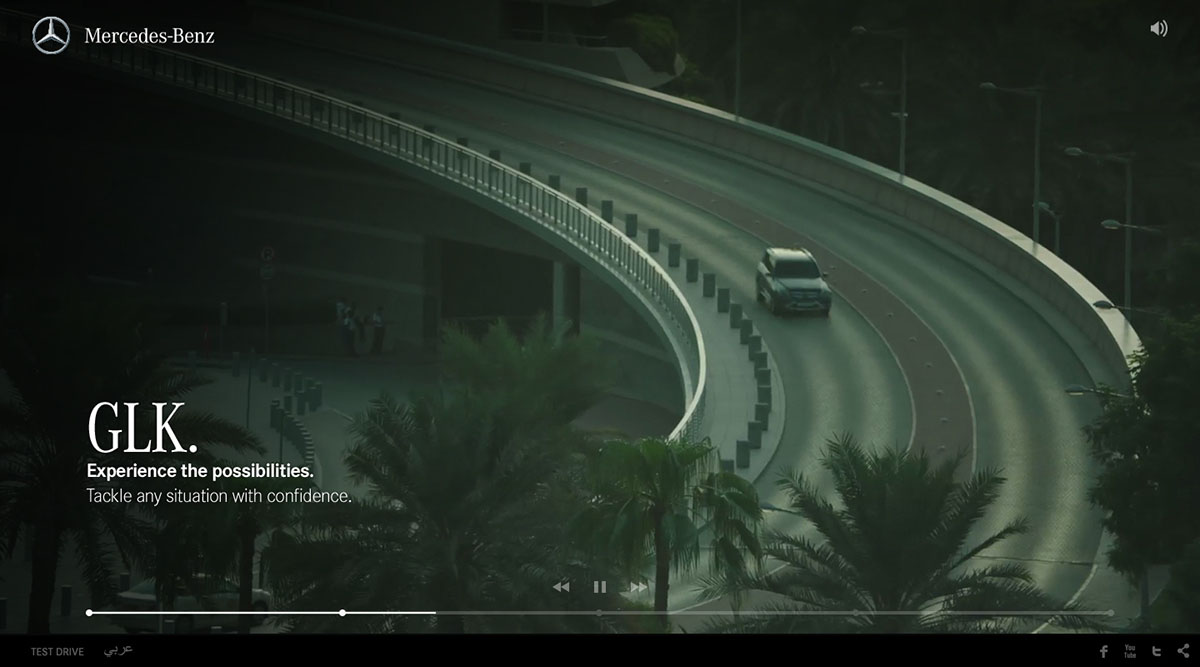
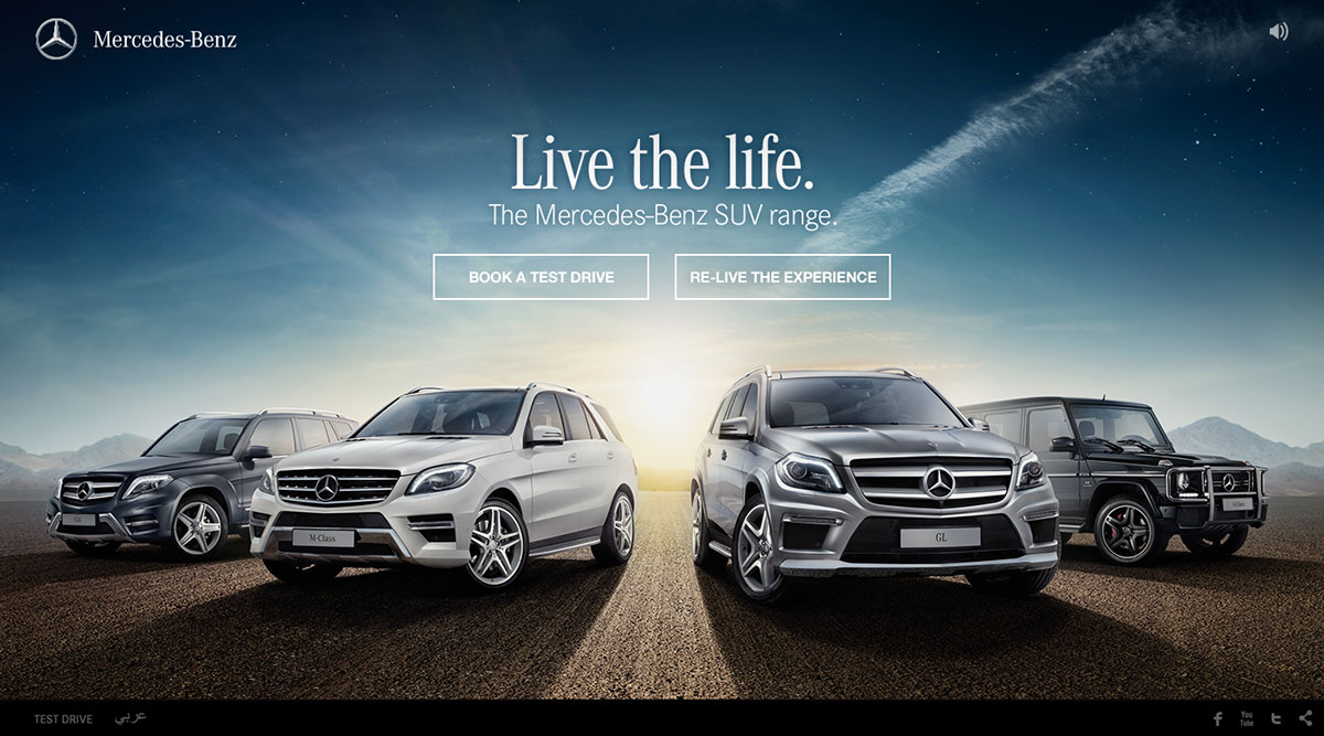
Live the Life
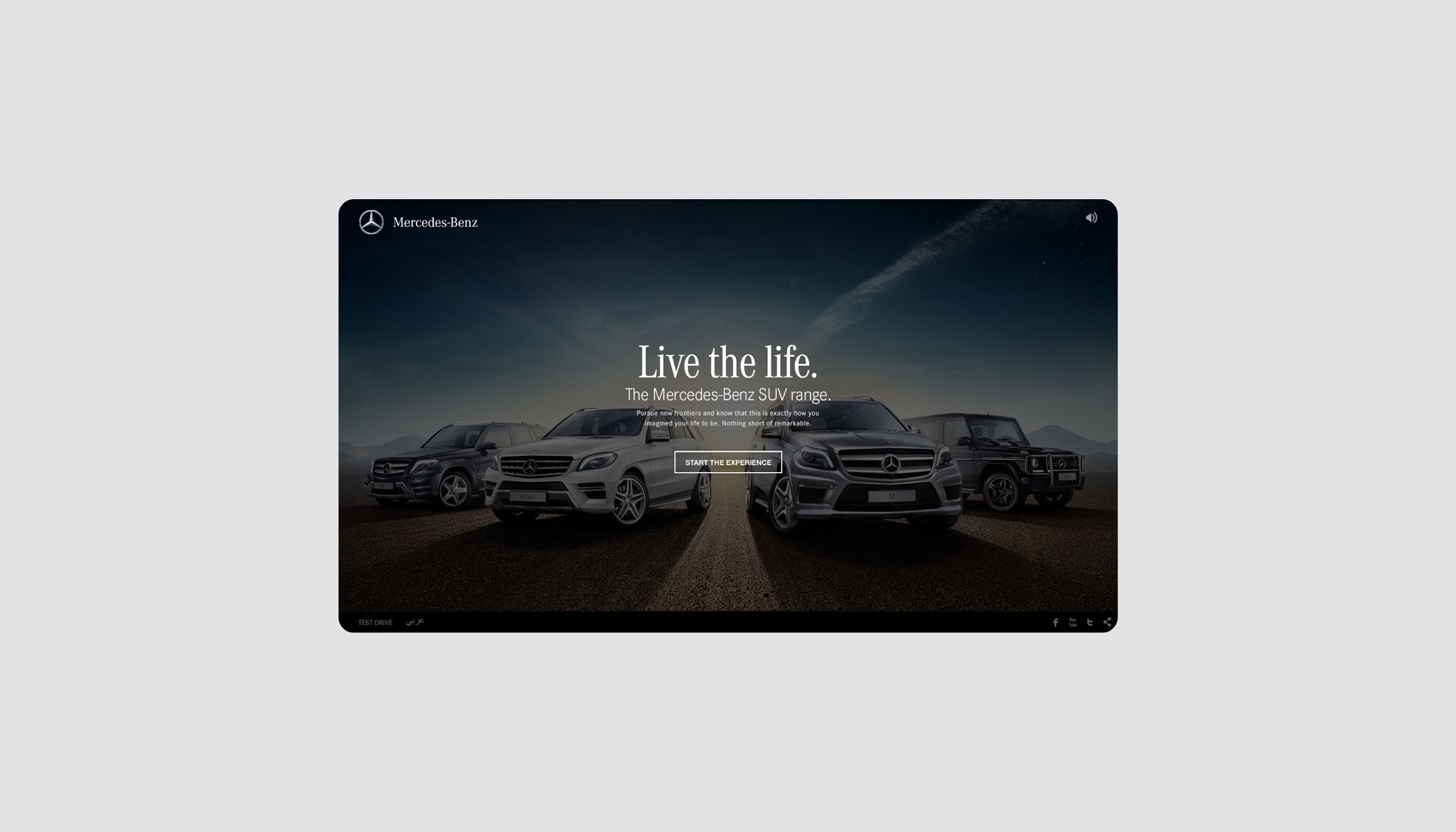
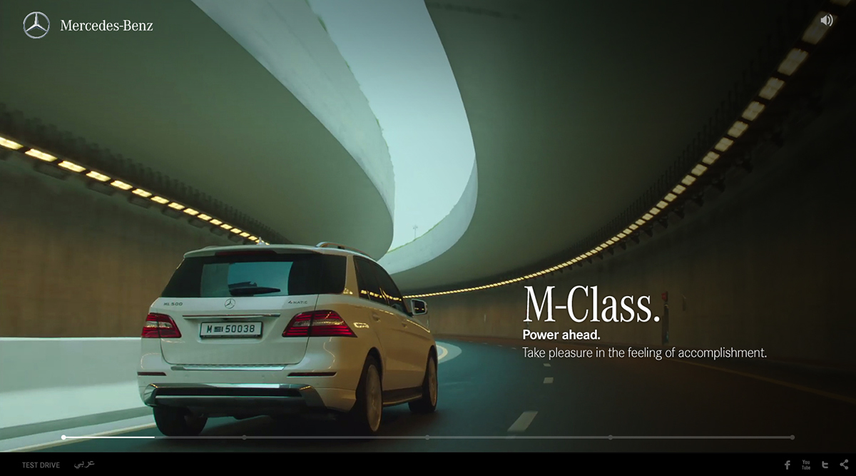
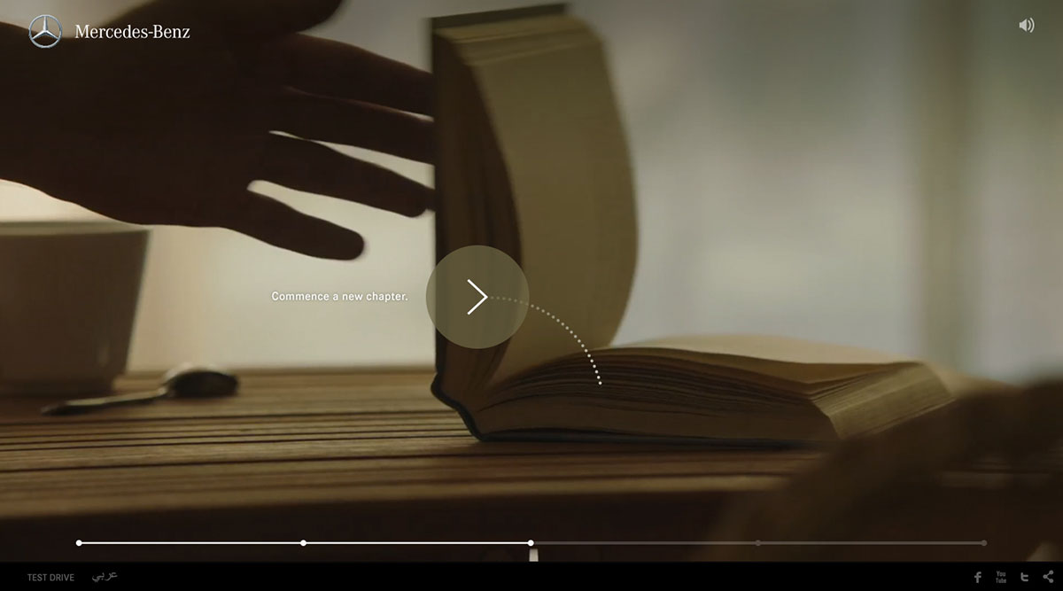
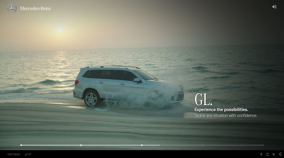
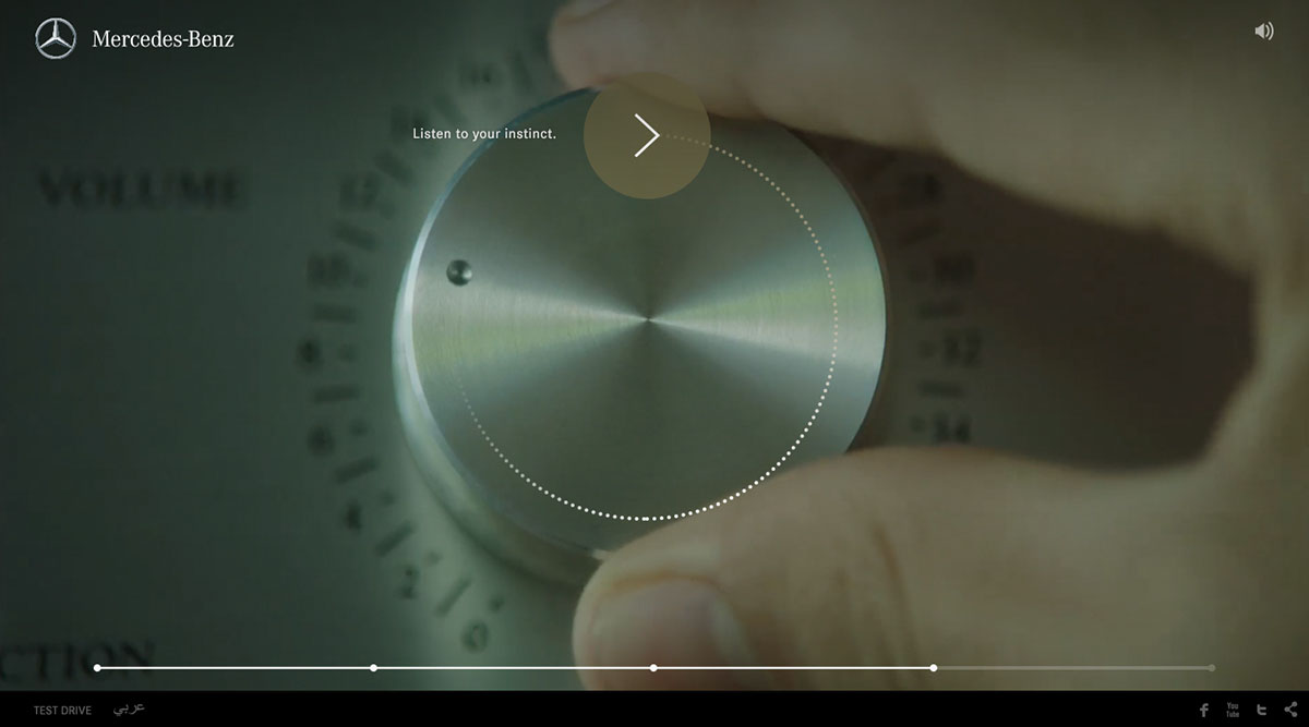
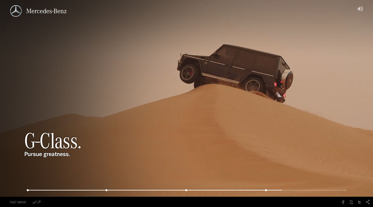
Dubai based advertising agency BBDO Impact Proximity approached me to work on the "Live the Life" campaign site for the Mercedes Benz SUV Range. Mercedes-Benz Middle East wanted to promote their latest premium line-up, so we created an aspiration interactive film showcasing the high-class lifestyle that comes with owning these exceptional vehicles.
The site was launched in October 2013 for the Middle east market.
Year
2013
Project sort
Freelance
Client
BBDO Impact Proximity
What did I do
Visual design
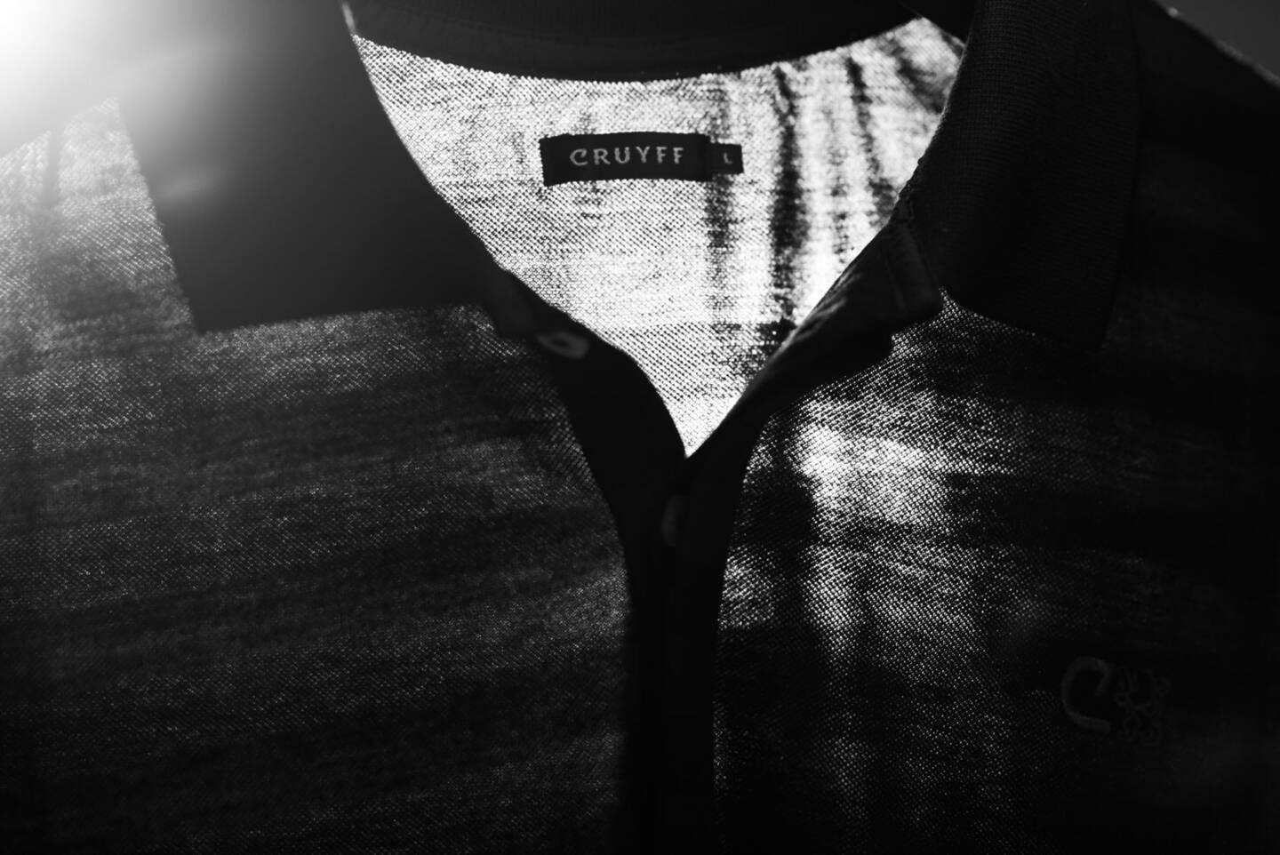
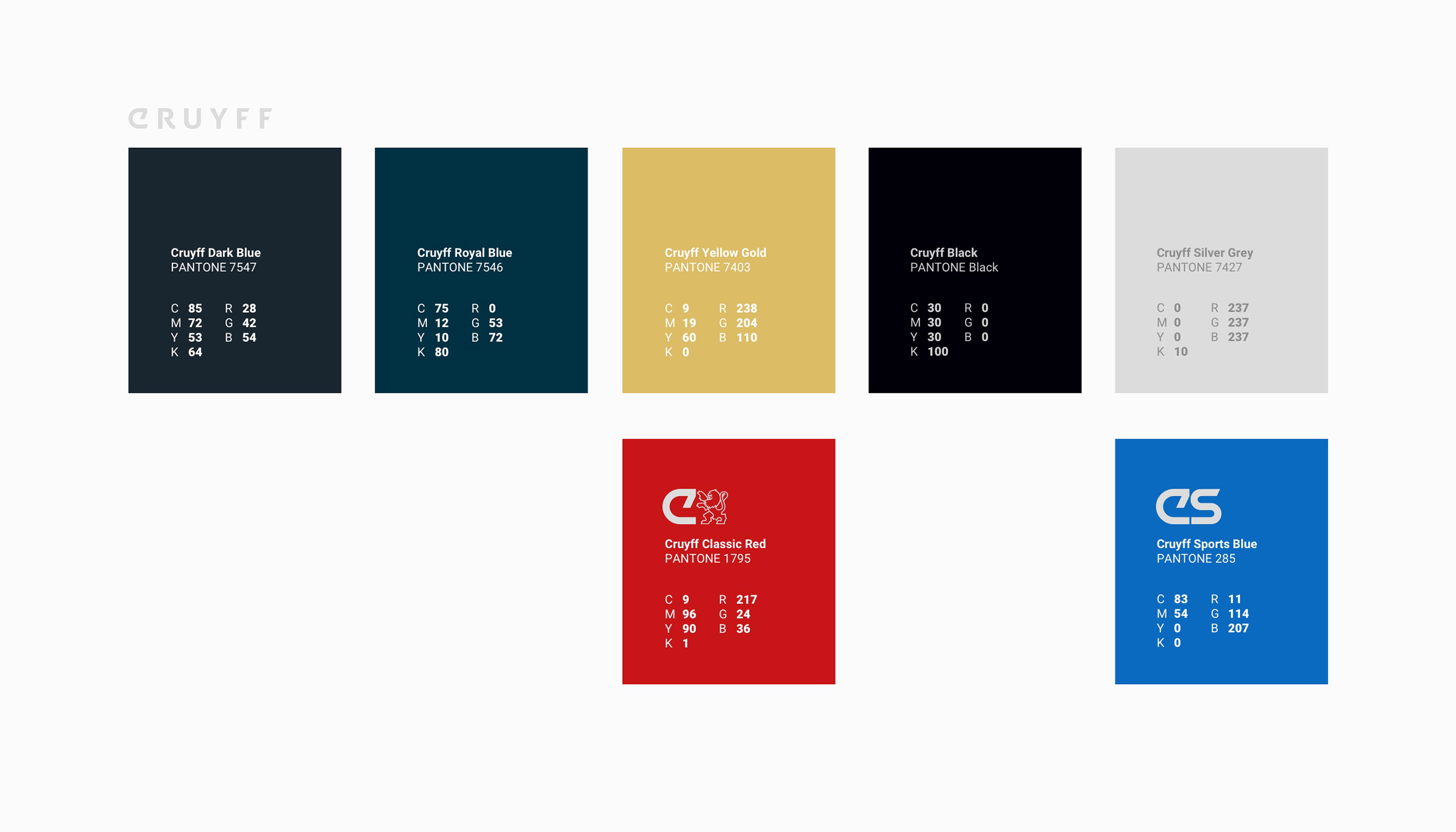
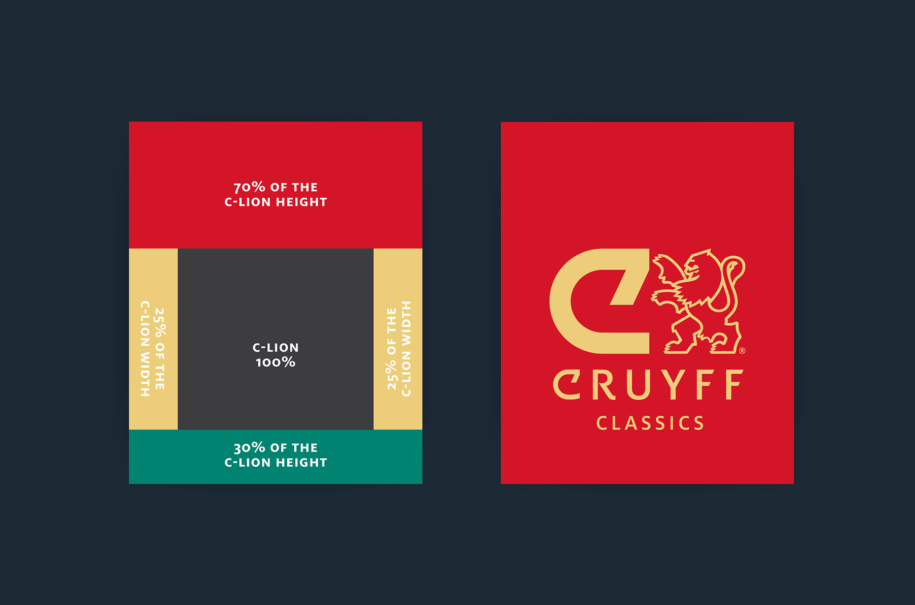
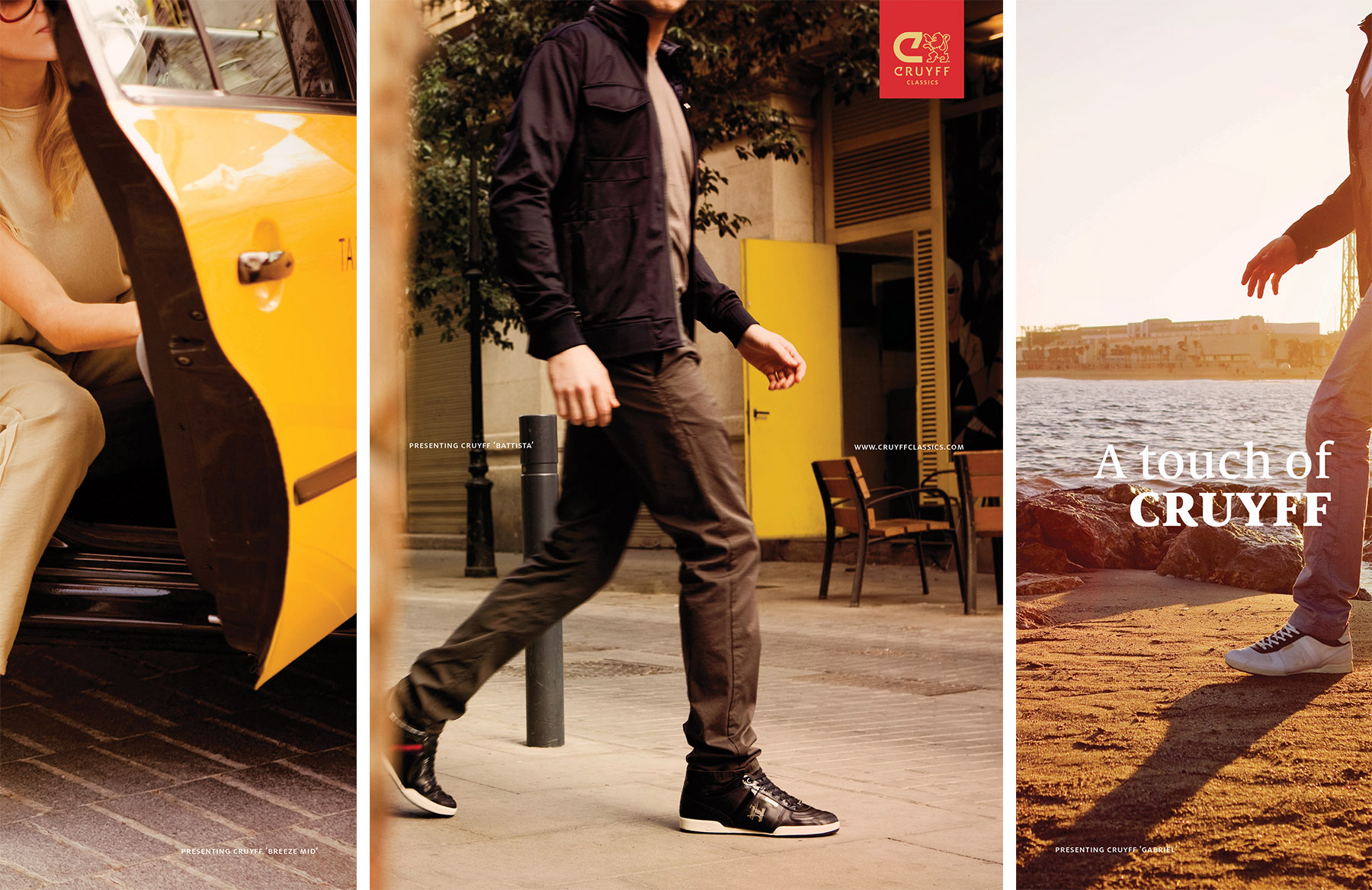
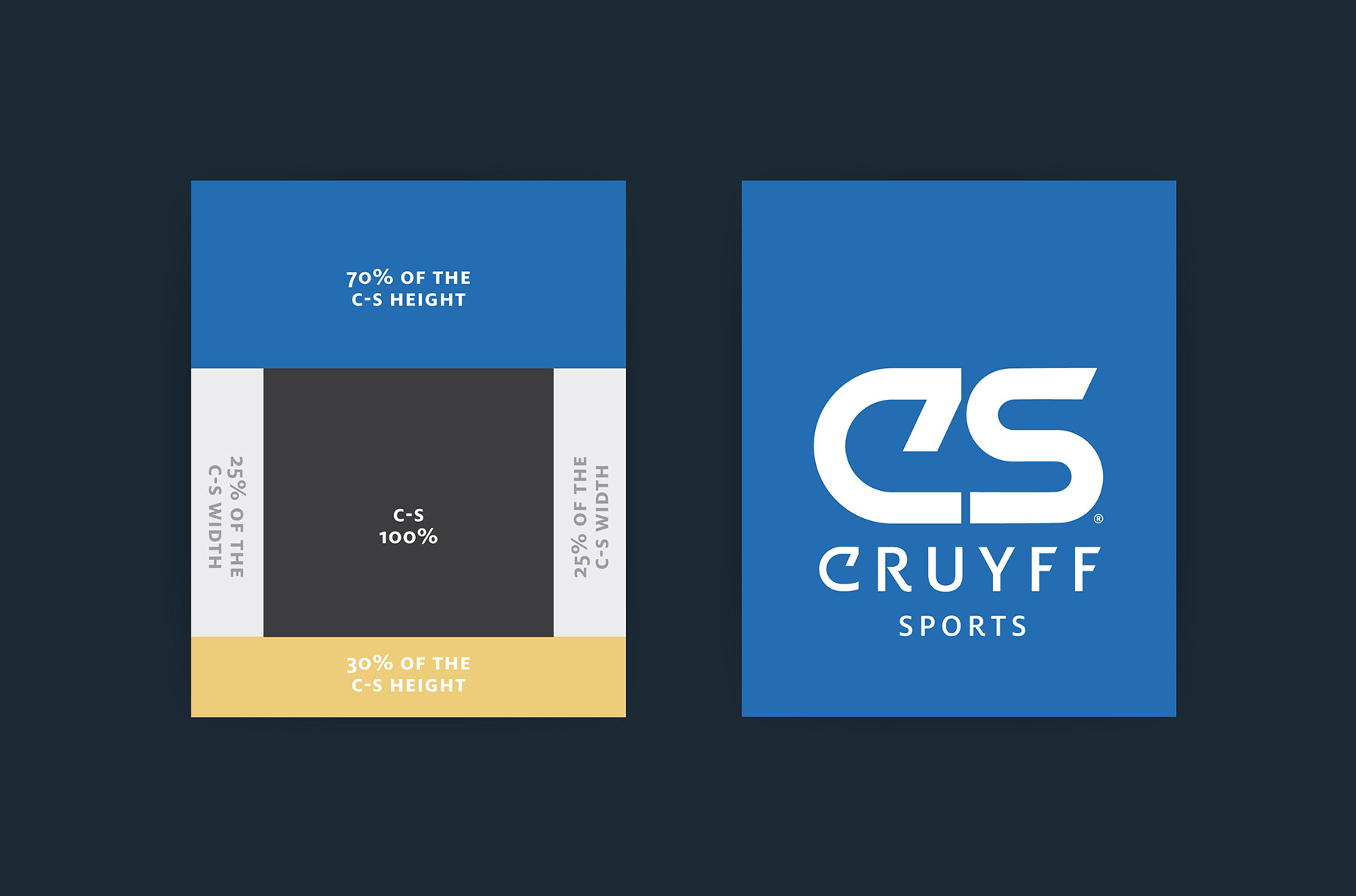
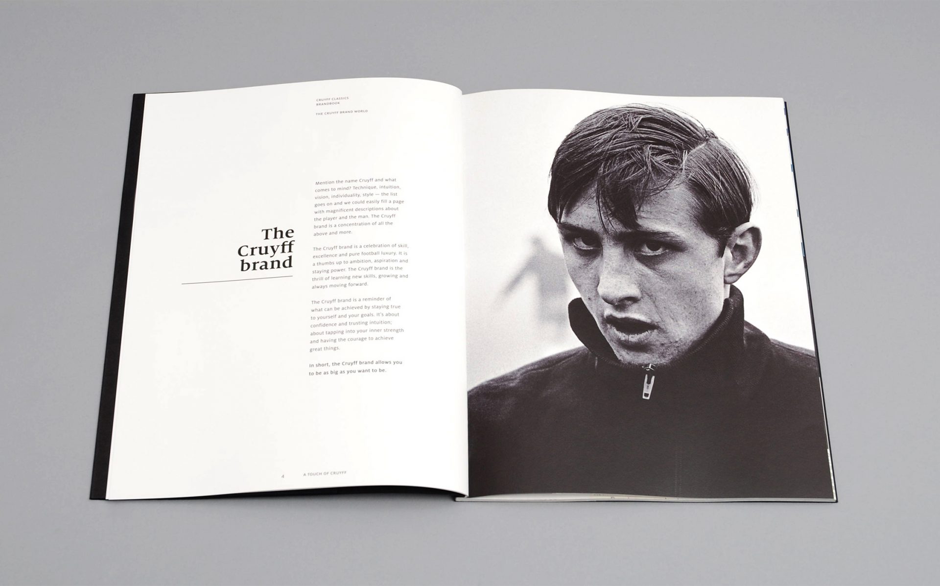
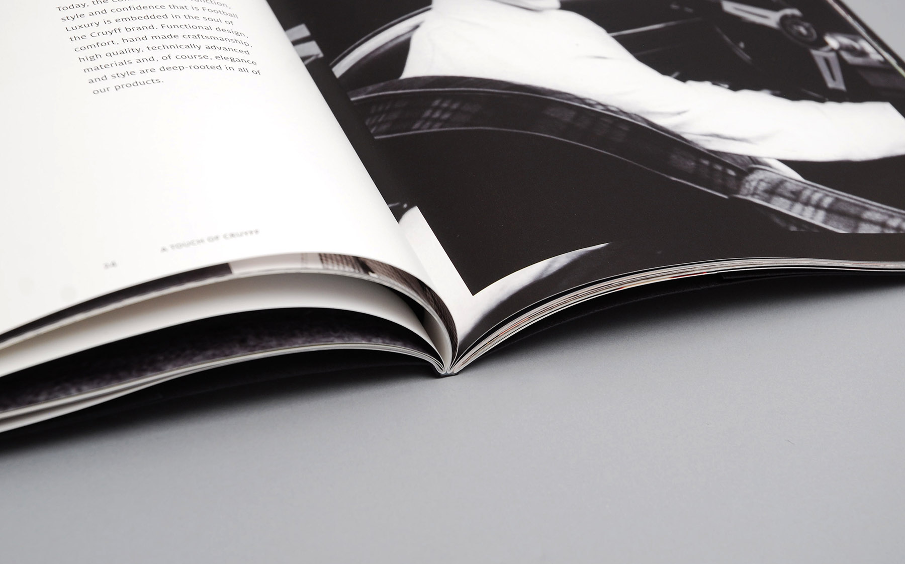
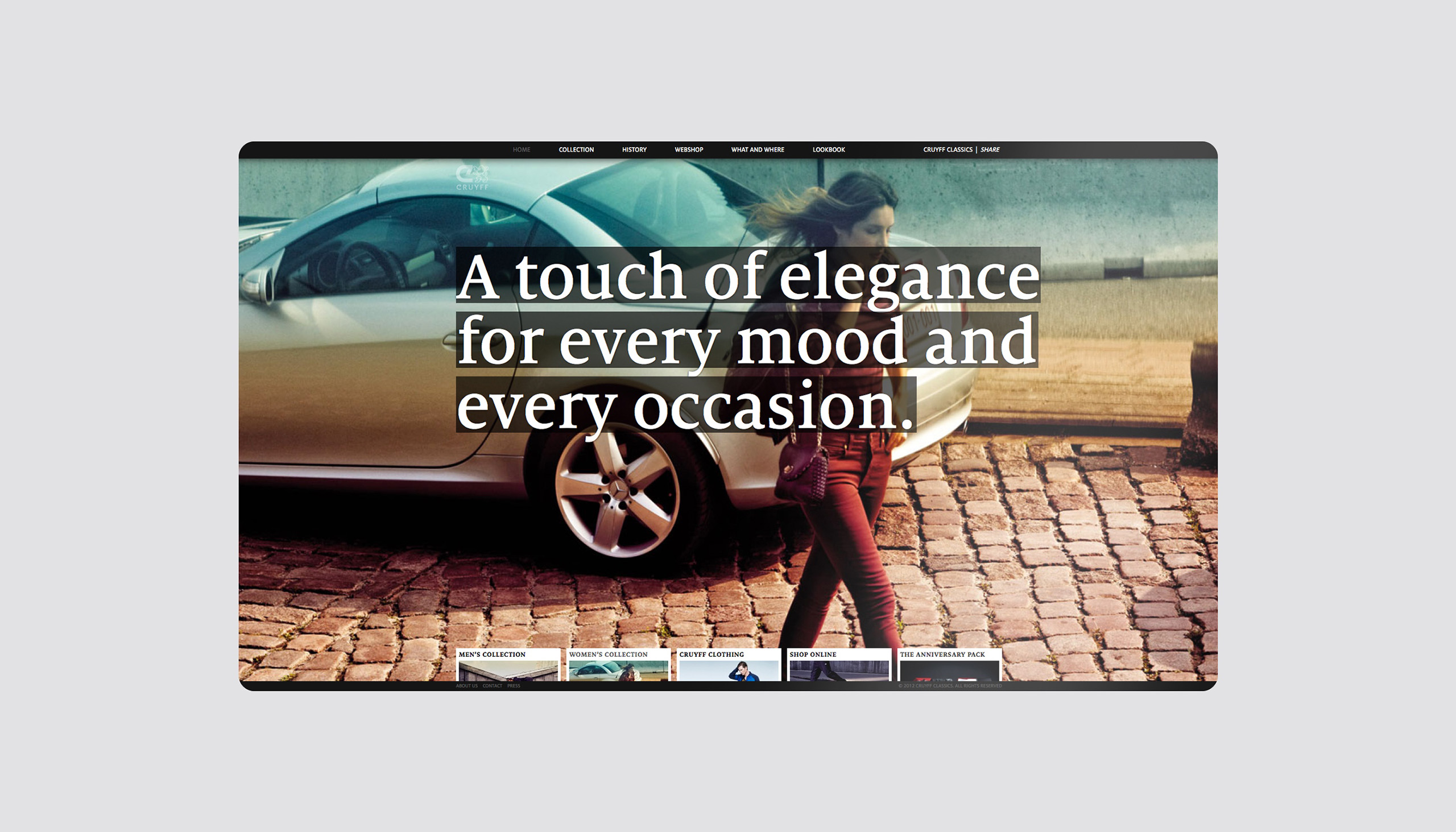
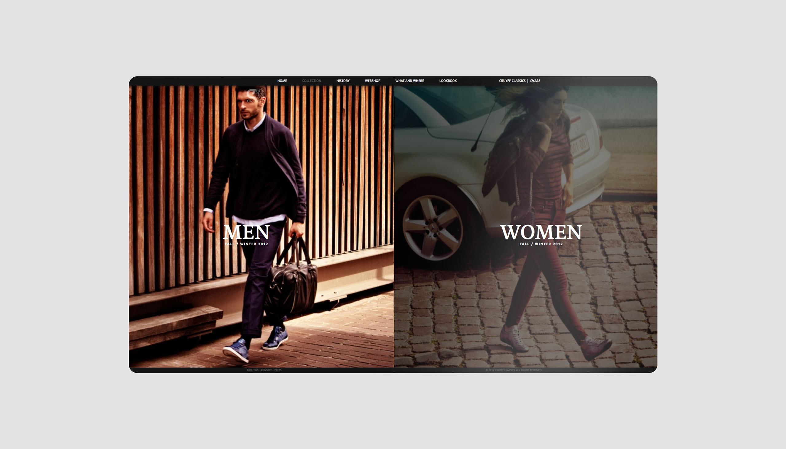
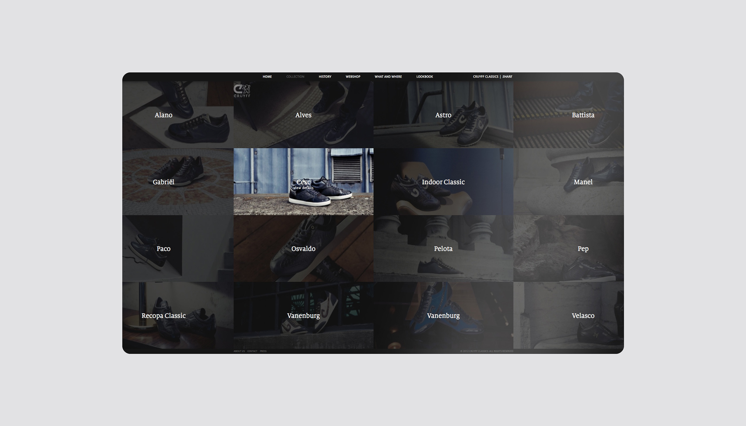
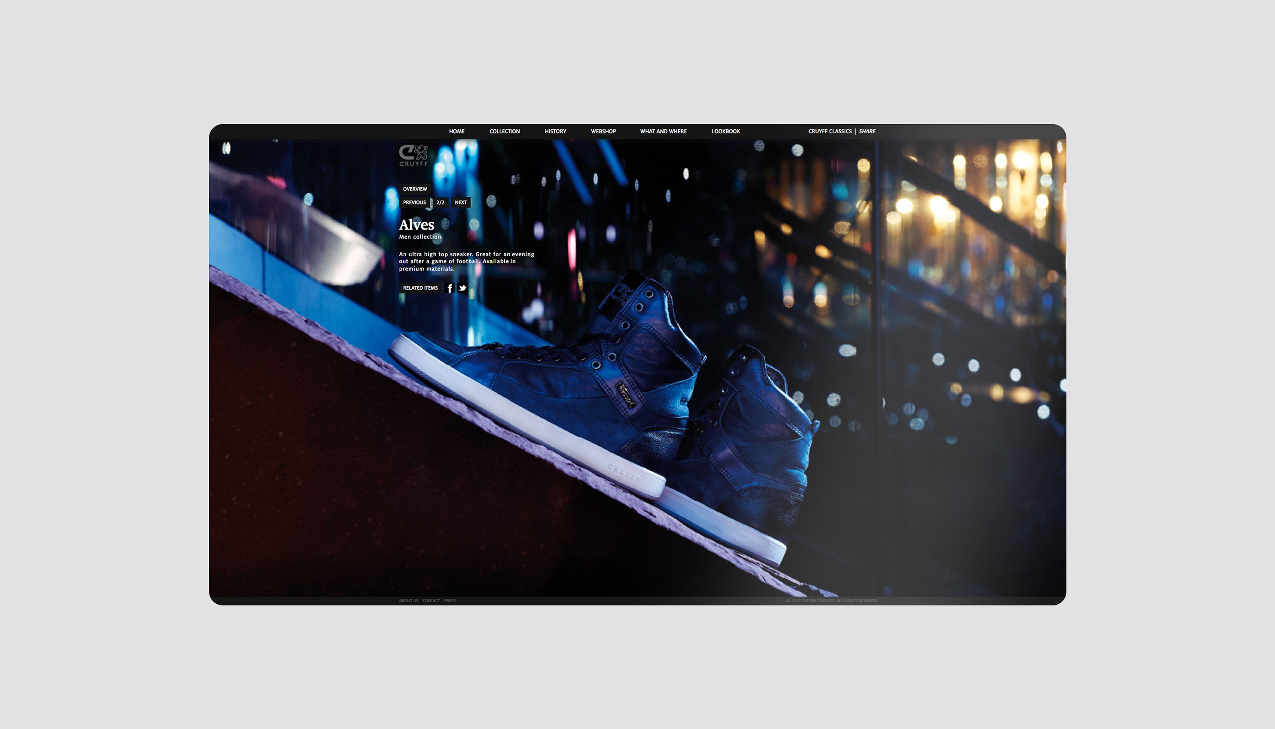
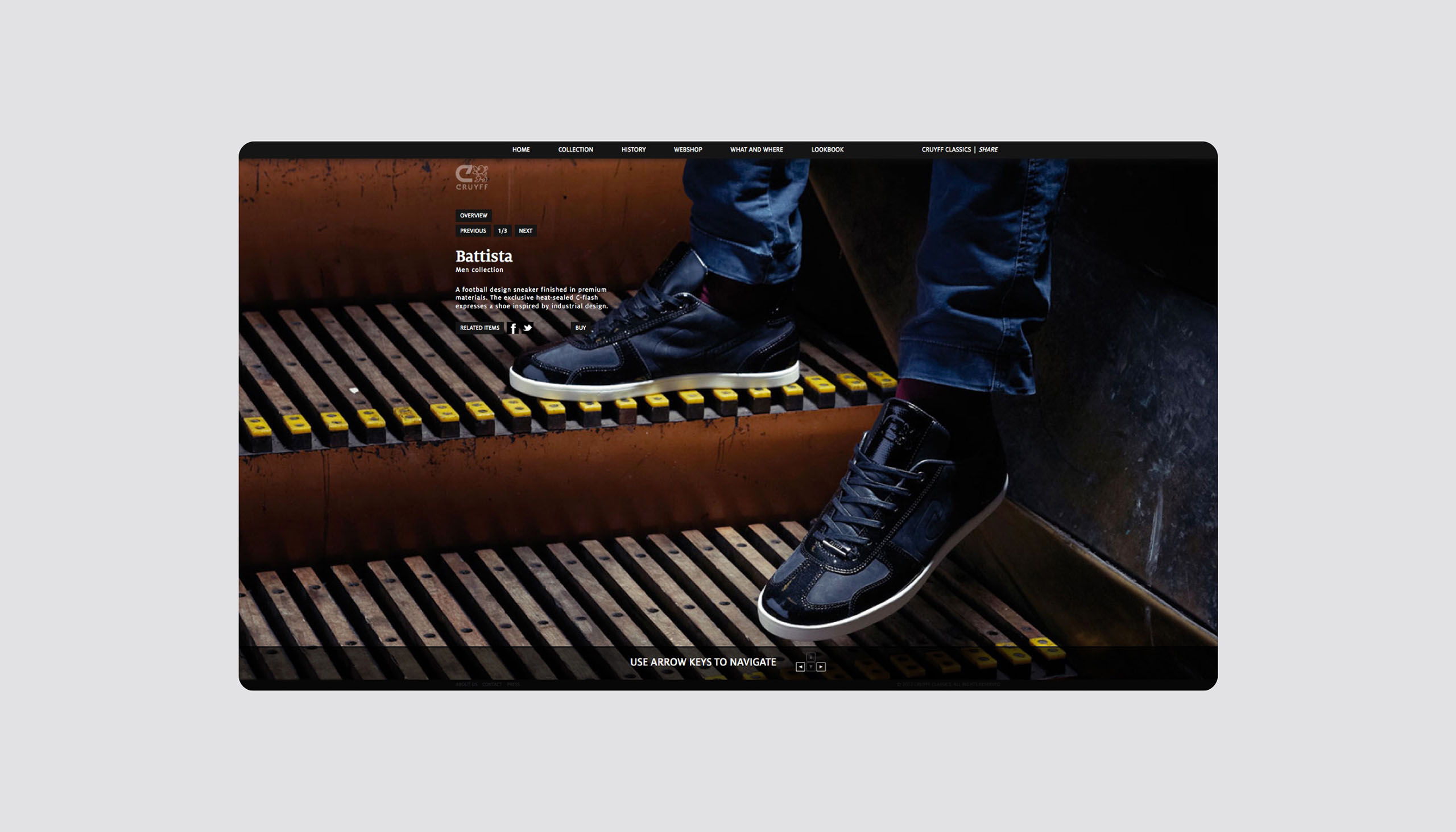
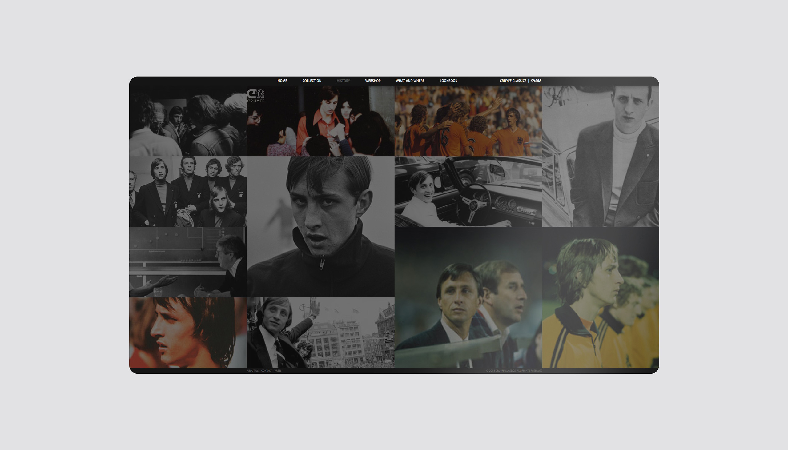
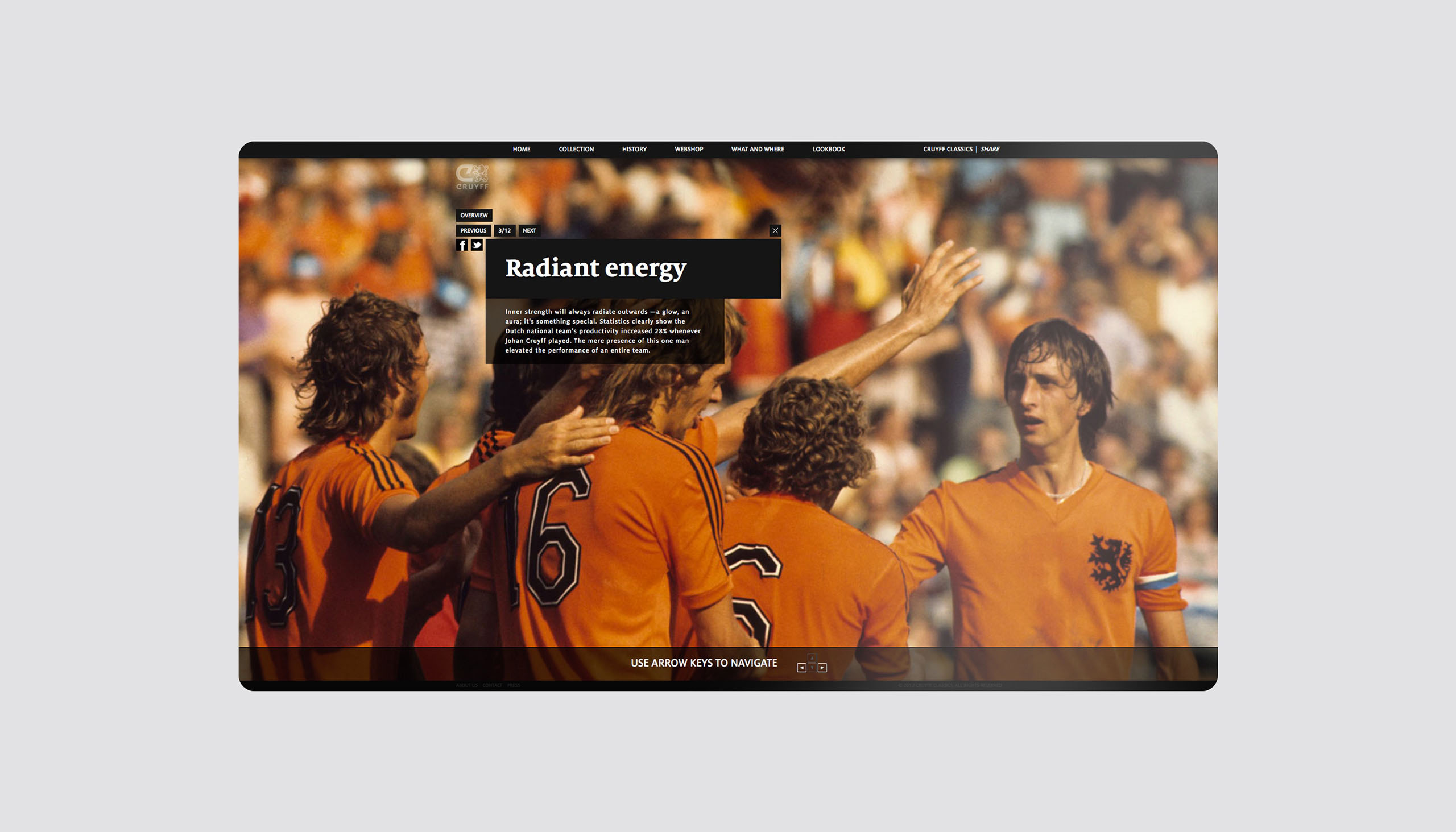
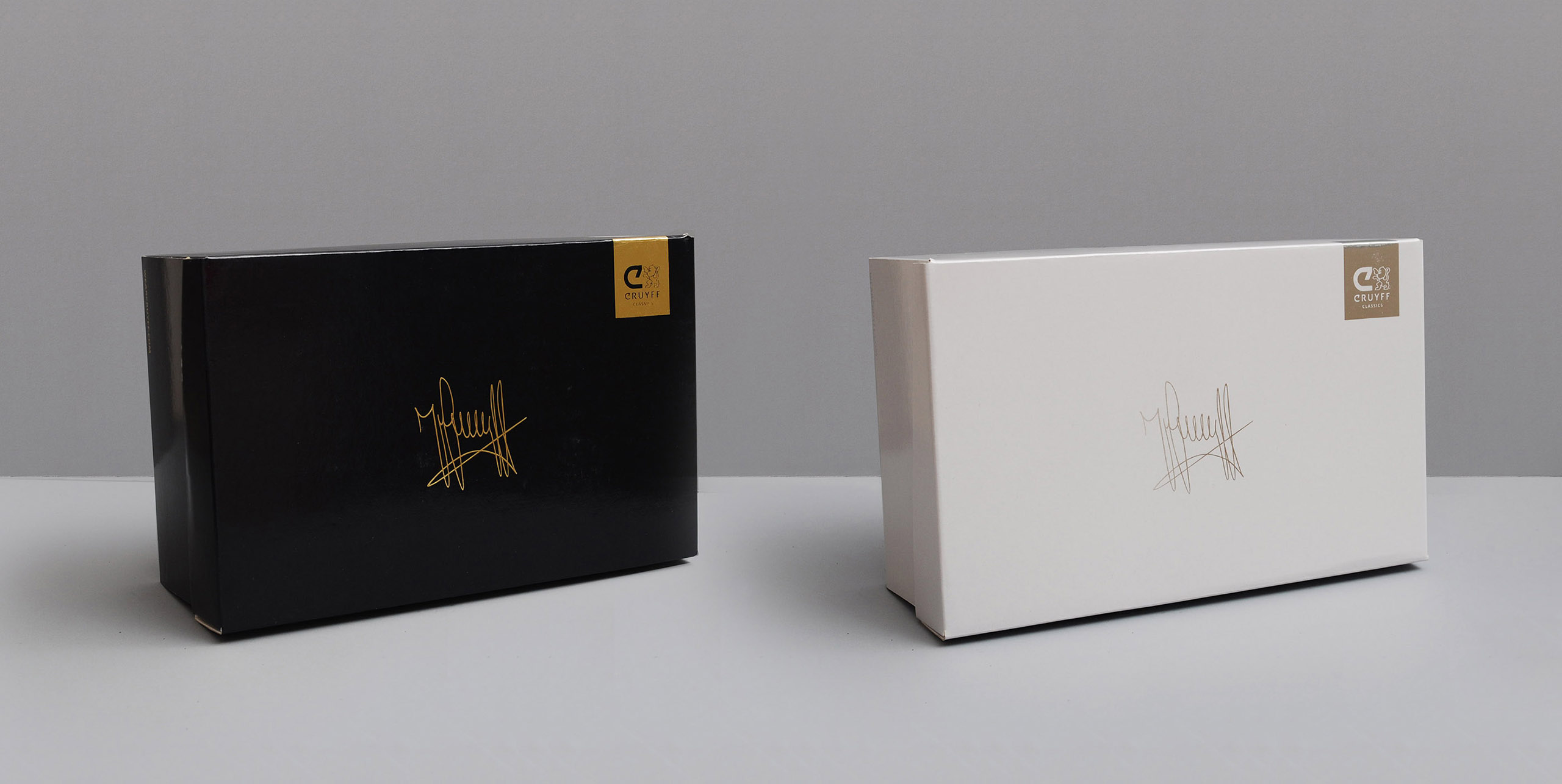
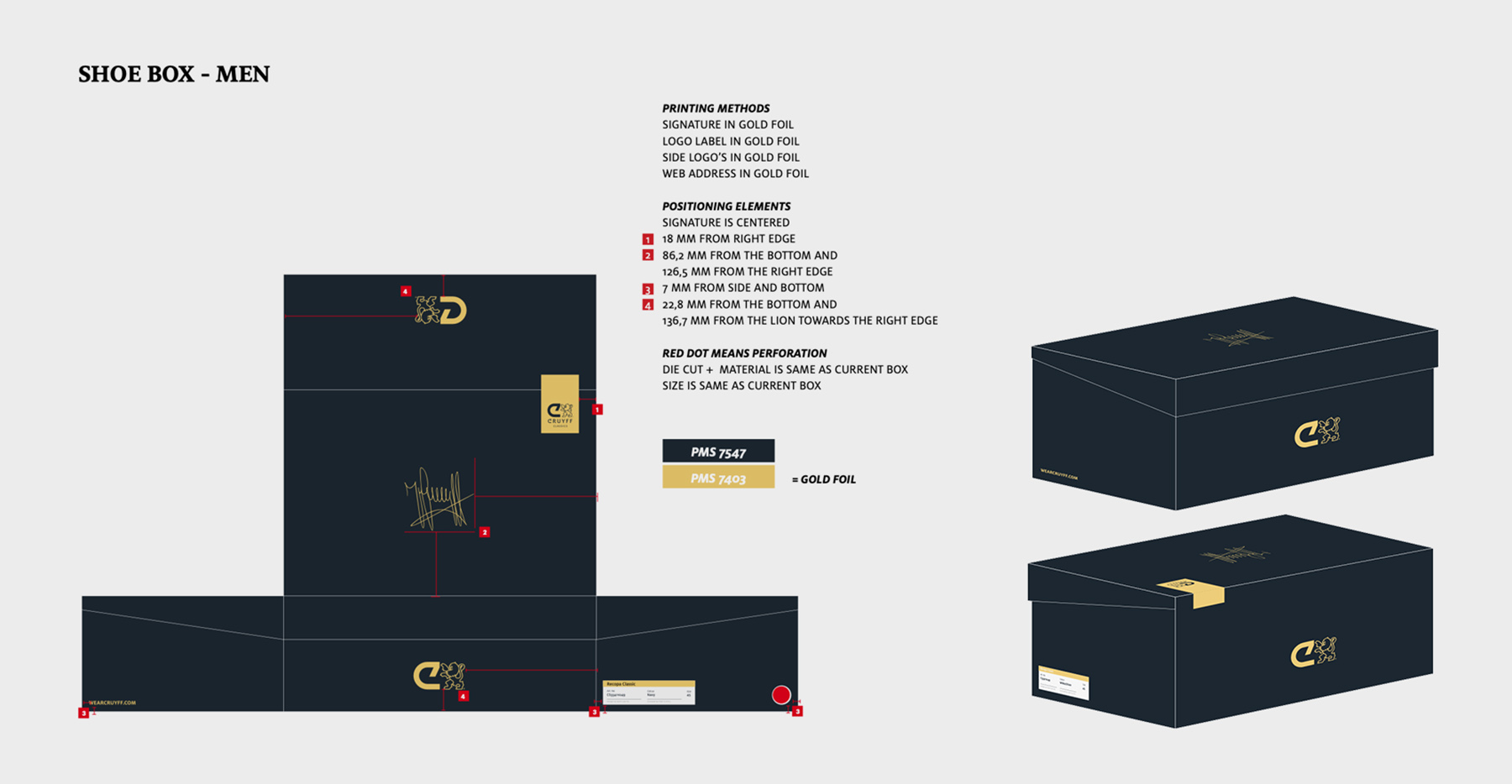
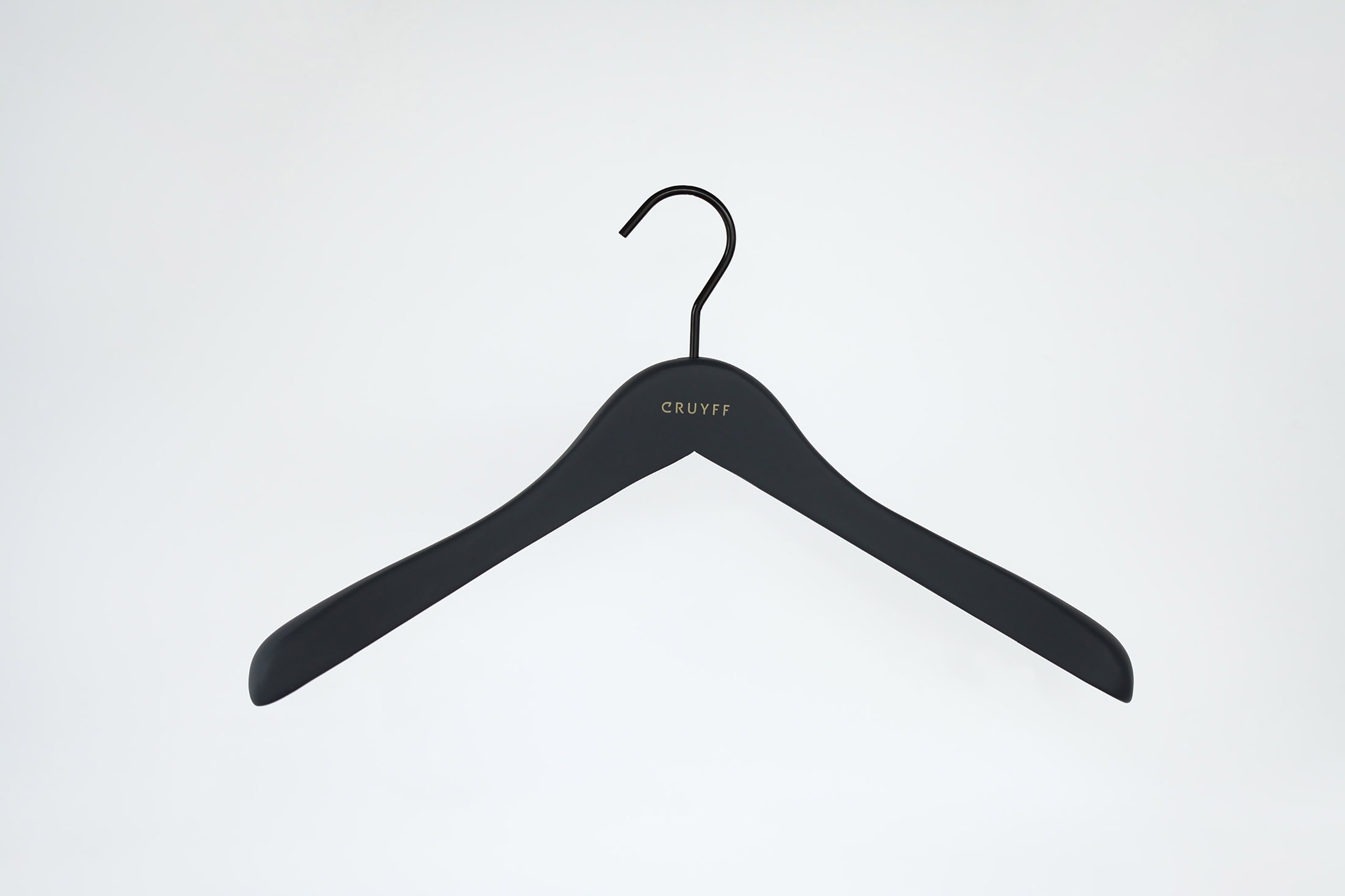
Cruyff rebranding

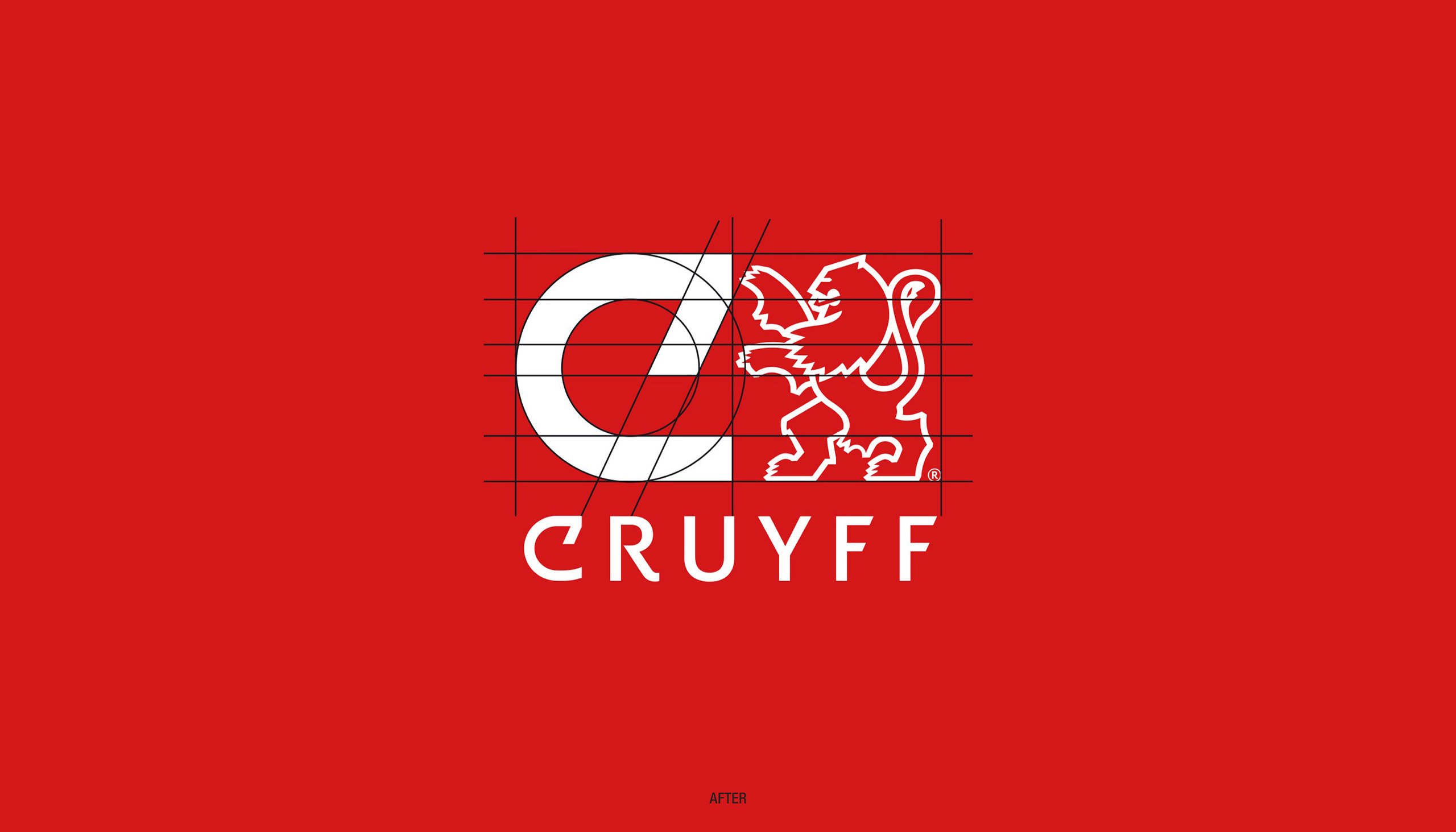
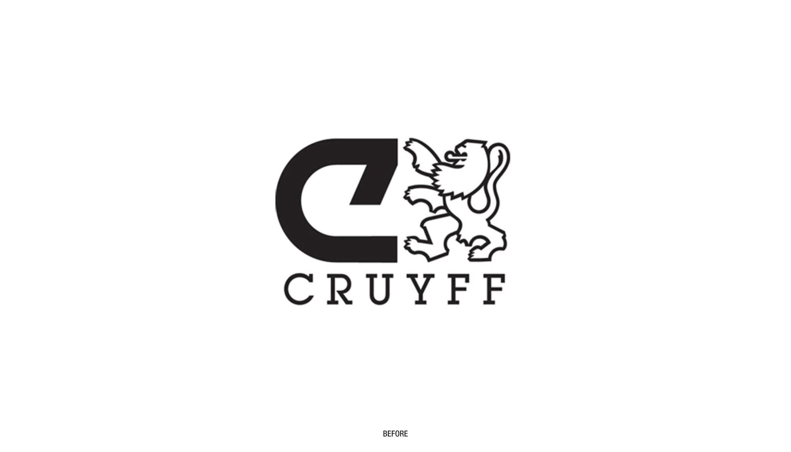
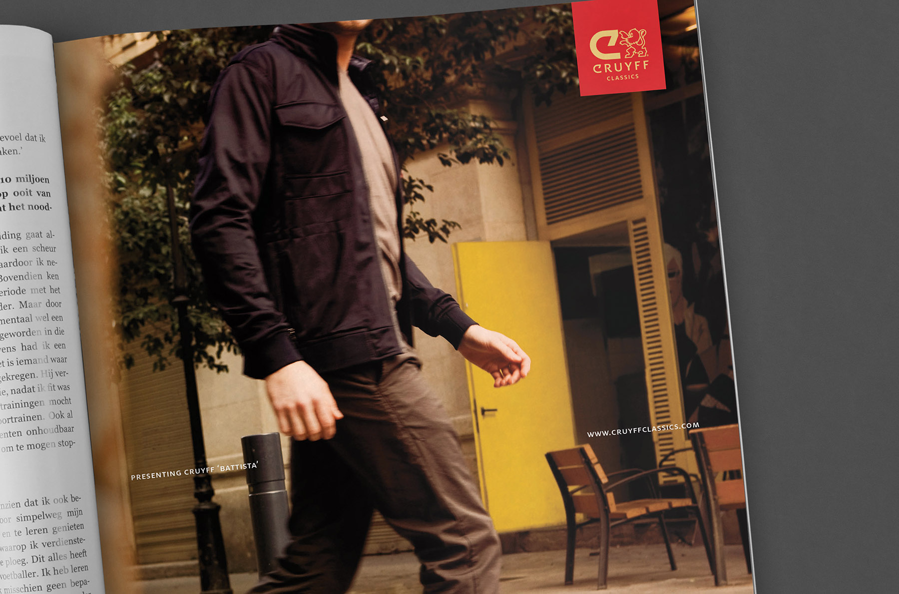
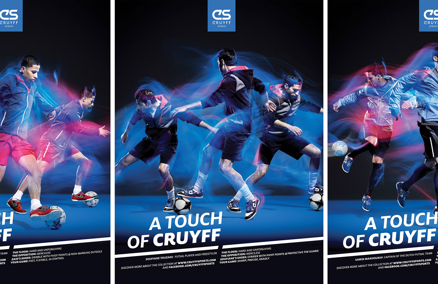
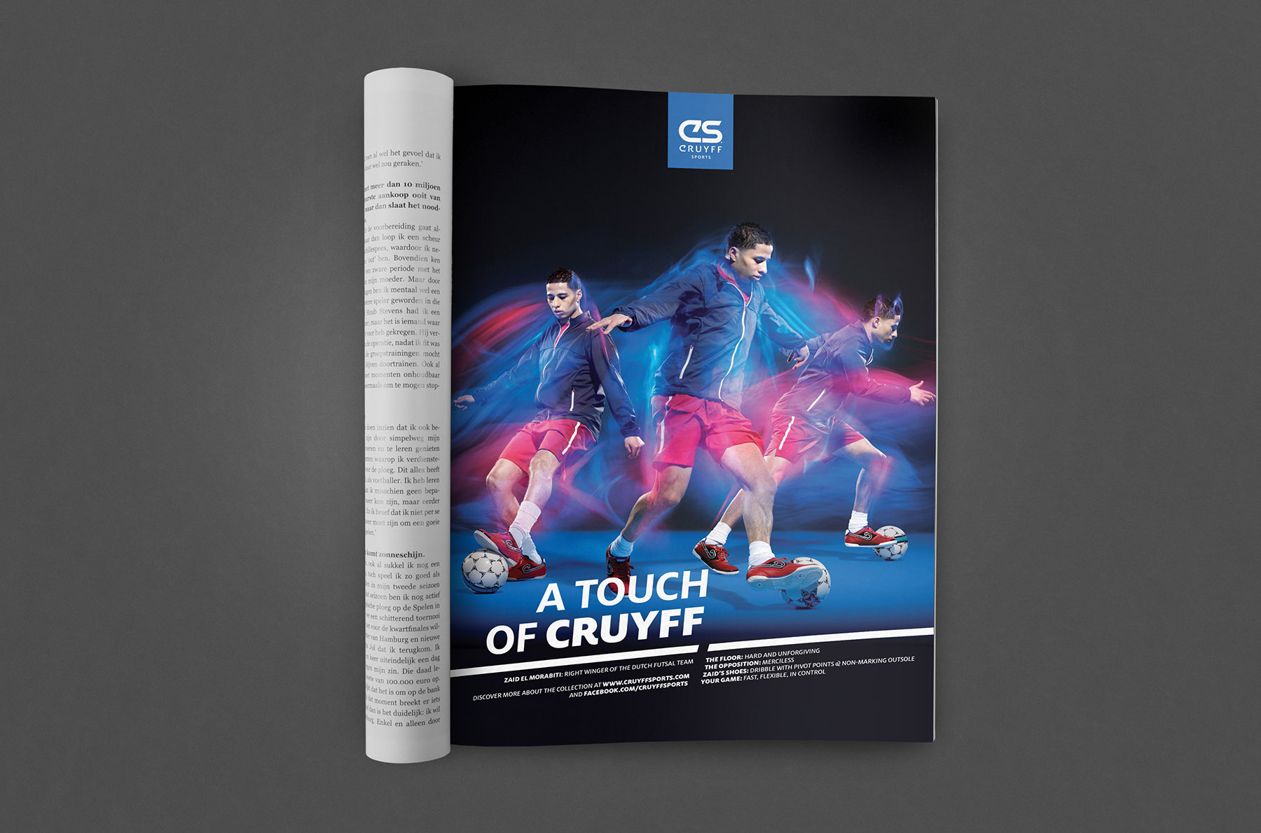
Johan Cruyff was football’s original dandy. His style of dressing and choice of accessories – his car, shoes, watch and even the furniture in his house – expressed a certain strength and confidence. However, the brand relied heavily on the past and was splintered across various sublabels.
For the Cruyff rebranding we created an overall brand concept focused on style and luxury. This brand concept – A Touch of Cruyff – tightened the bonds between the different sub-labels. We used abstract features from Johan Cruyff’s personality, such as ‘movement’, ‘energy’ and ‘development’ and created a visual world of international style, sport and luxury.
Year
2012
Project sort
Contract
Made while working at
Premium Inc.
Creative Direction André Bouwman
Product photography Pim Top

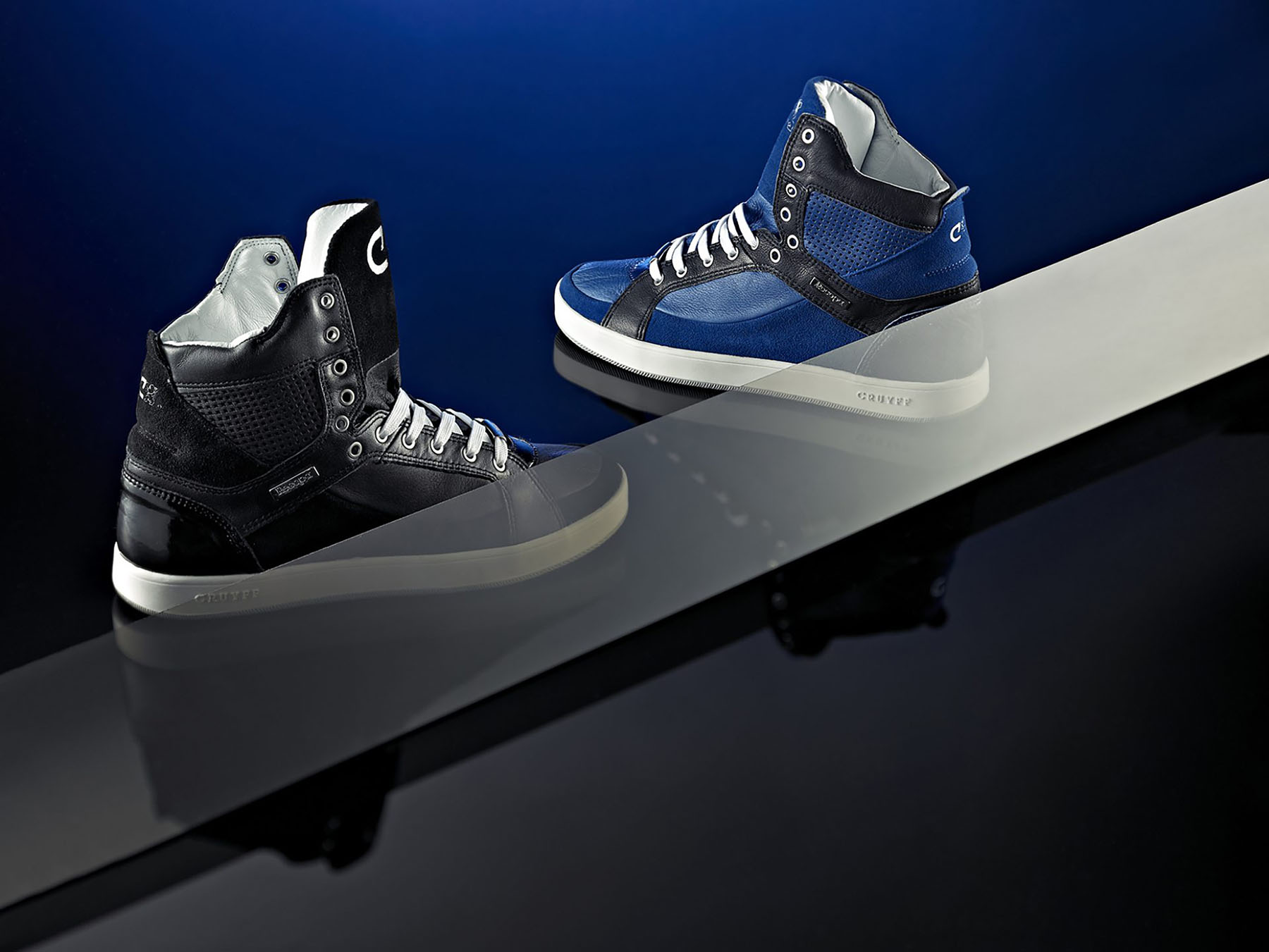
Kinner Italia
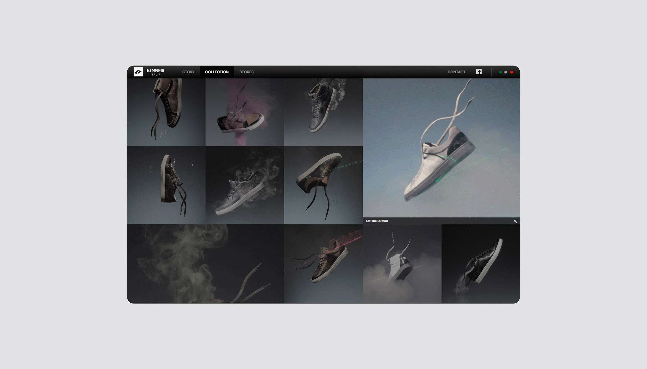
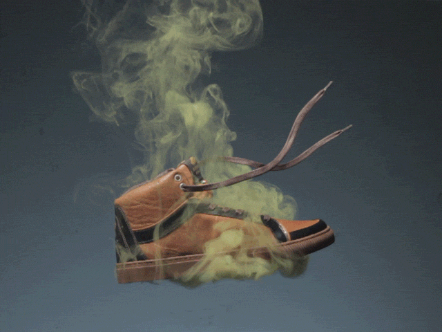
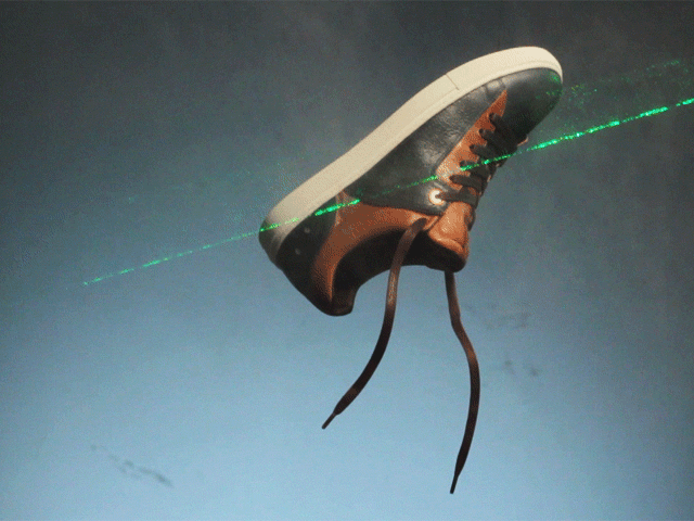
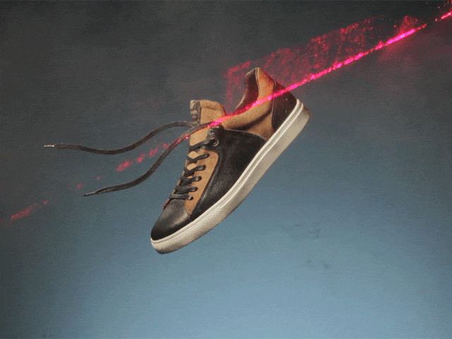
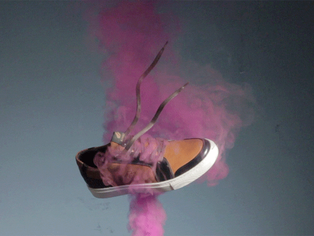
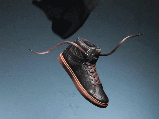
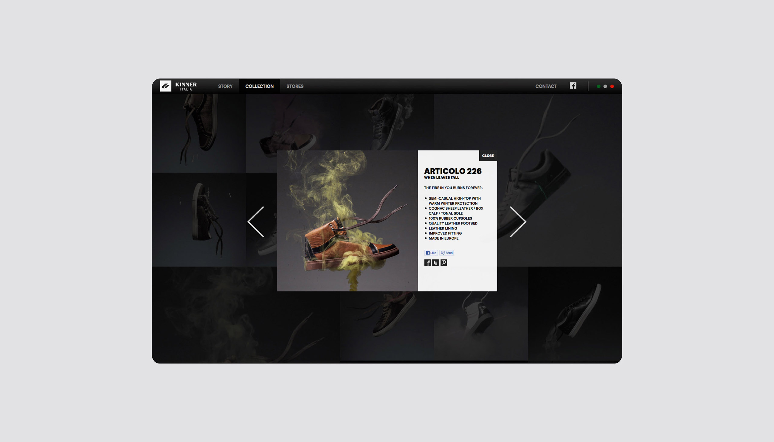
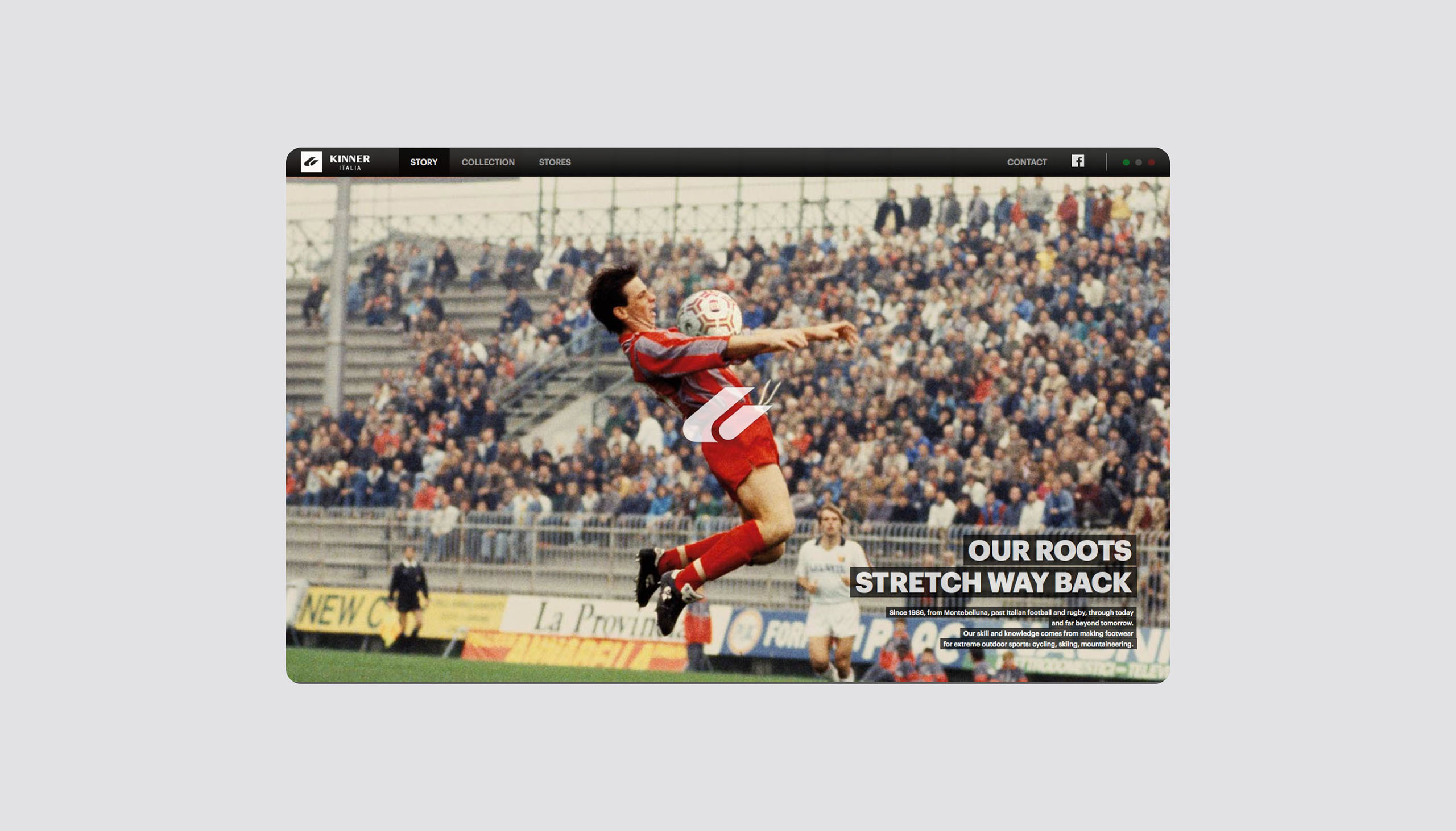
The roots of Kinner Italia lie deep within the world of Italian rugby. For years Kinner has supplied men of action and other heroes with high quality and indestructible footwear. To re-launch the brand as a fashionable footwear brand, we created a brand world that was inspired by the past, yet designed for the future.
The Kinner Italia brand stands for (young) men who work hard. Men of action. Men who live with all their heart. A brand for the strong, the brave and for those who walk their own path and make their own mistakes. A brand for “Fallen Angels”.
This concept of Fallen Angels became leading in everything: from the design of the shoes to the photography and visual identity: raw, original, industrial. The product photography revealed the experimental character of the shoes through daring angles, close-ups and ‘special’ effects.

Year
2012
Project sort
Contract
Made while working at
Premium Inc.
Creative Direction André Bouwman
Development & animation Oskar Sundberg
Photography Ingmar Swalue
What did I do
Visual design
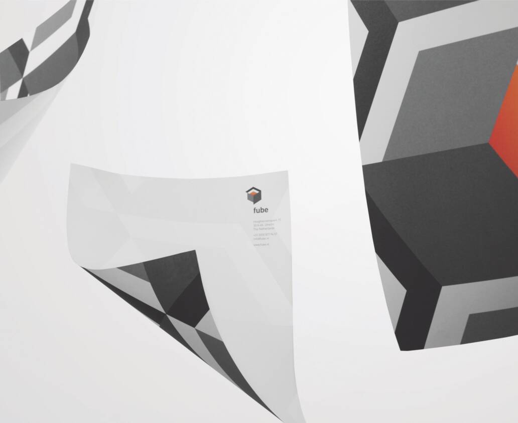
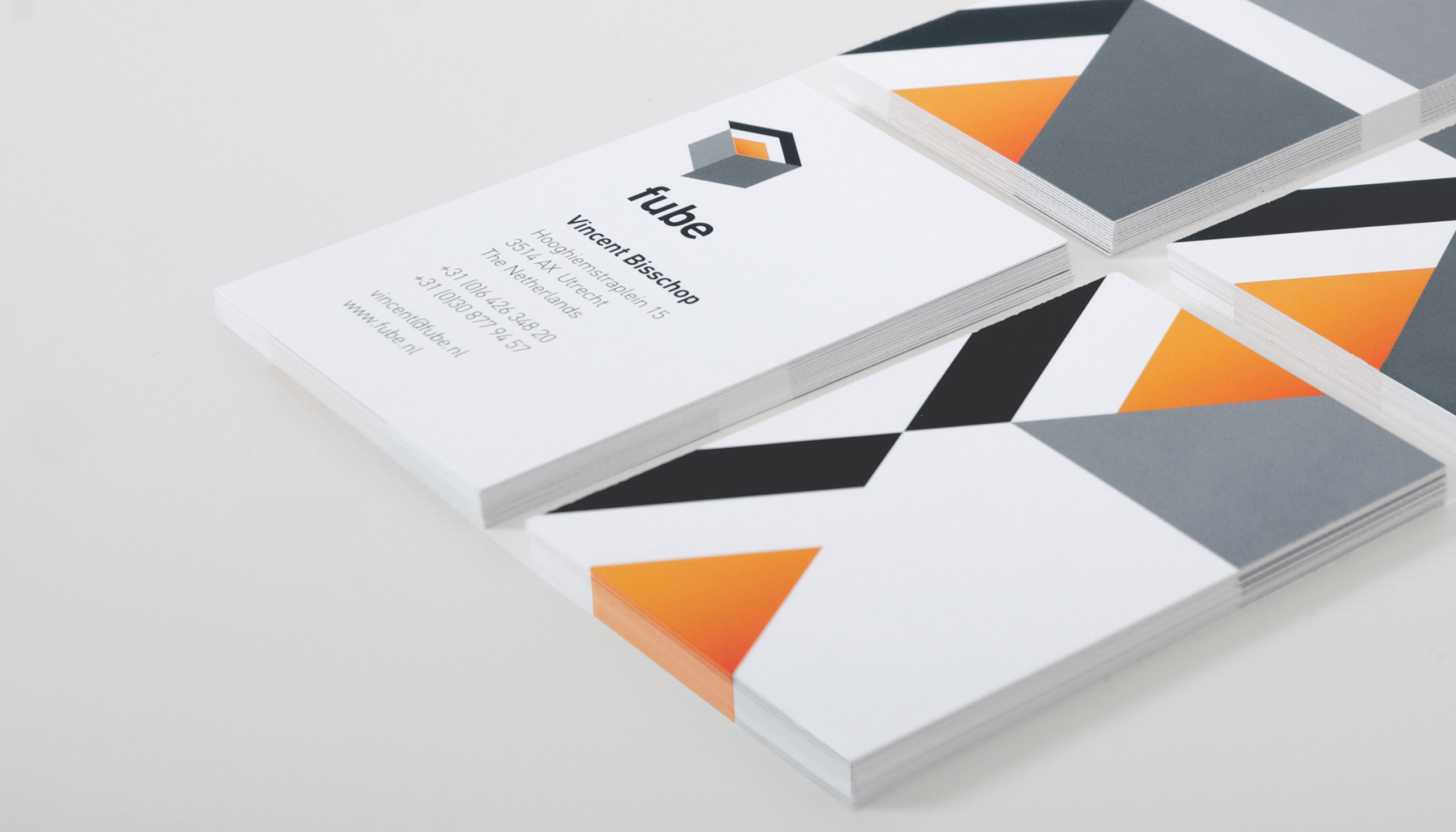
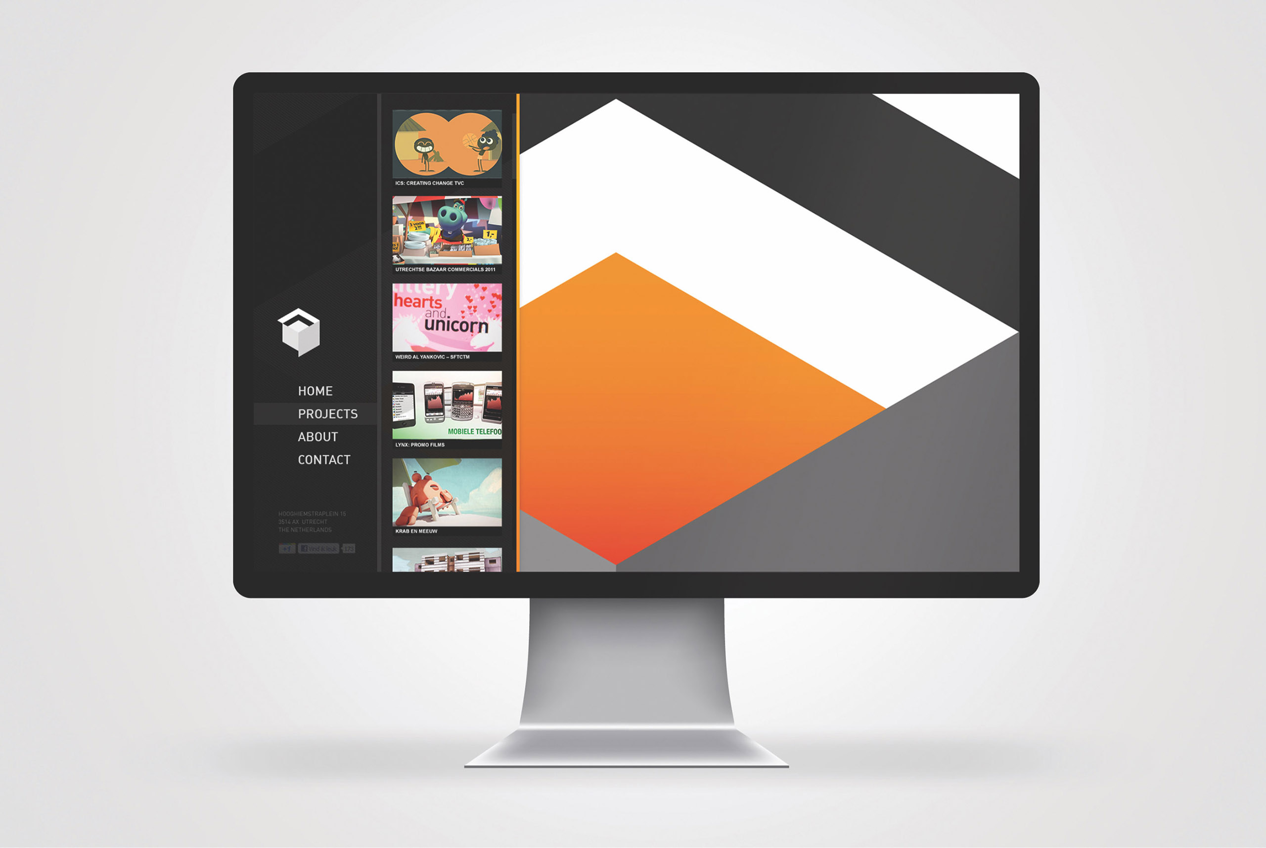
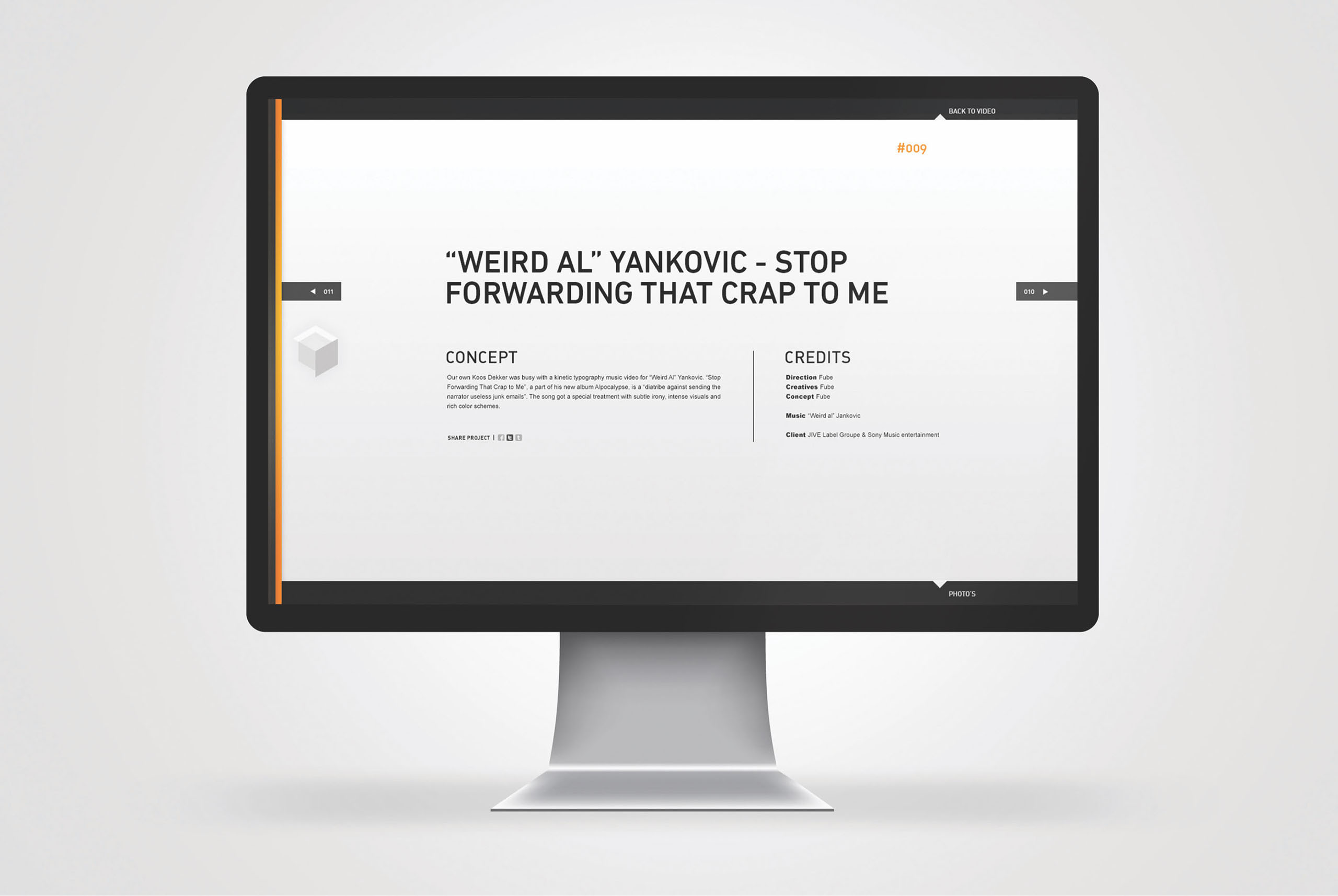
Fube Branding
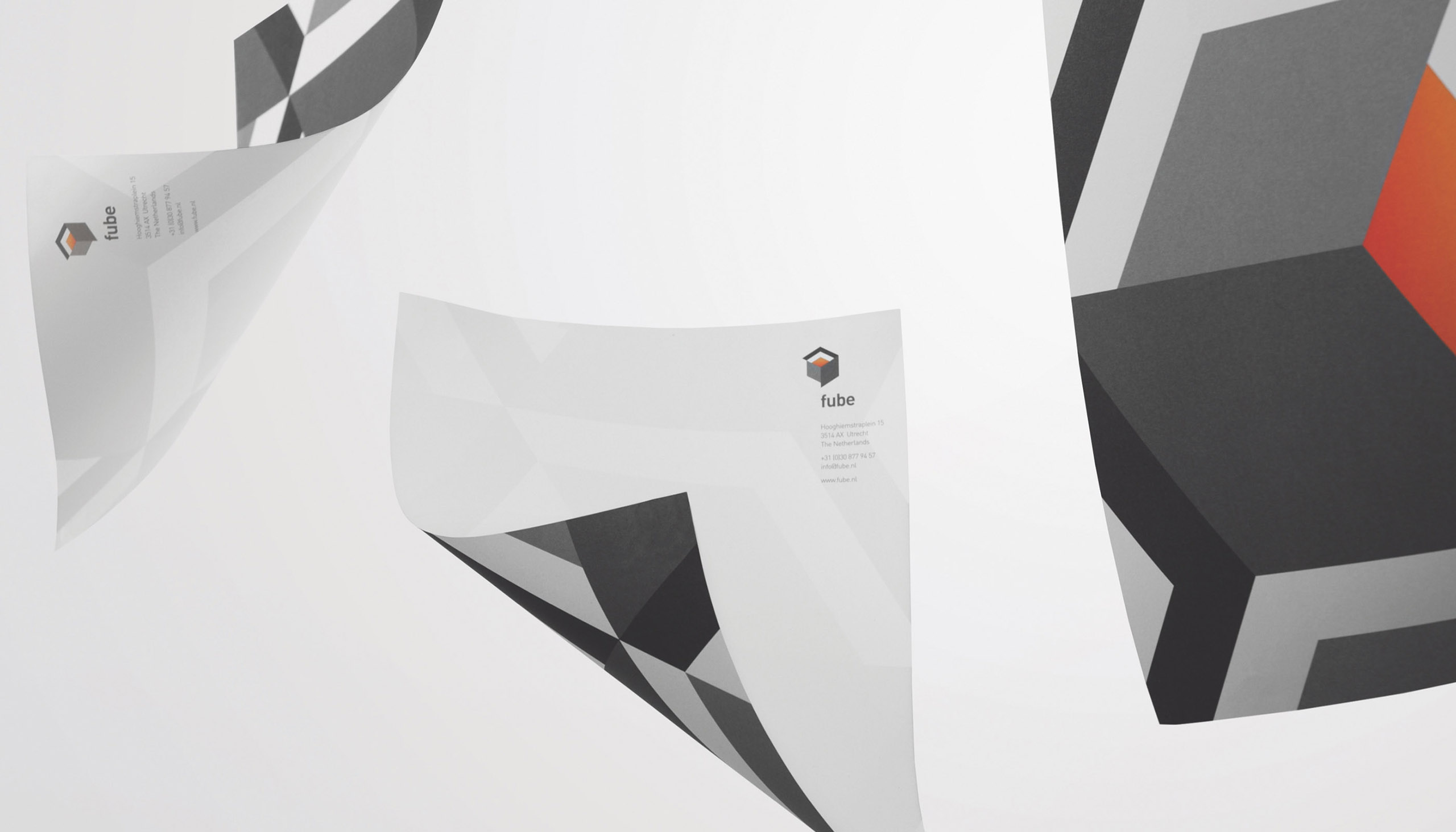
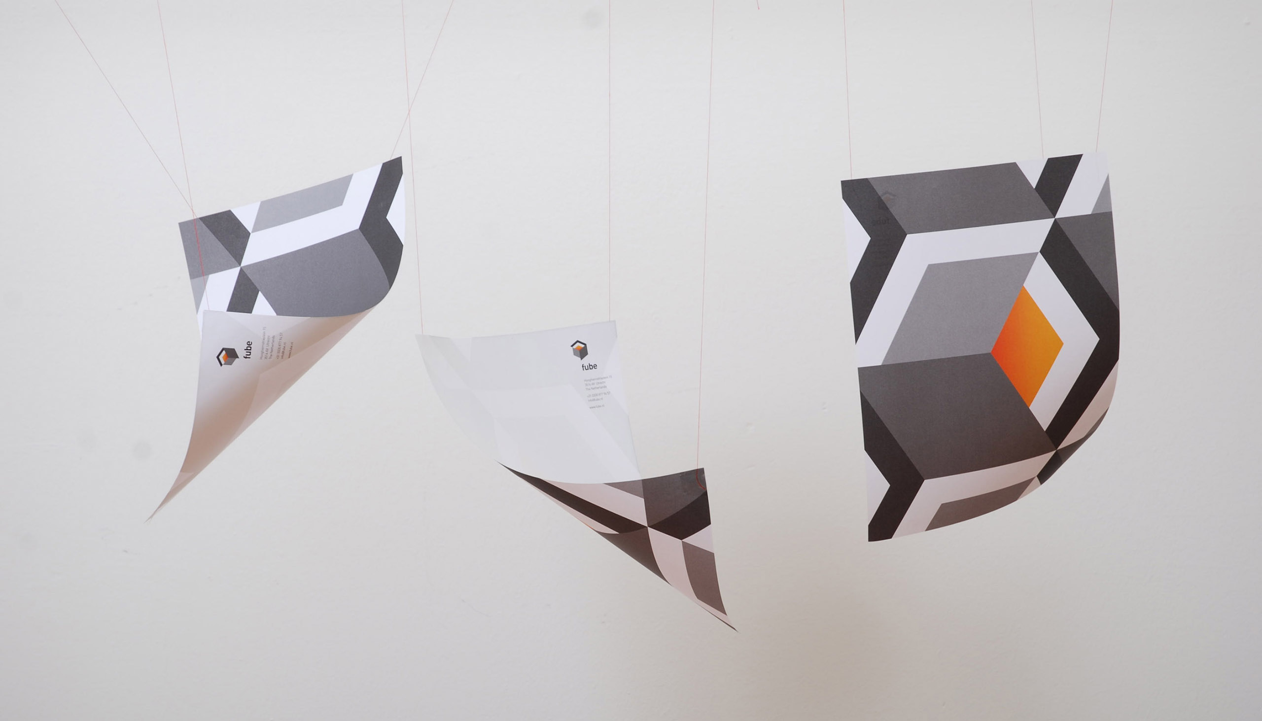
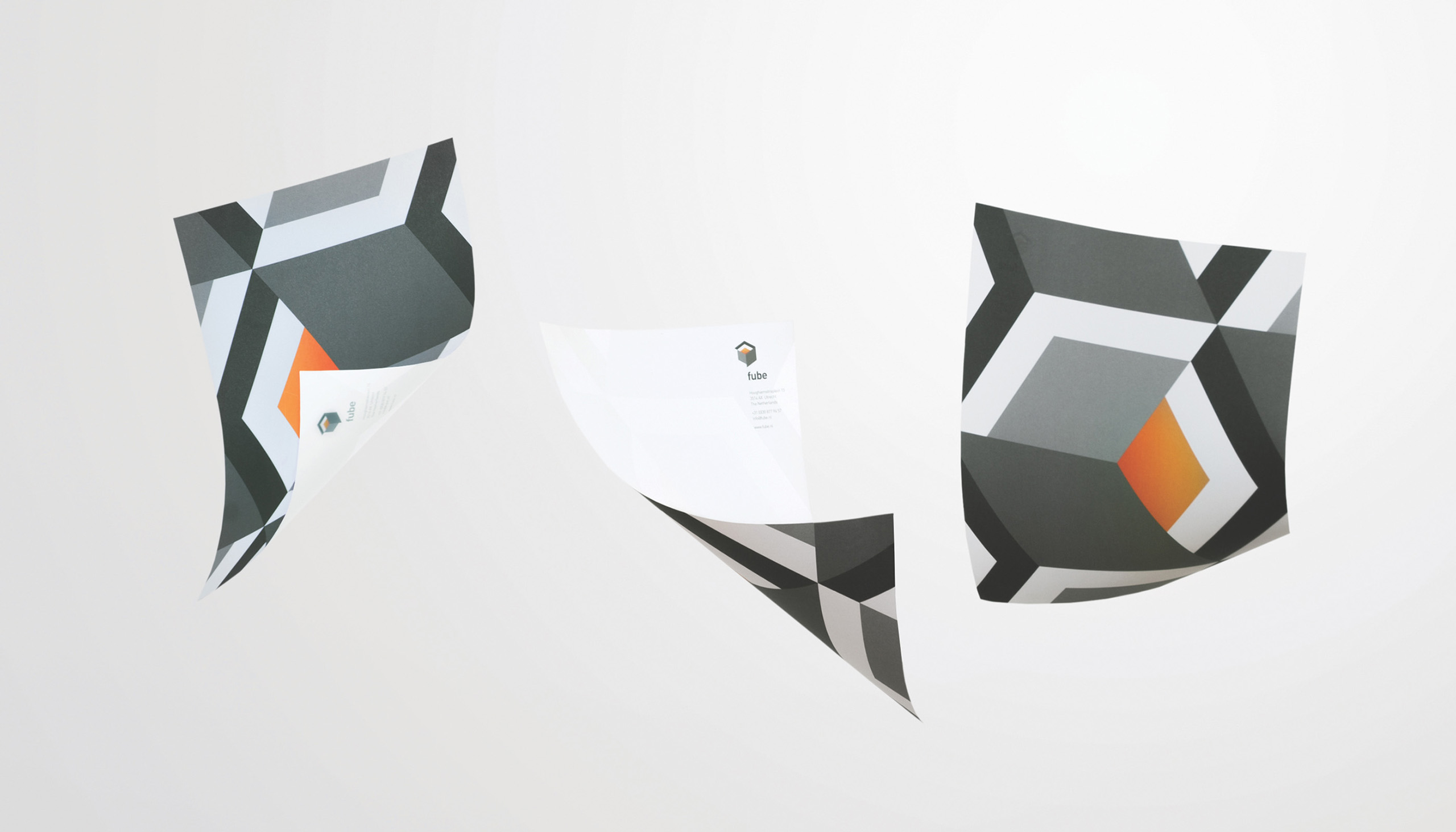
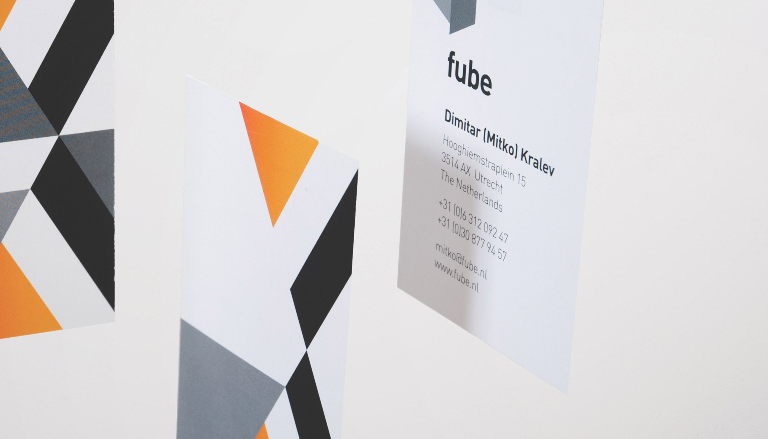
I was commissioned by Fube [ fiu-b ], creative production company based in Utrecht, to create a new brand identity for their company that mostly created 3D productions.
The word Fube originates from the definition of an incorrect cube also known as a fuckup cube. This ‘fucked-up cube’ has become the main-core of the identity. The main idea was that the fucked-up cube could "grow" depending on the services that are being used.
Year
2012
Project sort
Client
Client
Fube
What did I do