adidas RUNLAB
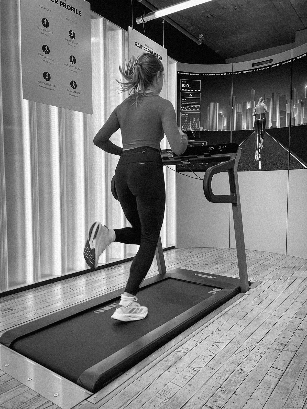
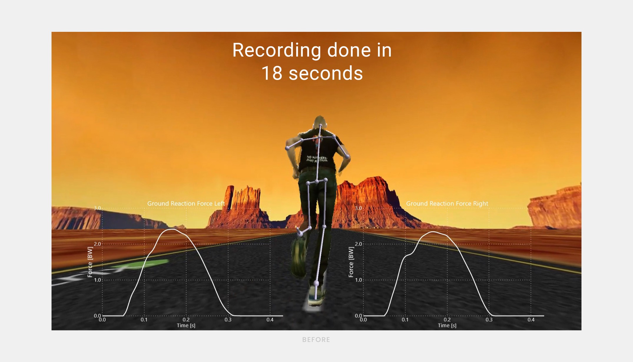
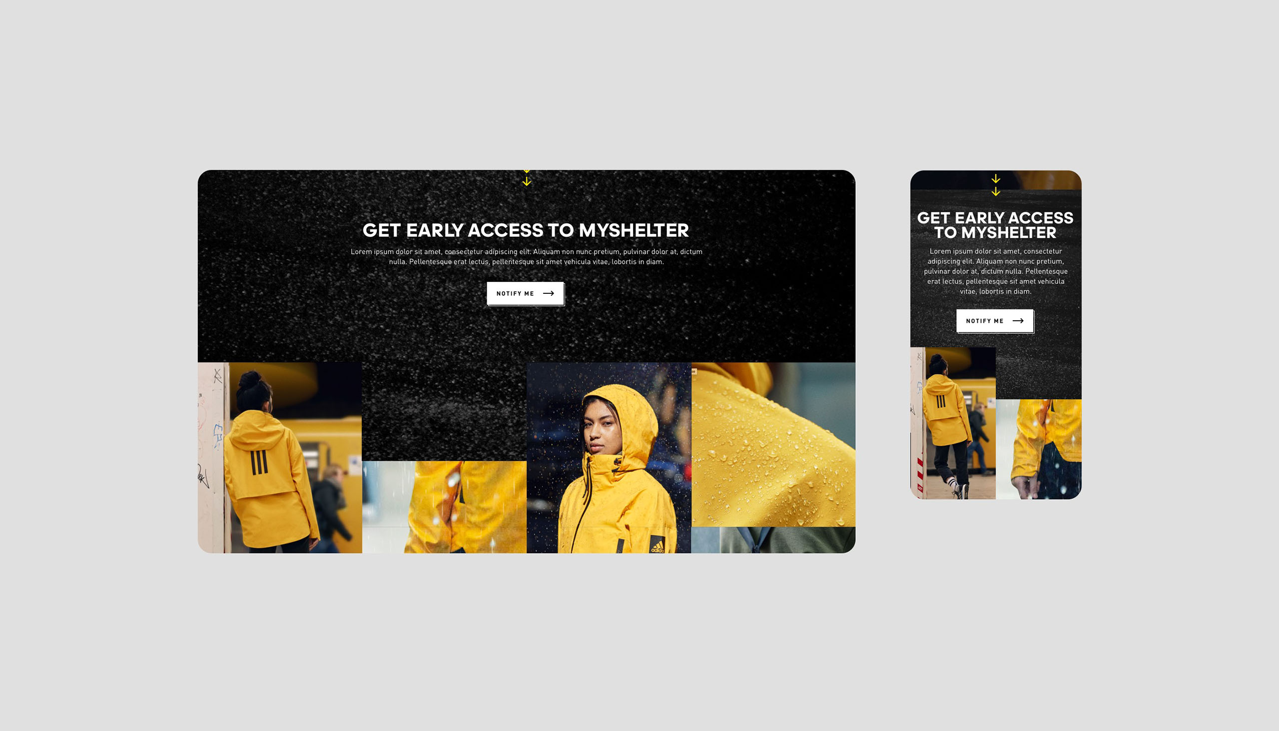
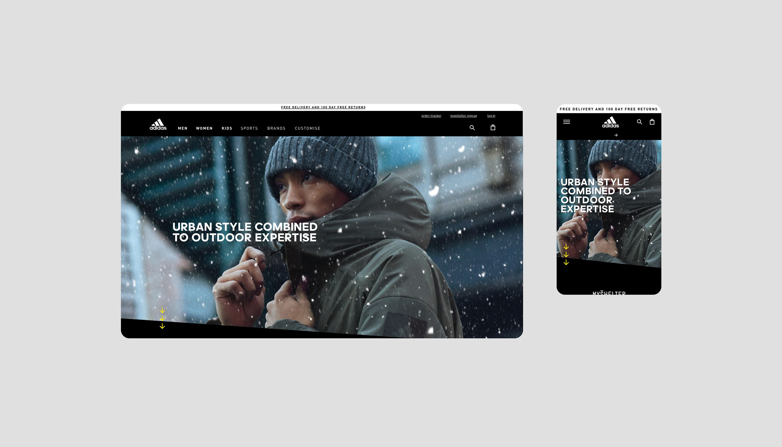
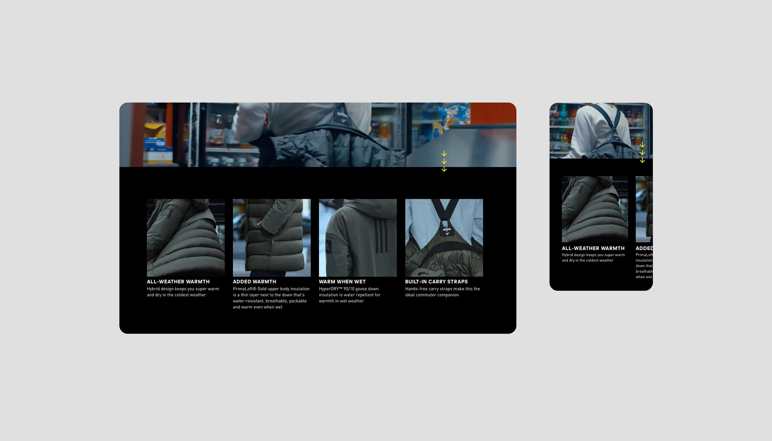
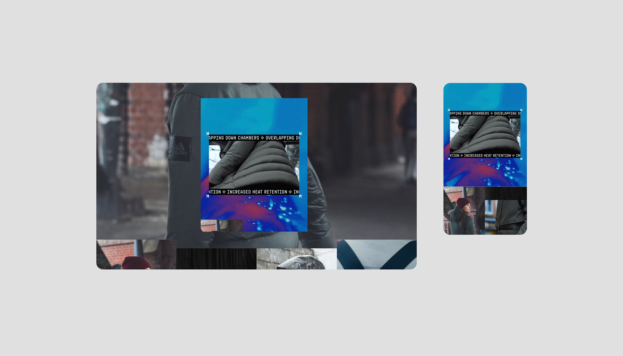
Towards the end of 2023, I was approached by adidas to contribute to their retail experience, RunLab. RunLab is an in-store running experience, offering customers a comprehensive biomechanical running analysis report, featuring insights into gait kinematics and kinetics among others. The goal of the RunLab project was to increase adidas credibility & expertise as a running brand.
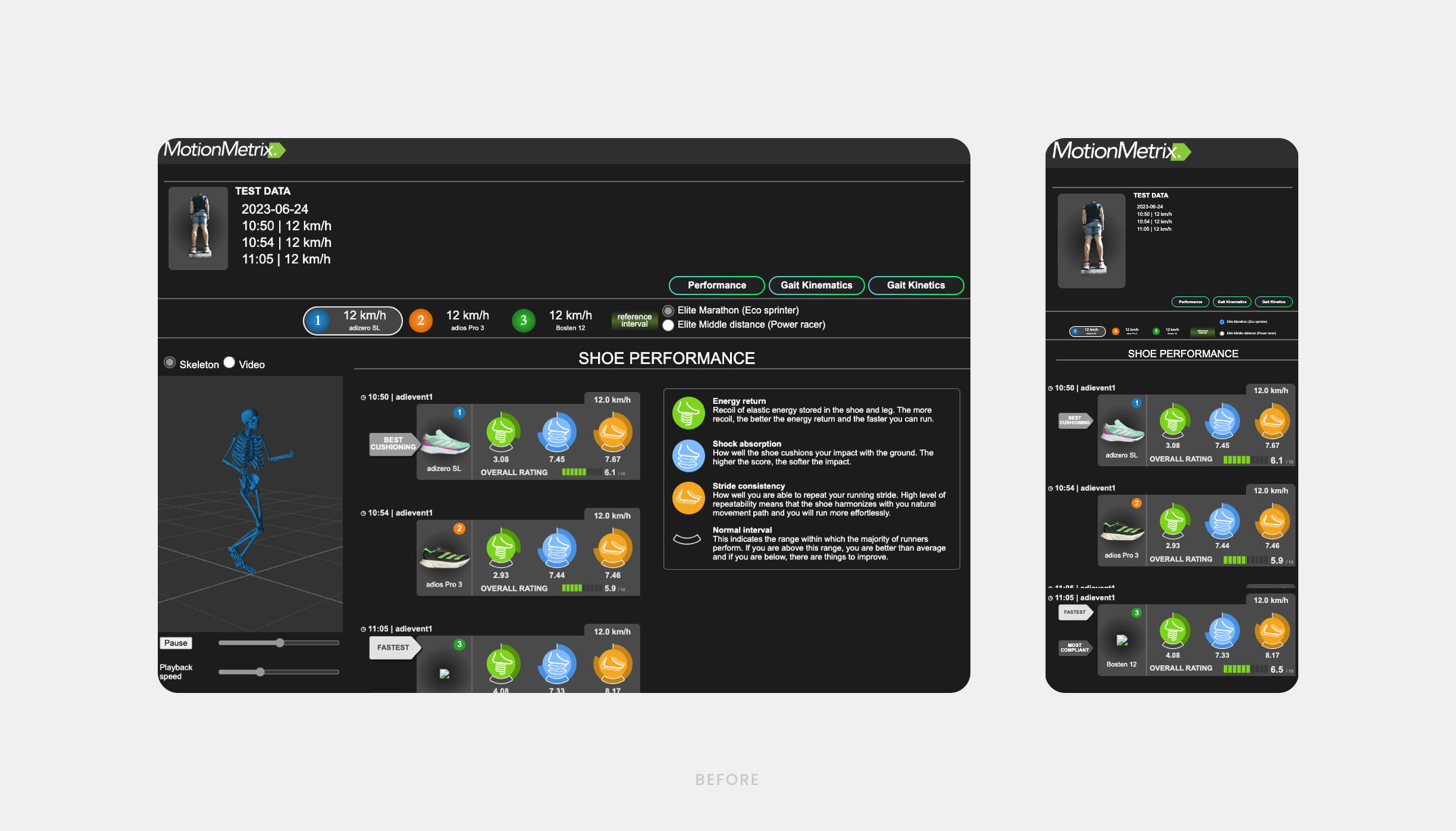
For this project adidas utilized a third-party tool by MotionMetrix (an expert in biomechanics) for conducting the running analysis. As adidas had ongoing running pilots in several stores. Due to its pilot status, it followed MotionMetrix's visual style. Seamless integration into the adidas brand was crucial.
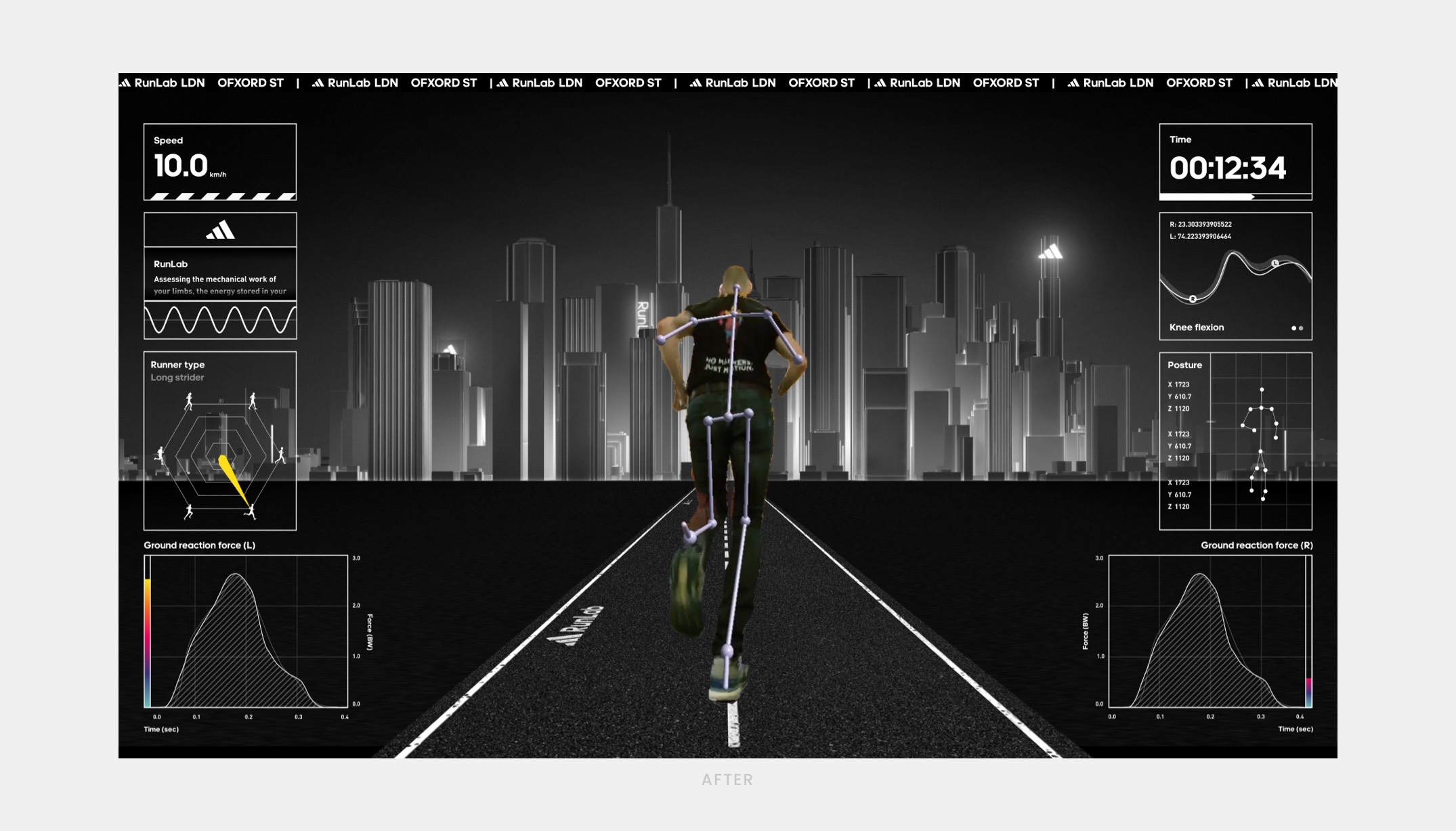
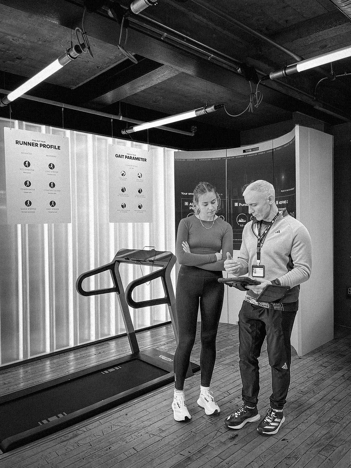
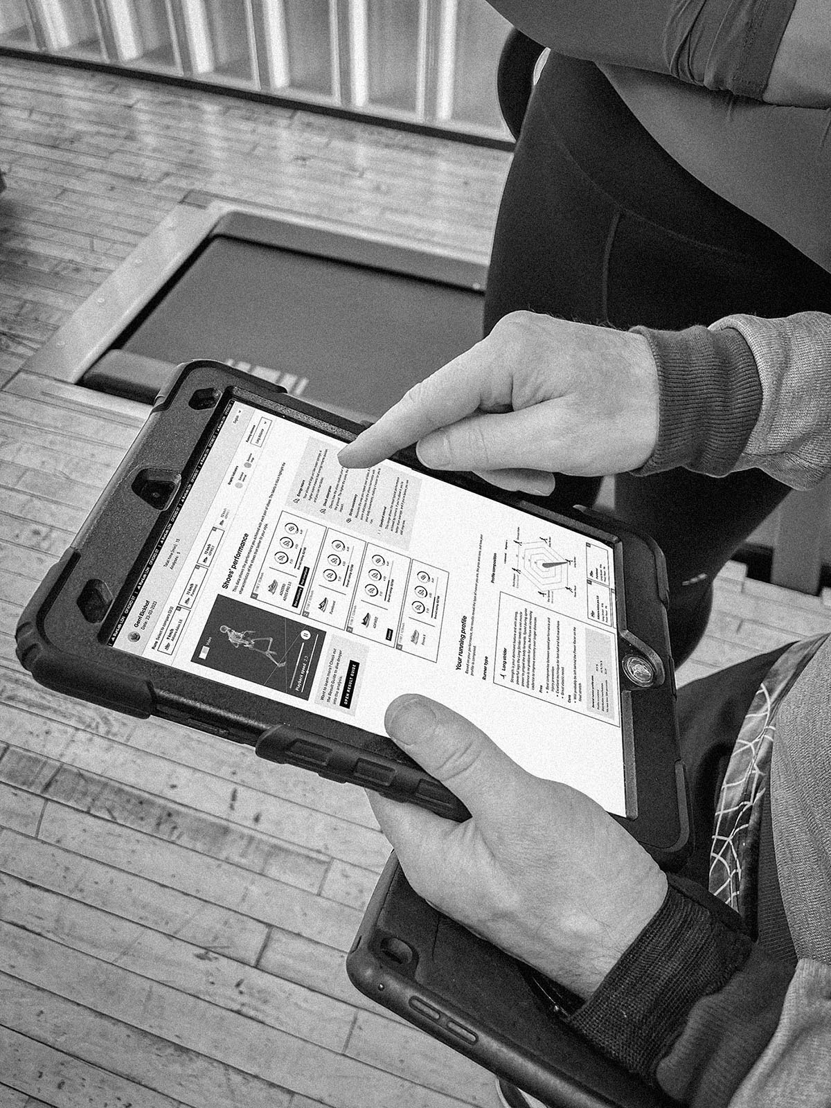
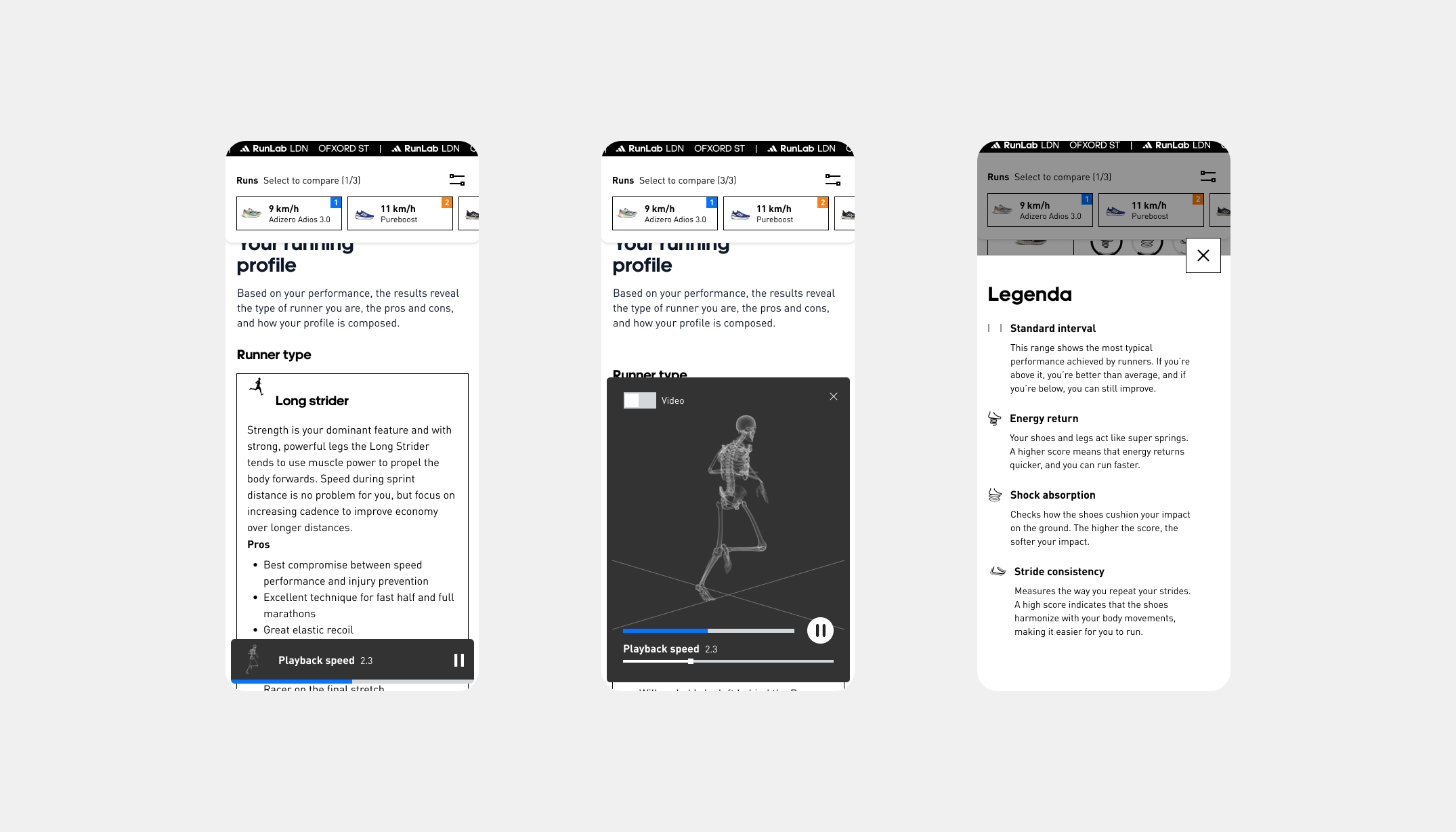
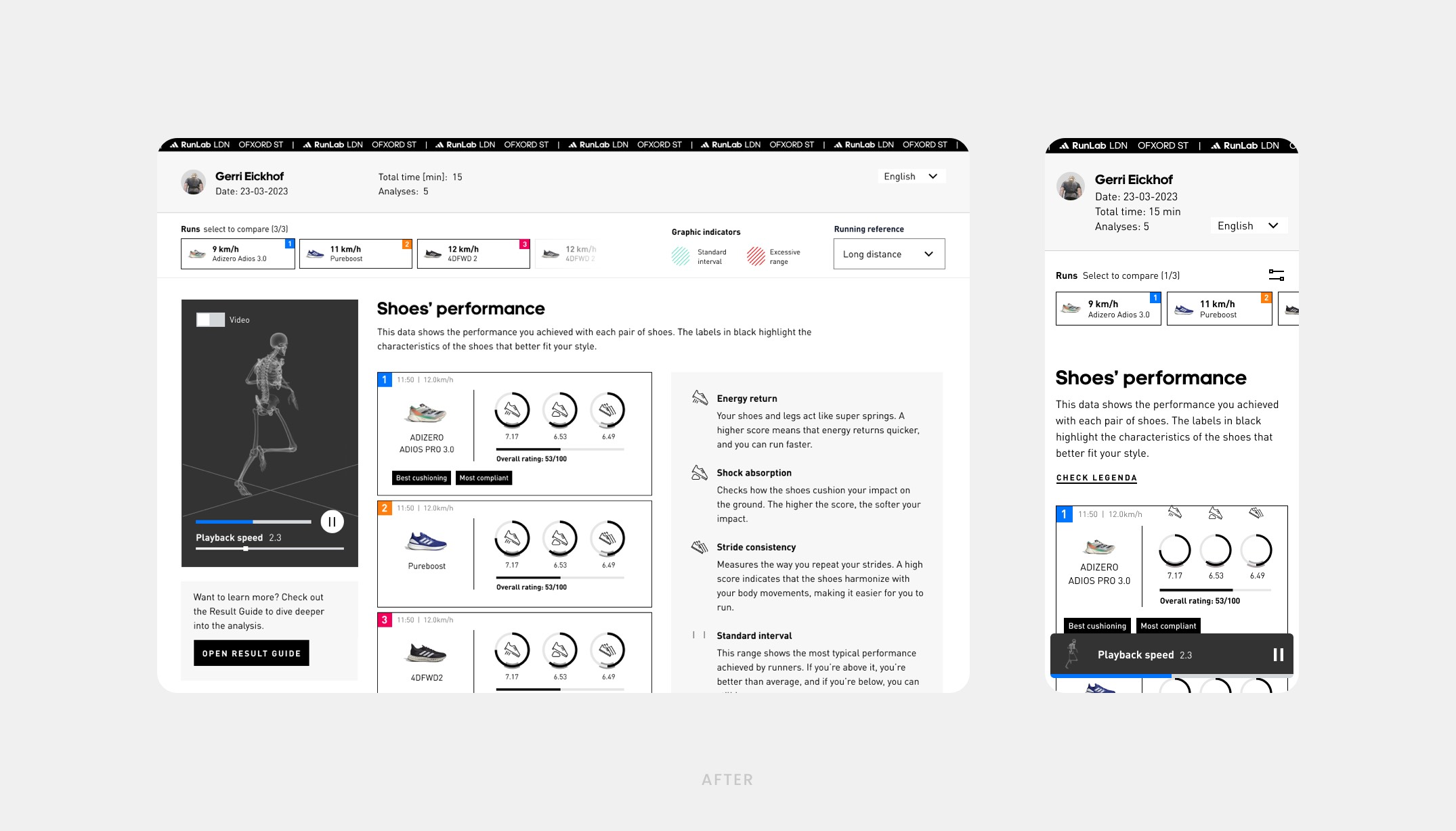
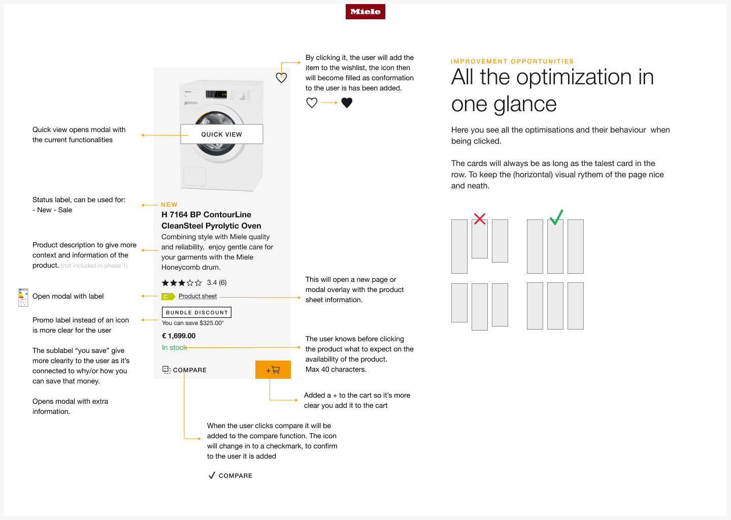
I worked within the Digital retail team and together with the Retail Consumer Experience team. My role involved focusing on the digital aspects of the experience and I was responsible for developing the "big" screen designs for various stages: idle, active during treadmill use and results screen. Additionally, I redesigned the first version of the MVP of the analysis report that is generated based on the completed run(s).
In the initial phase, we determined that the MVP would entail transitioning the existing experience and designs to reflect the Adidas look and feel, while minor UX enhancements were considered, major changes were not within scope. This because of it’s pilot state and because that way we could get results faster.
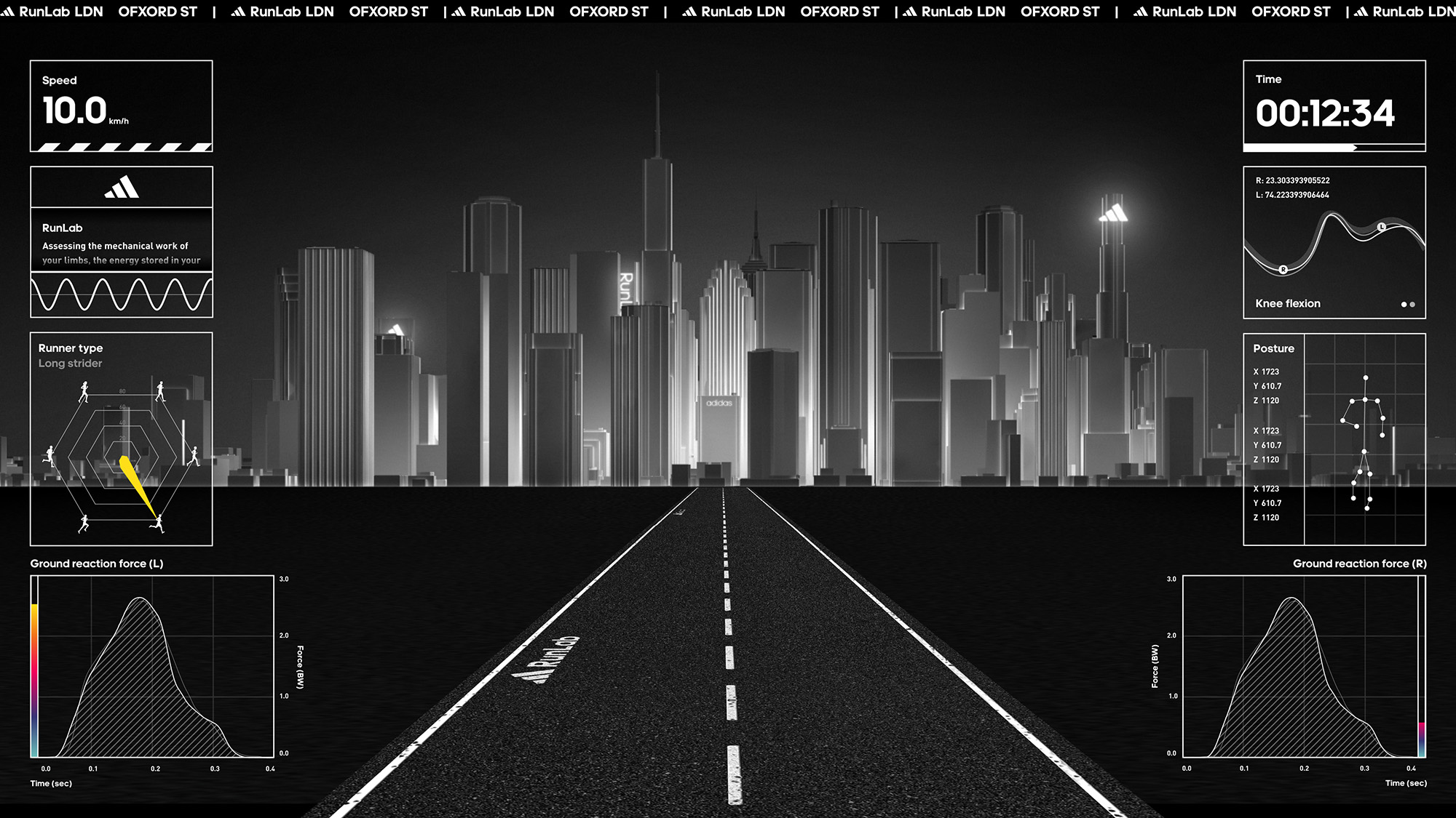
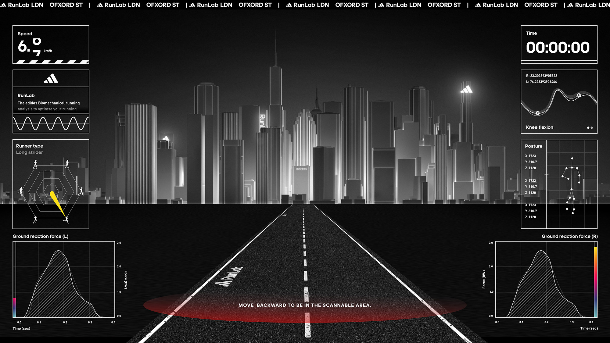
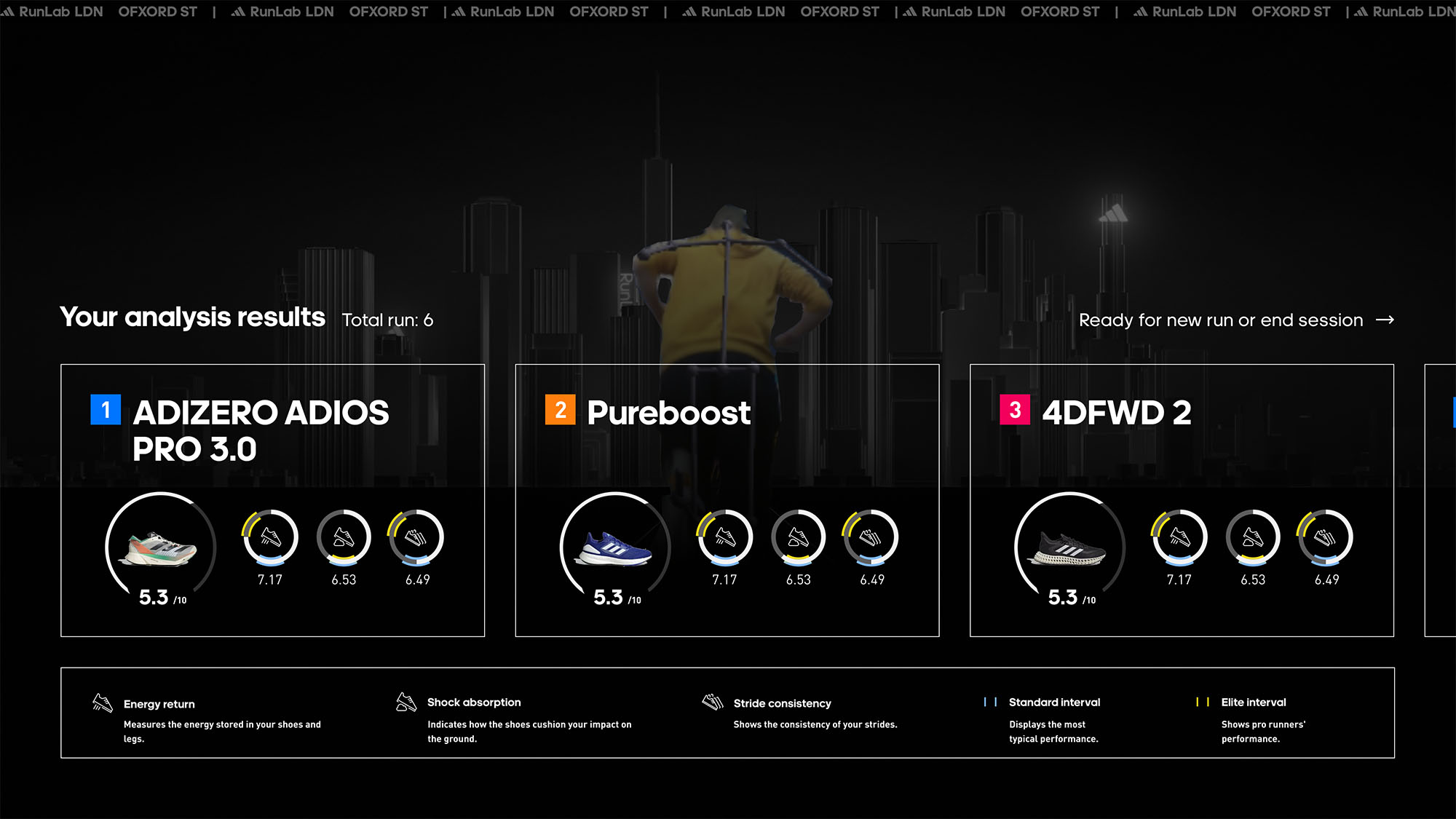
Throughout the entire project, our objective was to infuse a more technical and scientific ambiance by showcasing different metrics being measured on the "big" screen. We pursued an approach similar to “information overload” creating a sense of activity and engagement with multiple elements displayed simultaneously.
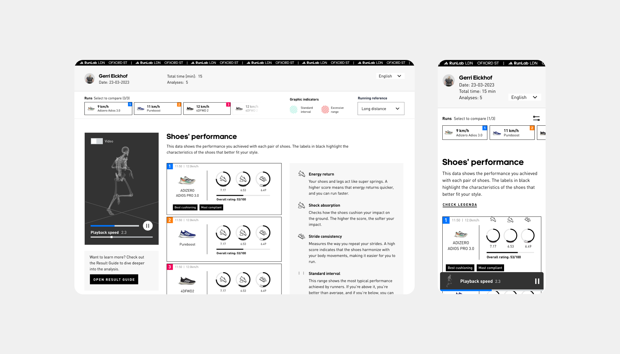
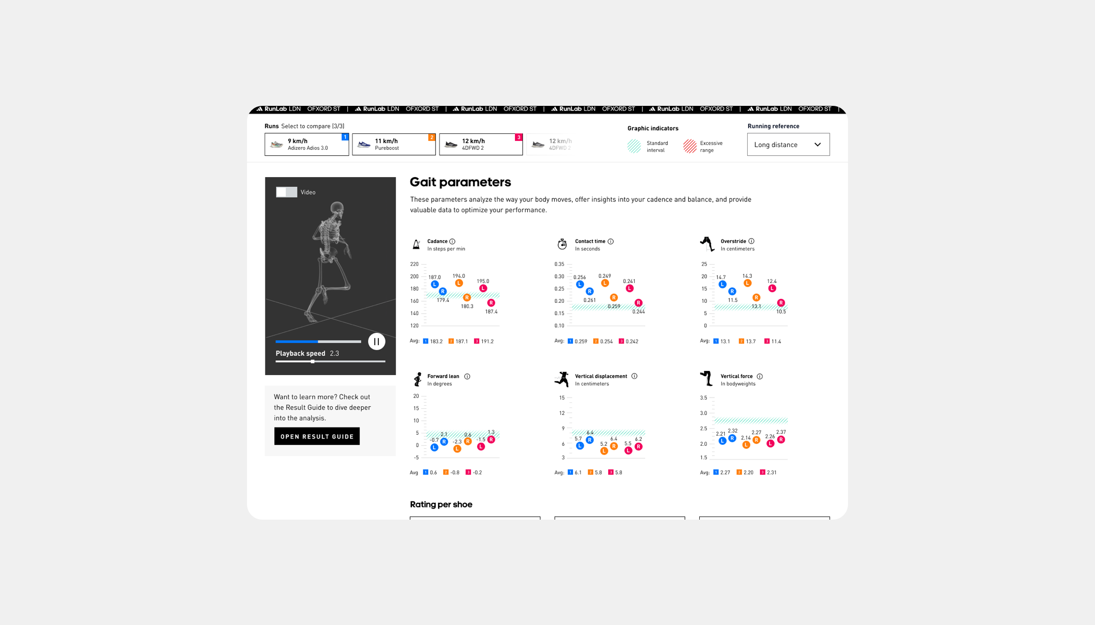
As for the report, our main focus was on enhancing the user experience by integrating extra guidance, ensuring users could navigate and interpret the data more effectively.
Year
2023
Project sort
Client
Director: Thamar Swart
Copywriting: Kevin Marc Koppe
Project management: Lucia Marote

Not Important Identity
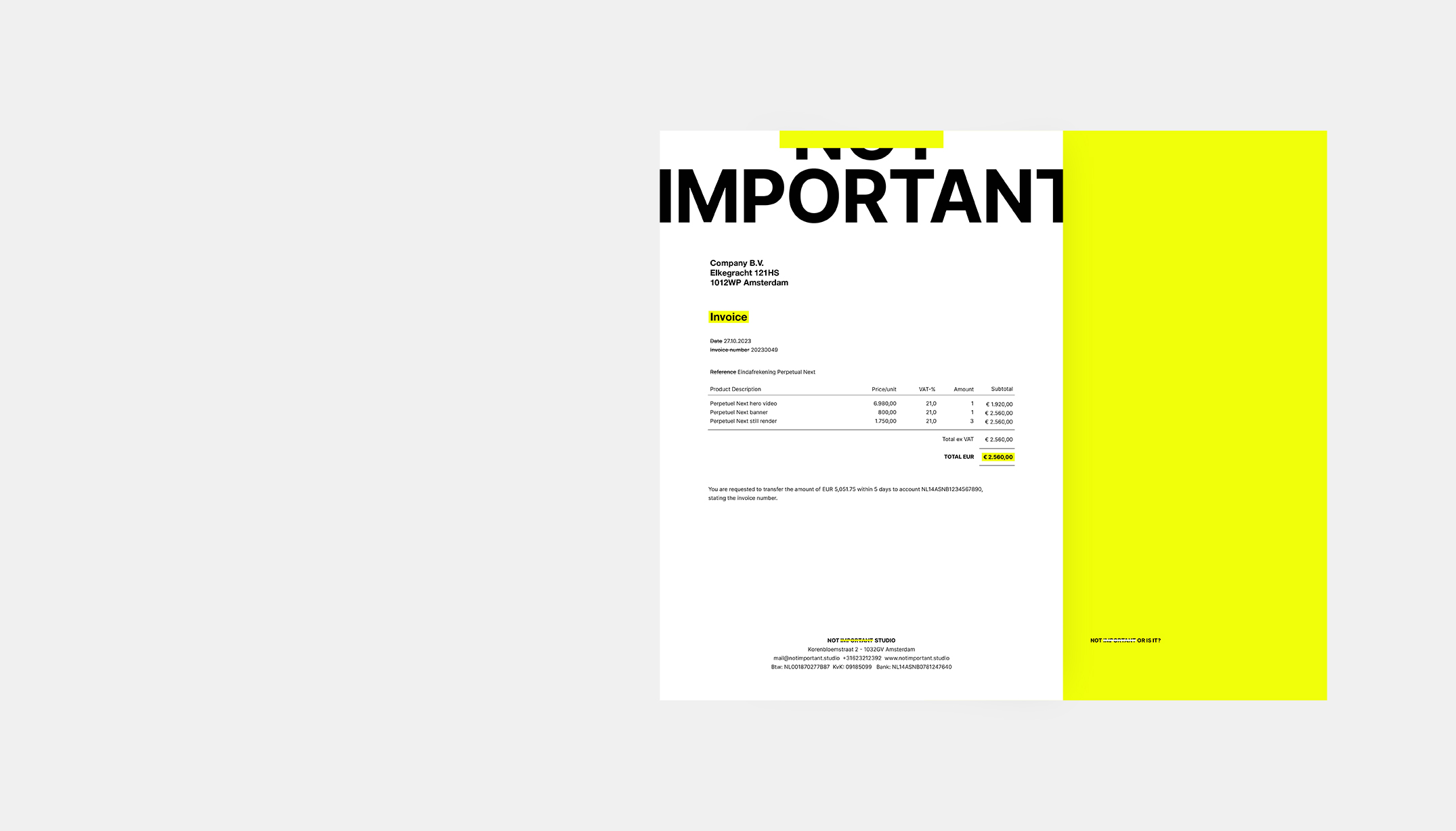
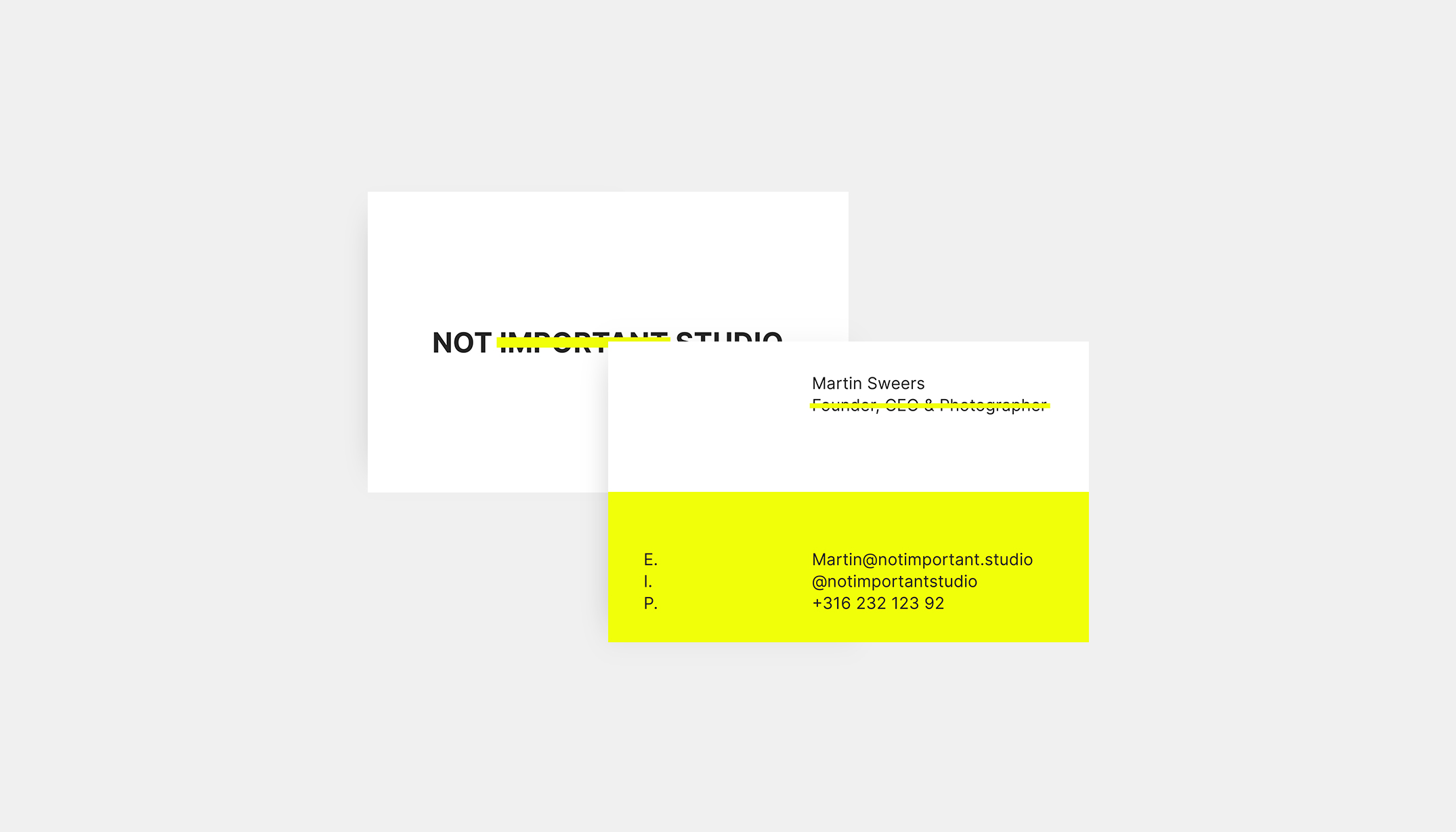
I was asked by Not Important Studio to design a simple and easily usable identity. There was no real budget which created an extra challenge.
Not Important Studio is a content creation studio using the power of CGI and motion picture to create powerful imagery for luxury brands. Their idea is that the work needs to speak for it self the rest does not matter, it is not important.
I came up with the idea not to design a logo in the traditional sense, but rather a feeling which would be achieved by applying a set of rules. These you can trace back to striking-through and highlighting with a marker pen.
Year
2023
Project sort
Client
What did I do
Concepting
Art direction
Branding
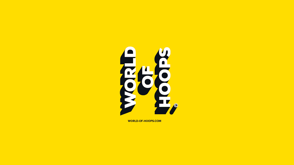
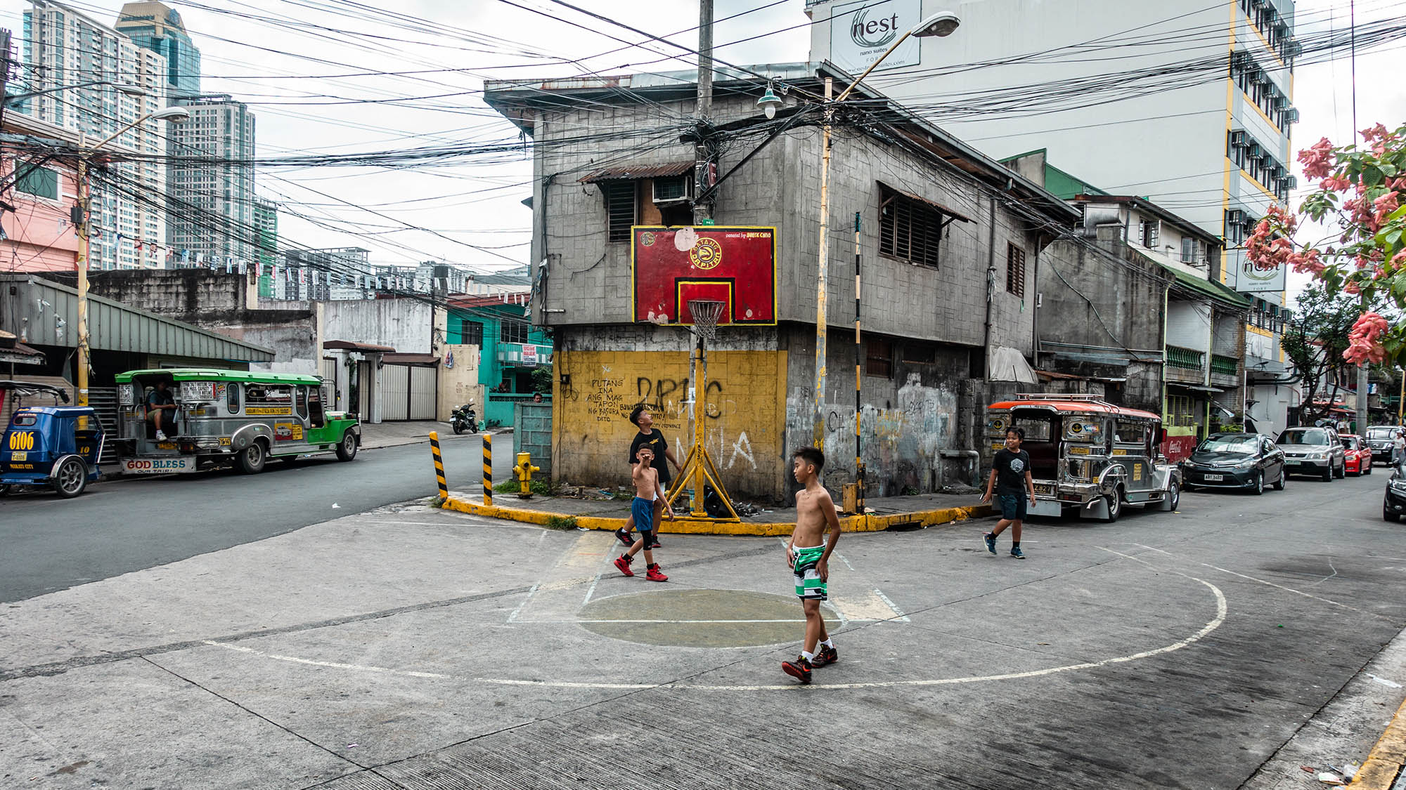
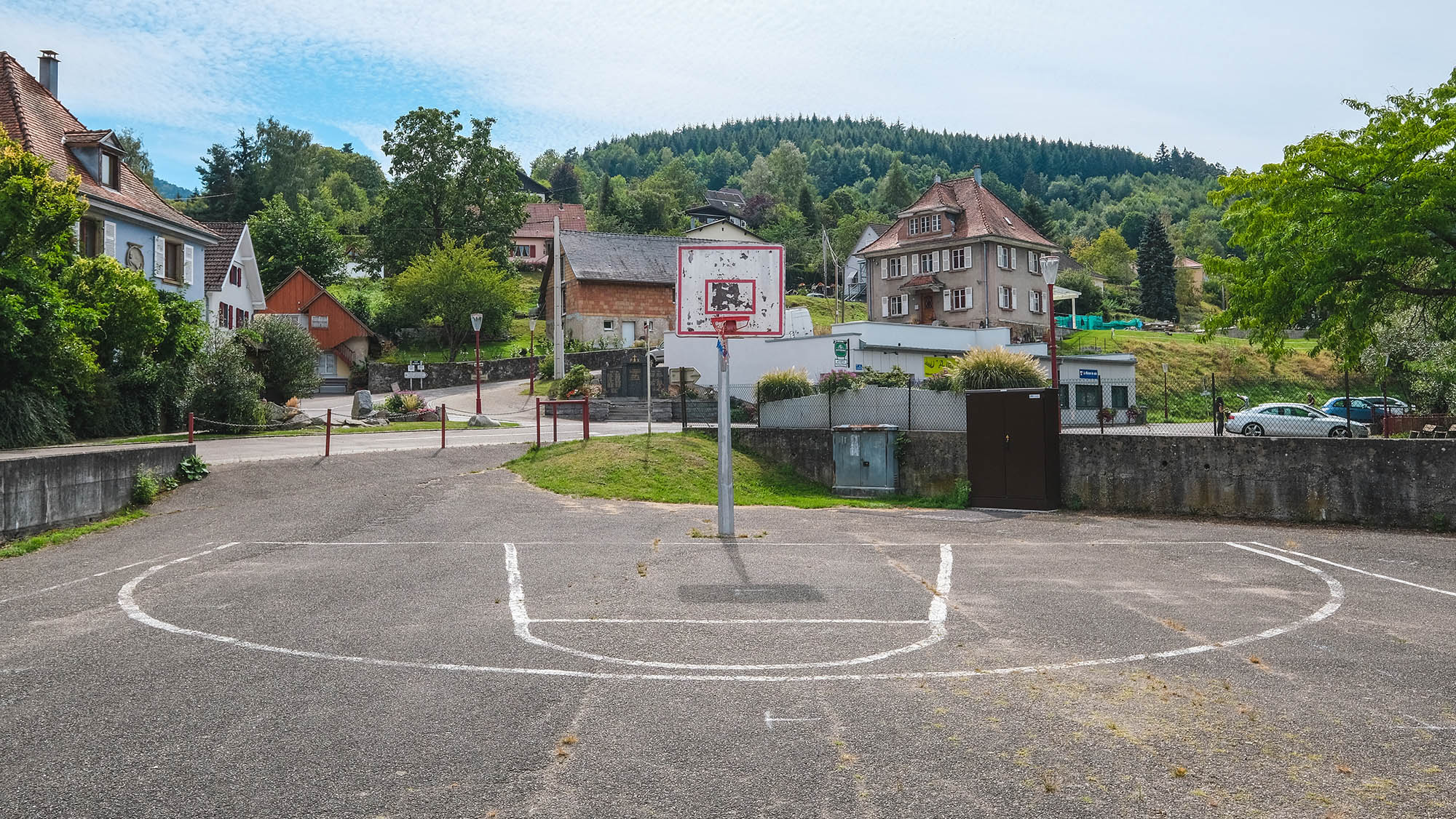
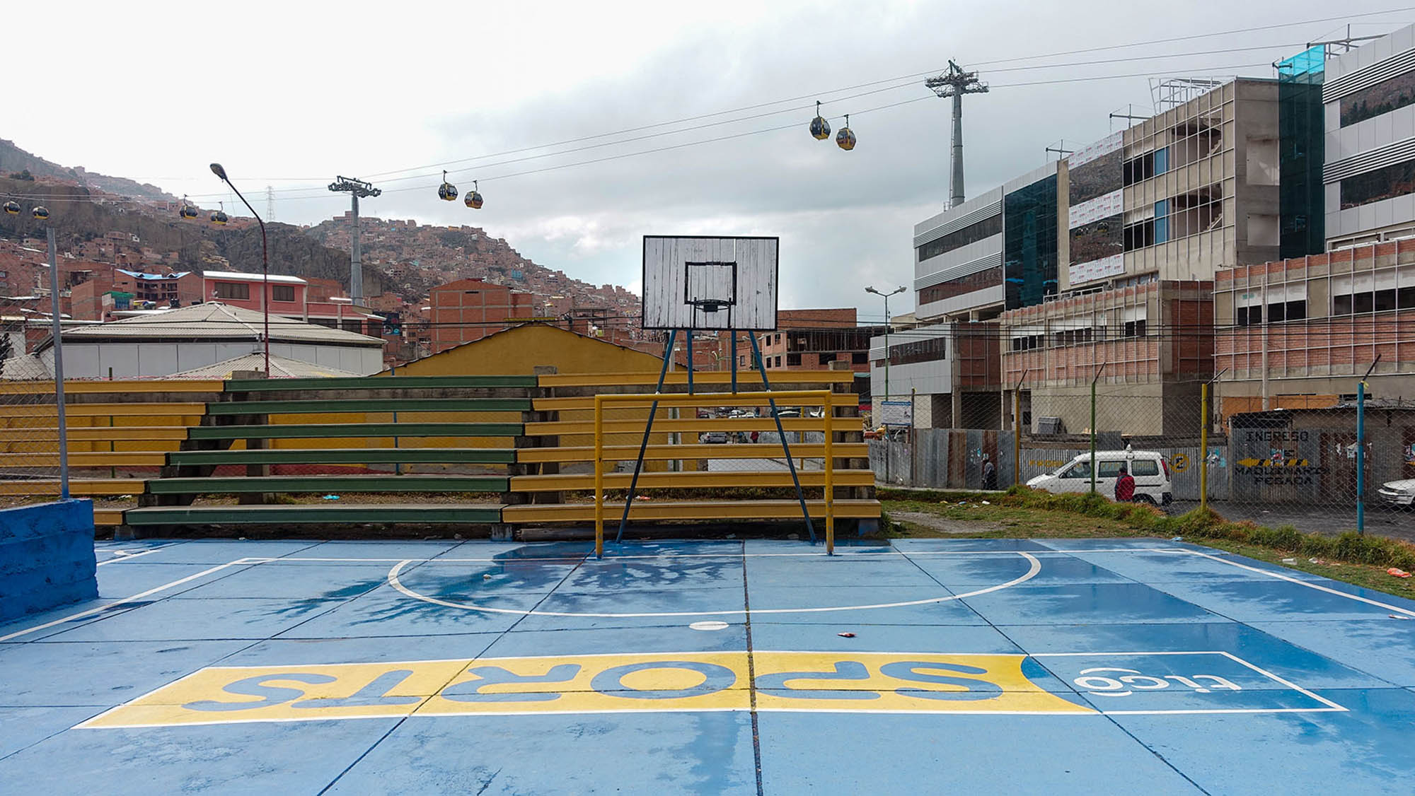
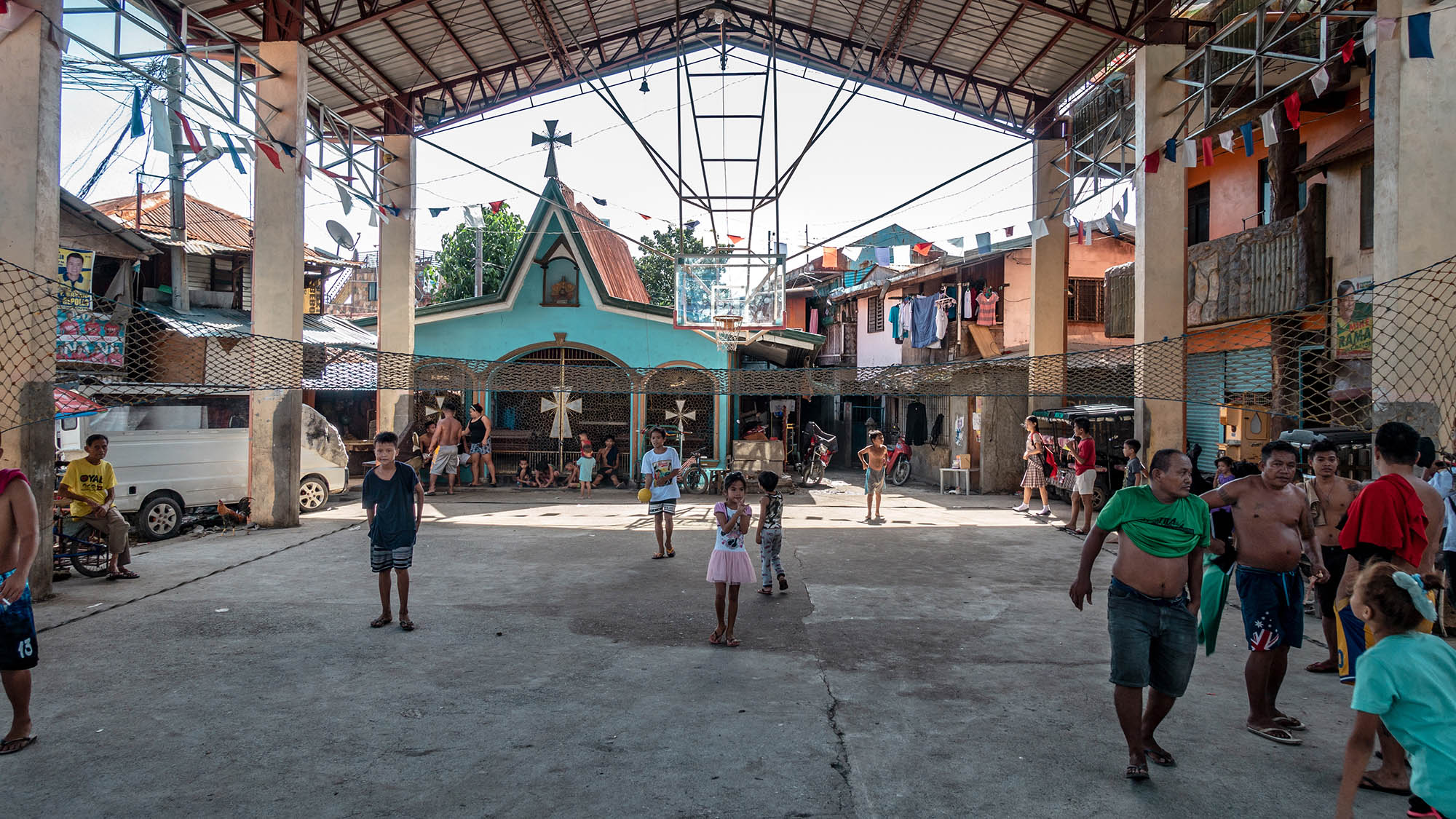
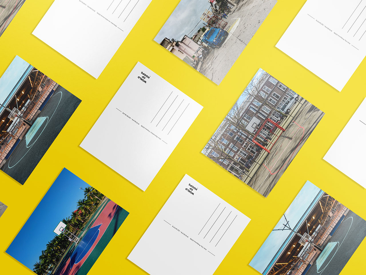
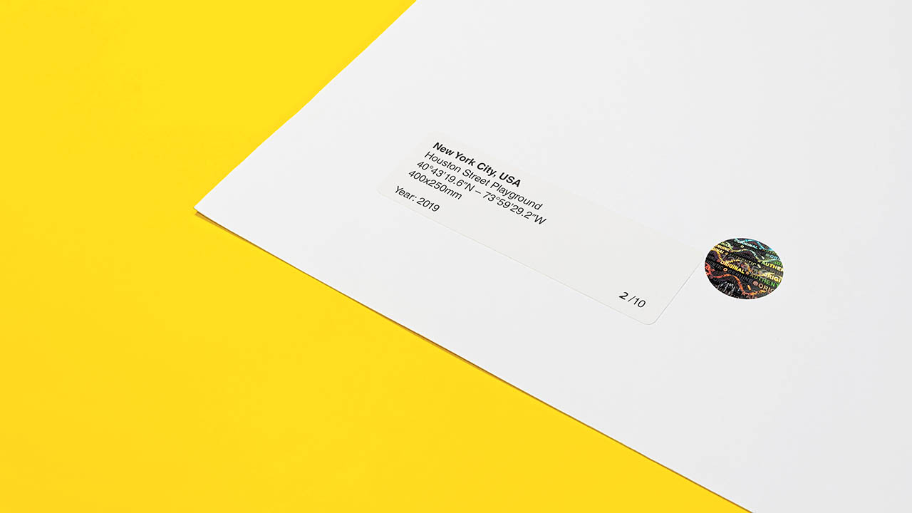
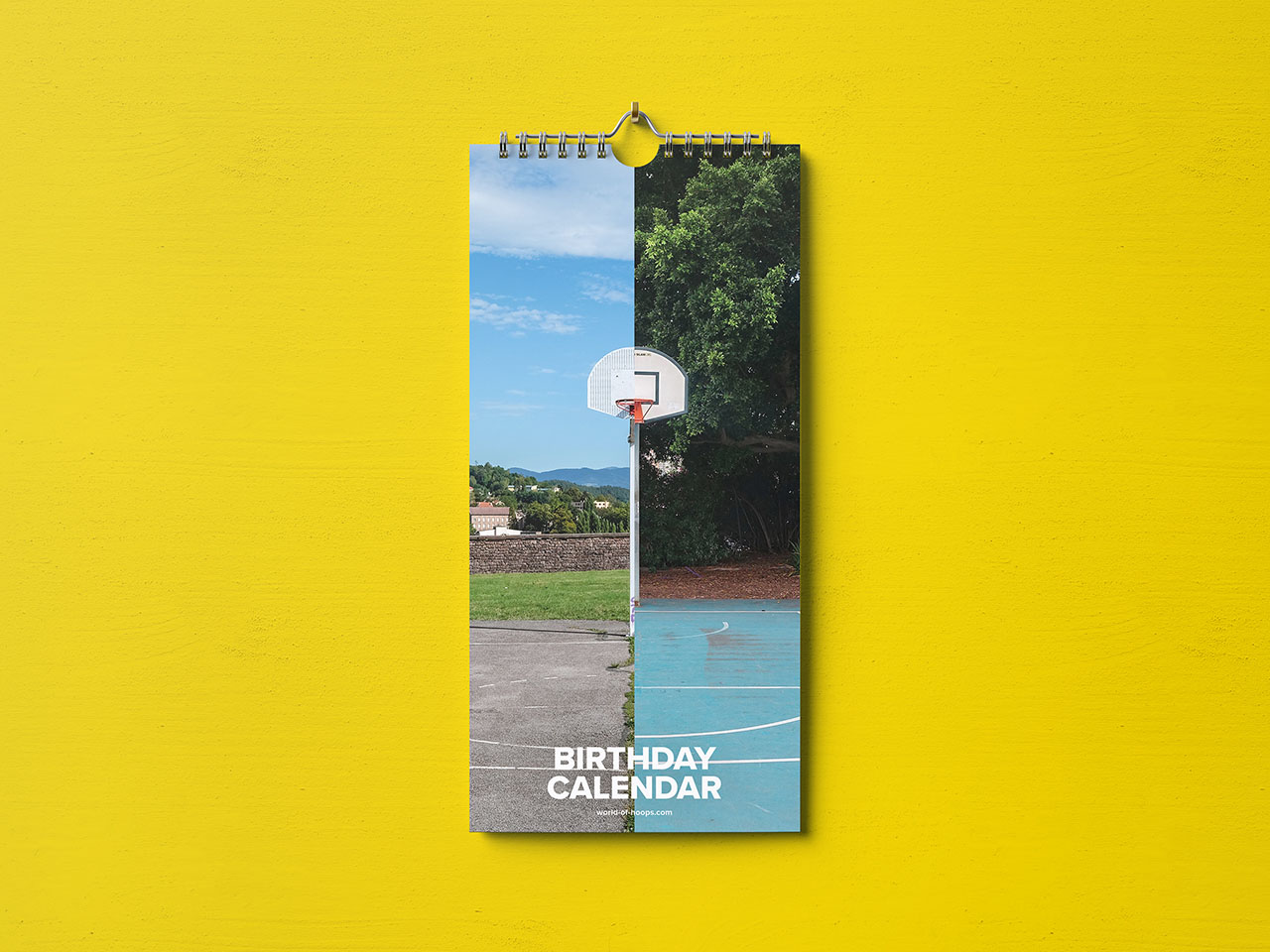
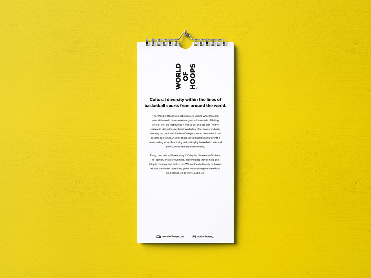
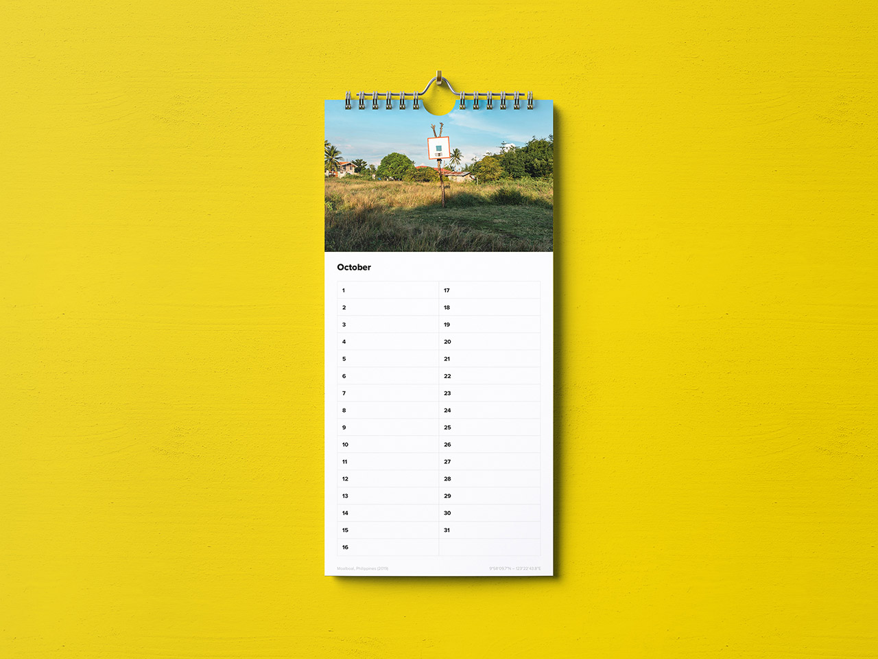
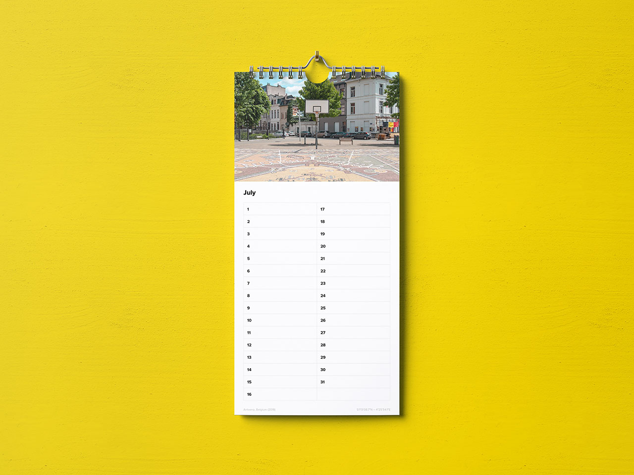
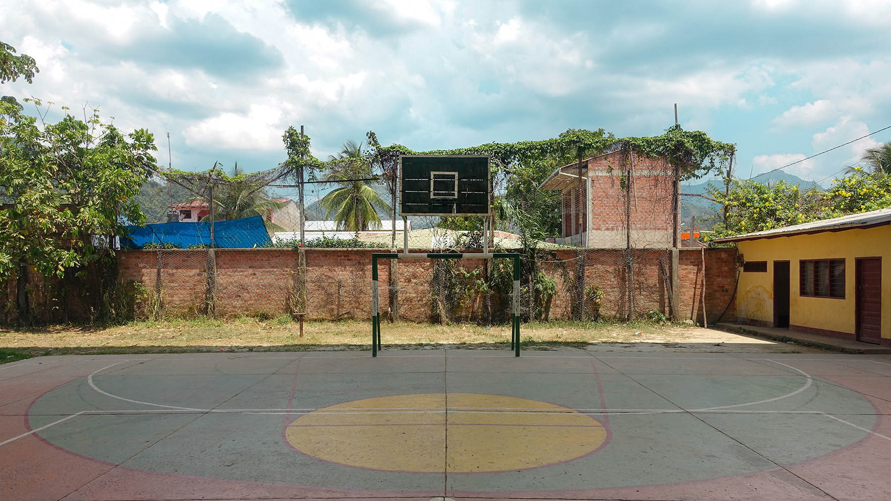
World of Hoops
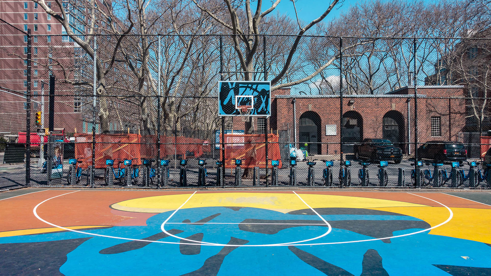
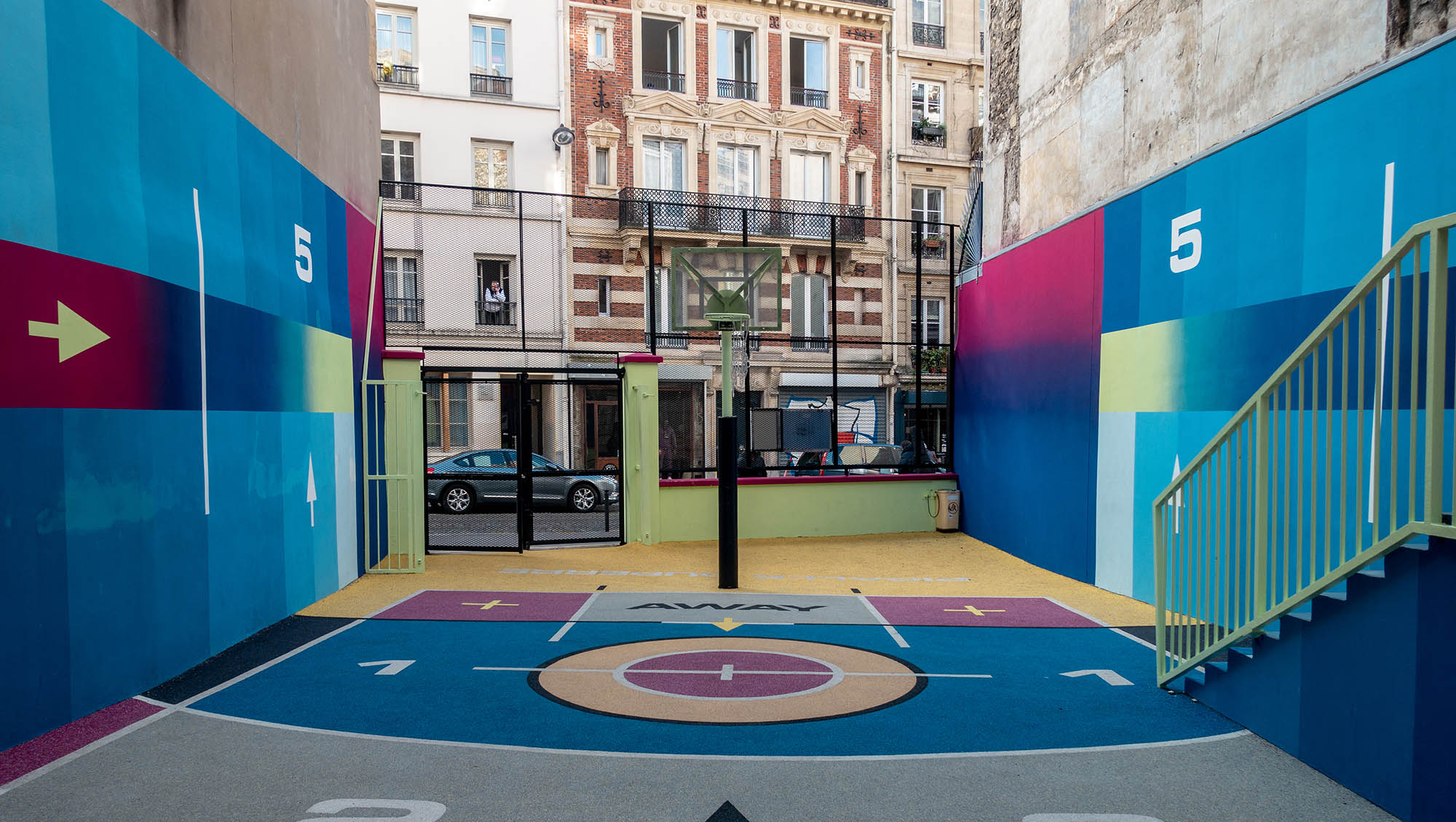
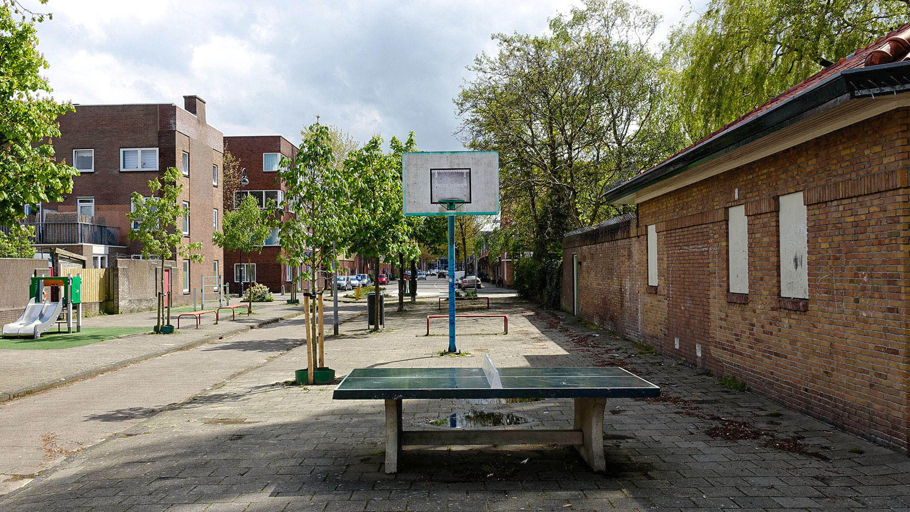
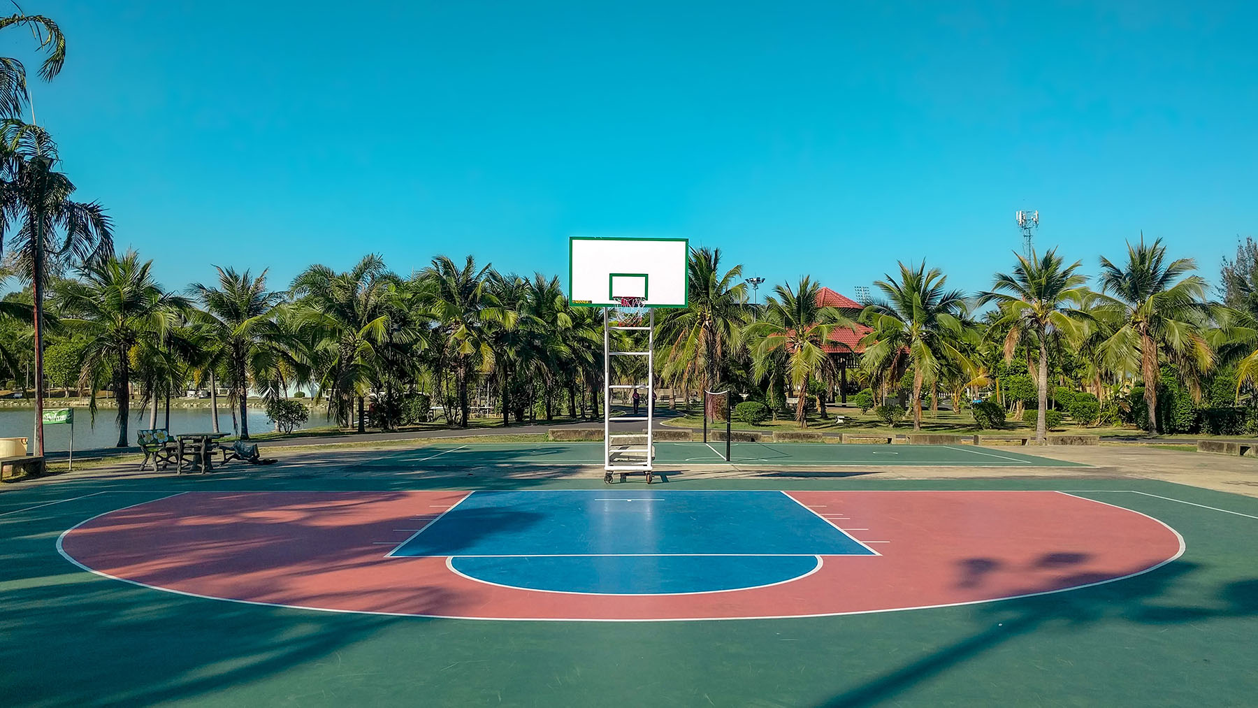
The ‘World of Hoops’ photo project originated in 2015 while I was traveling around the world. It was next to a gas station outside of Beijing where I shot the first bucket. It was so out of place that I had to capture it! It was after shooting the tropical Colombian Cartagena court two months later that I knew that it had become something. It became an interesting way to navigate through a city, to visit neighbourhoods you wouldn’t typically find yourself in, a fun side project while exploring the world.
Over time the photo project grew slowly into a never ending story of capturing and portraying basketball courts and their cultures from around the world. Every court tells a different story if it’s by the placement of its lines, its location, or its surroundings. Nevertheless they all have one thing in common, and that’s a rim. Without the rim there is no basket, without the basket there is no game, without the game there is no life, because we all know…Ball is Life.
Year
On going
Project sort
Self initiated
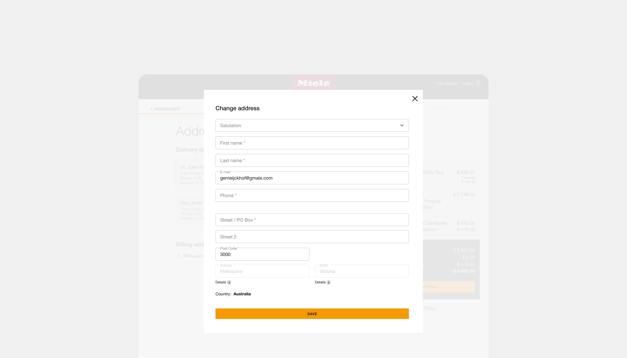
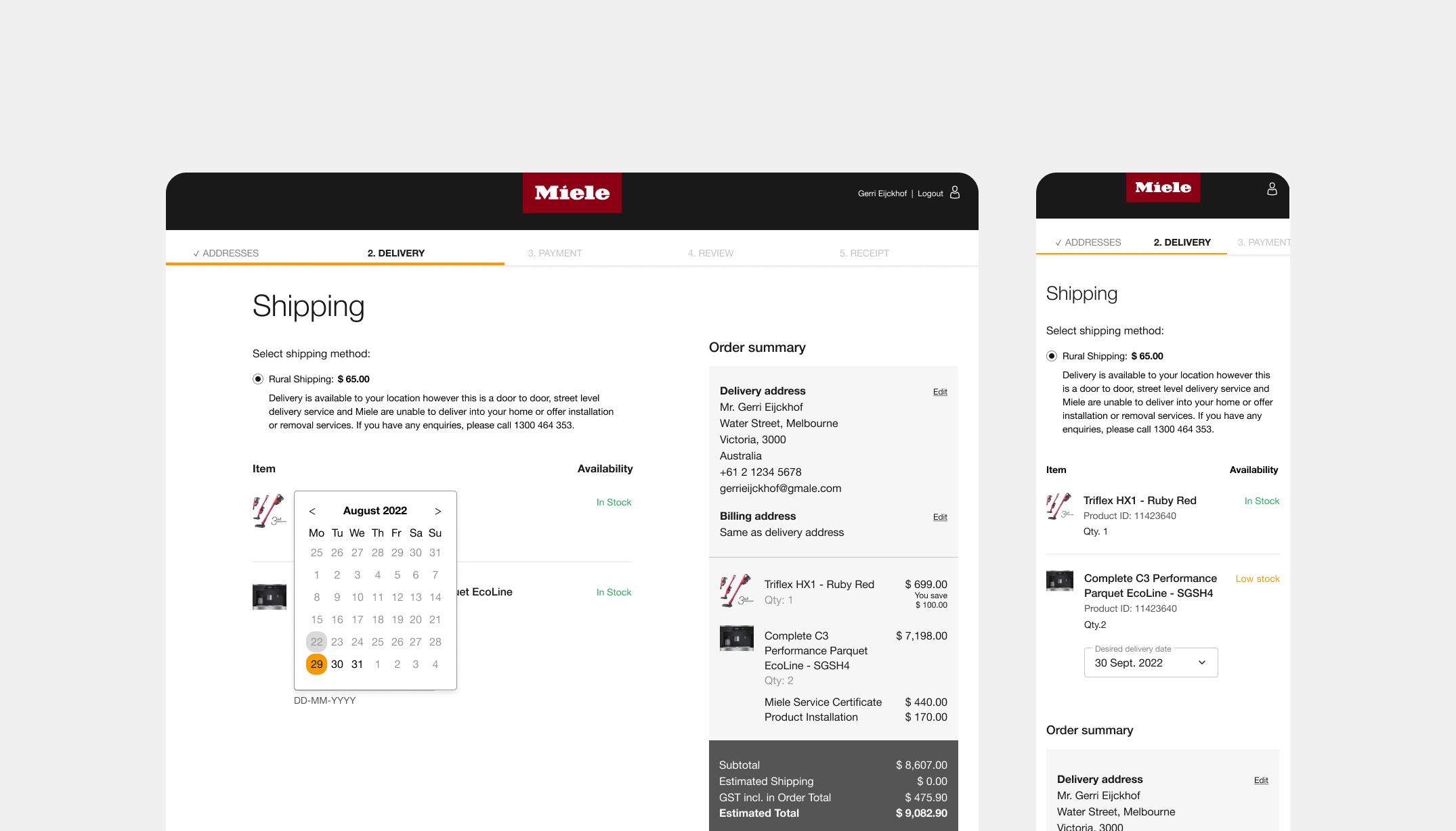
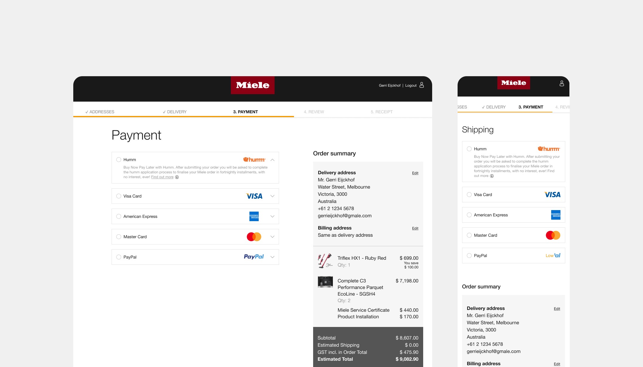
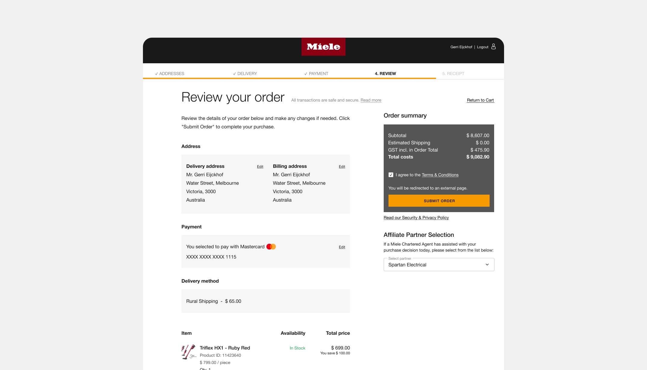
Miele eCommerce
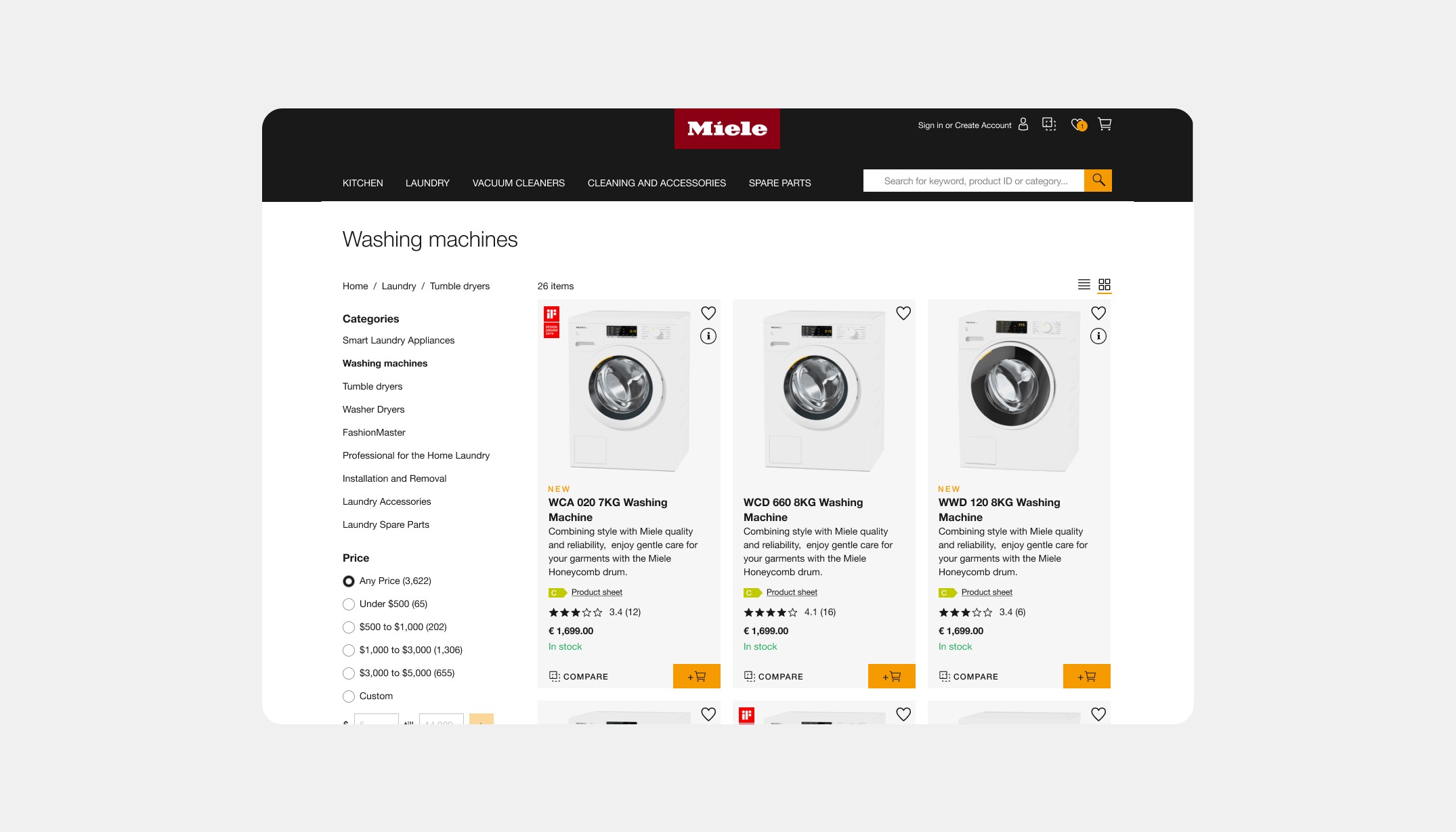
Miele was moving from multiple ecommerce platforms to one. This takes time so they wanted help with one of the platforms, as the migration to the new platform was not going to happen in the foreseeing future. This was a platform for several markets, with Australia being the biggest.
The problem: they faced was that the platform felt outdated but needed to stay in function for quite some time. So the goal was getting on to par with the industry with an extra challenge of a minimum research availability.
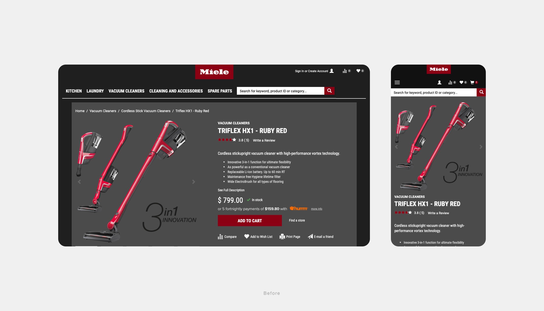
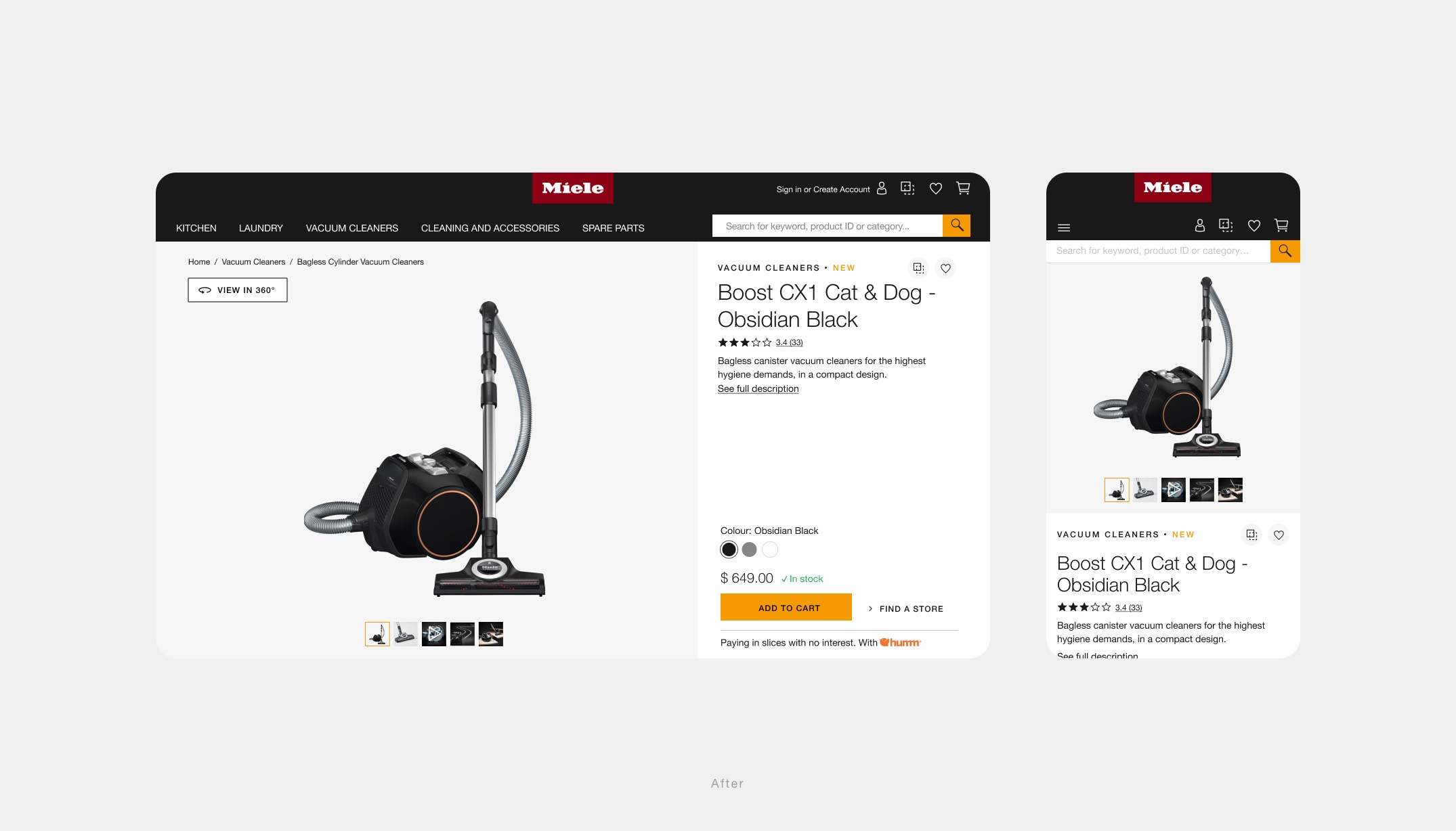
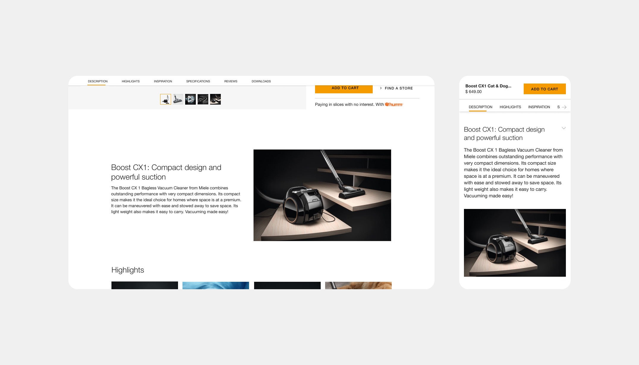
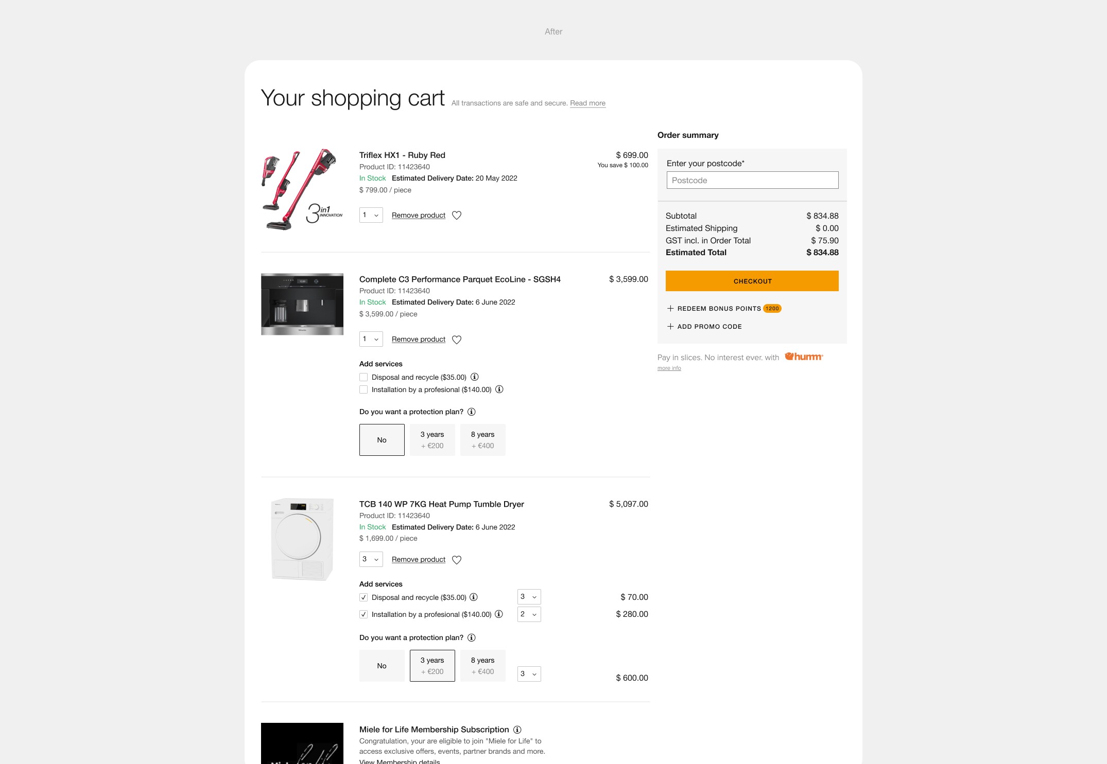
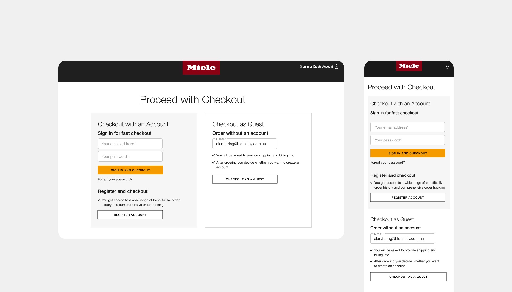
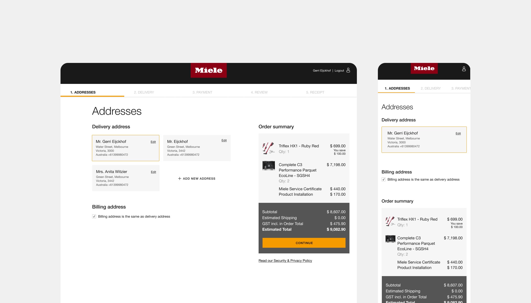
Solution: Through Baymard Institute research, benchmarking and a little user-testing we were able to get insights on what we were doing well, and what we could improve the experience for users. We did this by providing relevant information at the right time throughout the journey and by removing clutter & distraction from pages.
We were able to clean up the fundamentals and create a clear hierarchy of buttons, fonts, icons and colour usages. We moved from a dark to light themed website. Which resulted in improvements on the PLP and its product cards, PDPs, cart and the checkout flow. Because of these changes the new look connected better within the other Miele eCommerce platforms and brand.
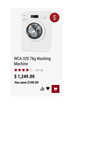
The result was that consumers were able to find relevant products more easy. We saw an uplift of 45% in product views and an increase of 59% of add to cart interactions.
Overall we measured that the Click Through Rate (CTR) within the webshop customer journey of Australia went up to 64% in Q1 & Q2 (2022).
Year
2022
Project sort
Freelance
Client
Miele
Worked closely together with Marinus Ames (UX)
What did I do
Visual design
UX design support
High fidelity prototyping
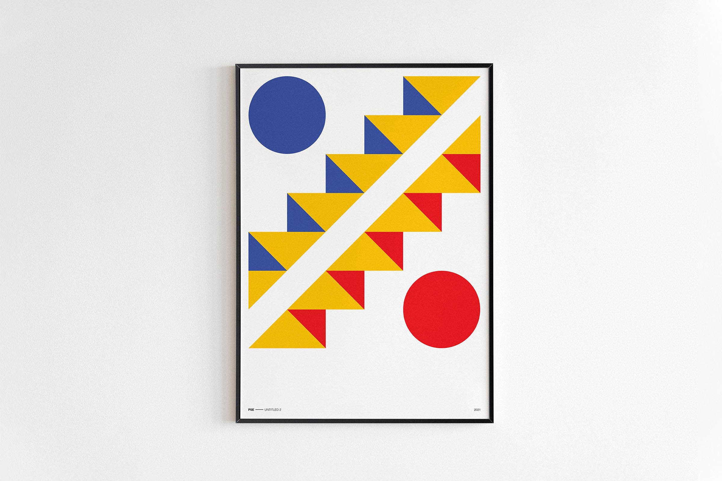
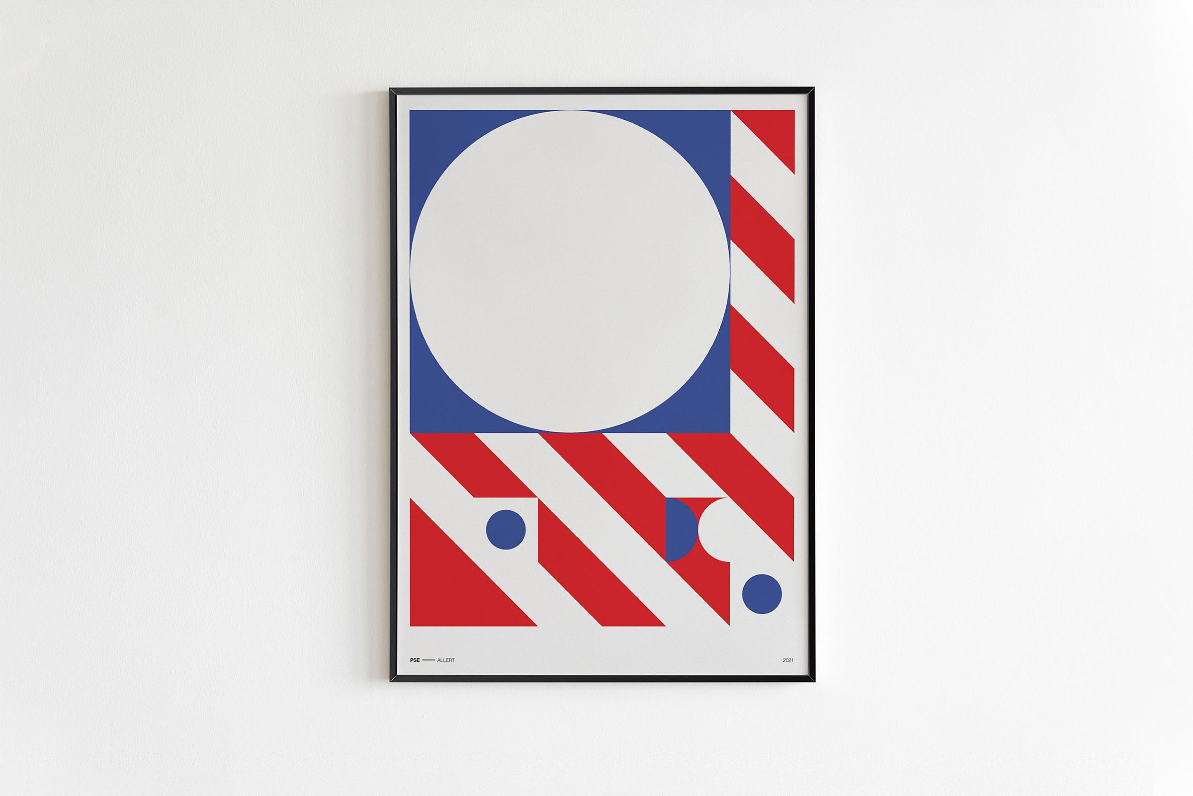
Primary Series Experiment
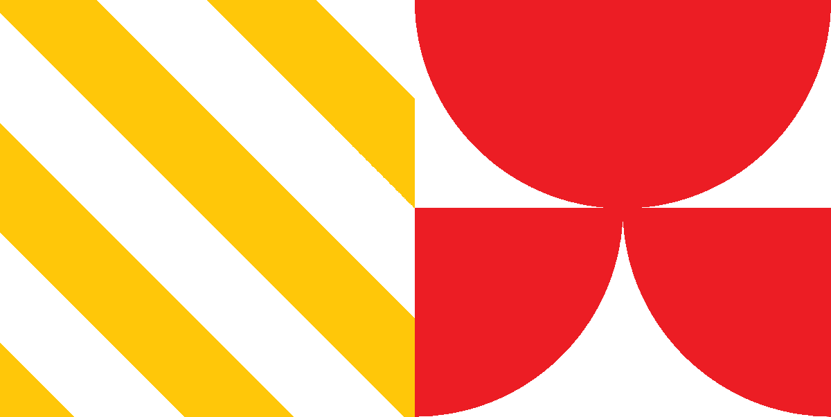
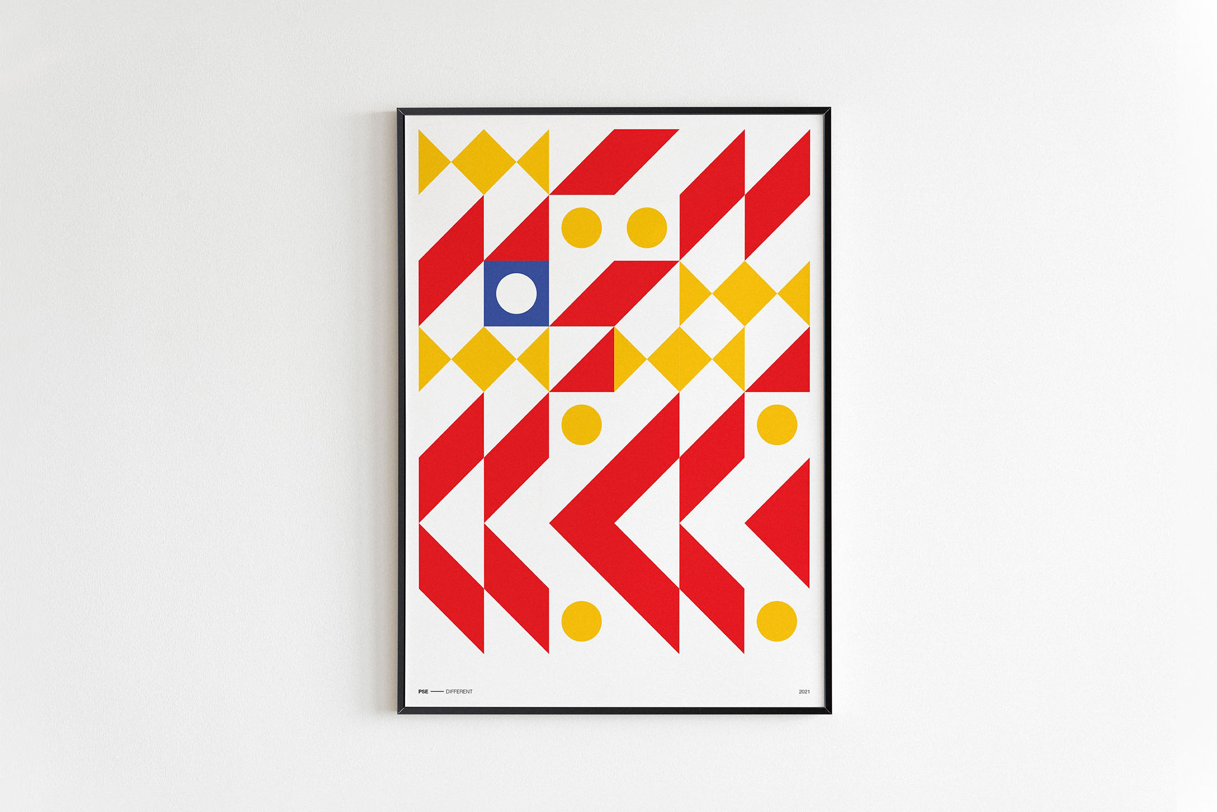
Within the Primary Series Experiment (PSE) I've challenged myself by limiting myself to design compositions within a grid system and a fixed amount of shapes & colours.
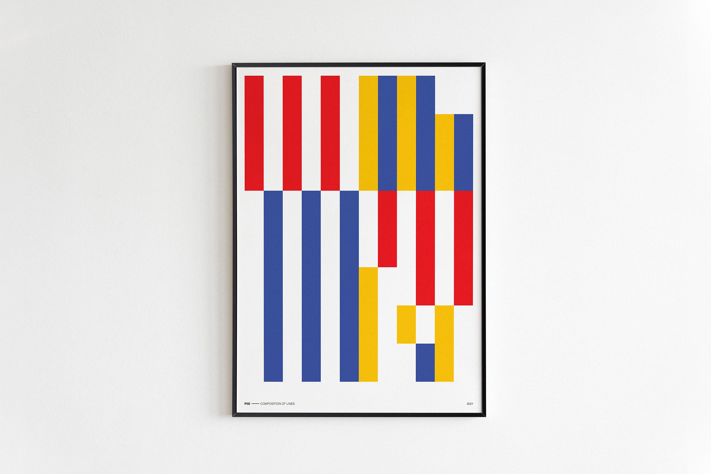
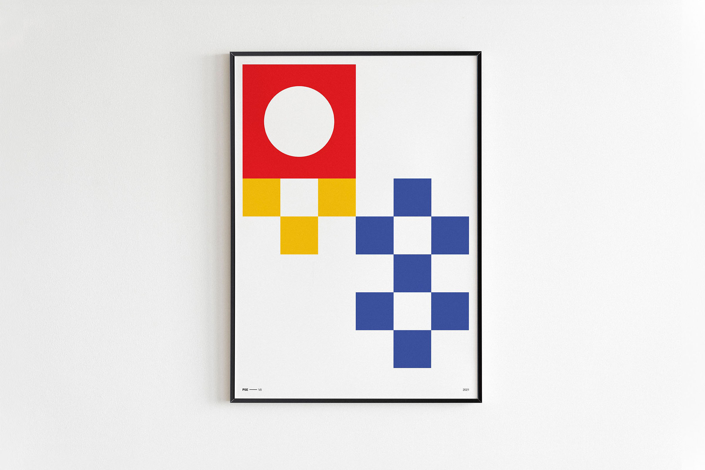
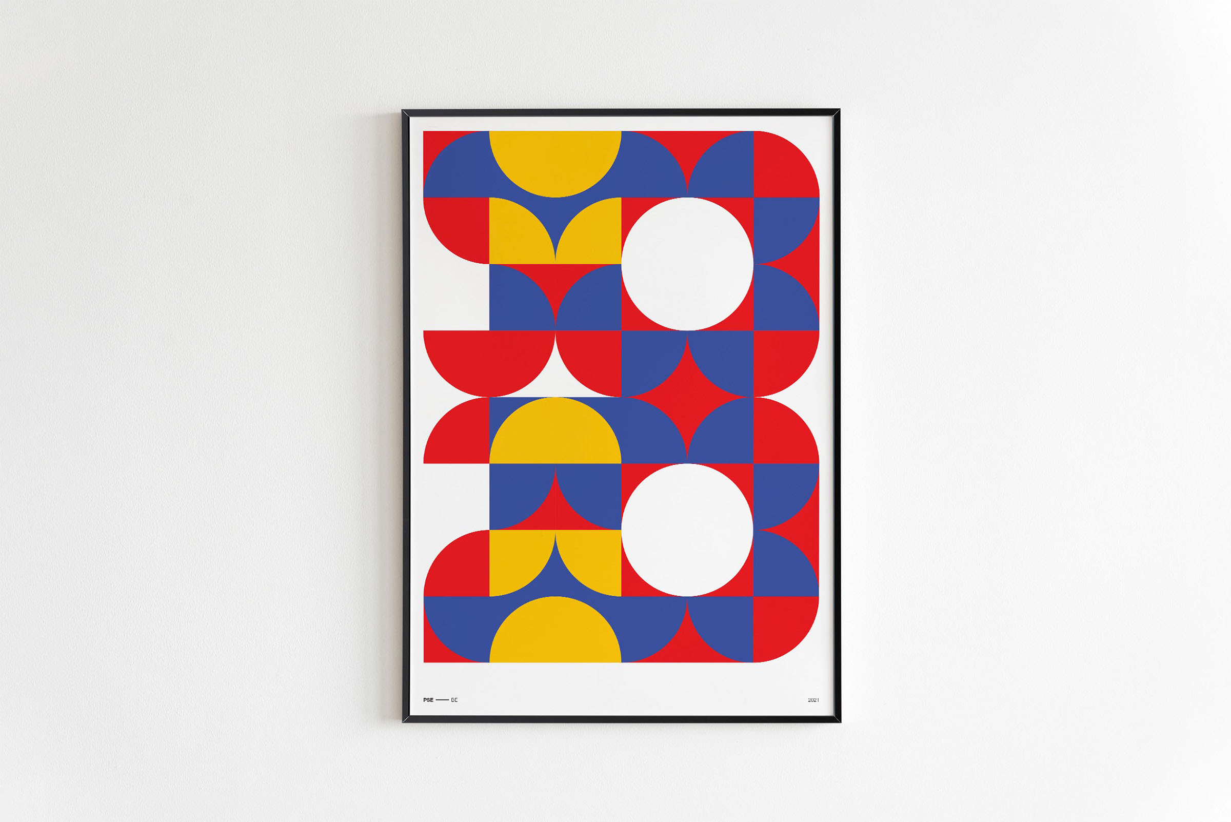
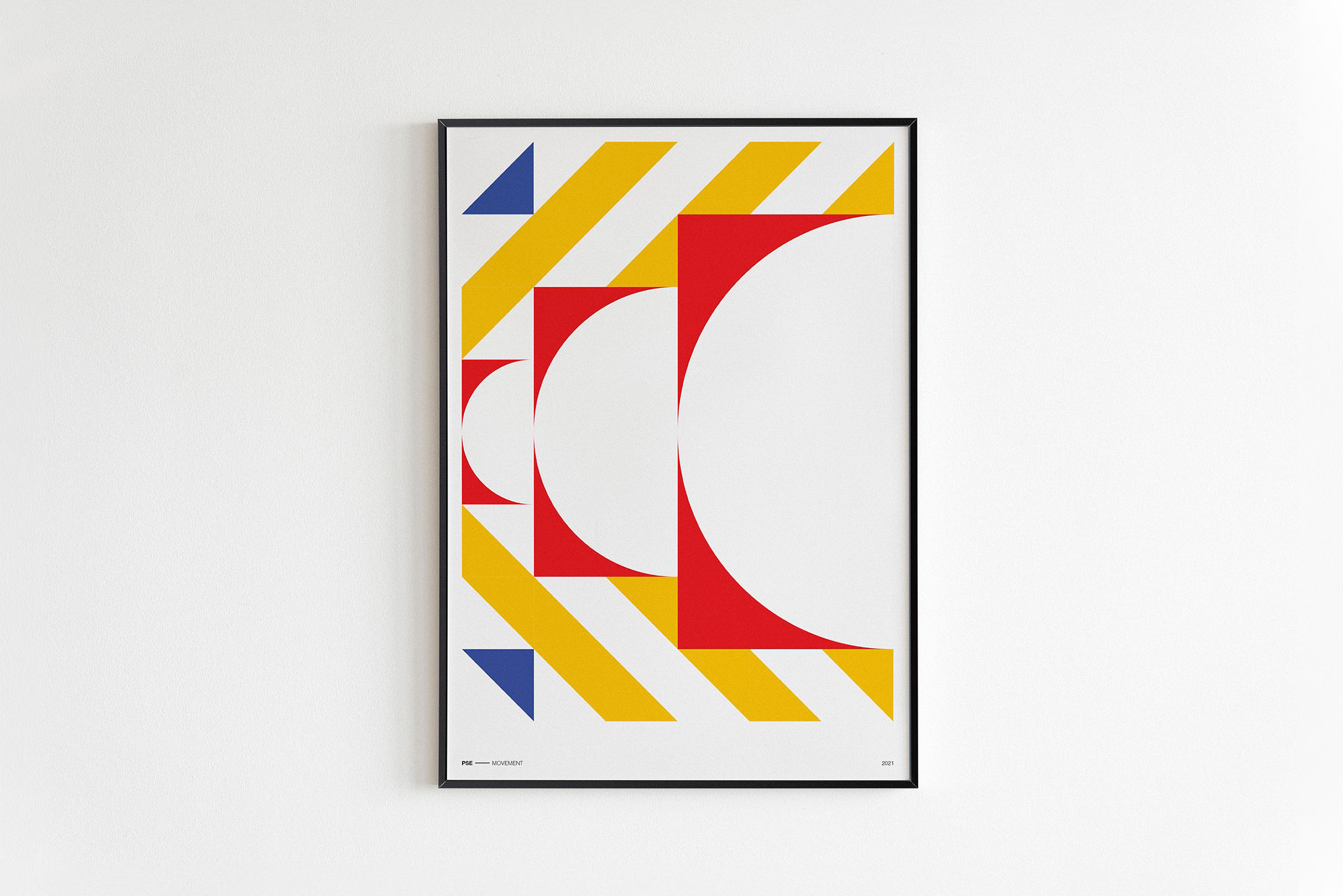
Year
On going
Project sort
Self initiated
What did I do
Concepting
Art direction
Graphic design
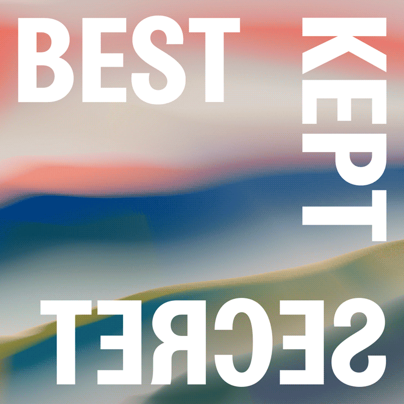
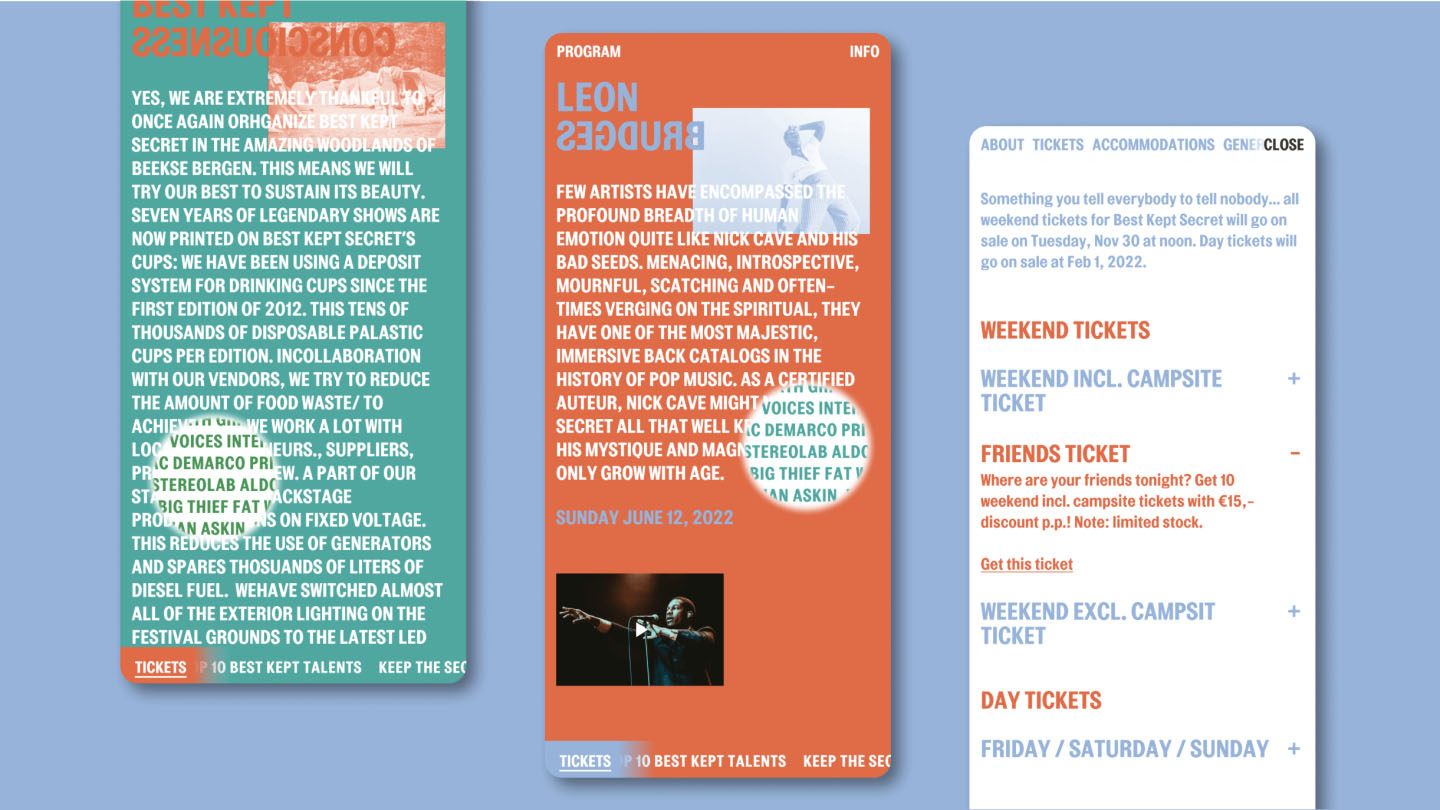
Best Kept Secret
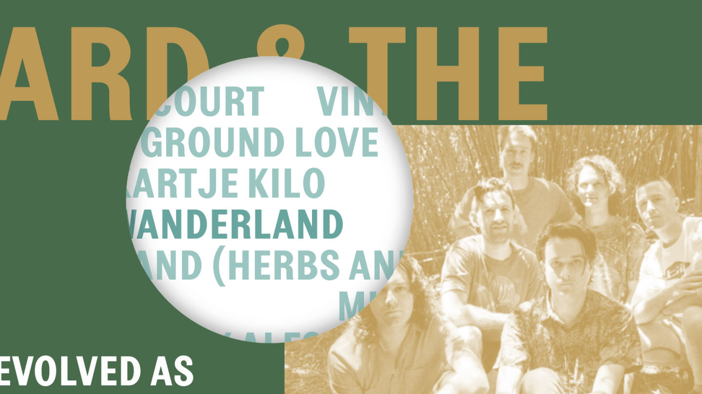
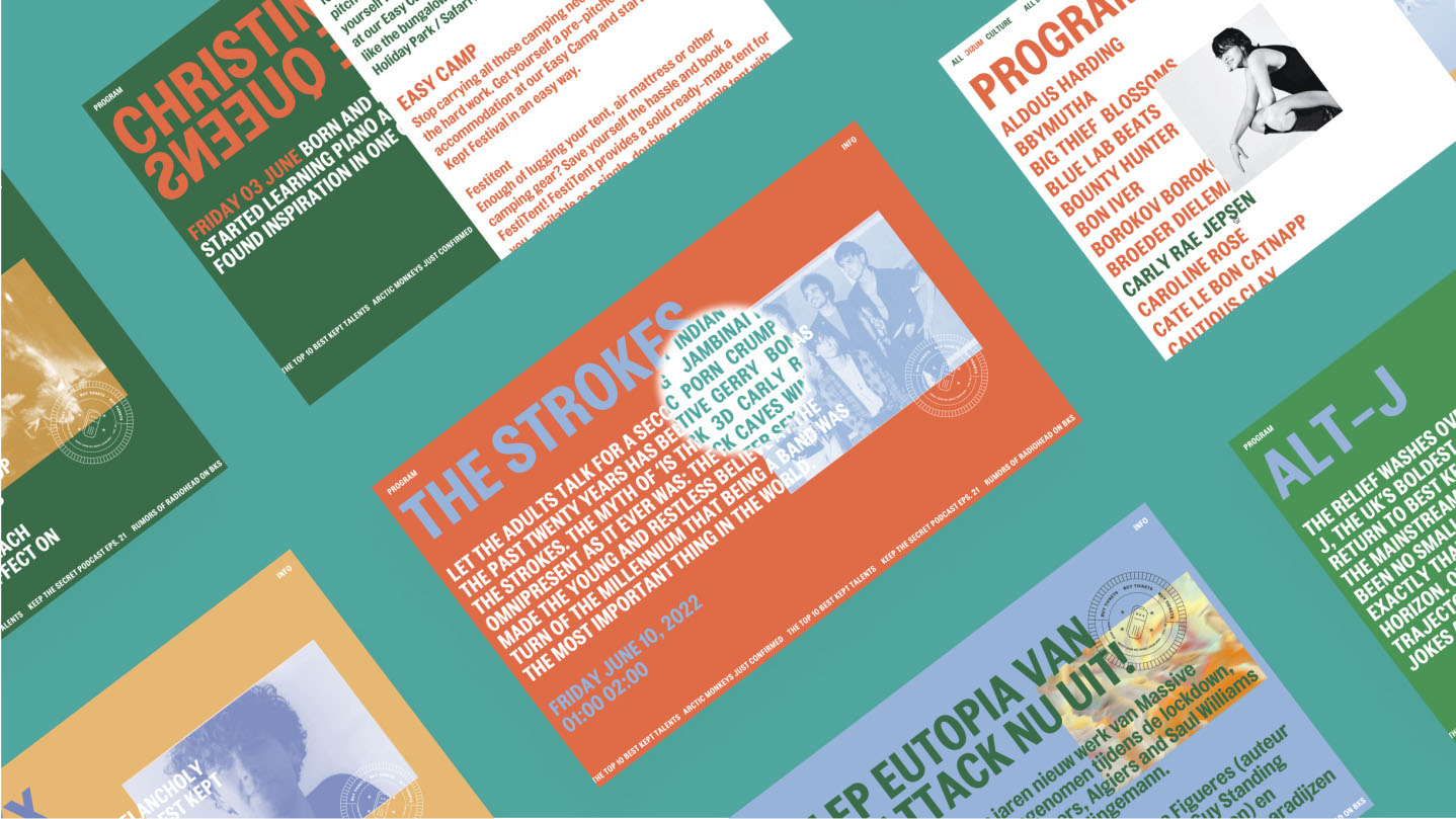
Agency Bravoure asked me to help out with the website of the Best Kept Secret festival. The festival got a (digital) rebranding were we translated the concept ‘Music through the lens of culture’ into an innovate but user friendly UX concept.
We came up with the idea to make an actual zoom lens that will let the visitor discover the program, full of secrets, by going deeper and deeper through the artists and cultural program items. Kind of how you explore a festival in real life!

Awarded with one 2022 Silver DIA for Brand
Year
2021
Project sort
Freelance
Client
Bravoure
Worked closely together with Simon Sitanala
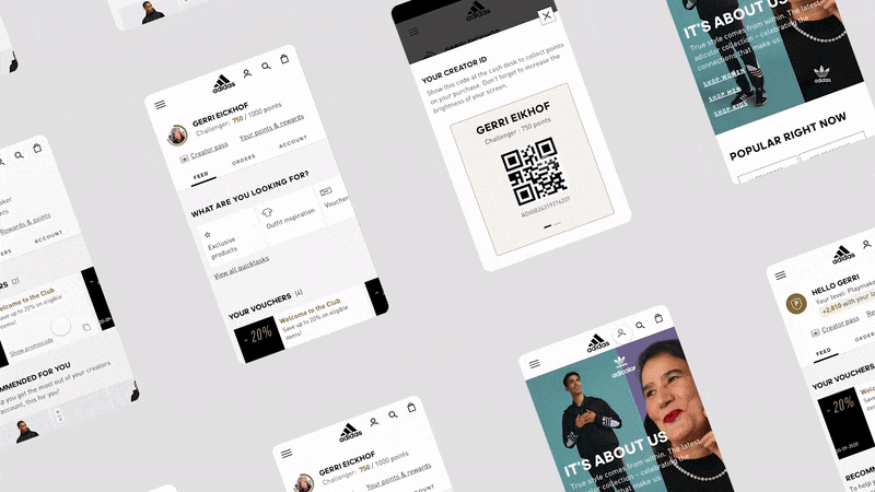
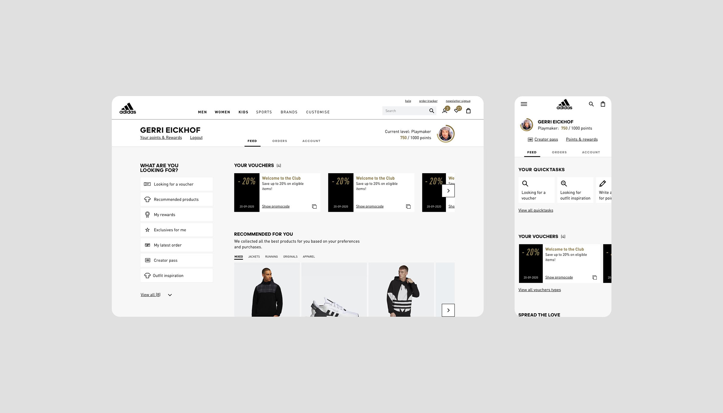
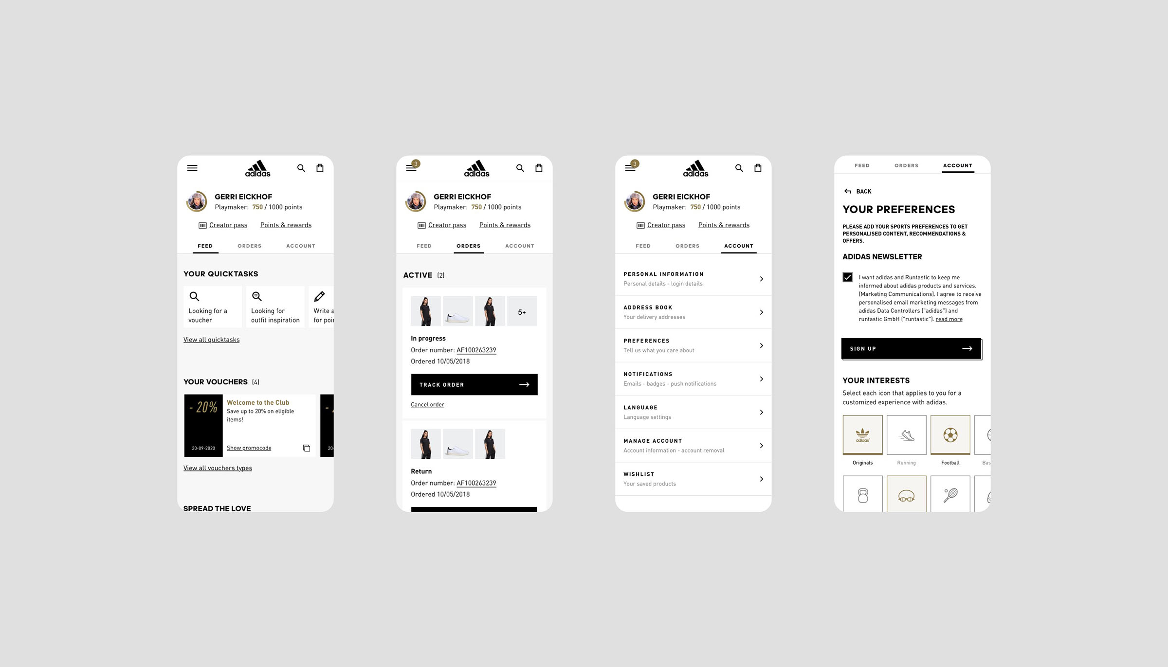
adidas Membership
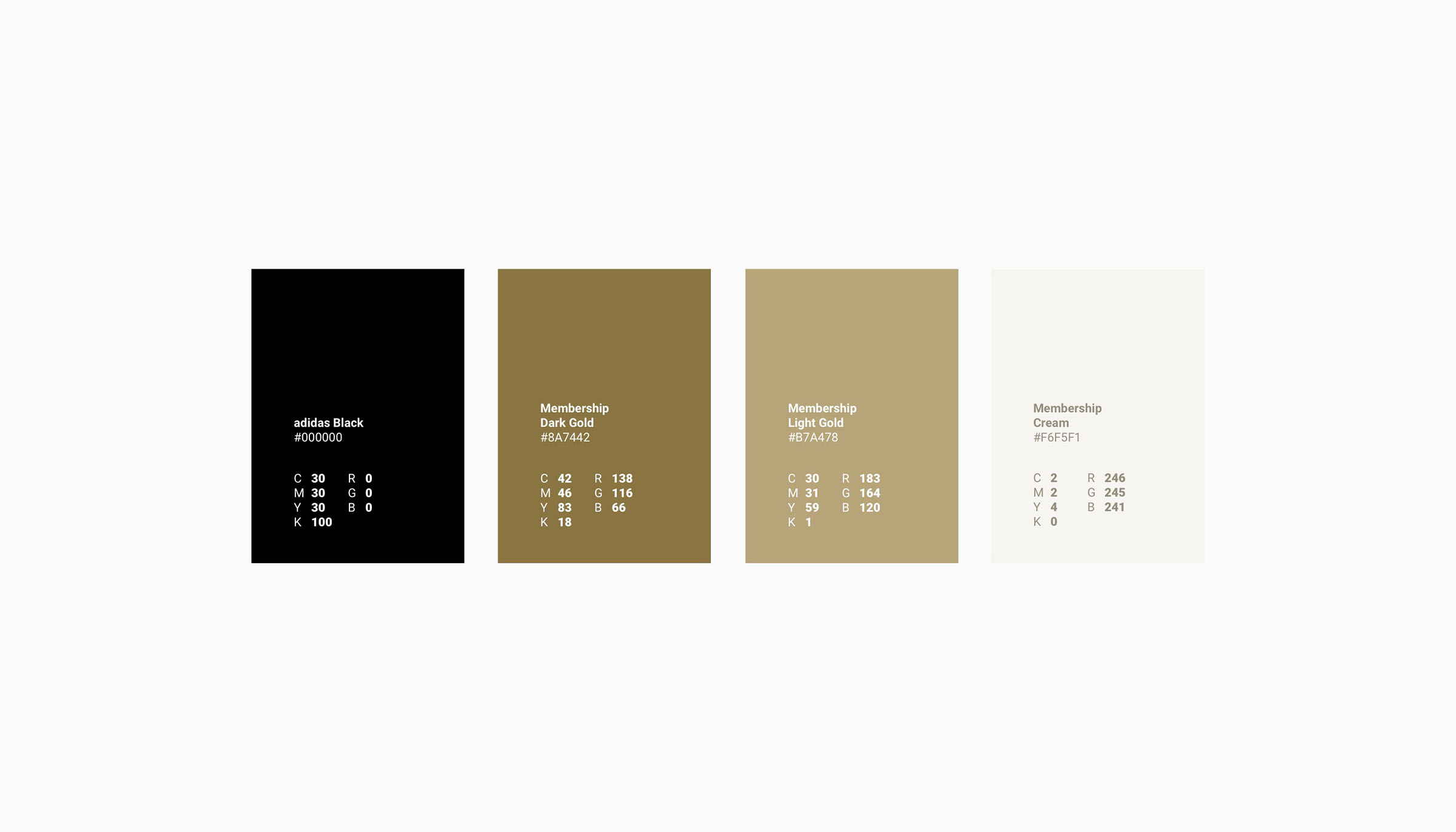
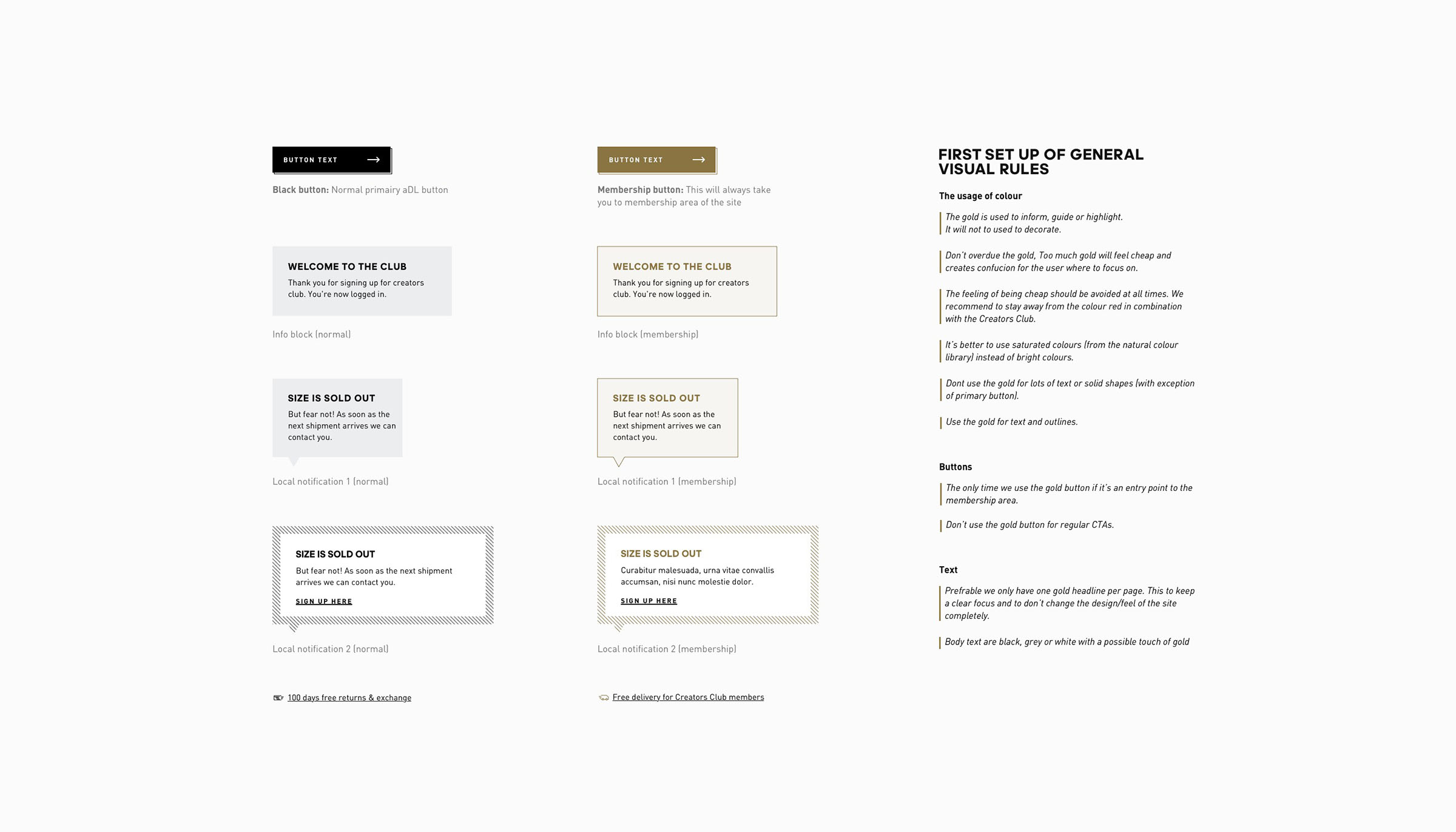
Adidas wanted to provide unique membership deals & promotions. But there was no identifier for the consumer to understand what was for members. So we created coherent membership visual style that helped differentiate the journey from non logged in consumers.
There were several challenges that came with this. It needed to fit within the exciting adidas design language. All content was not in our hands and it needed to work on different pages through the journey.
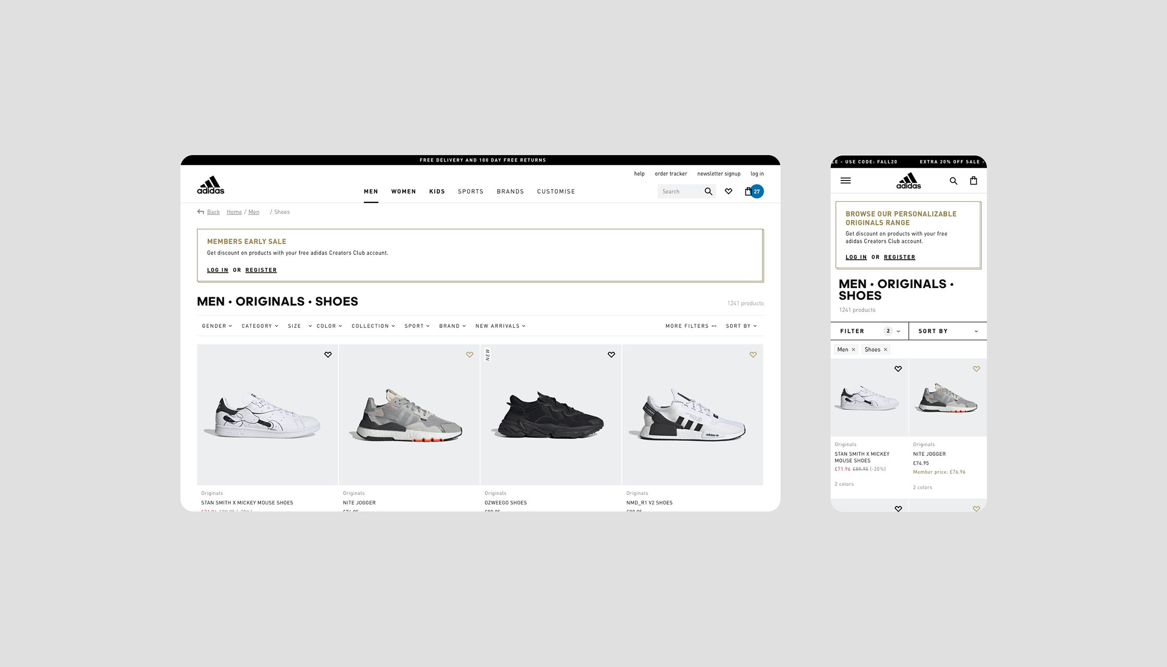
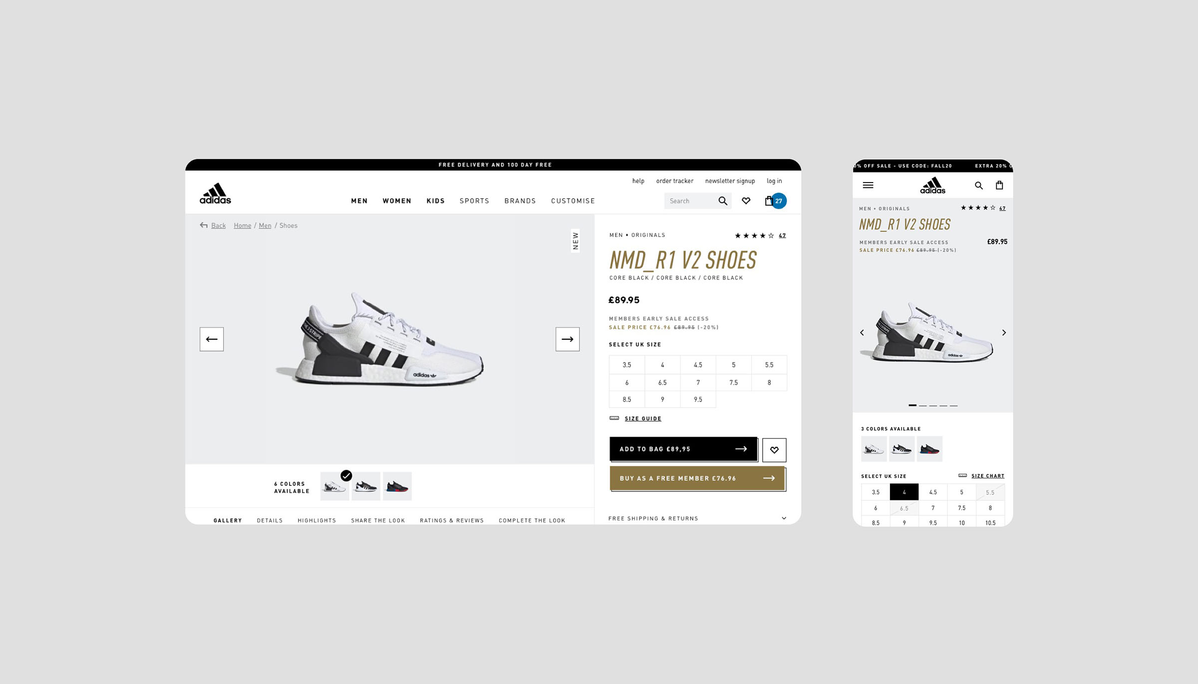
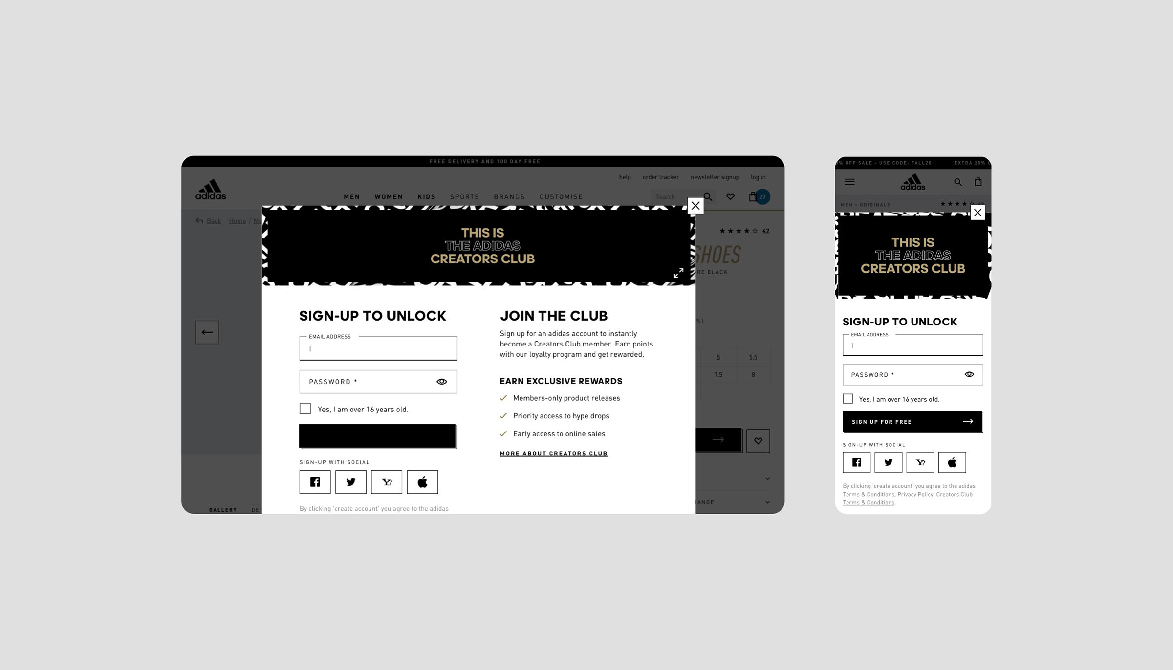
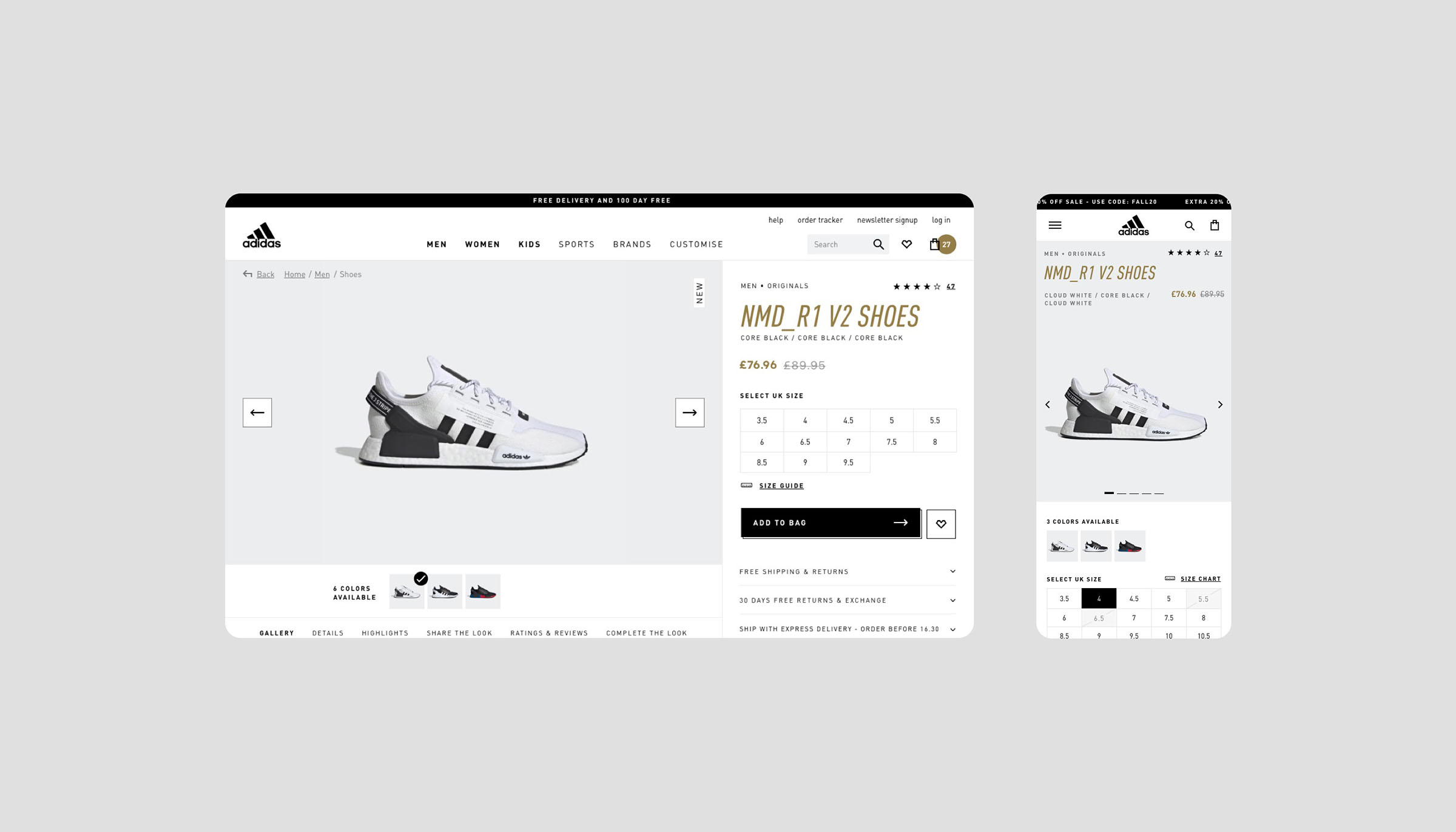
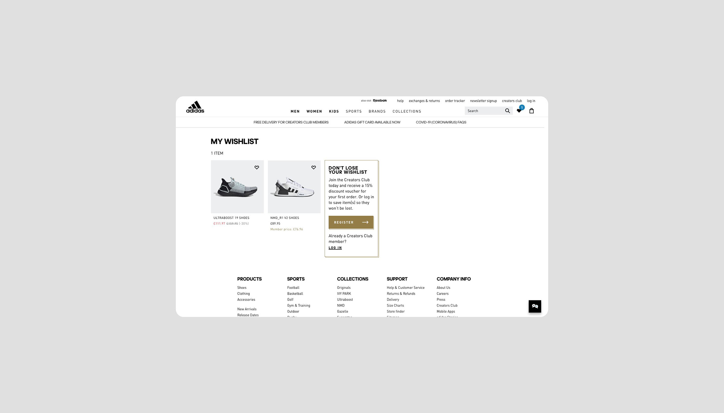
After creating the membership identifier style we went to focus on optimising the my account area. We wanted to make the my account more personalised, user-friendly and mobile friendly.
Year
2020-2021
Project sort
Client
Client
adidas
UX design: Roy Laurier
What did I do
Branding
Visual design
High fidelity prototyping
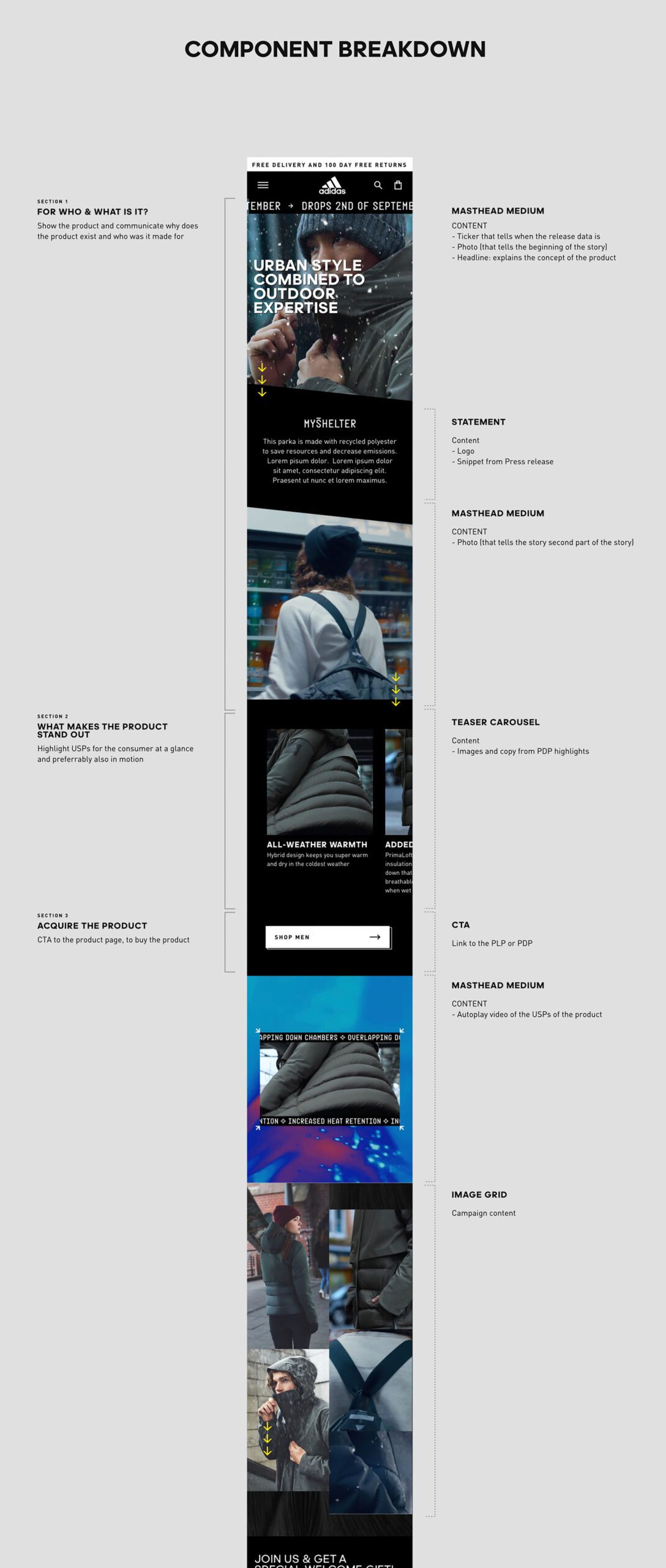
adidas Component Creation
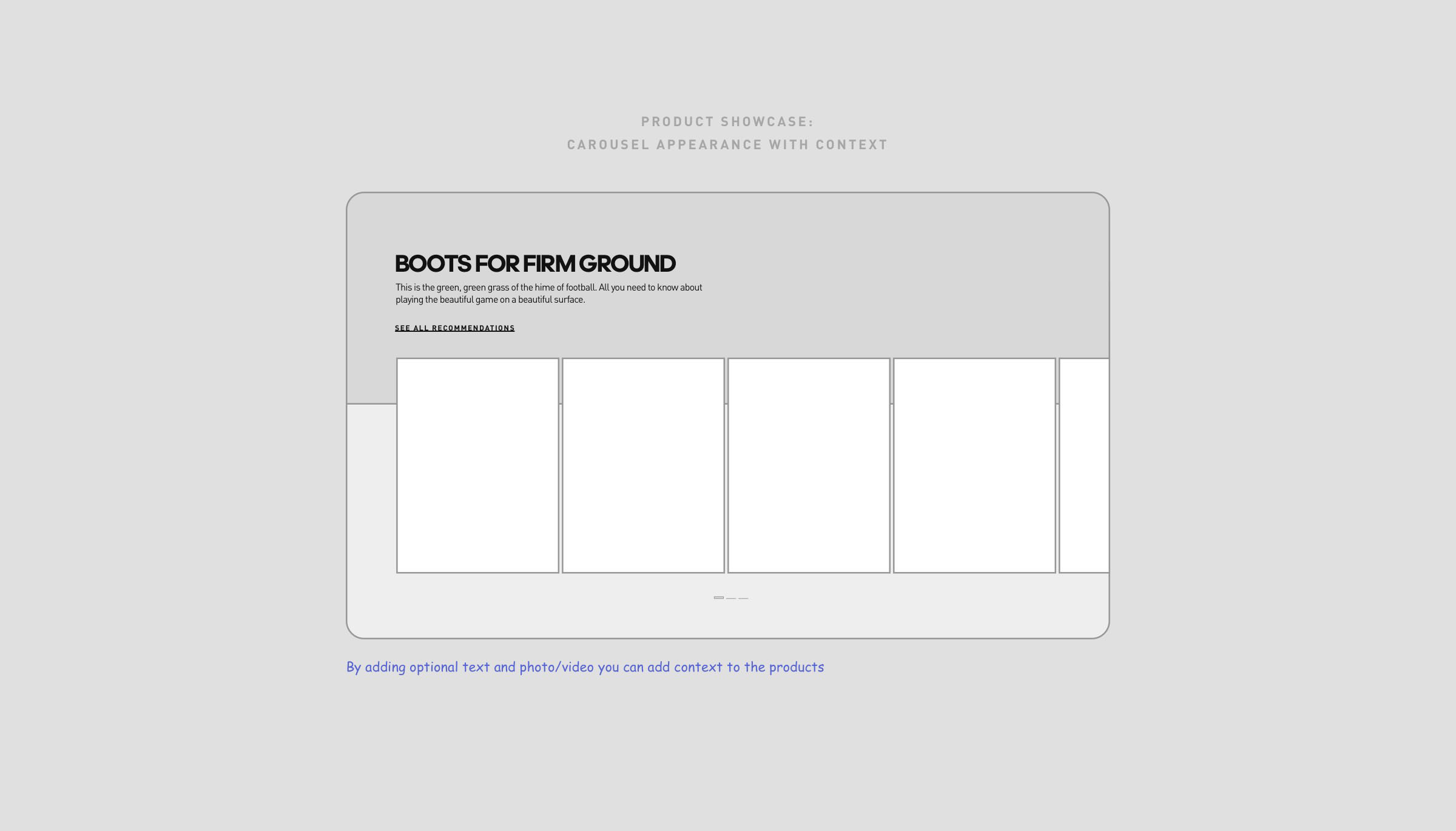
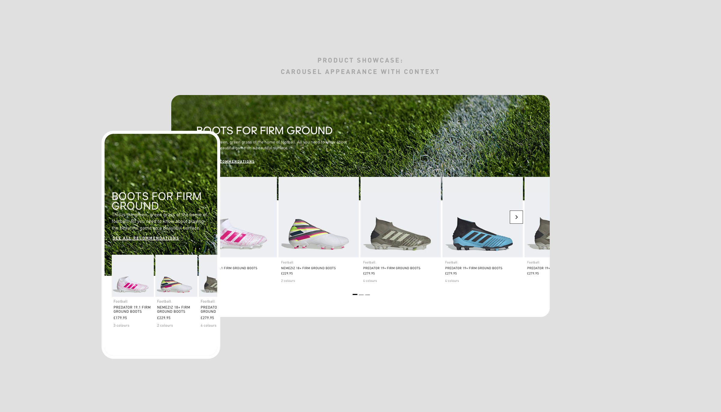
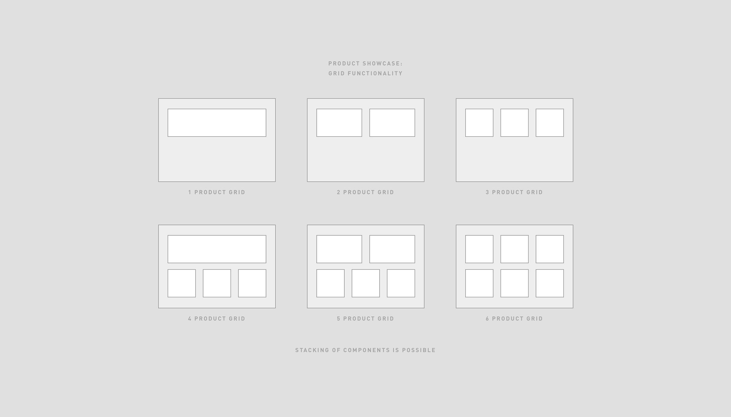
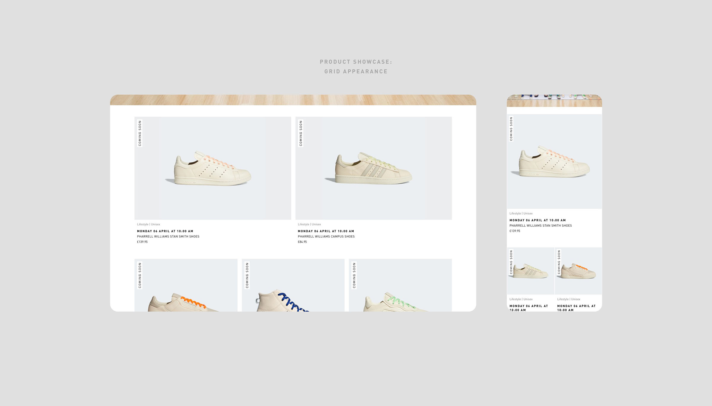
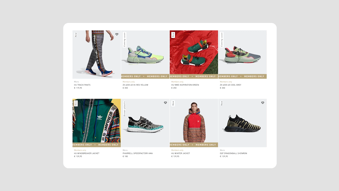
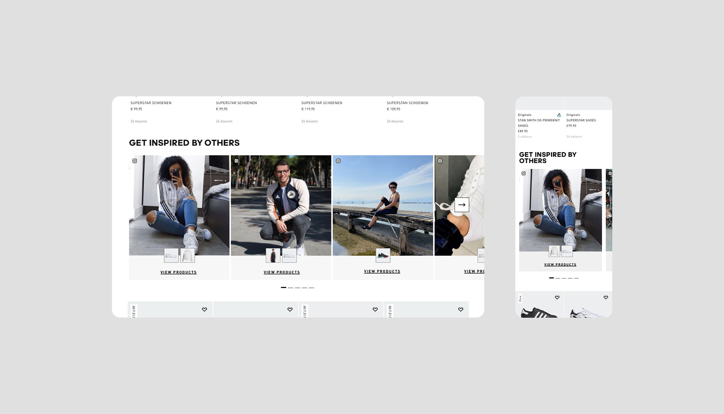
To increase product visibility on homepage & landing pages we created multiple components that the business could use to showcase collections/groups of products together to help consumers get through a specific funnel more efficiently.
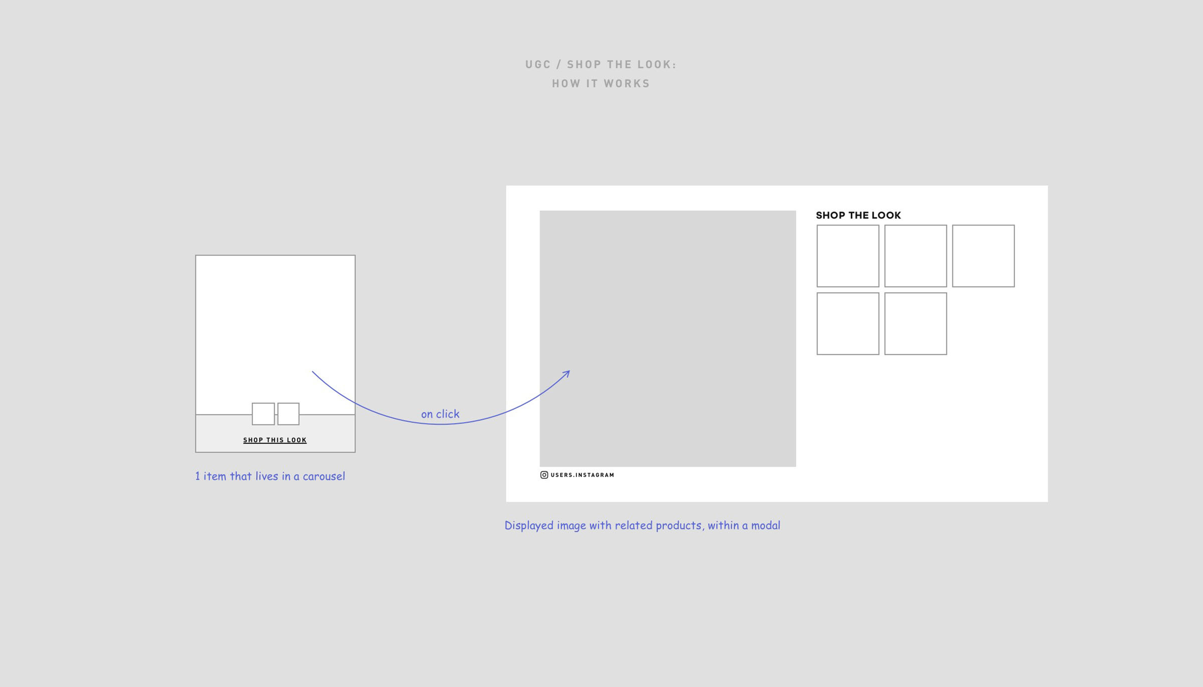
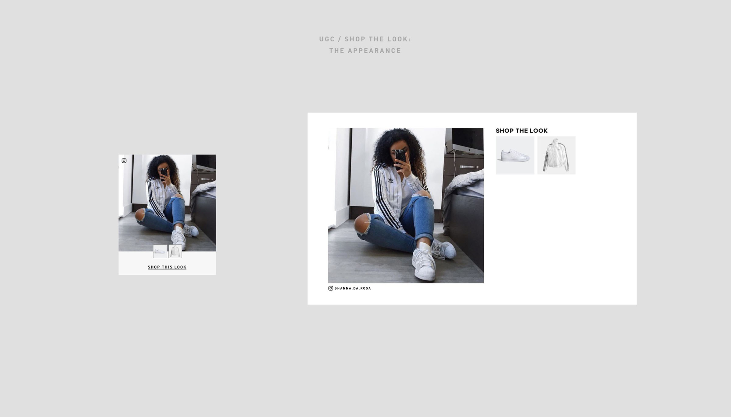
Through research and testing we were able to optimize the way of presenting product in the best way possible. With these new components the business was able to create more ‘creative’ landing pages with direct links to products.
Year
2020
Project sort
Client
Client
adidas
UX design: Roy Laurier
What did I do
Visual design
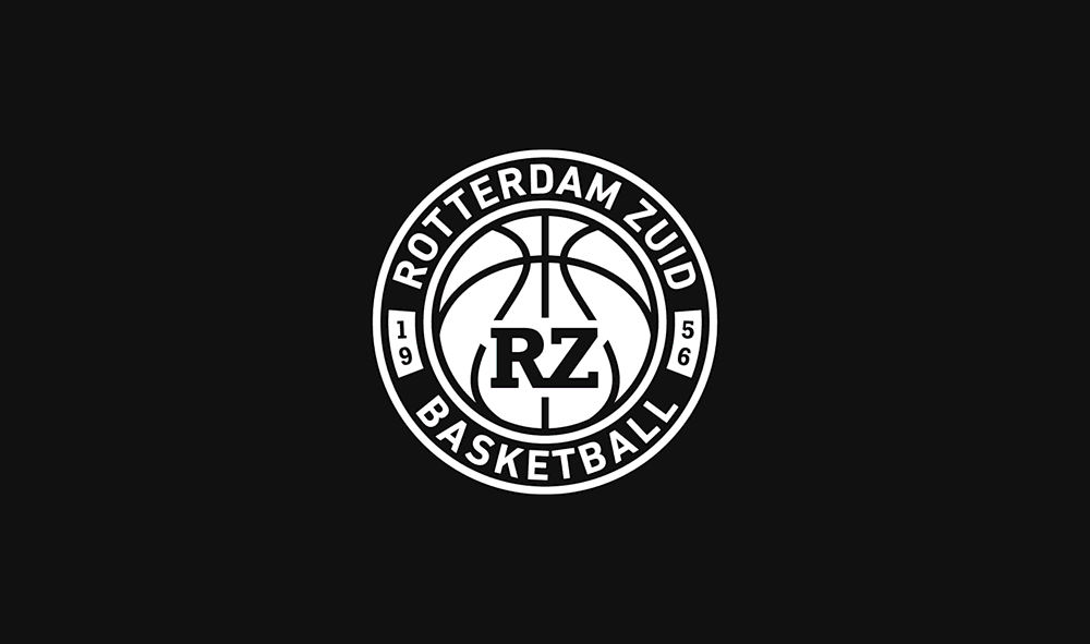
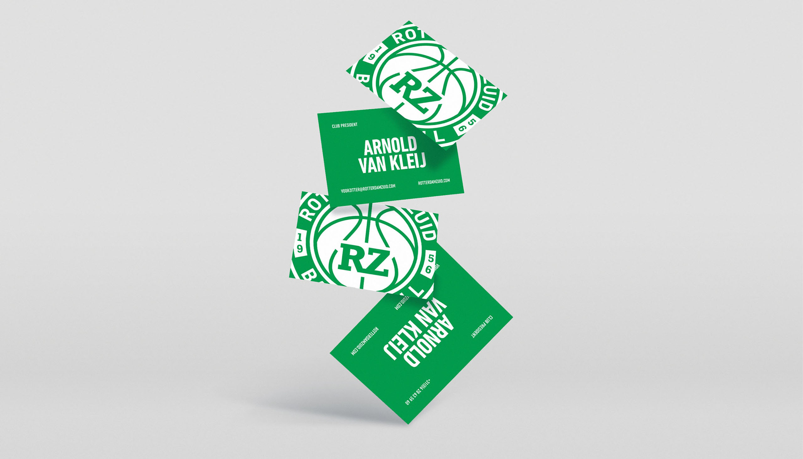
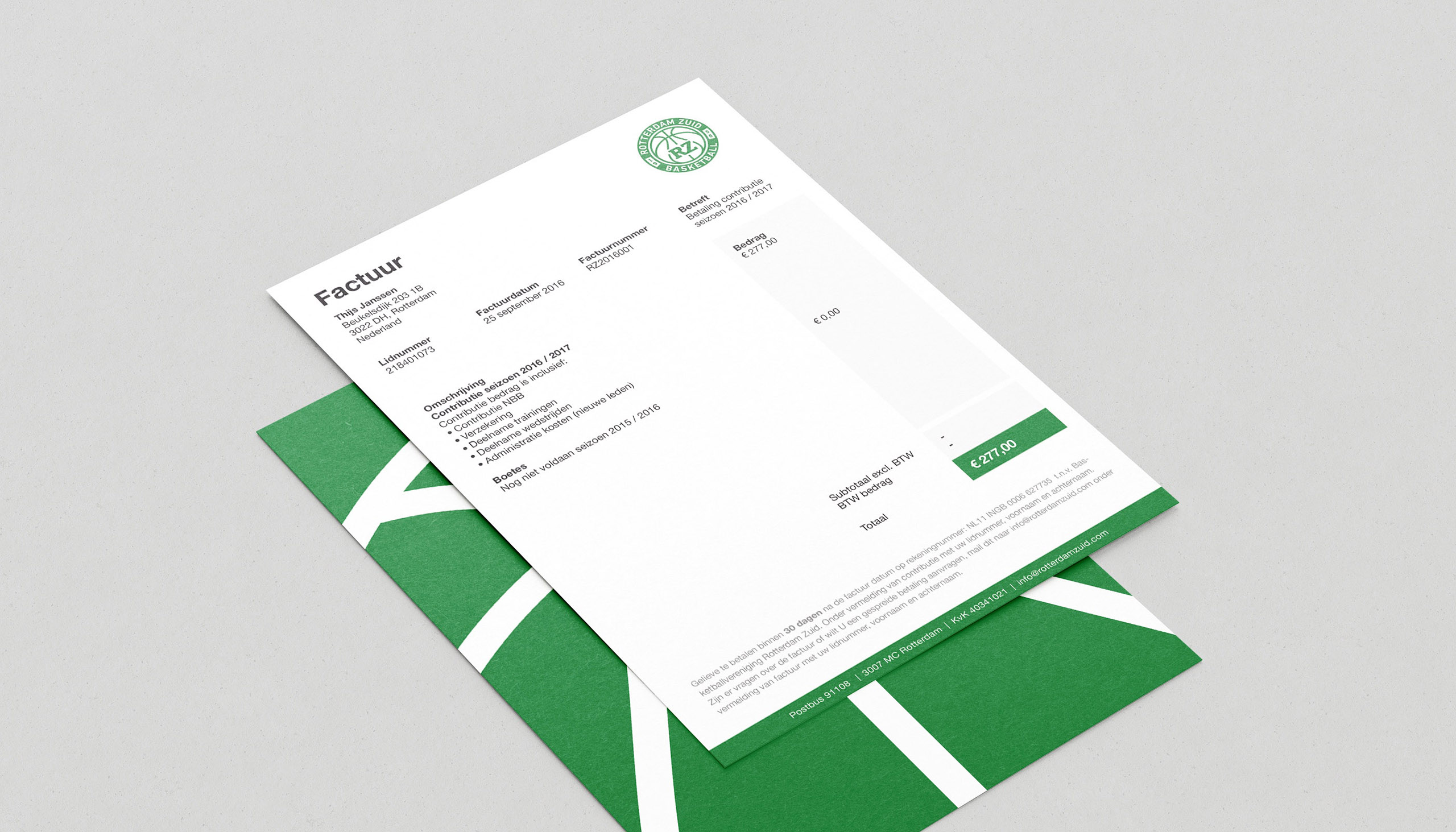
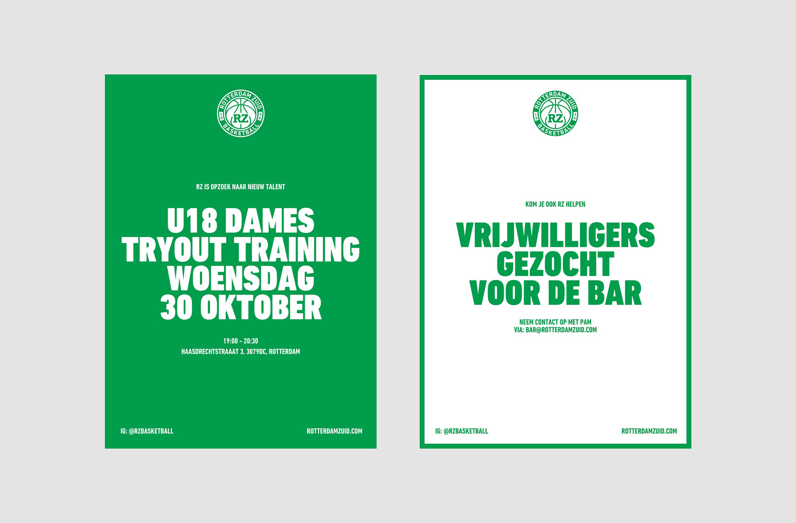
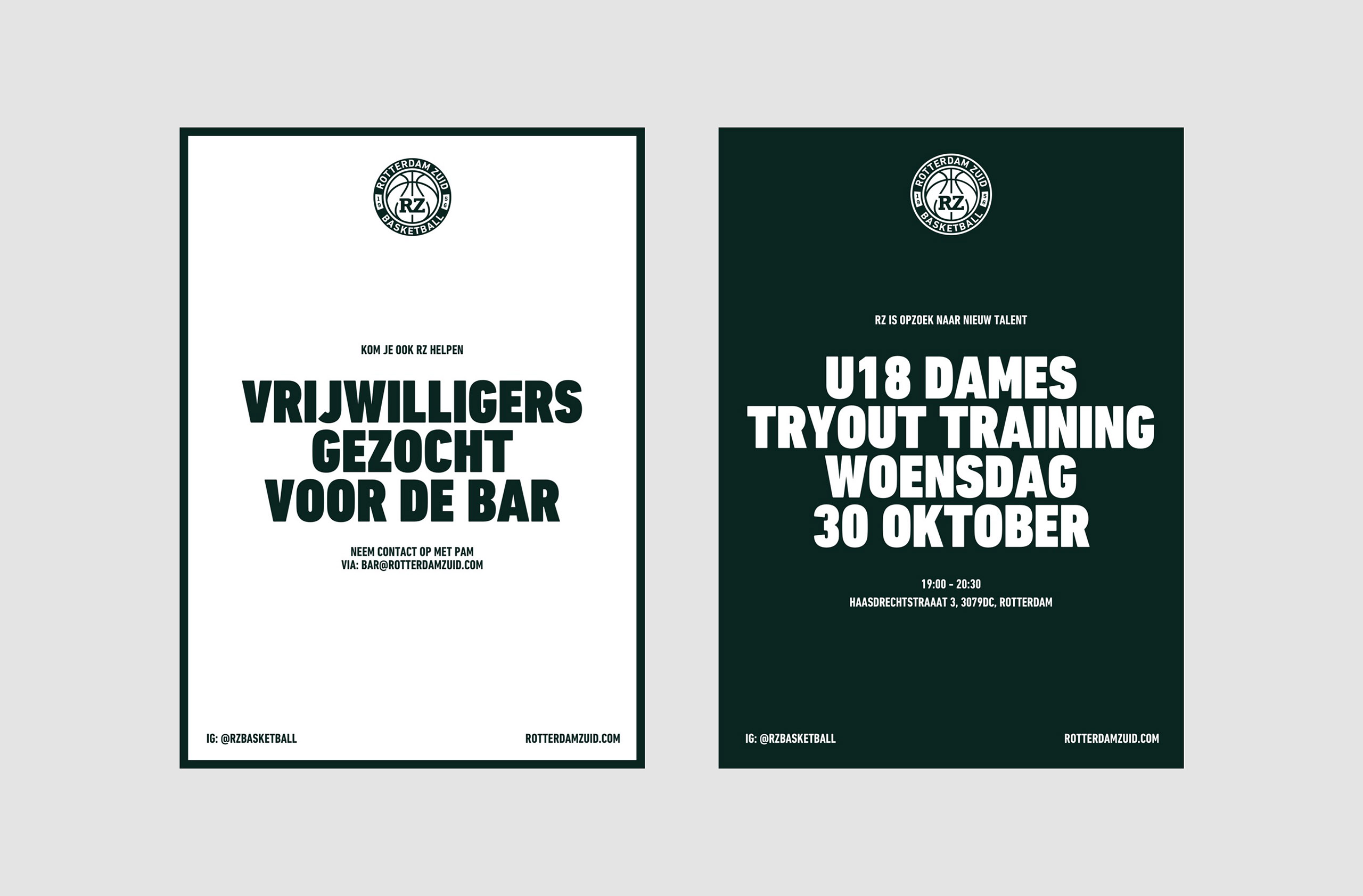
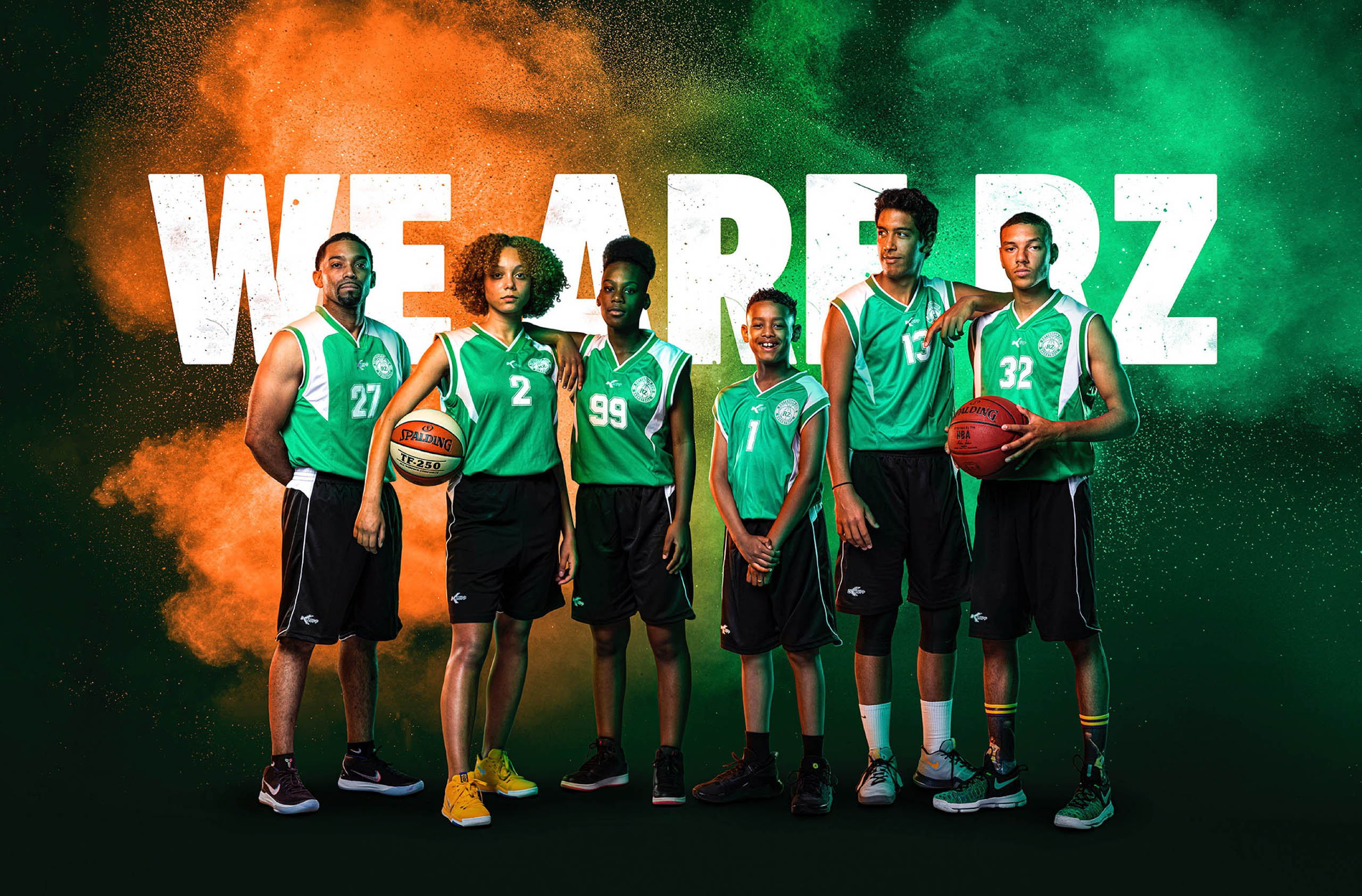
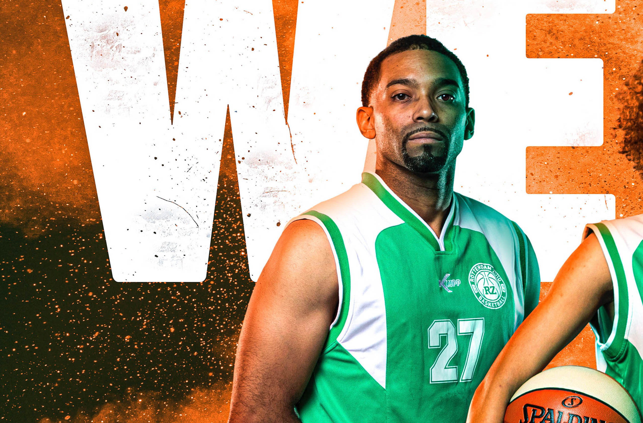
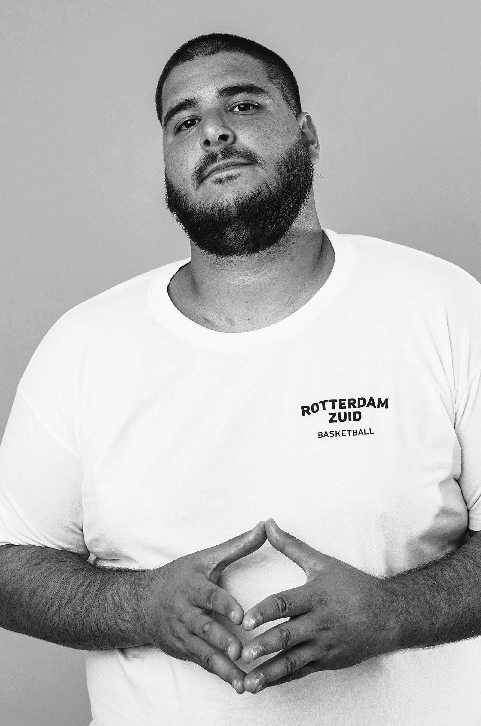
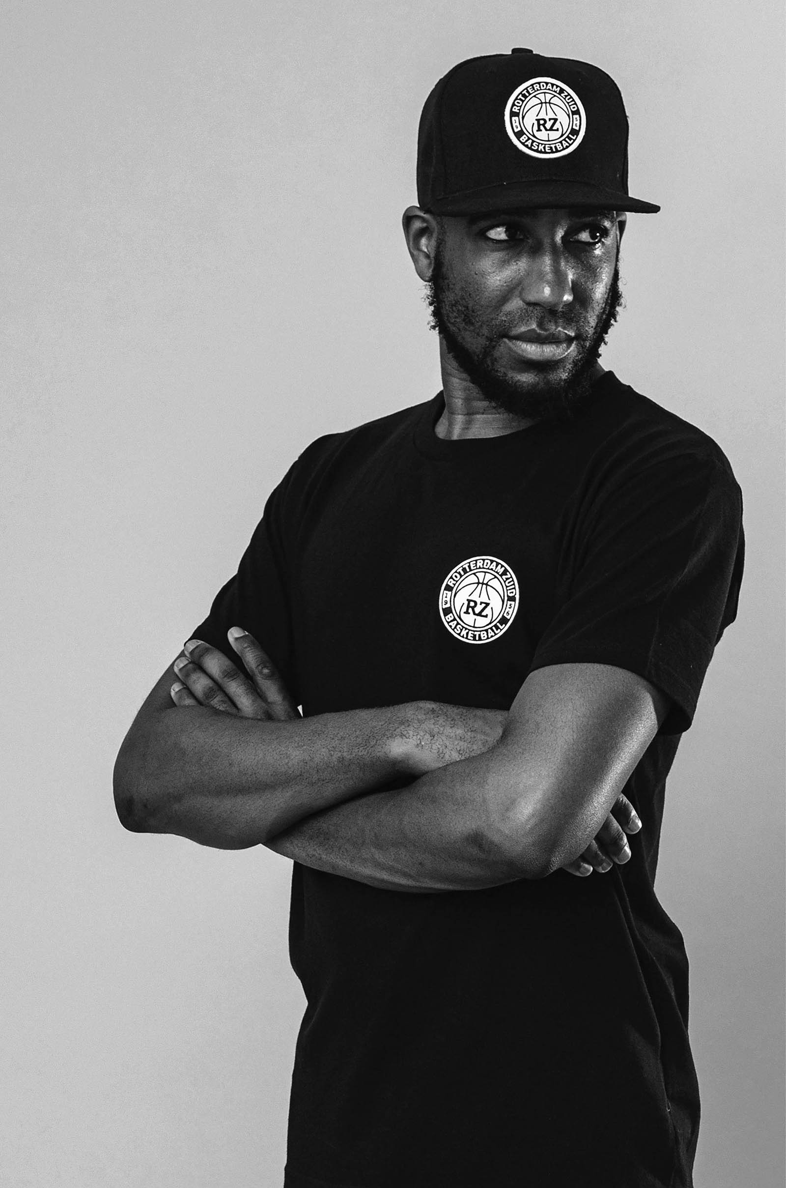
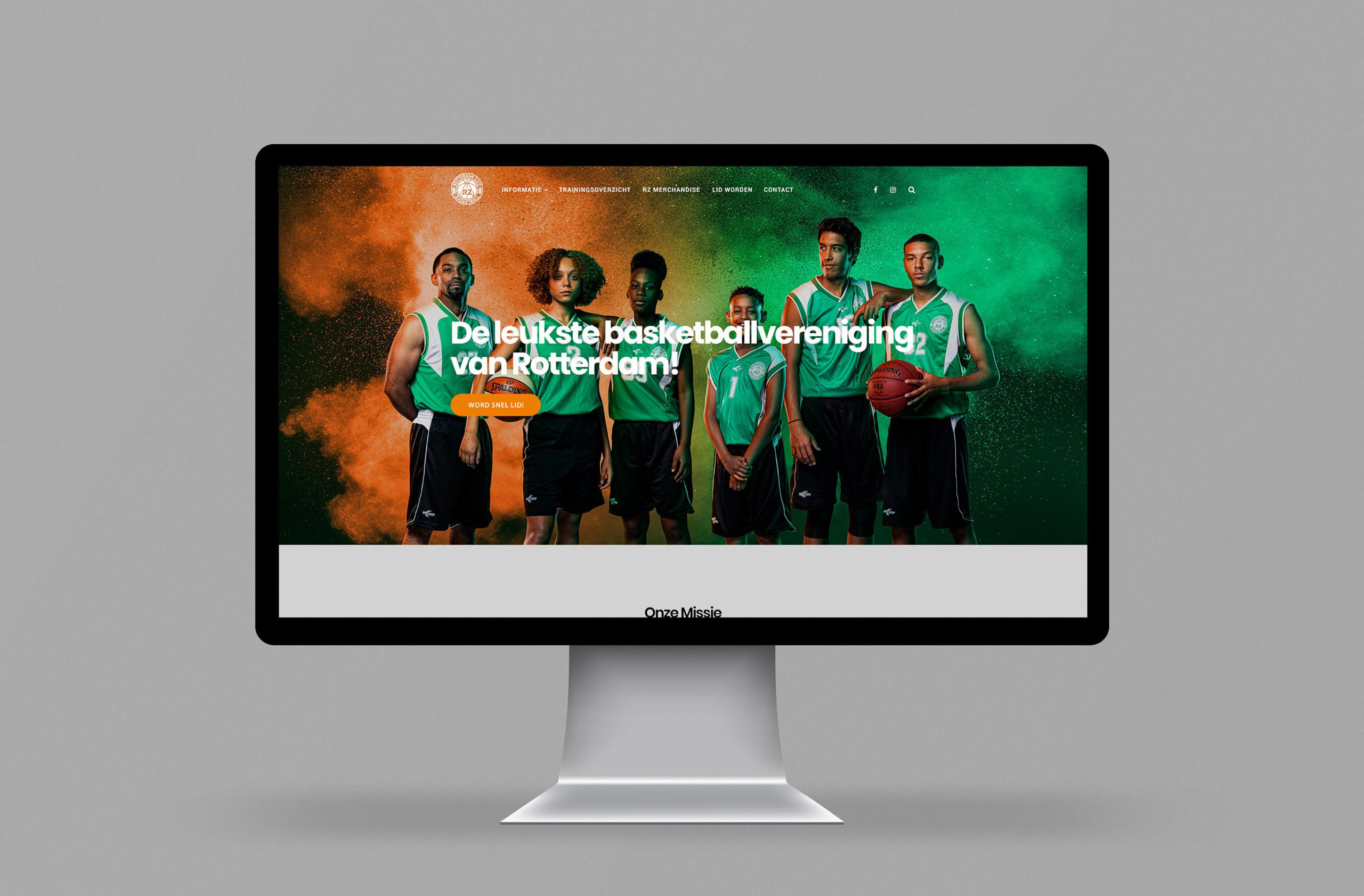
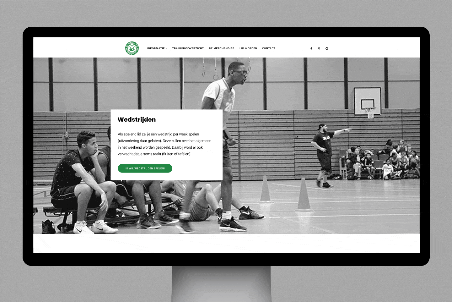
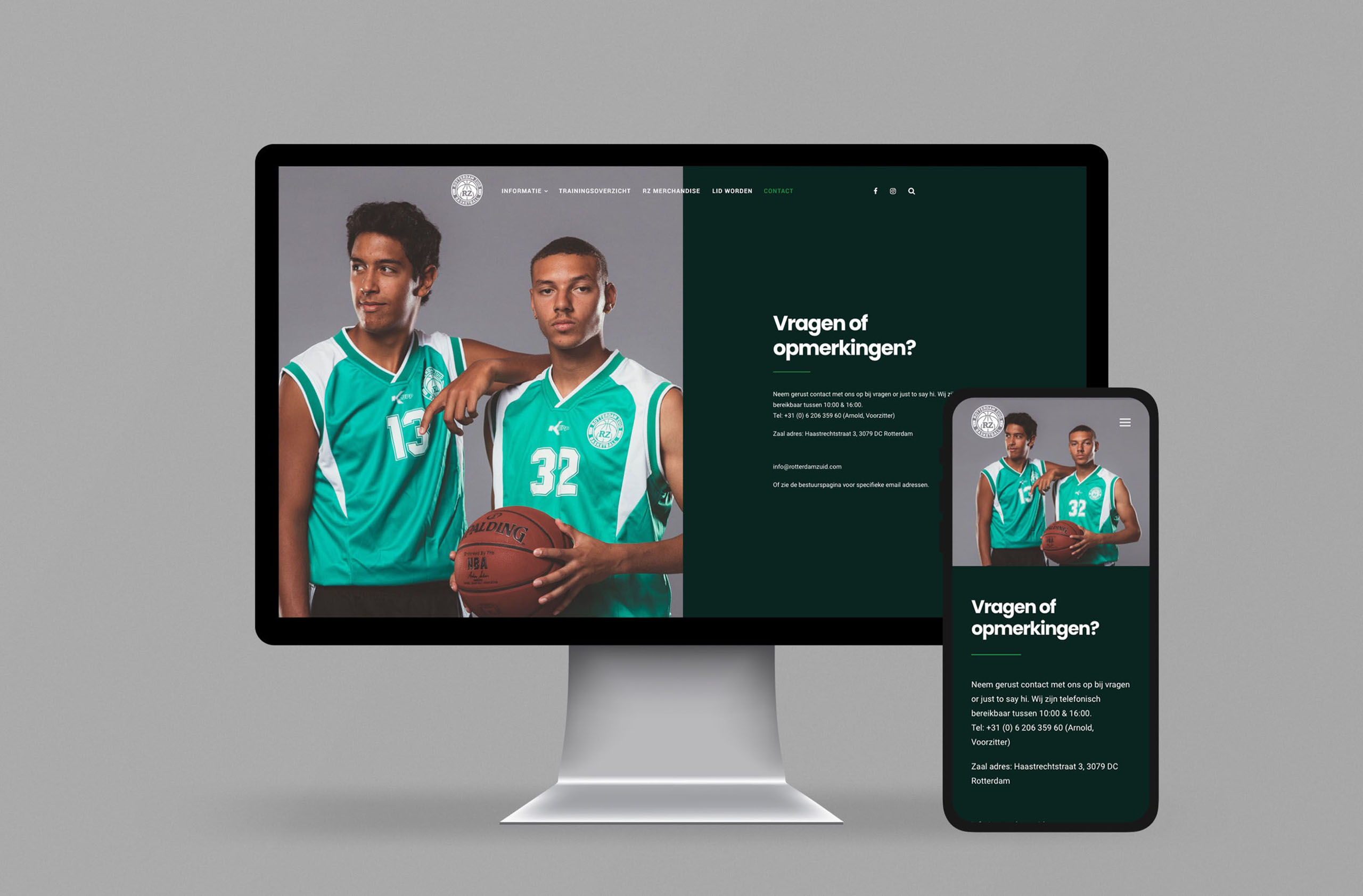
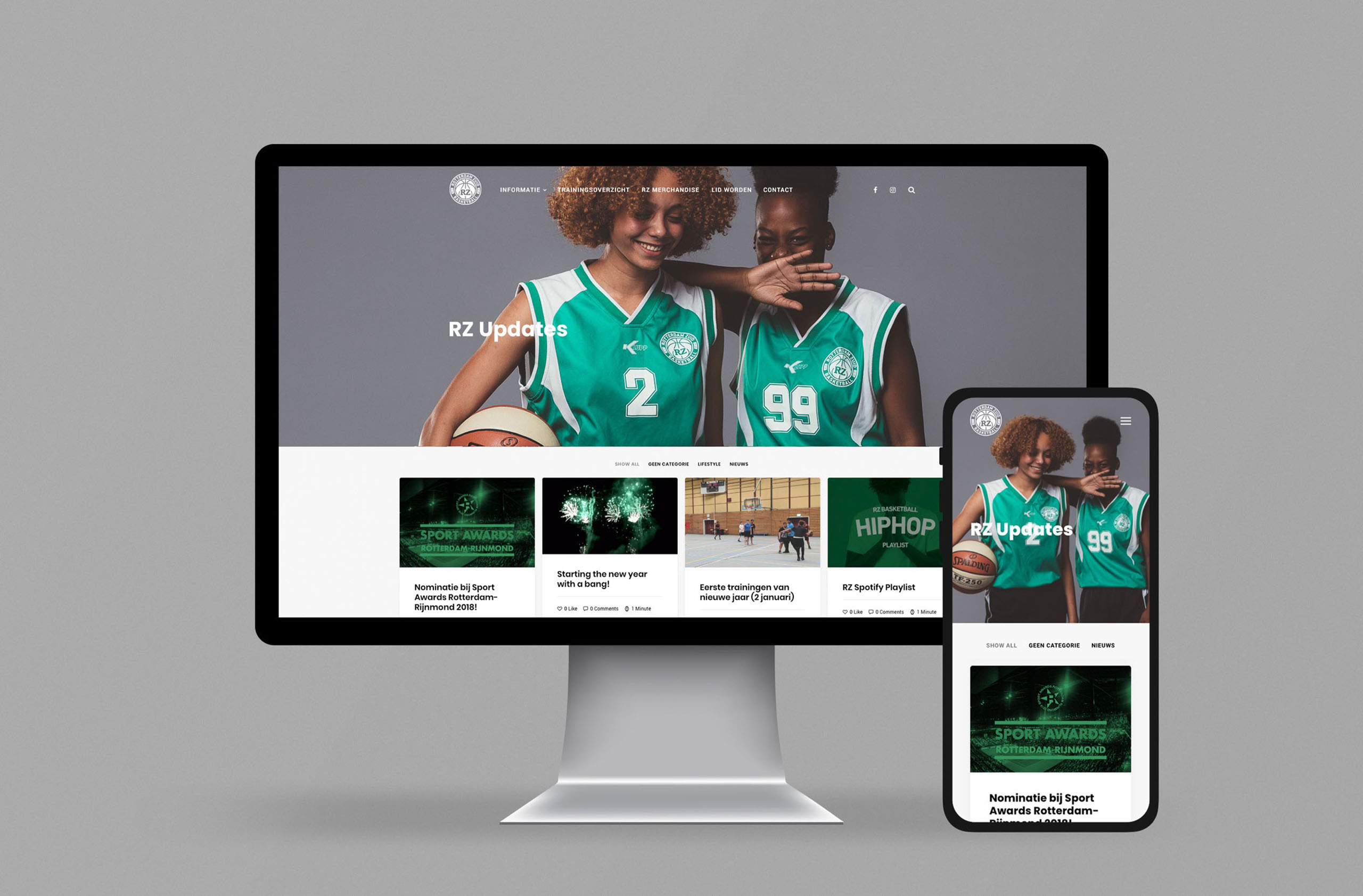
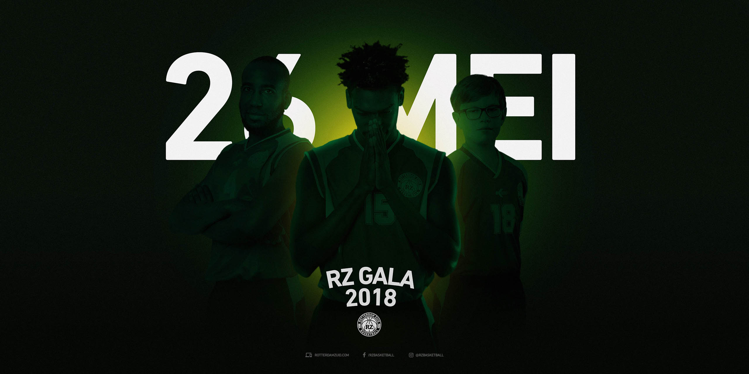
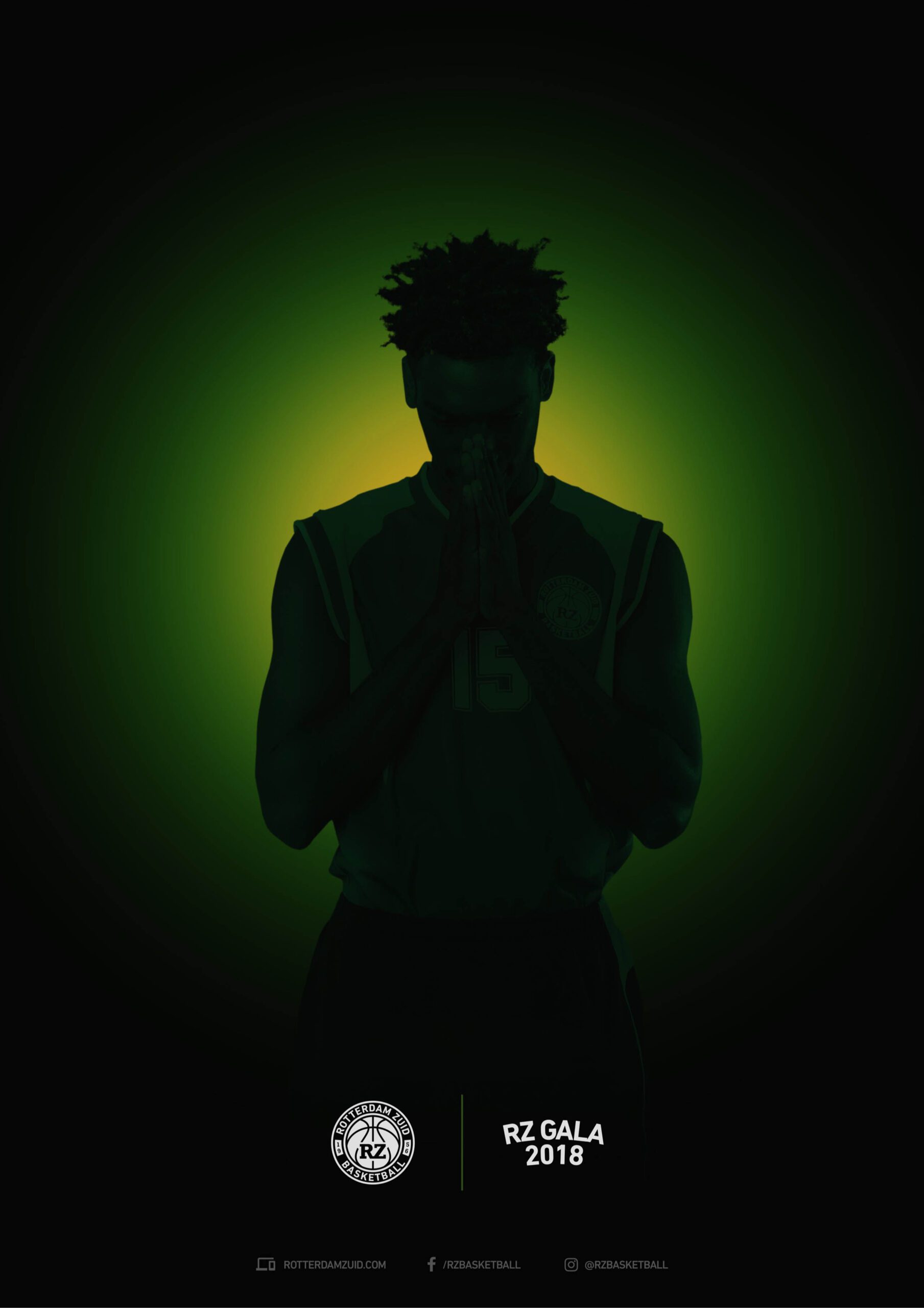
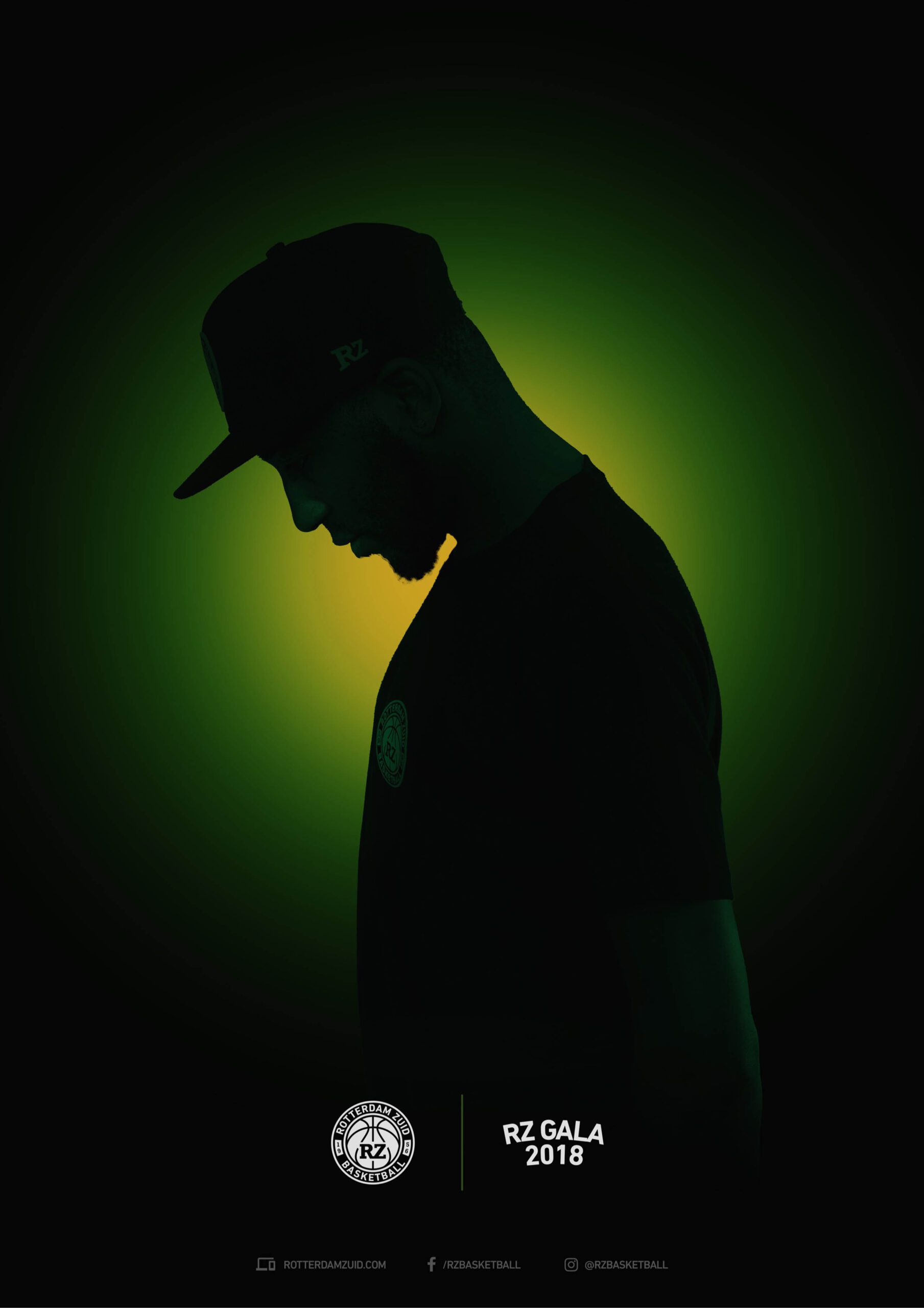
RZ Basketball branding
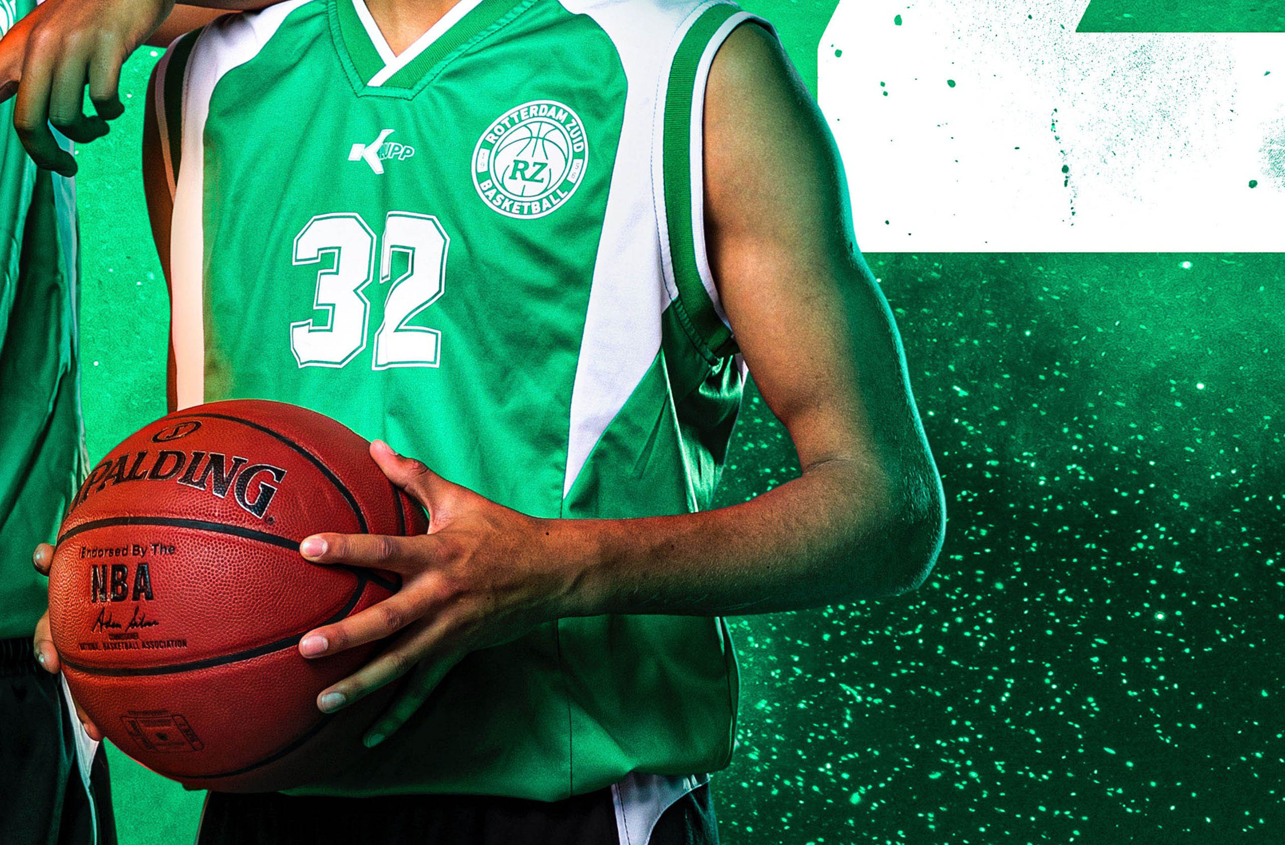
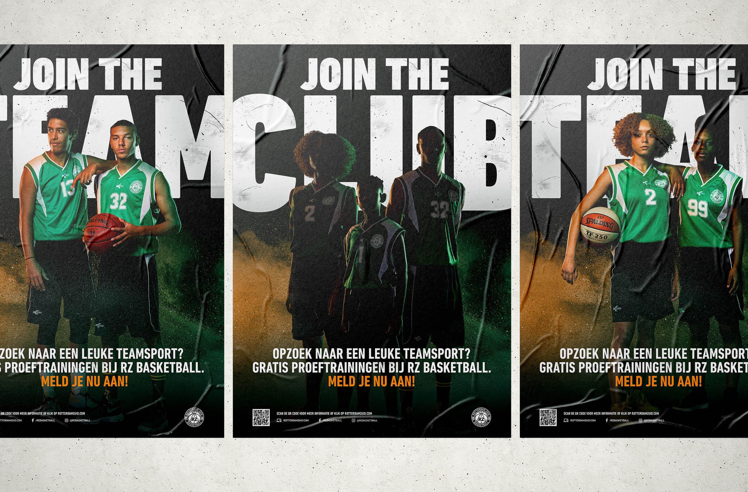
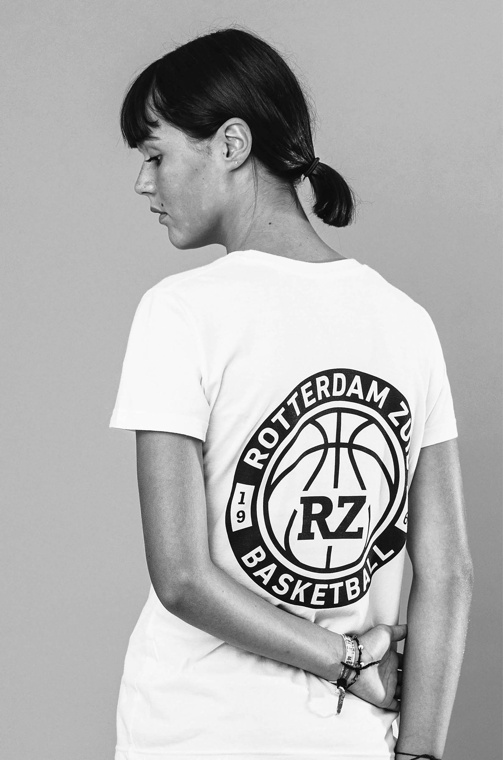
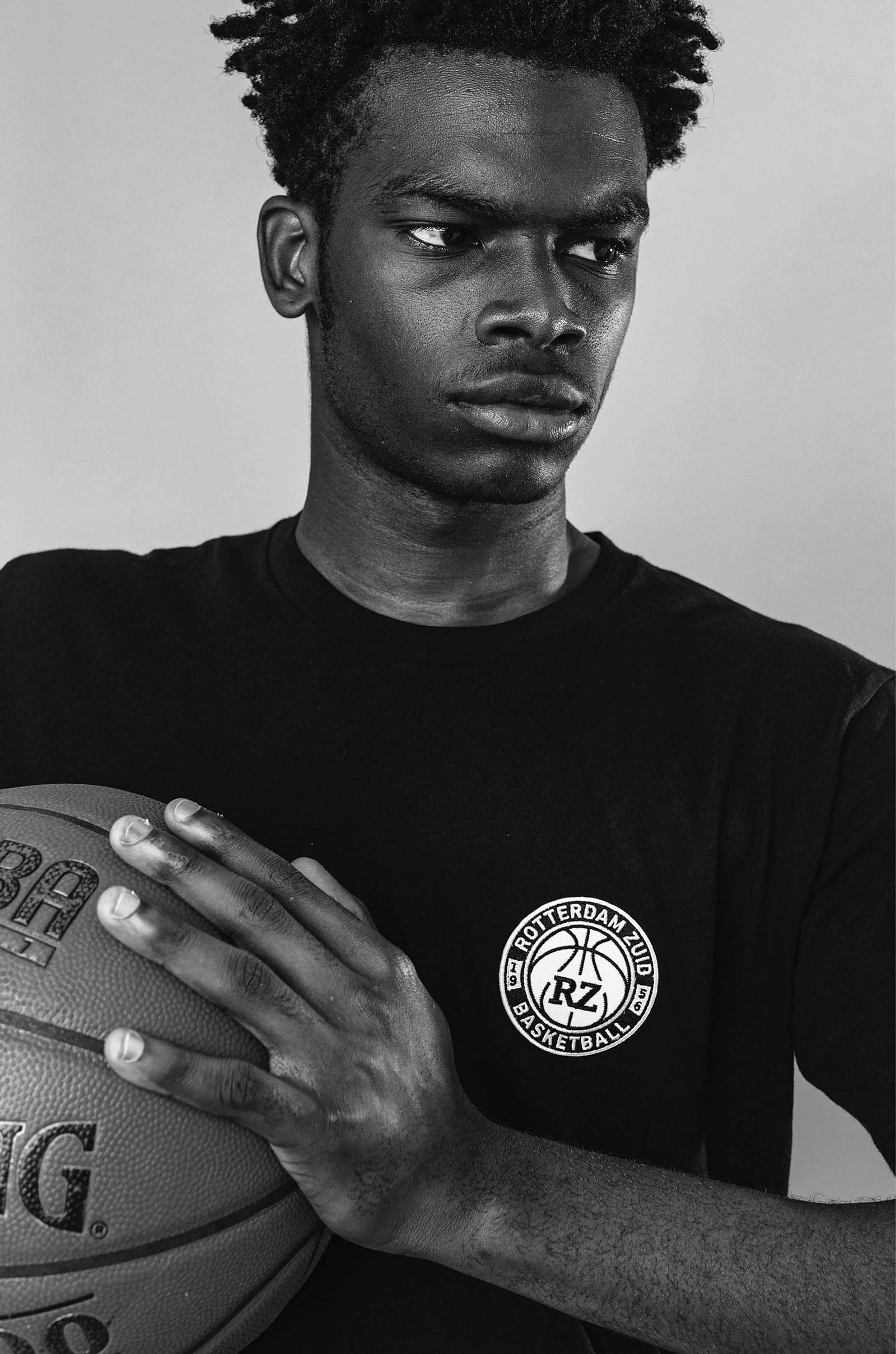
RZ is a (amateur) basketball club with a rich basketball history and a turbulent existence. From playing internationally against Maccabi Tel Aviv and Real Madrid. To hit rock bottom with a burned down clubhouse, massive debt and a reputation problem of being a ‘ghetto’ club.
The main concept was to embrace the 'bad ghetto' reputation and turn it in a strength... A ‘family’ club with attitude. This translated into the photography, font usage and merchandising. The biggest challenge was to create a simple design framework that anyone from the club could use, like Word templates (😑🔫)
Year
2017 - 2020
Project sort
Self initiated
Client
RZ Basketball
Photography: Willem de Kam
What did I do
Concepting
Branding
Logo design
Visual design
Photo editing
Apparel design

adidas custom CLPs
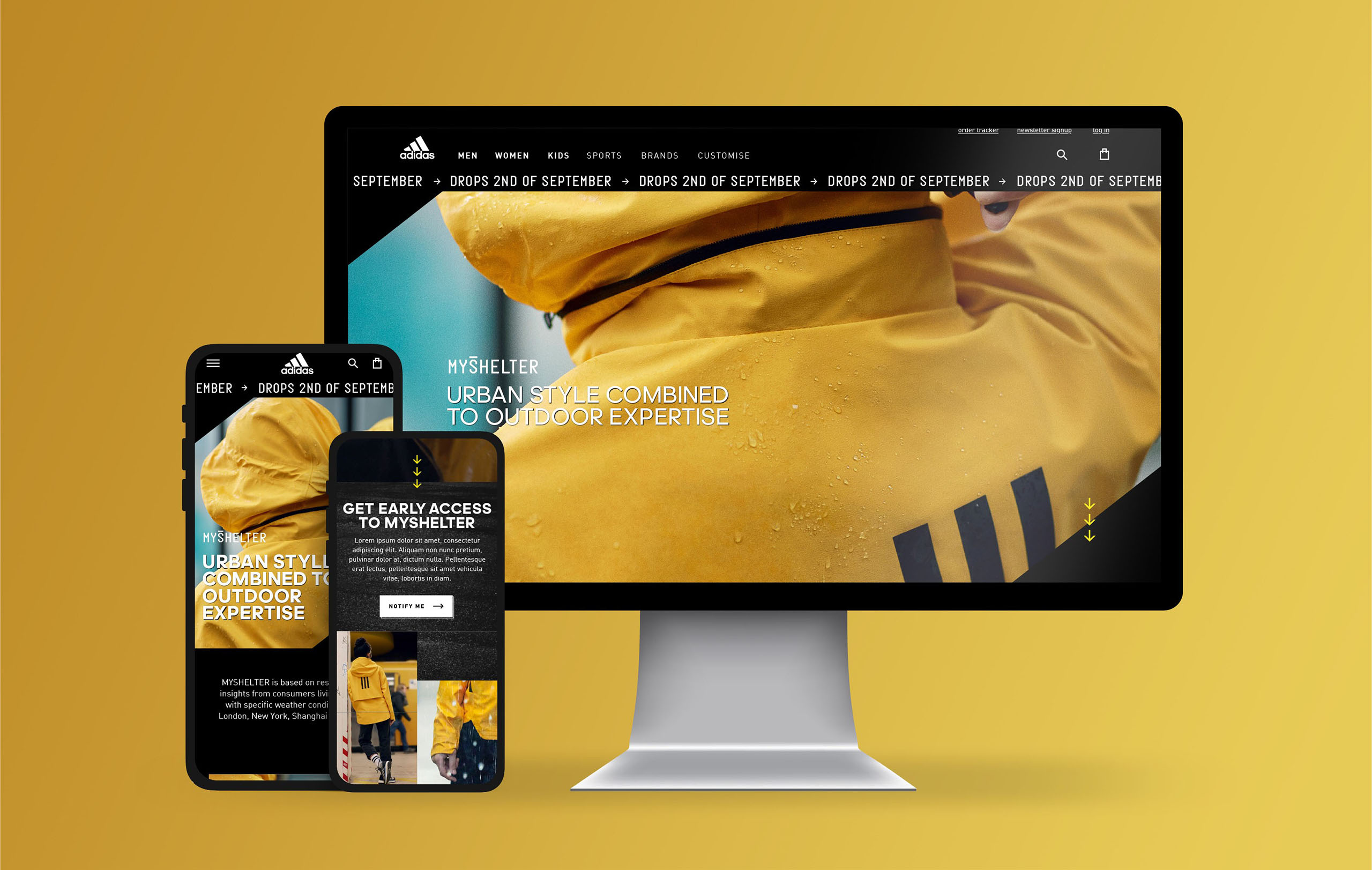
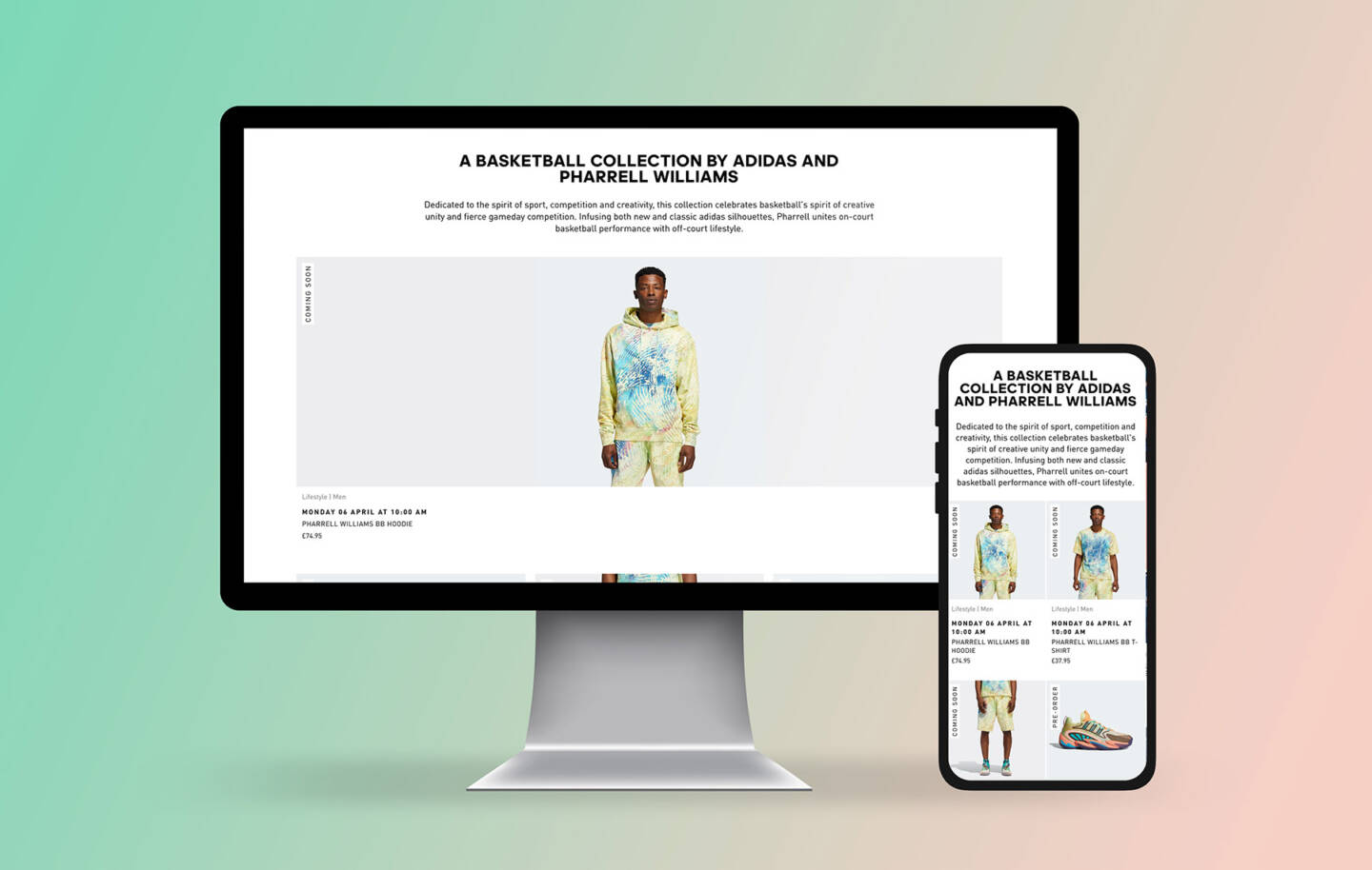
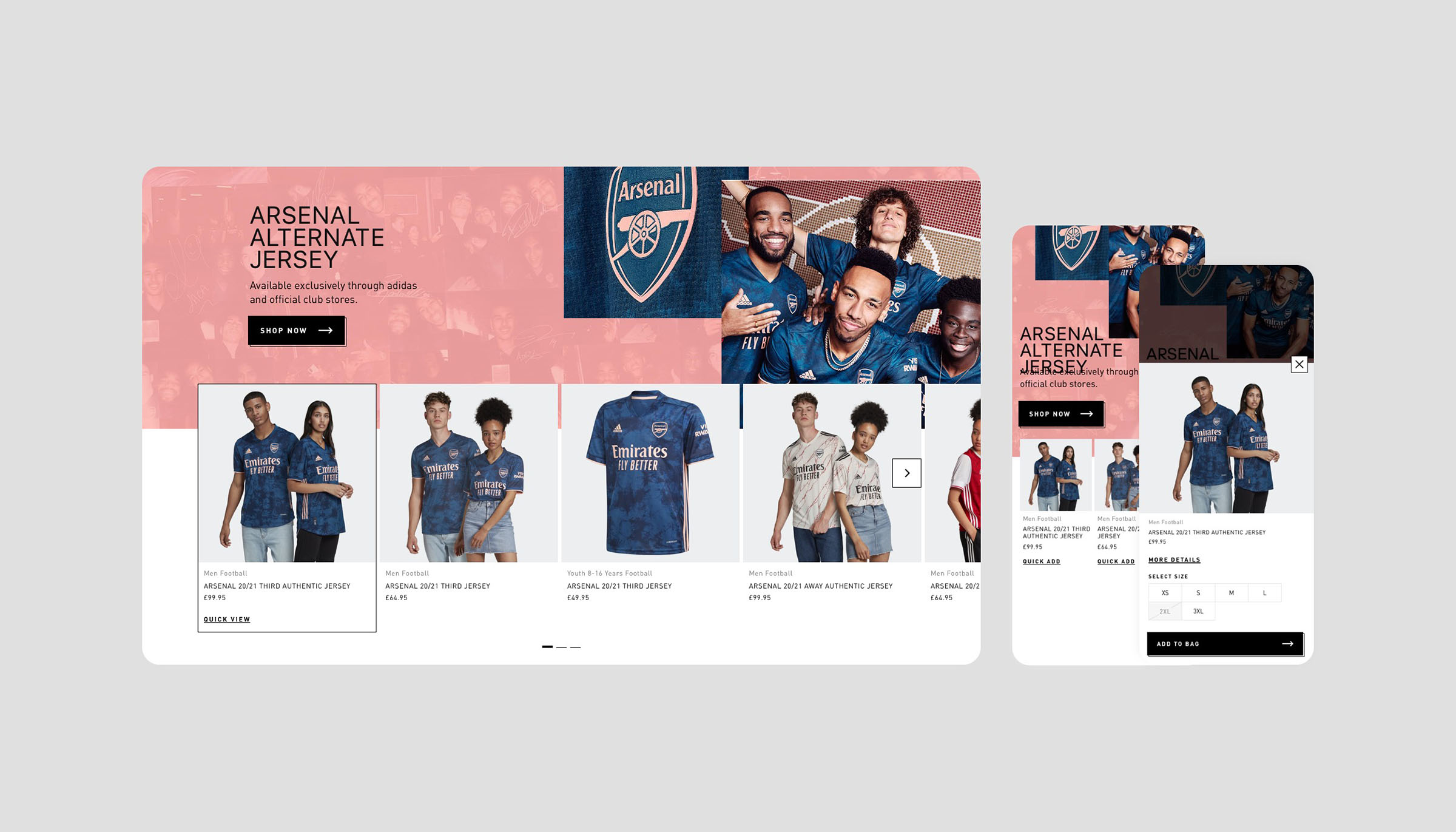
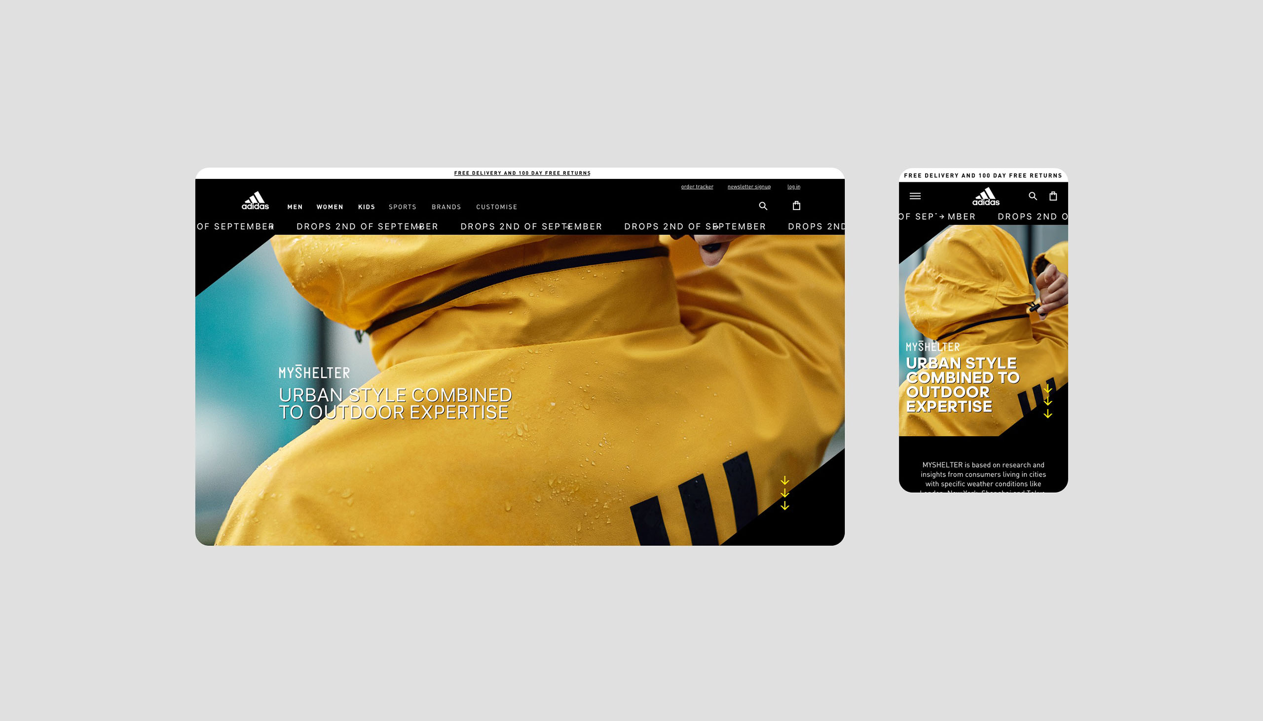
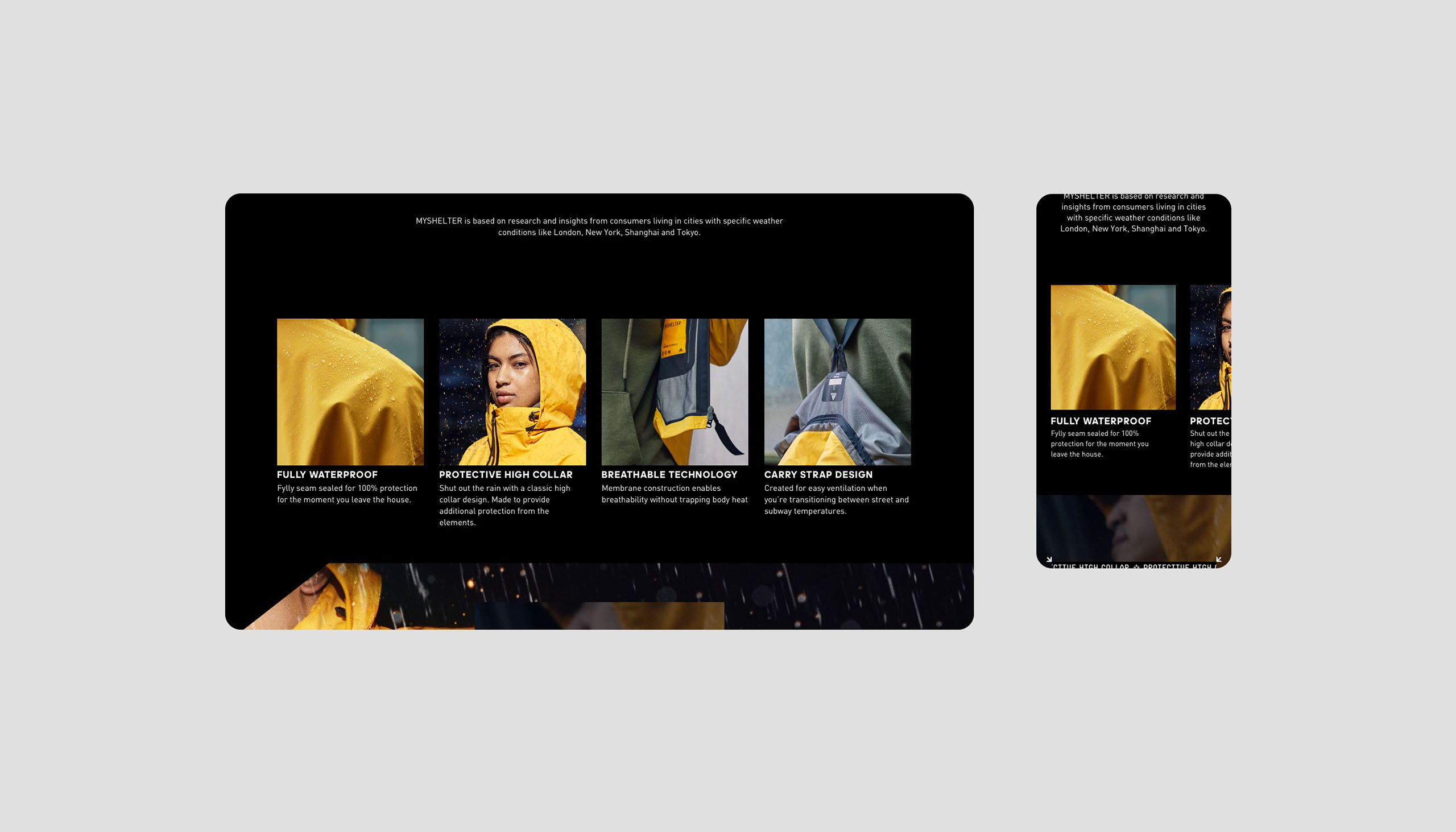
Adidas would often hire external companies to create landing page experiences. To show that this could also been done within the in-house design team we created some page designs with the available visuals and actual existing components from the website.
Because of the use of exciting components it would be really easy to create custom CLP's (Category Landing Pages) experiences like these two examples. Rich with photos, videos and options to go to the product pages to bring them further down the funnel.
Year
2020
Project sort
Freelance
Client
adidas
Worked together with Tommi Niskanen
What did I do