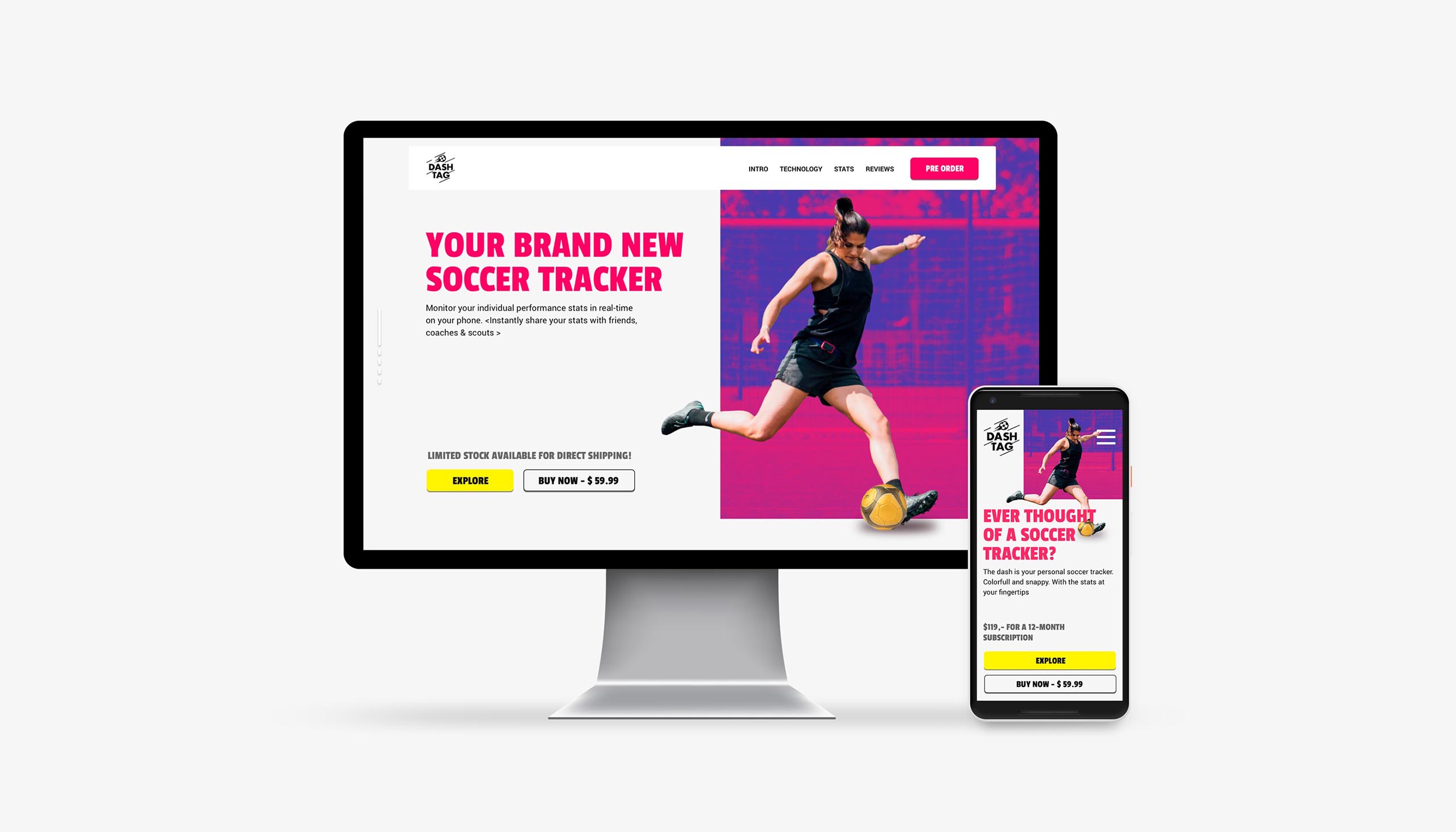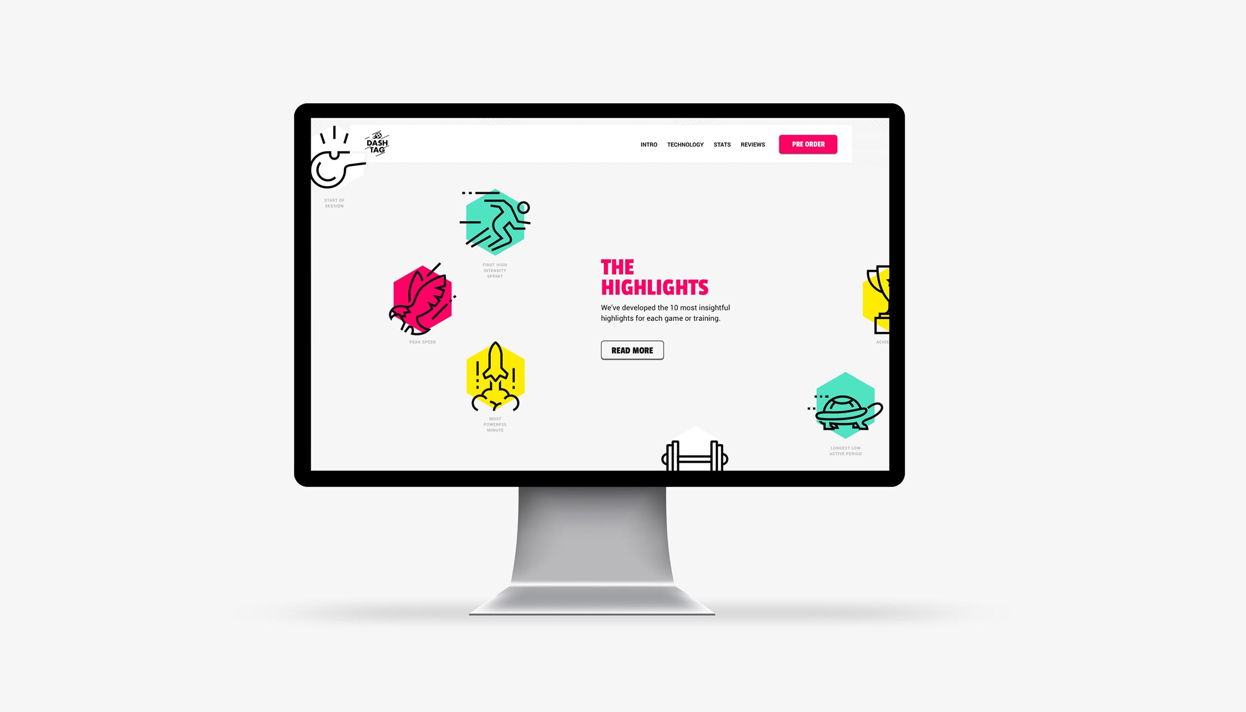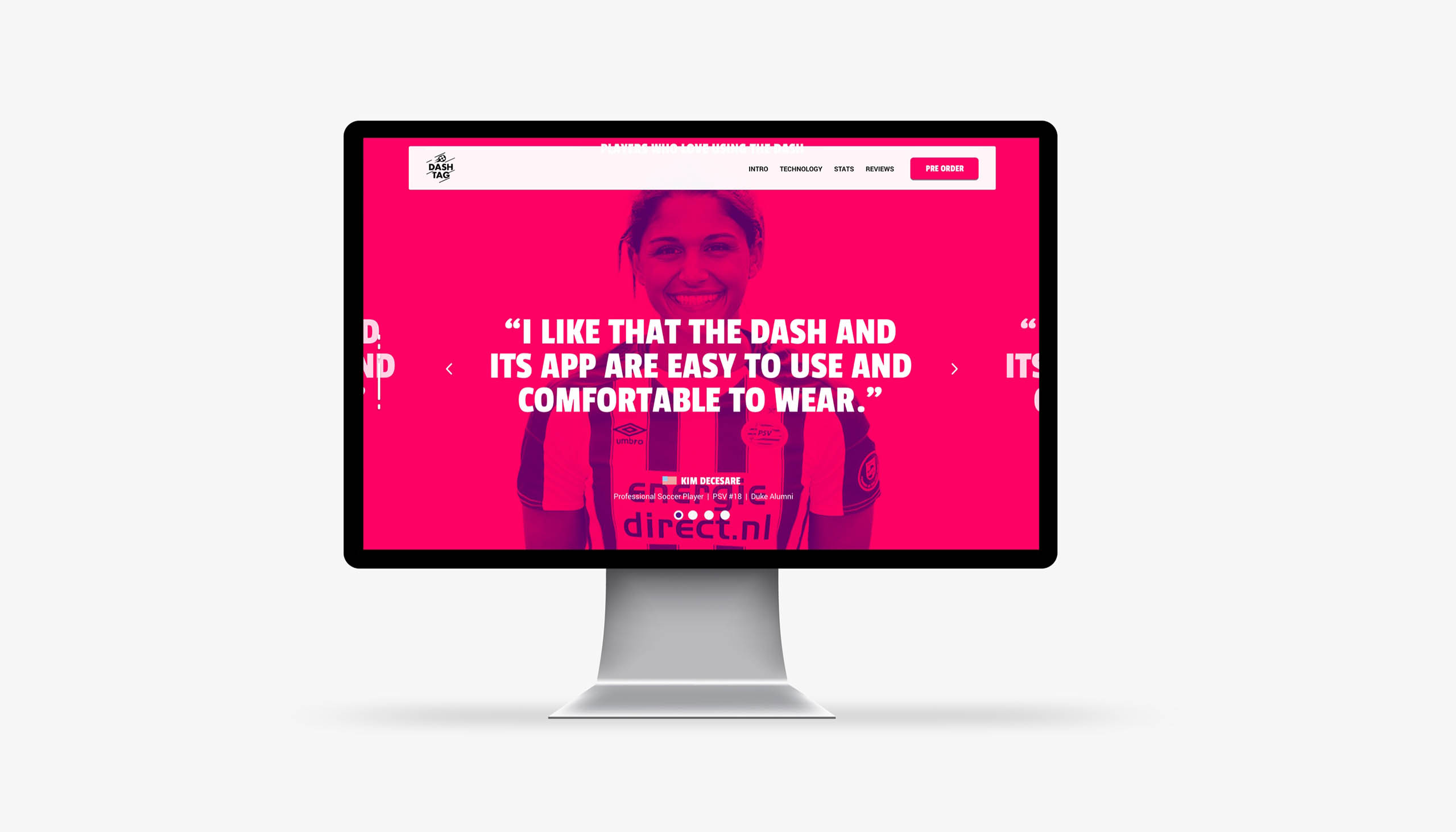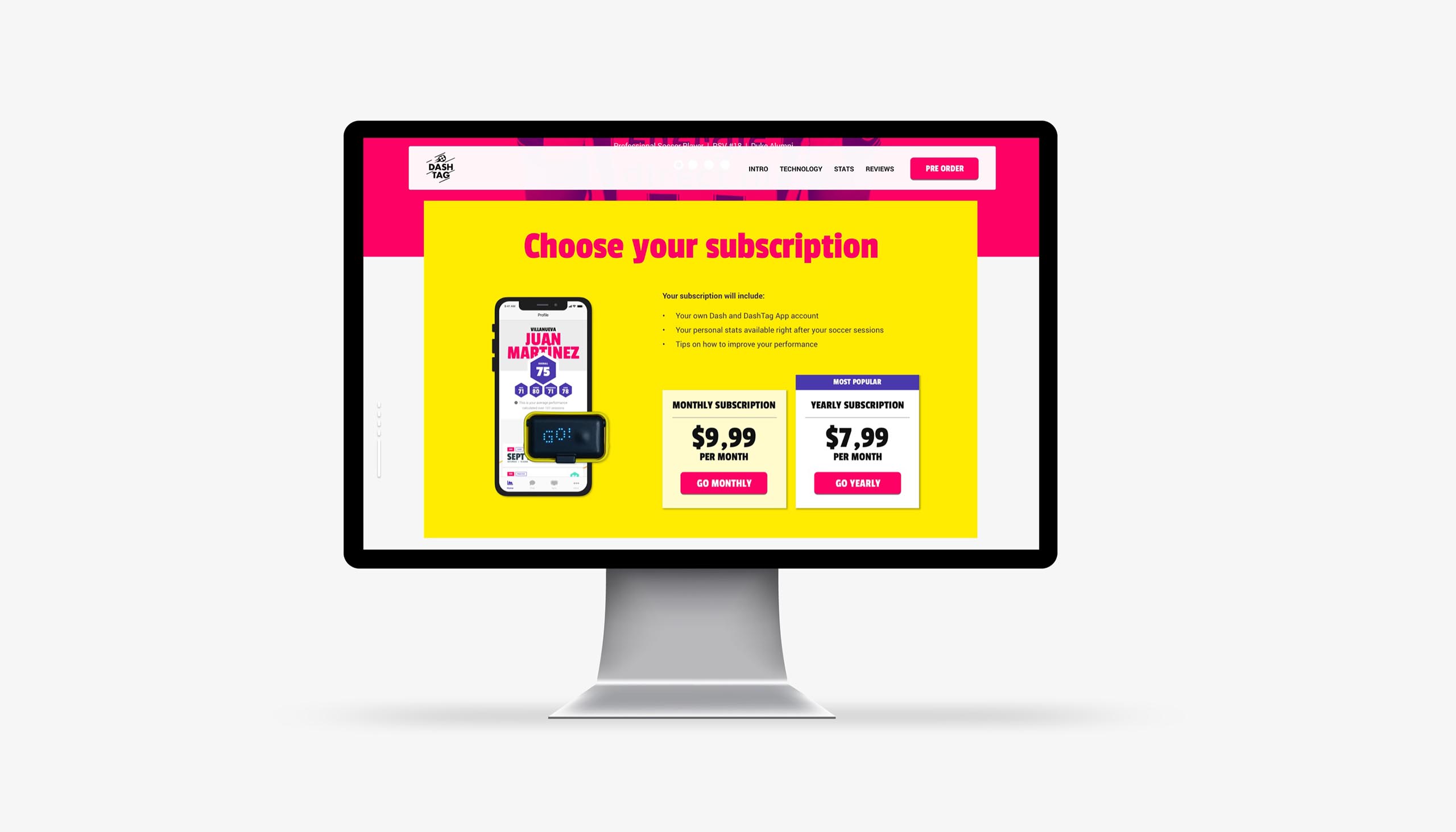

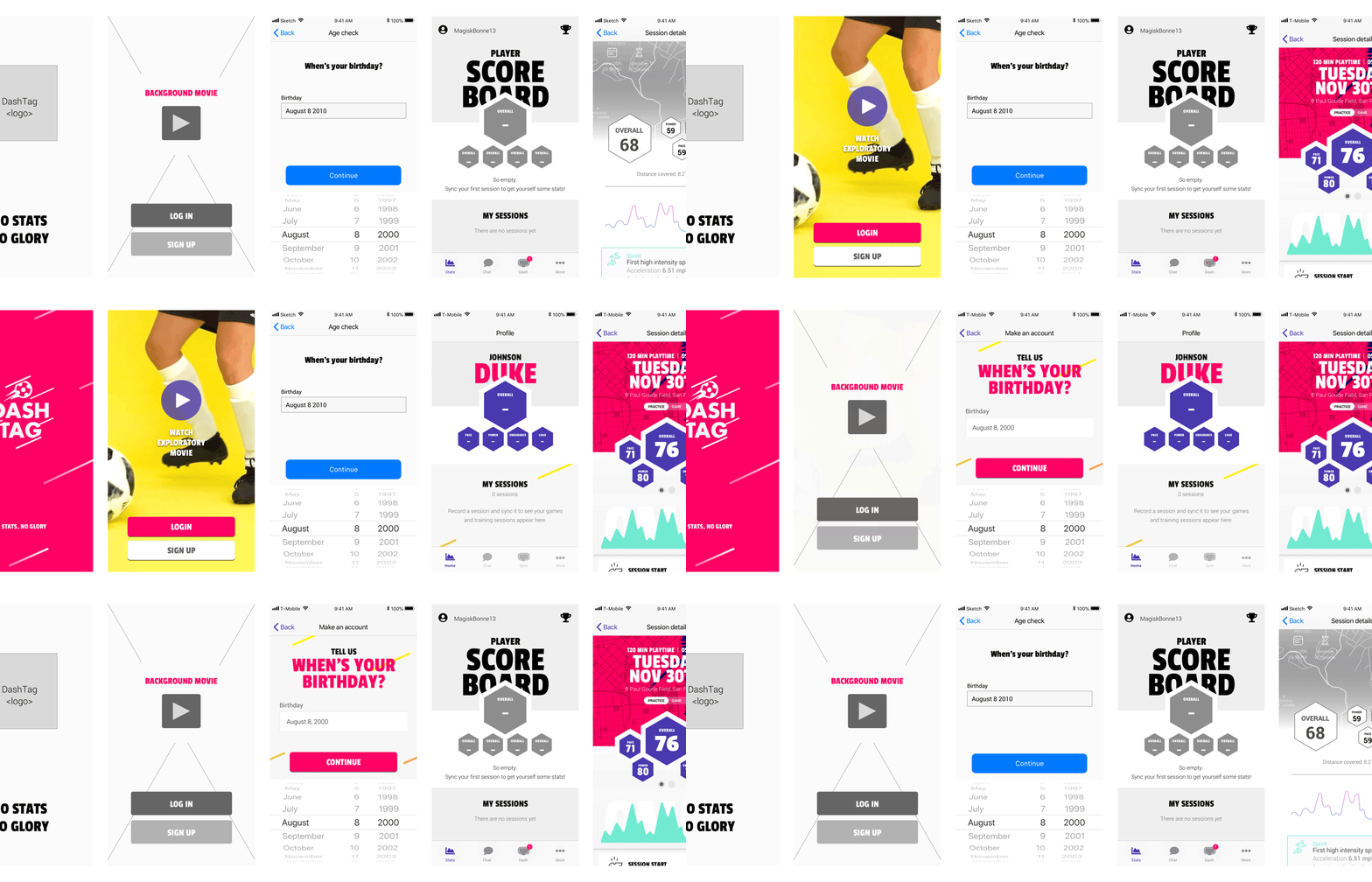
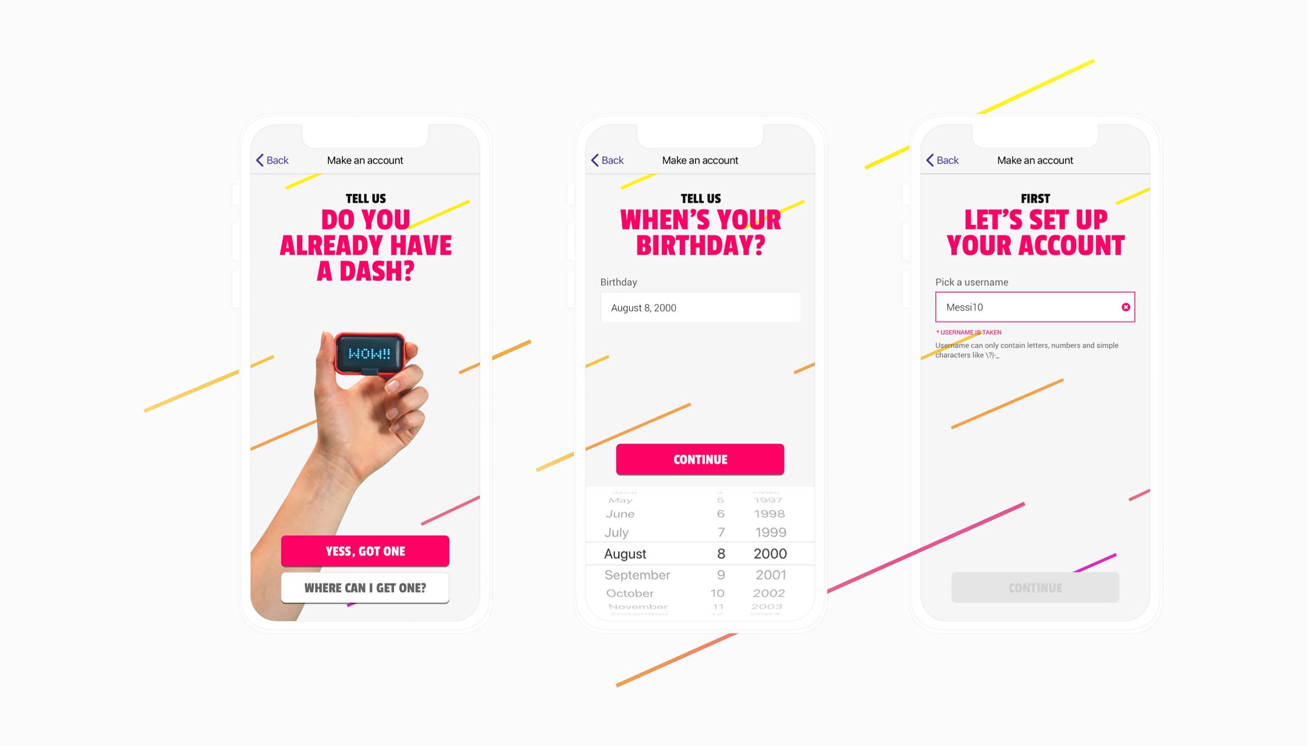
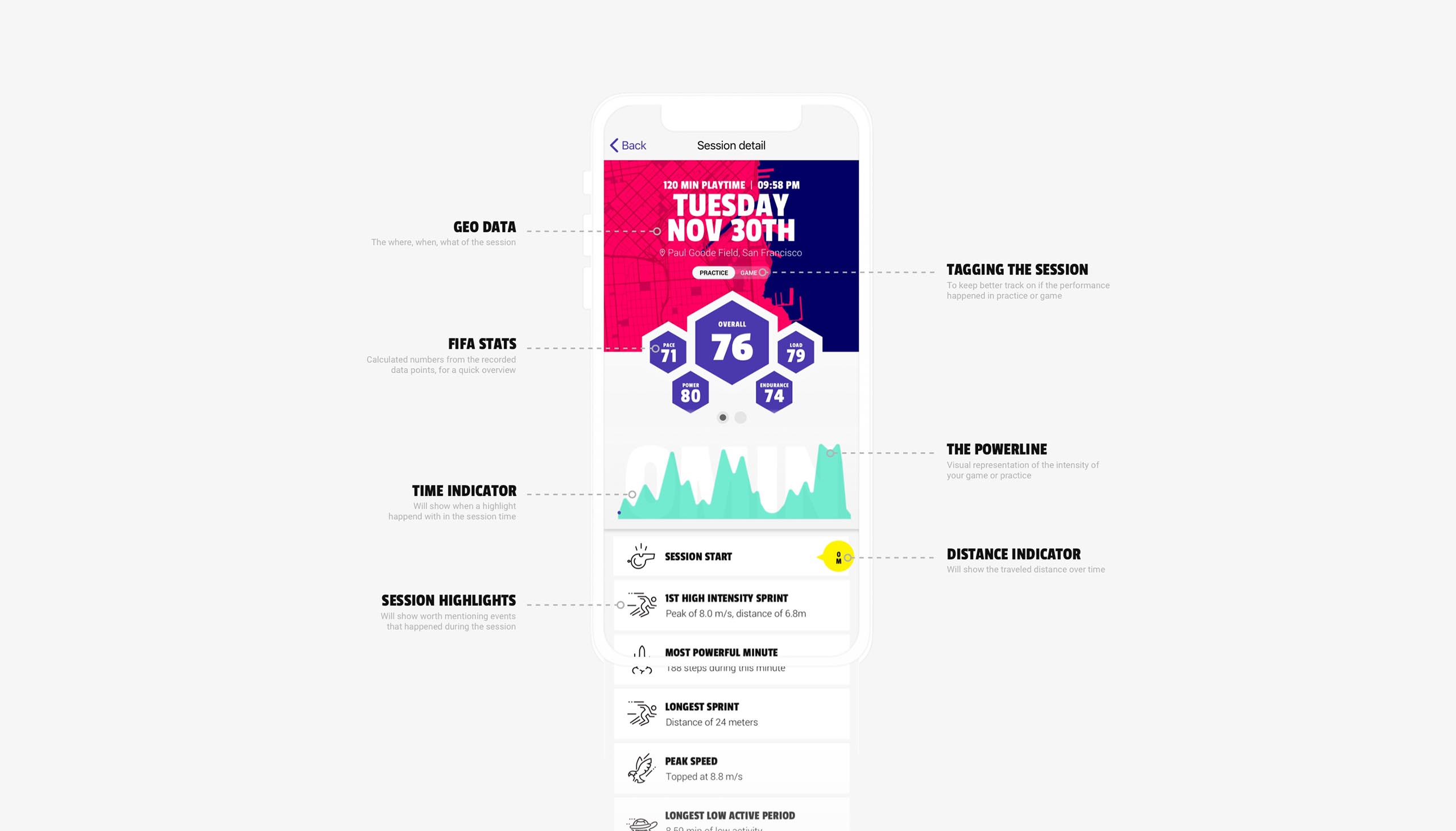
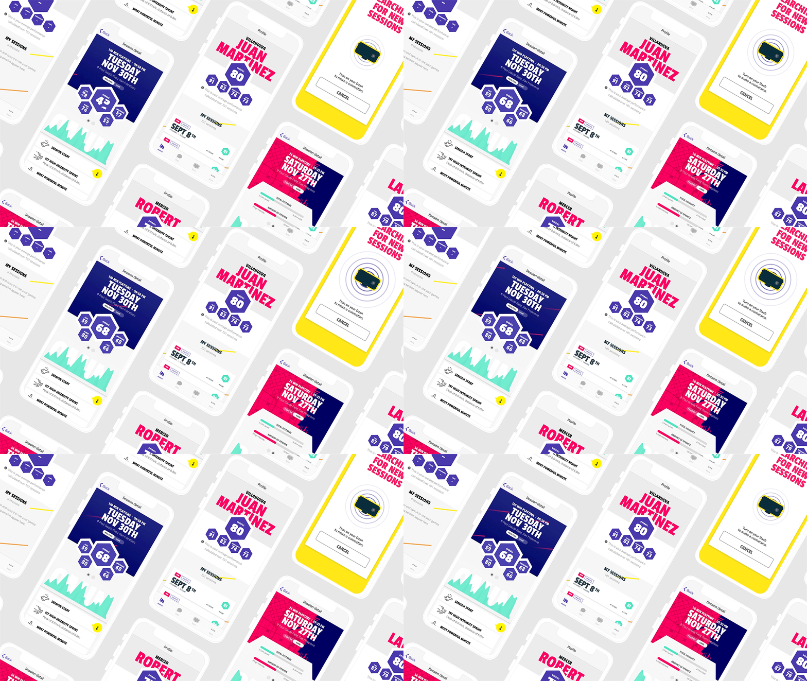
The problem that Dashtag encountered was a lack of visual clarity. So they asked me to grow and expand the brand identity with specific digital guidelines. The target group of users were young football players that wanted to improve on their game. With that I mind I started with simplifying the brand identity by reducing the colours and gradients to a minimum (they had quite some). After that we created some overall rules on how to use the colours. These rules translated into the design of the website and interface of the app. A light and clean base were there was room for elements to pop. Quite a bold look and feel that still connected with the earlier designed packaging.
Year
2018
Project sort
Freelance
Client
DashTag
Product videos & photography: form + function
UX design: Maarten van Sprang
Packaging & logo: March
Website realisation: Bedrock
What did I do
