Miele was moving from multiple ecommerce platforms to one. This takes time so they wanted help with one of the platforms, as the migration to the new platform was not going to happen in the foreseeing future. This was a platform for several markets, with Australia being the biggest. The problem: they faced was that the platform felt outdated but needed to stay in function for quite some time. So the goal was getting on to par with the industry with an extra challenge of a minimum research availability.
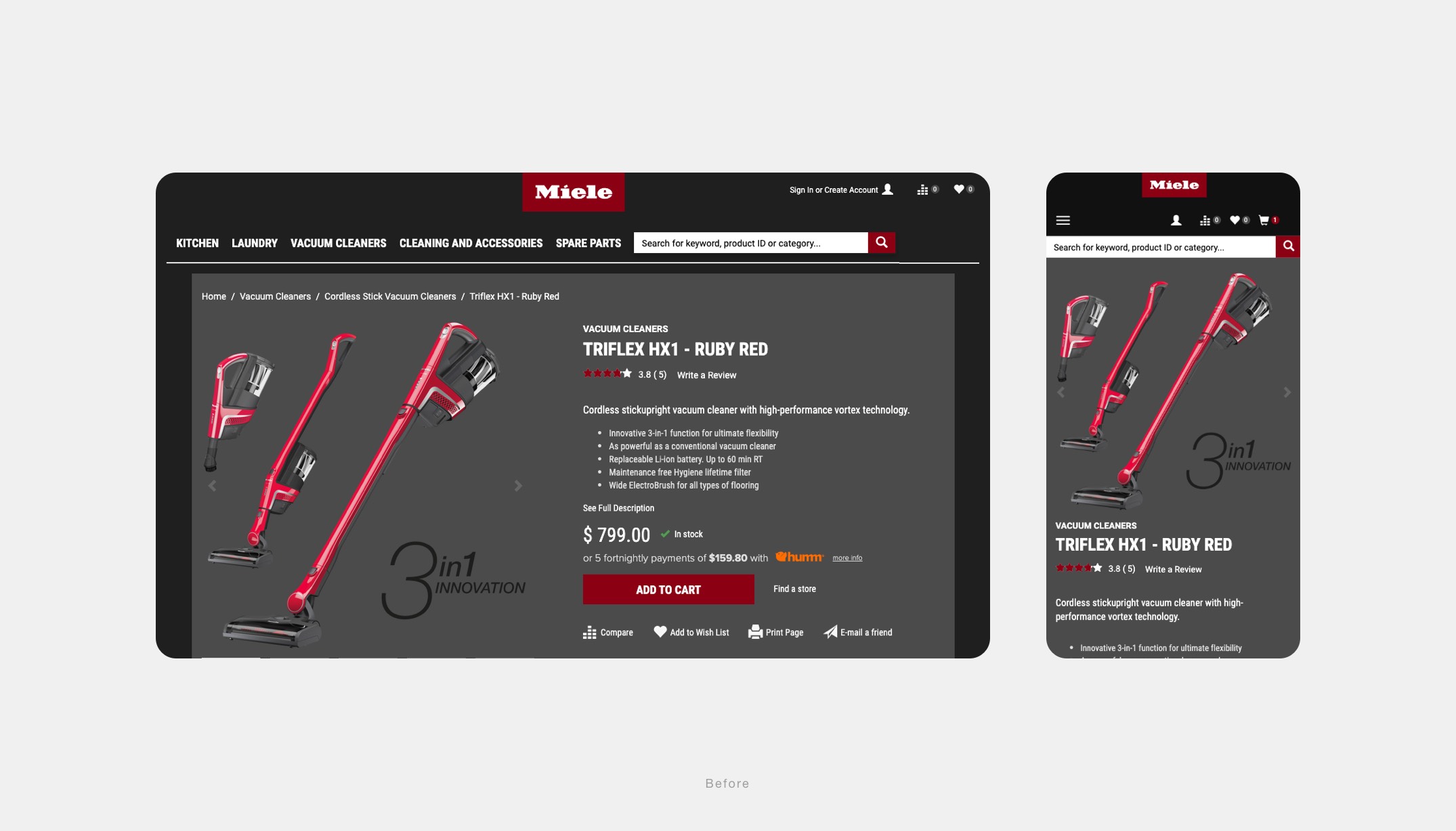
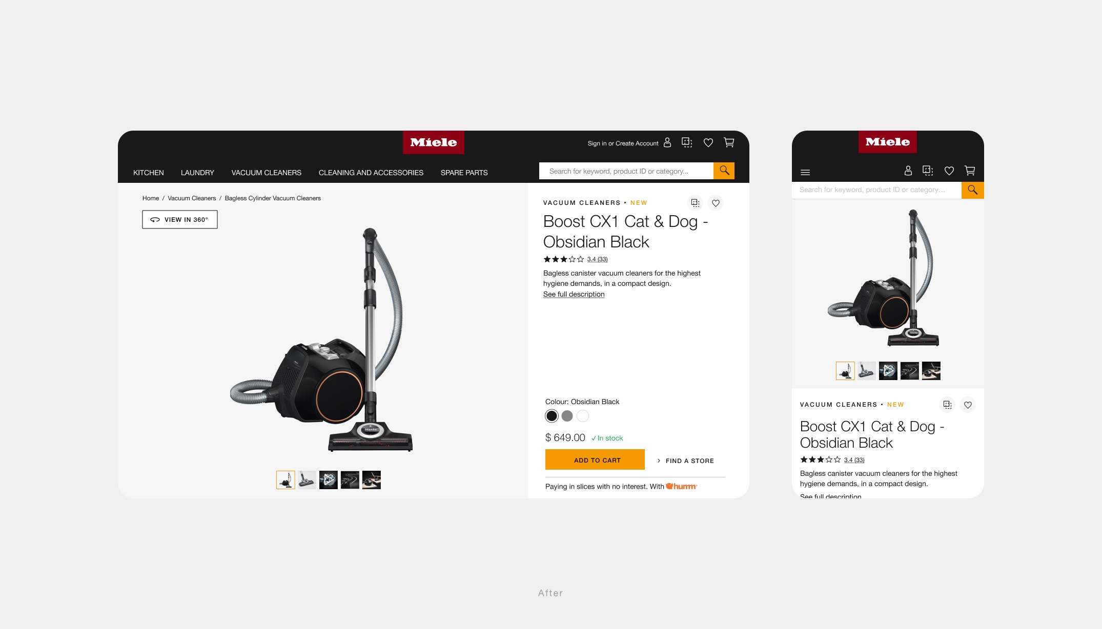
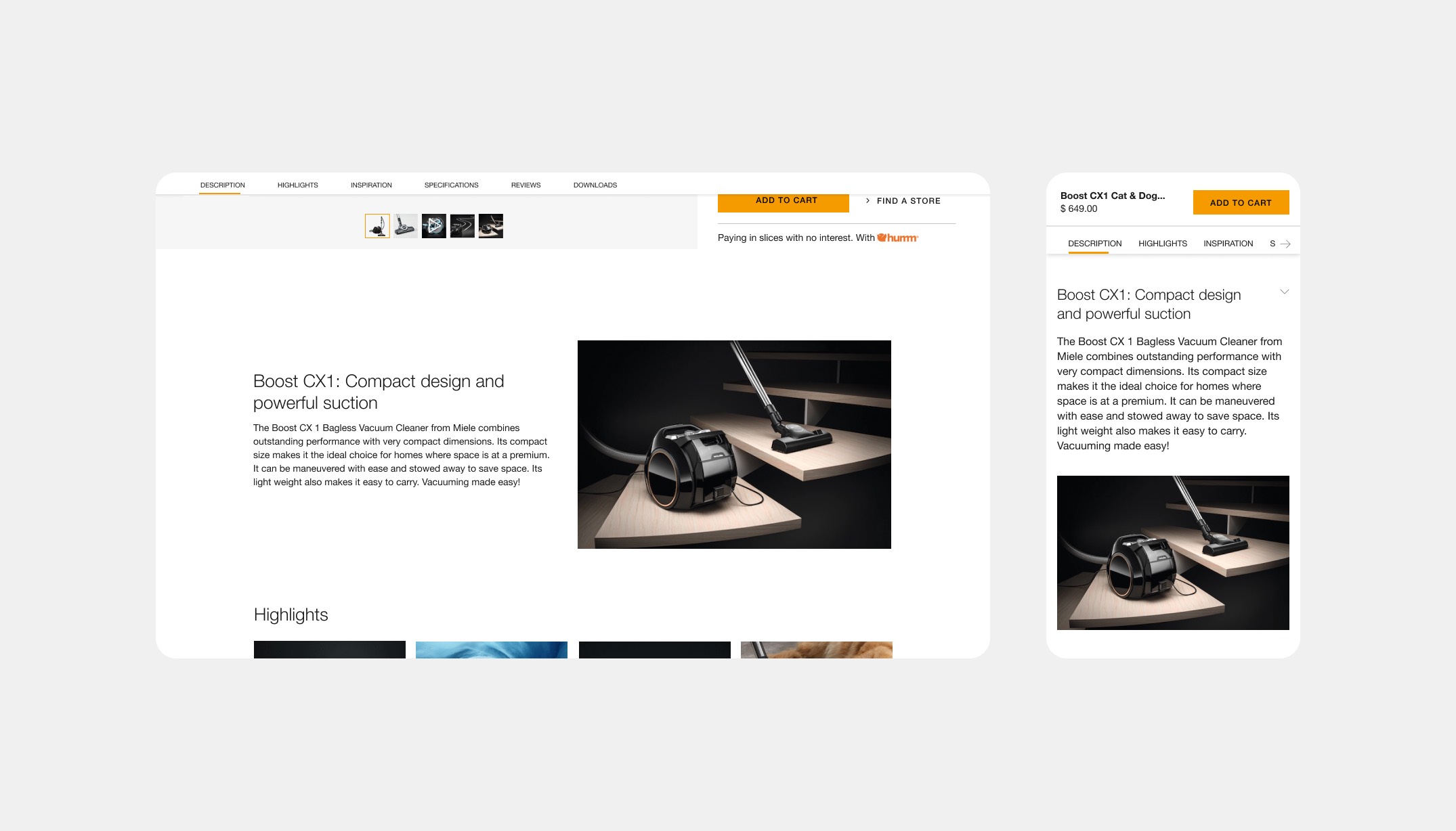
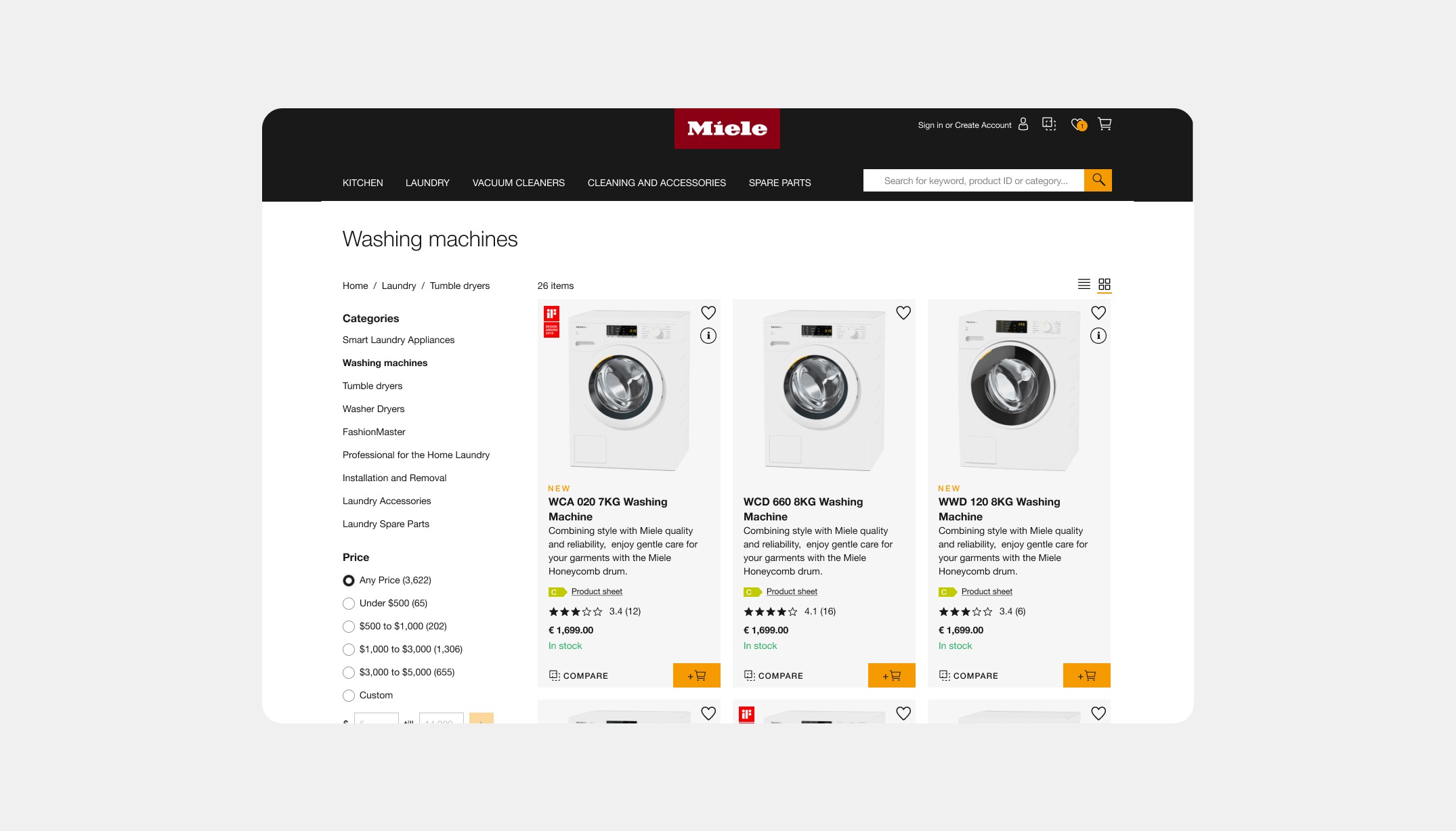
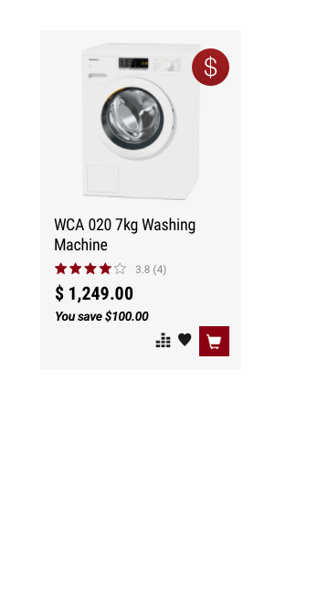
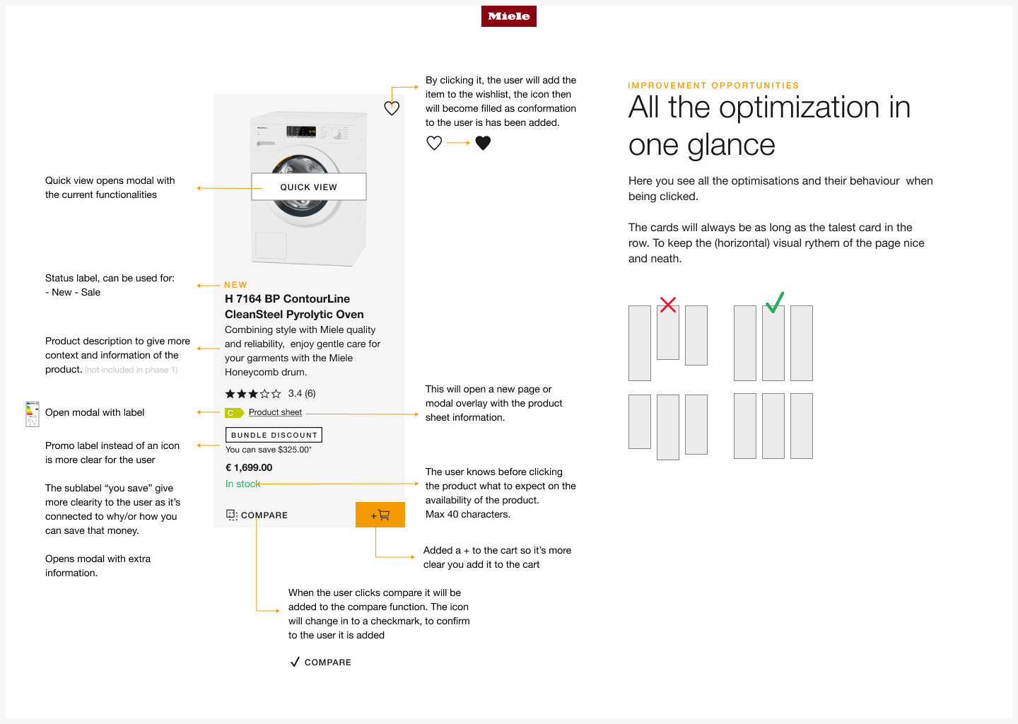
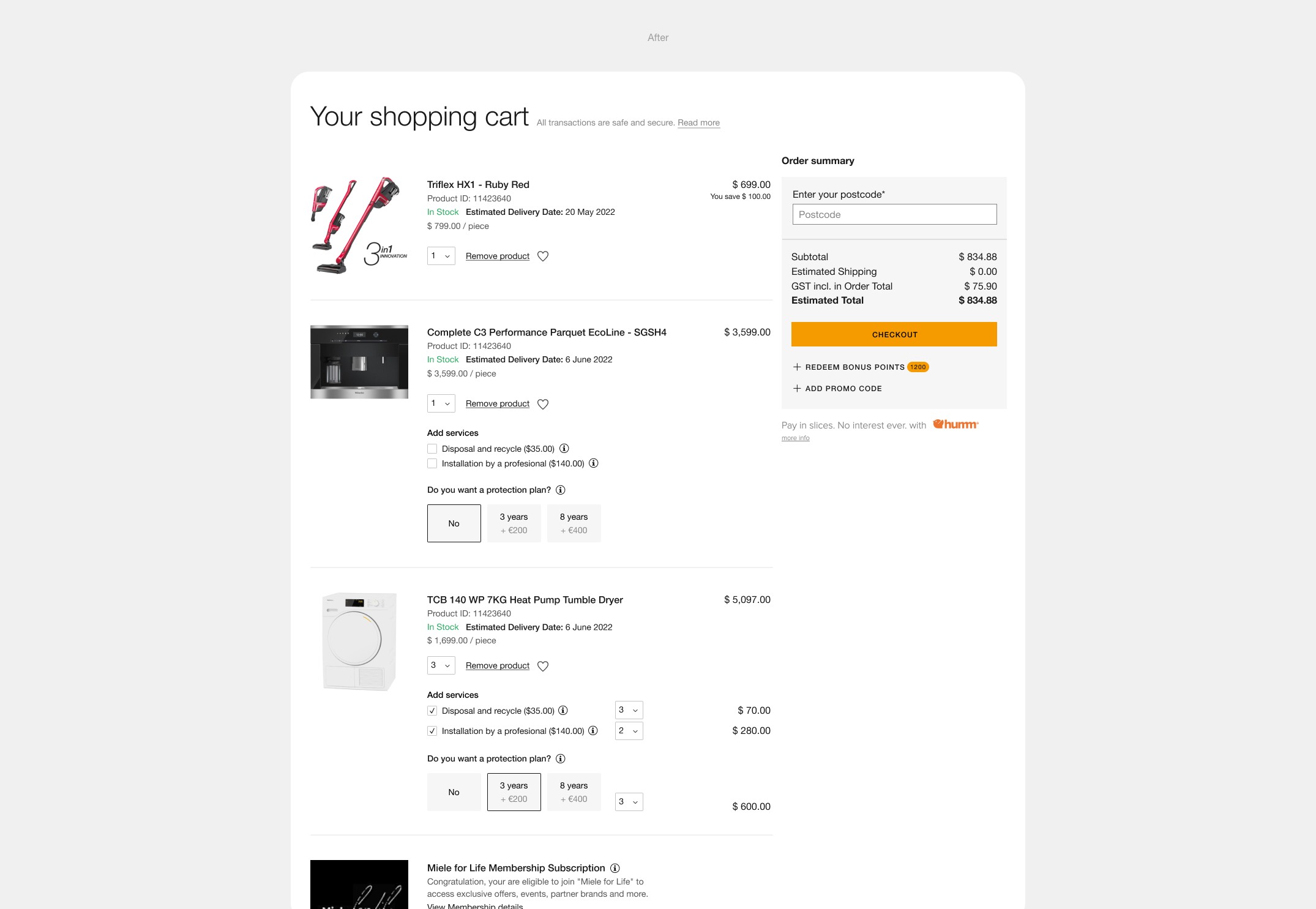
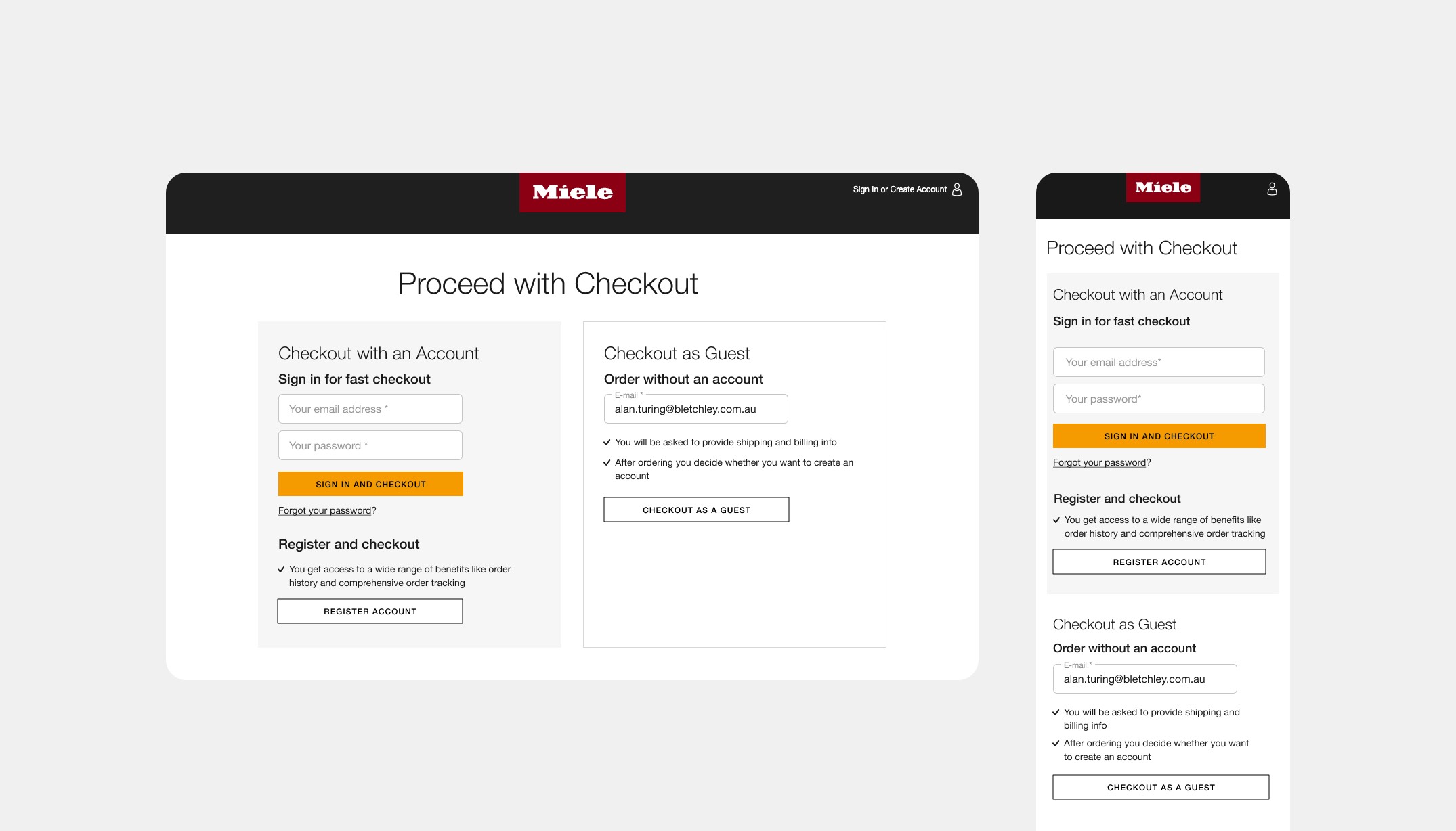
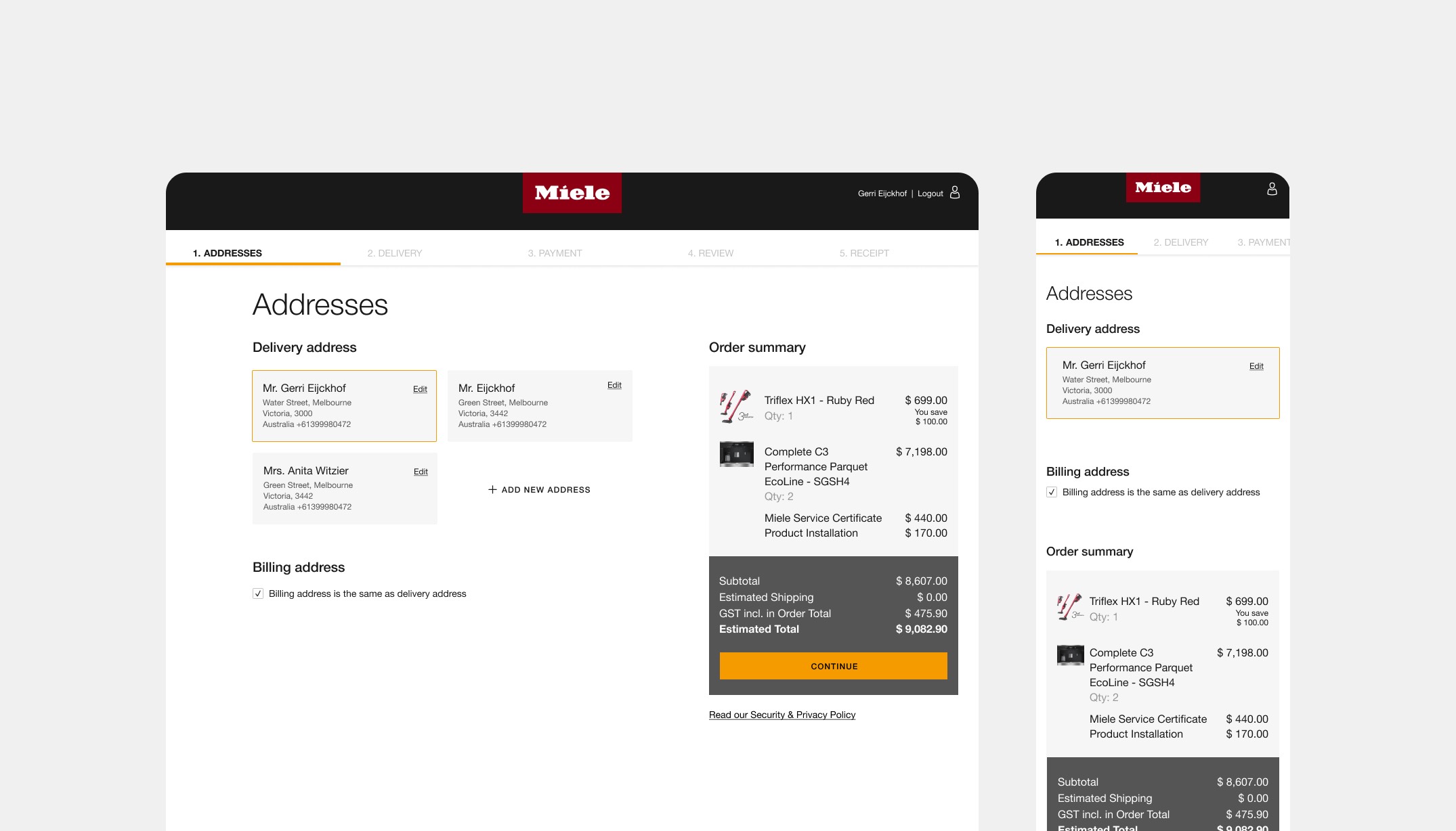
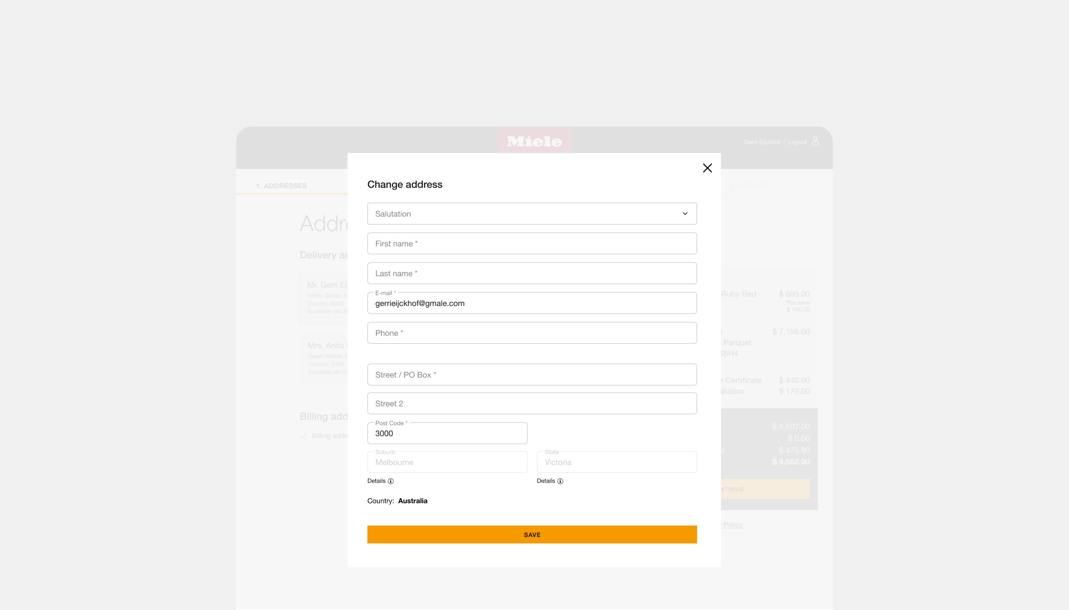
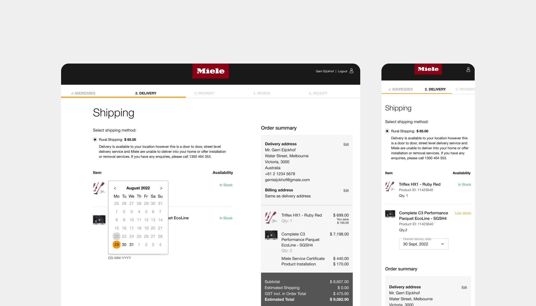
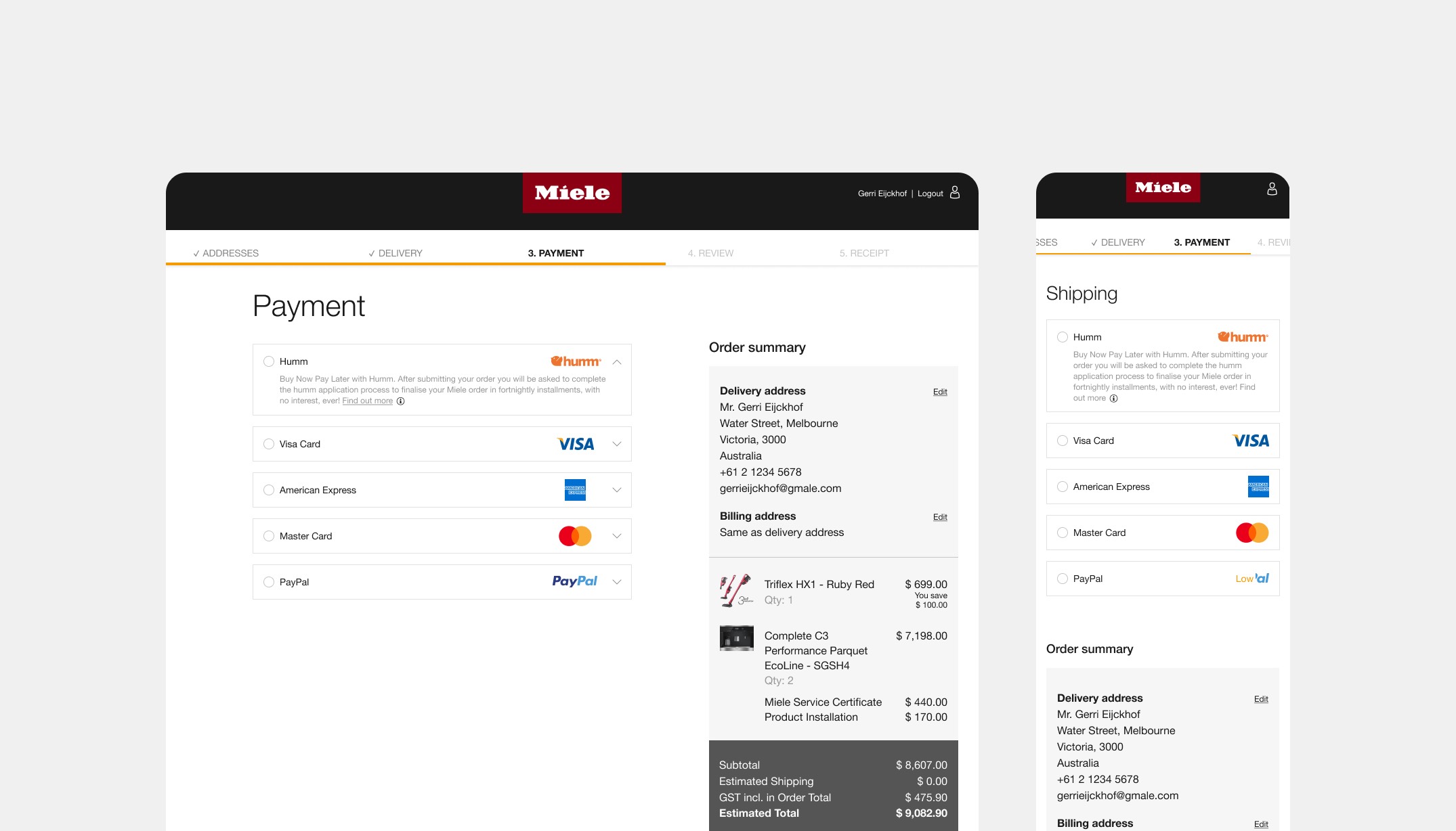
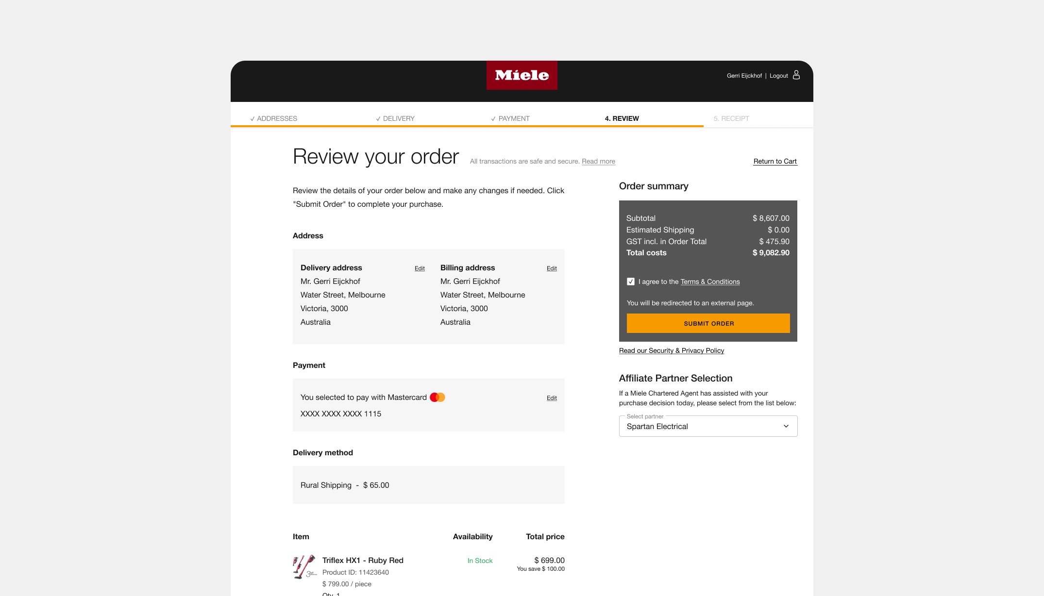
Solution: Through Baymard Institute research, benchmarking and a little user-testing we were able to get insights on what we were doing well, and what we could improve the experience for users. We did this by providing relevant information at the right time throughout the journey and by removing clutter & distraction from pages. We were able to clean up the fundamentals and create a clear hierarchy of buttons, fonts, icons and colour usages. We moved from a dark to light themed website. Which resulted in improvements on the PLP and its product cards, PDPs, cart and the checkout flow. Because of these changes the new look connected better within the other Miele eCommerce platforms and brand.
The result was that consumers were able to find relevant products more easy. We saw an uplift of 45% in product views and an increase of 59% of add to cart interactions. Overall we measured that the Click Through Rate (CTR) within the webshop customer journey of Australia went up to 64% in Q1 & Q2 (2022).
Year
2022
Project sort
Freelance
Client
Miele
Worked closely together with Marinus Ames (UX)
What did I do